
FoxstudioAdd and edit elements
Product details
5 min read
How to add the Product details element to your page
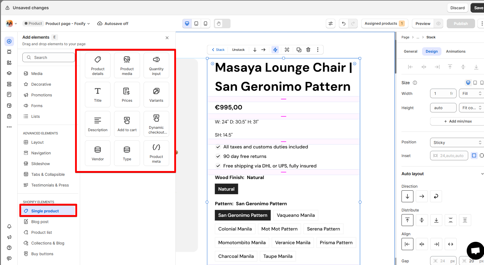
- From the editor, click Add elements > Single product > Product details
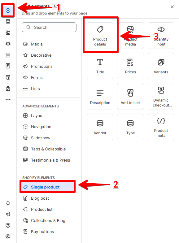
- Drag it onto the canvas
- The element includes some essential components you need
- You can also edit/add more elements to display the information you want.
Before you customize your Product details
- Click Assigned products from the Top bar.
- Choose how to apply the template:
- Apply to specific products: Select individual products
- Apply to all products: Template applies to your entire catalog
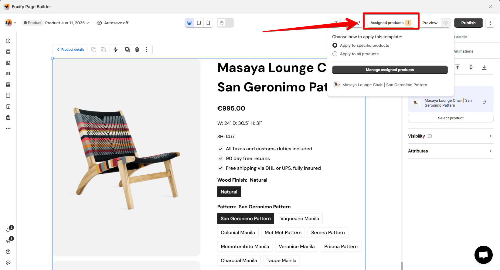
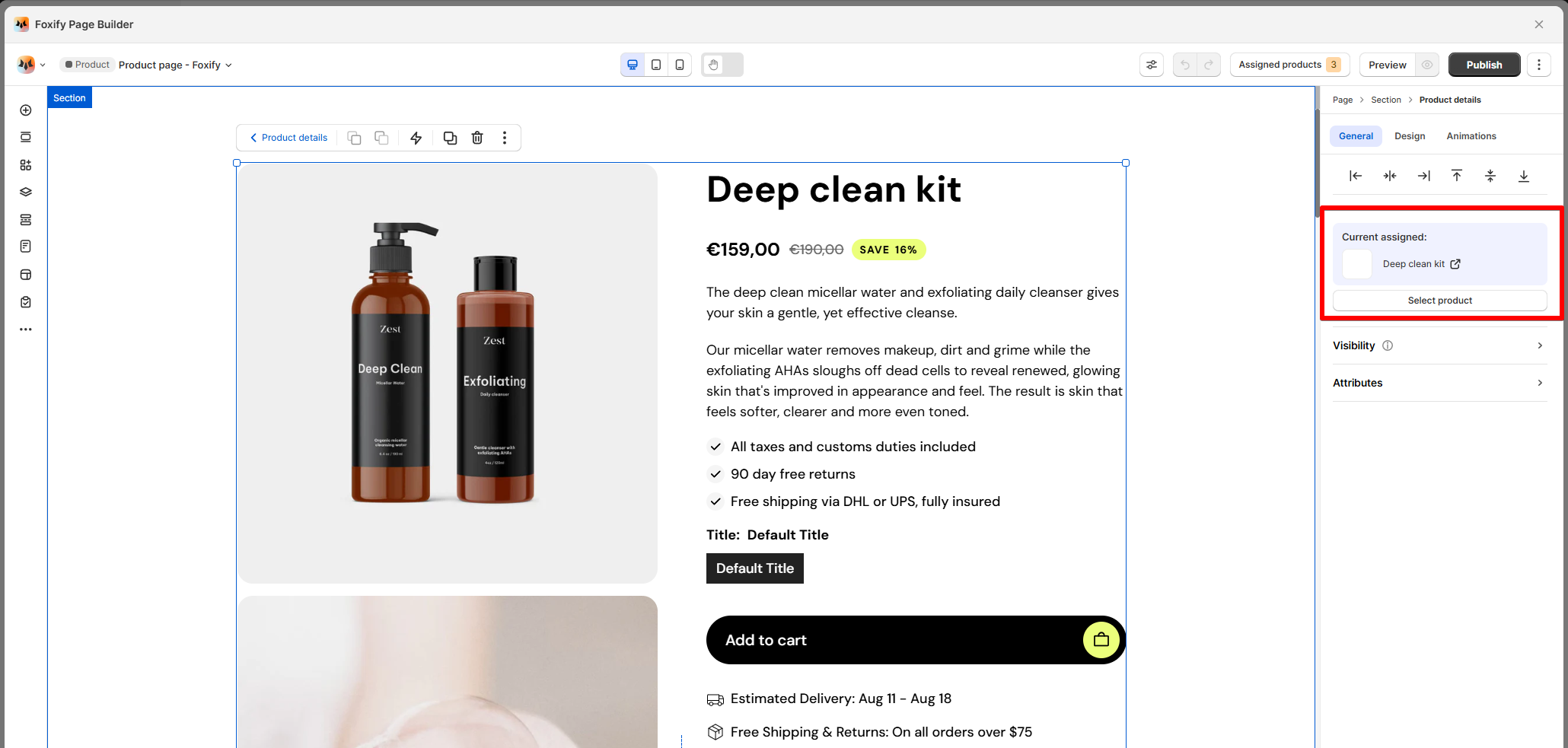
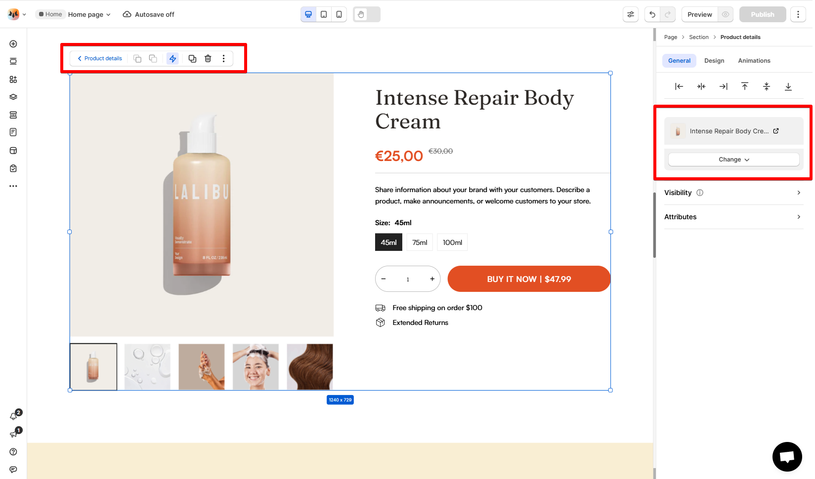
- Select the Product details element
- In the settings panel, choose Select product
- Select the specific product you want to feature
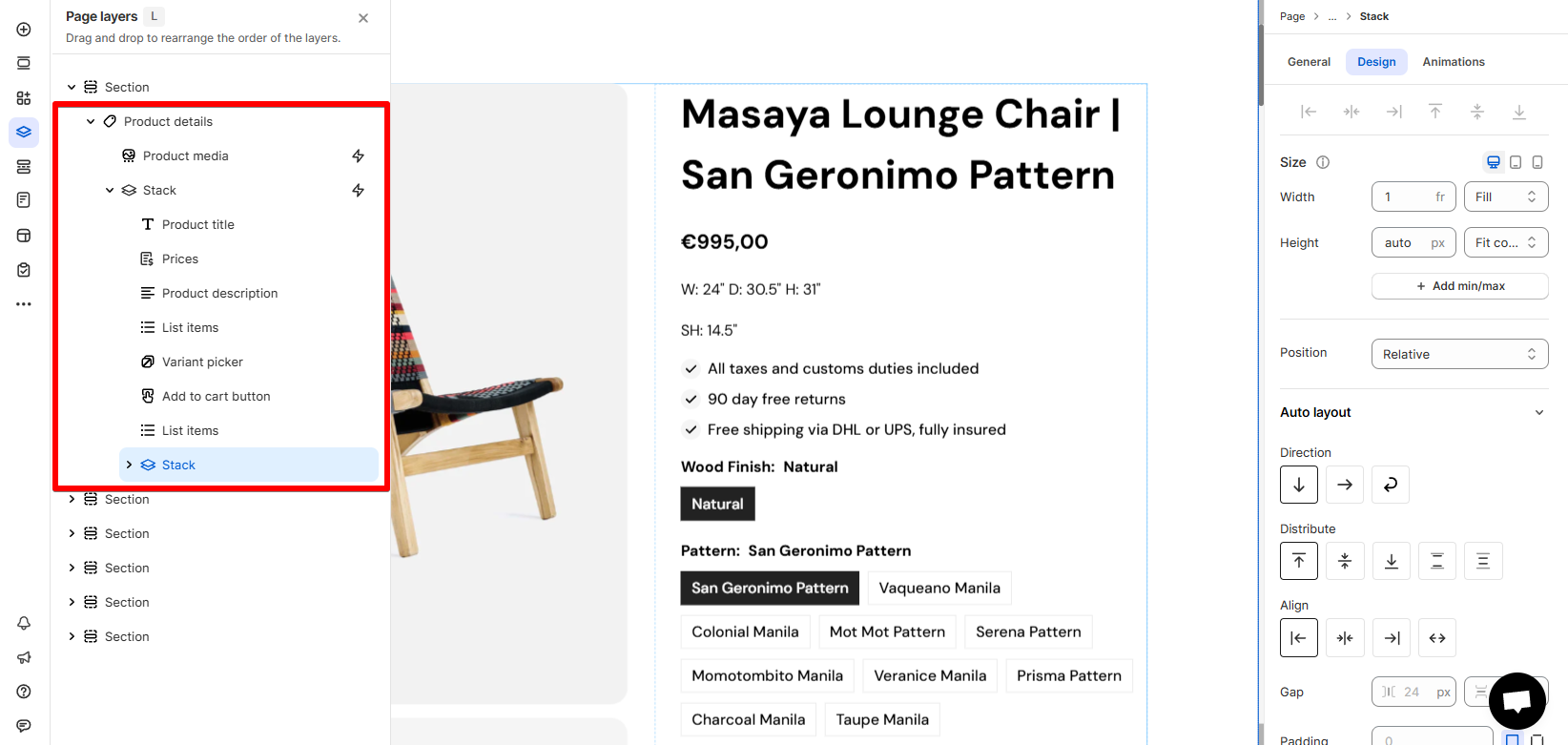
How to edit your Product details
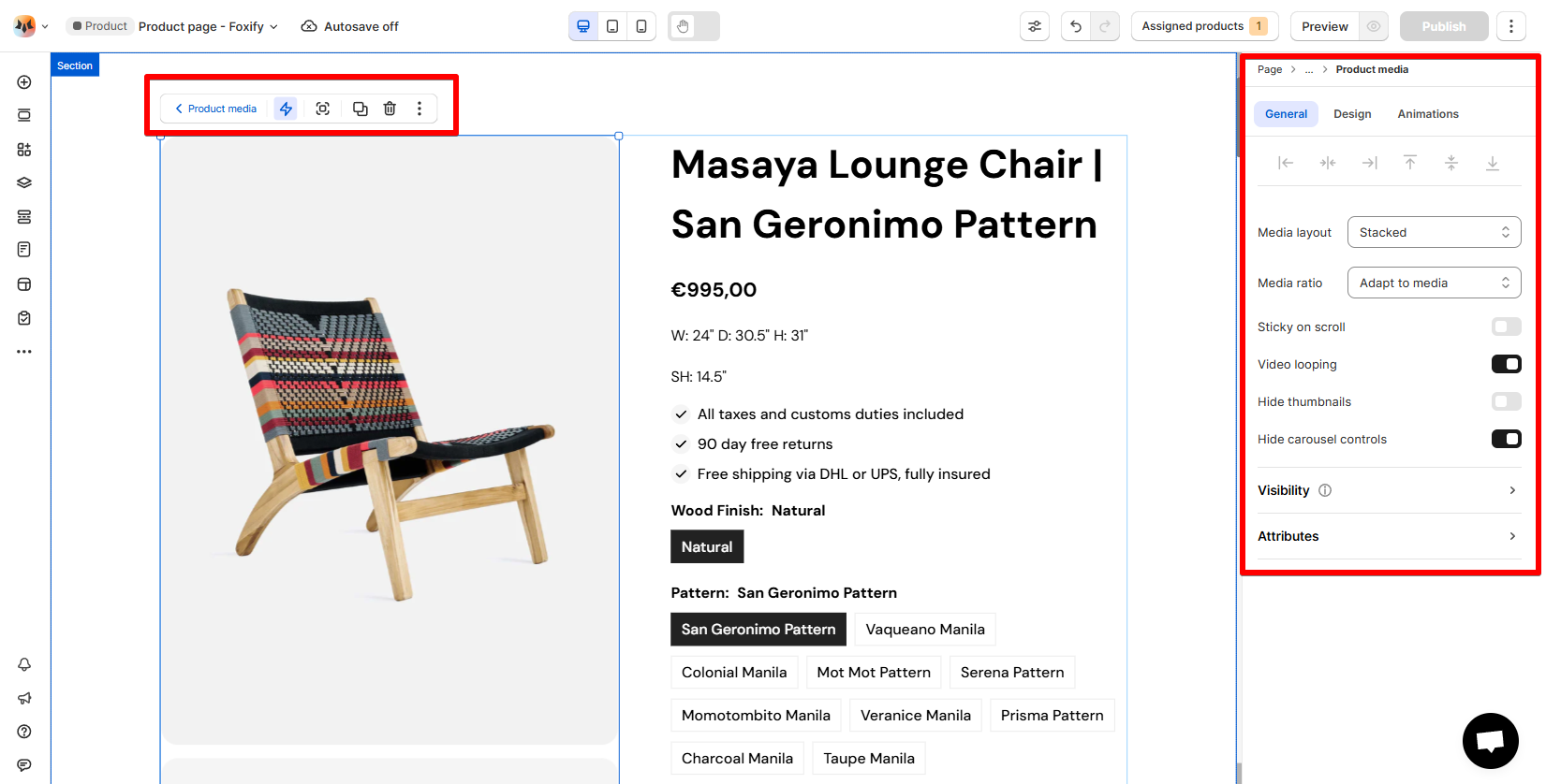
Product media
Product information
Elements to include & Why they matter
- Product title & price: Instantly communicate the product name and cost.
- Description: Useful for sharing size, materials, shipping info, and care instructions.
- ✍ See how to add description to your product.
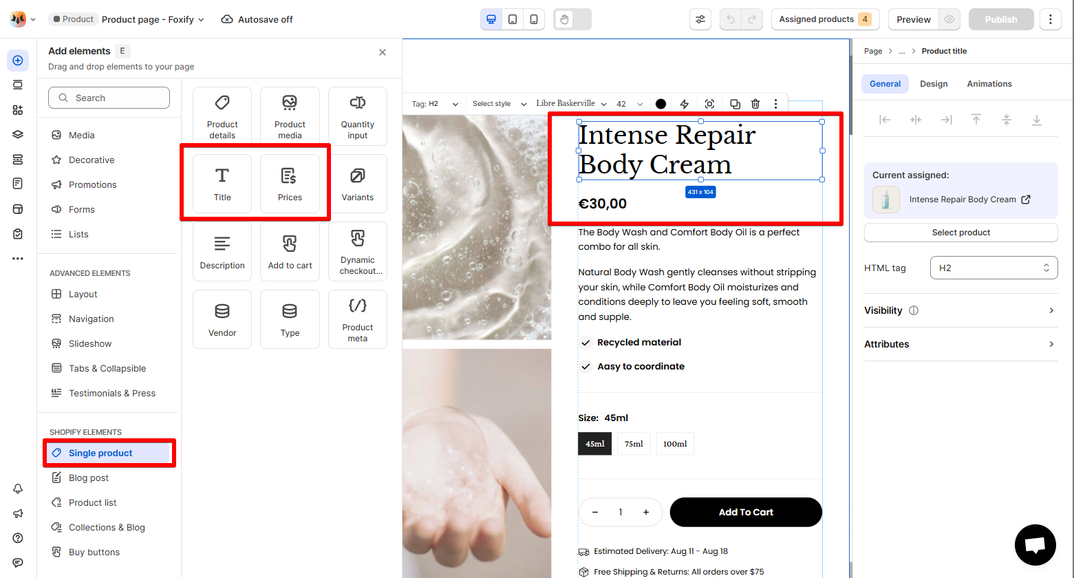
3. Variant picker (Variants)
-
Pulls data directly from Shopify variant options. Learn more
-
- Picker type: Dropdown or Buttons
- Label position: Above or Inline
- Show selected option value
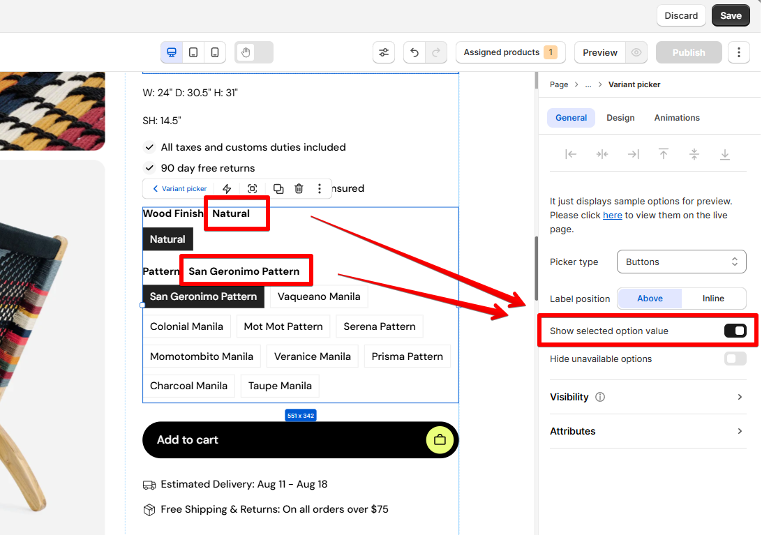
- Hide unavailable options: Hide the unavailable options based on the selected variant.
-
👉 Want to show swatches? Use the extension Color Swatches
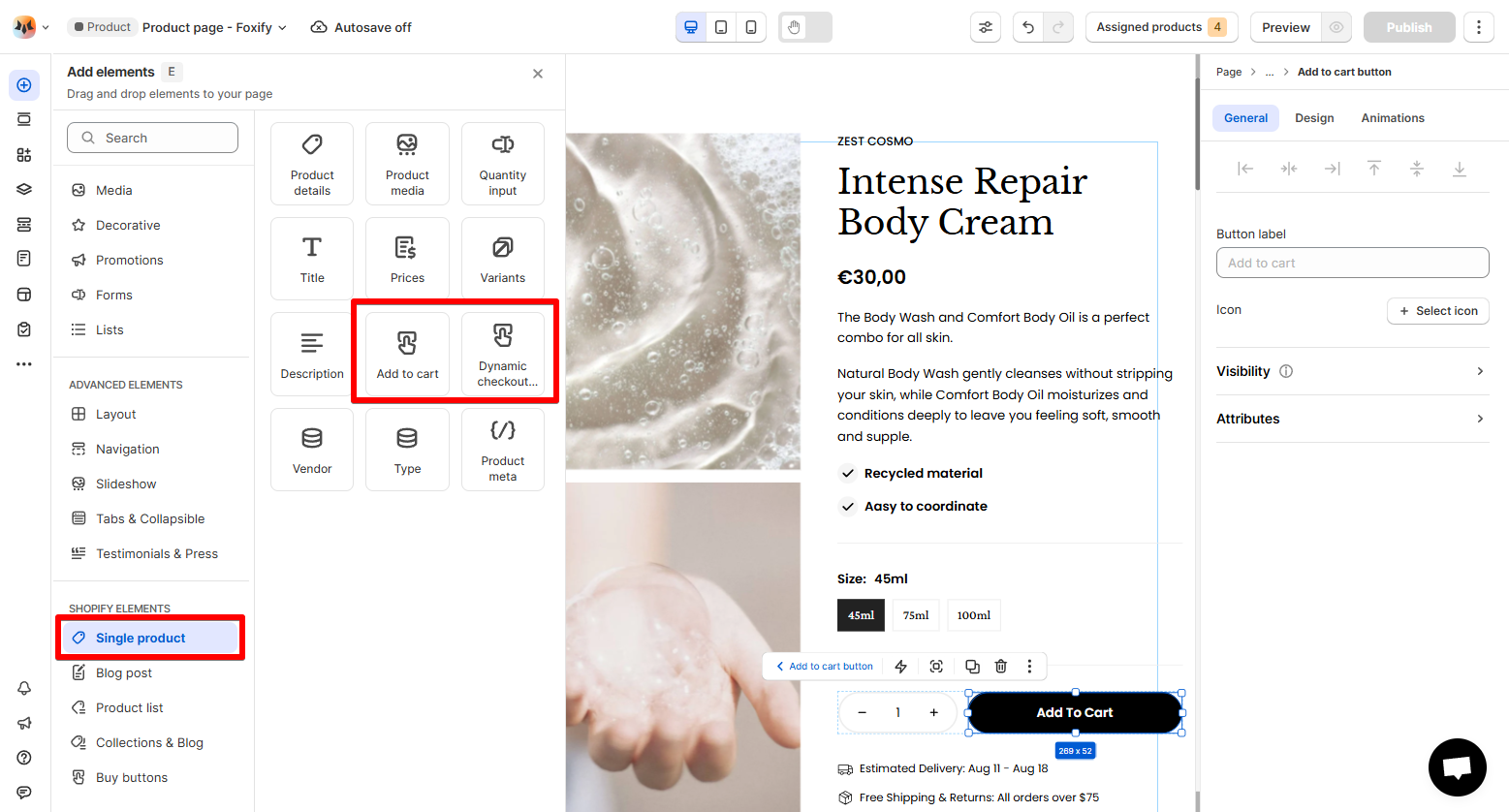
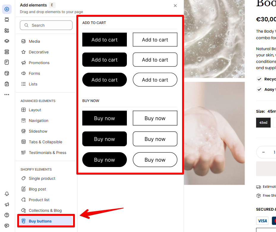
4. Add to cart
- These auto-detect the product + selected variant — no manual setup required.
- Change the button label and add an icon before the label.
- ⭐To change the ATC button label across all Foxify pages, go to Translation > Edit Foxify defaut theme content.
- Learn more: Change the default wording in Foxify
- 👉 Want to add products to cart without reloading the page? Enable the extension Ajax Add to Cart
- This extension can open the cart drawer of your theme or app (if you're using a cart drawer from an app) as well. To set this up, you may need to contact the app provider or theme developer to get the event to trigger cart — then contact us for integration!
5. Dynamic checkout buttons
- These auto-detect the product + selected variant — no manual setup required.
- The kind of accelerated checkout button that displays to your customers depends on different factors factors. Learn more
❌ 
Additional elements to enrich your product page
- Product Media: Add extra images, videos, or 3D previews.
- Tabs & Collapsibles: Organize long info (e.g., reviews, specs, FAQs).
- Testimonials & Press: Build trust with customer feedback or media mentions.
- Promotions: Highlight offers, discounts, or bundles.
👉 Learn more about all available elements: Add and edit elements
- Prevents overlapping
- Ensures spacing consistency
- Fully responsive on all screen sizes
🔍 Learn more: Stack elements
Last updated