# Cells and grids
The grid is made up of cells, and each element, or group of elements, gets its own cell. In a grid, you can add multiple cells to arrange elements in a specific order and control their size.
Cells and grids are powerful tools to create structured and responsive layouts, ensuring your page looks stunning on any device.
_iz2TfEUq.gif)
## Add a grid to a section
**Steps:**
1. Click **Add elements** on the left side of the Editor or press **E**.
2. Click **Quick add**, locate and drag the **Grid** element to the canvas.
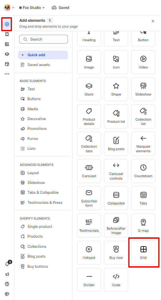
or
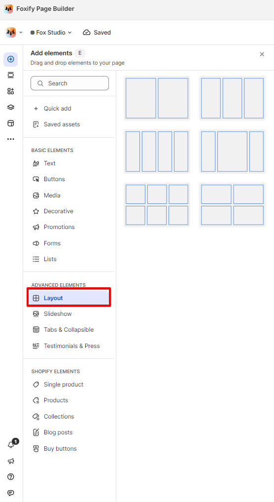
Click **Layout** in the **Advanced elements** section, select a grid layout you want, and drag it to the canvas.
## Customize a grid
### Change a grid layout
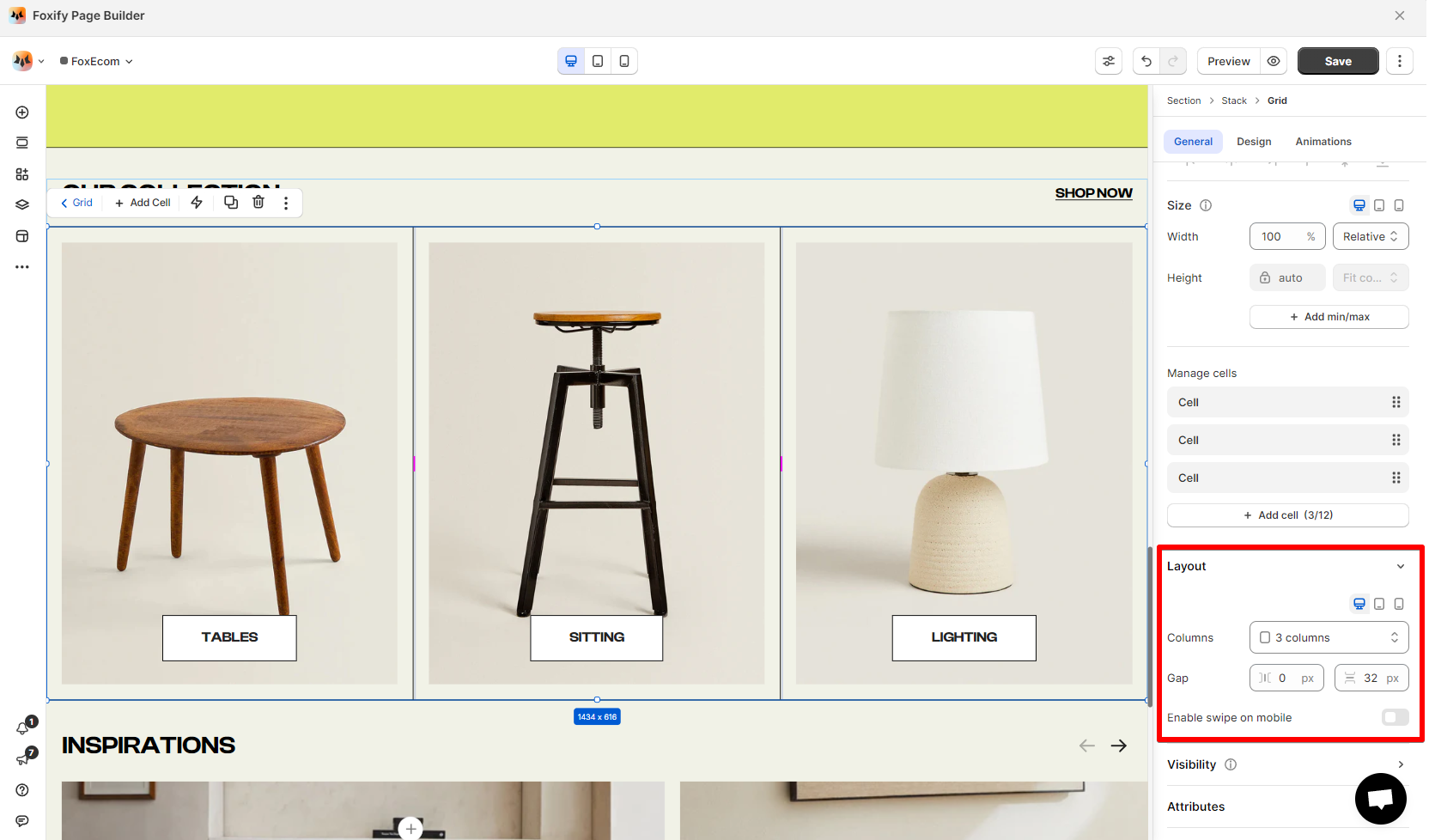
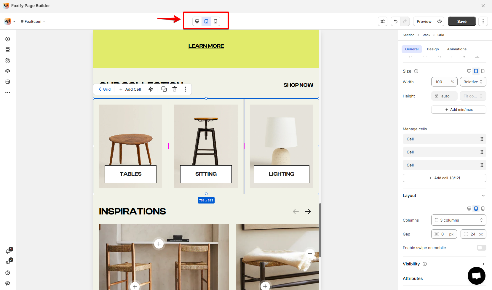
Customize your grid to get the exact layout you want. You can change the **number of grid columns**, adjust the **cell size**, and the **gap** between them using the Inspector panel.
**Steps:**
1. Click the relevant grid.
2. In the **Inspector** panel > **General** tab, locate the **Layout** settings.
3. Change the number of columns (between 1-12 columns).
Set the column gap and row gap between the grid cells.
For mobile view, you can enable the cells to be swipeable.
### Add more cells to the grid
You can add up to 12 cells in a grid.
**Steps:**
1. Click the relevant grid.
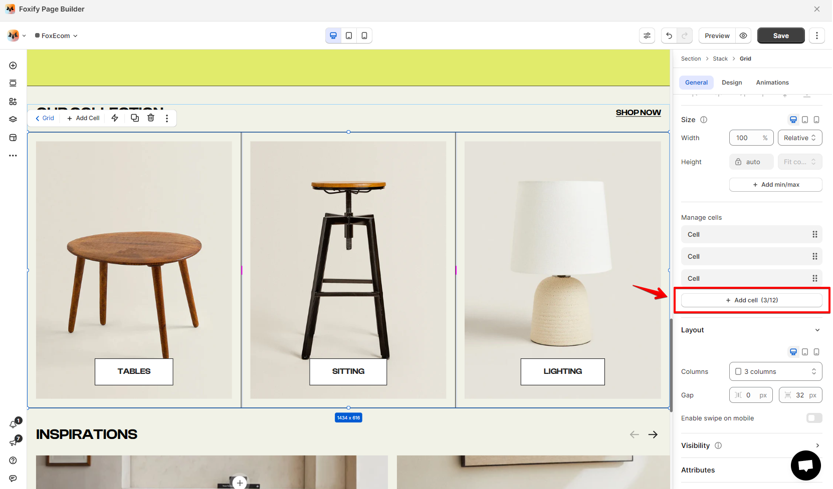
2. In the **Inspector** panel > **General** tab, locate the **Manage cells** section.
3. Click **Add cell** to add more cell to the selected grid.
Easily duplicate or reorder a cell using the **Manage cells** section.
Your design only applies to the breakpoint you're working on. You should tailor the grid to each breakpoint to ensure the composition of your elements is flawless.
### Manage the cell size
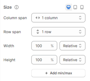
Manage the cell size (width and height), or expand it to create a hierarchical grid.
Steps:
1. Select the relevant cell.
2. In the **Inspector**, locate the **Size** section.
3. Set the column span, row span, width, and height of the cell.
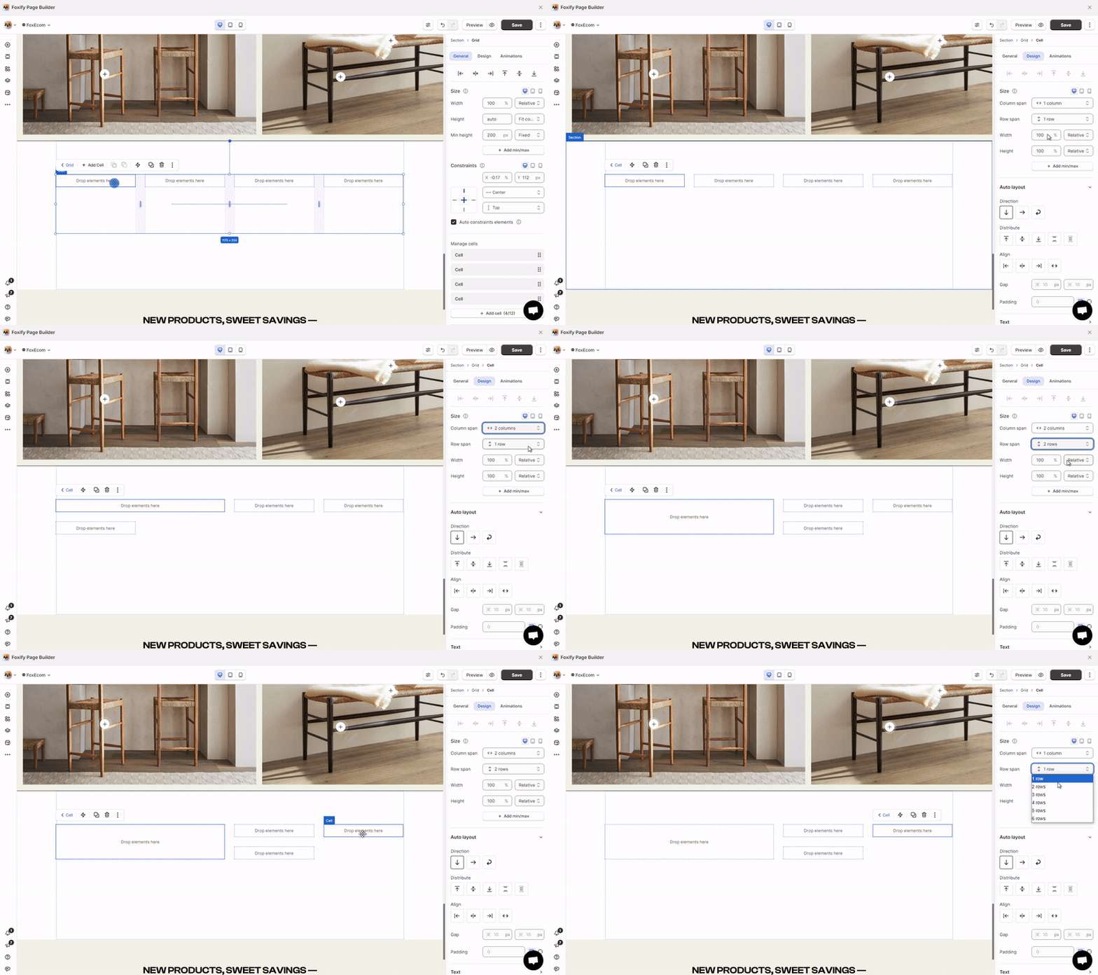
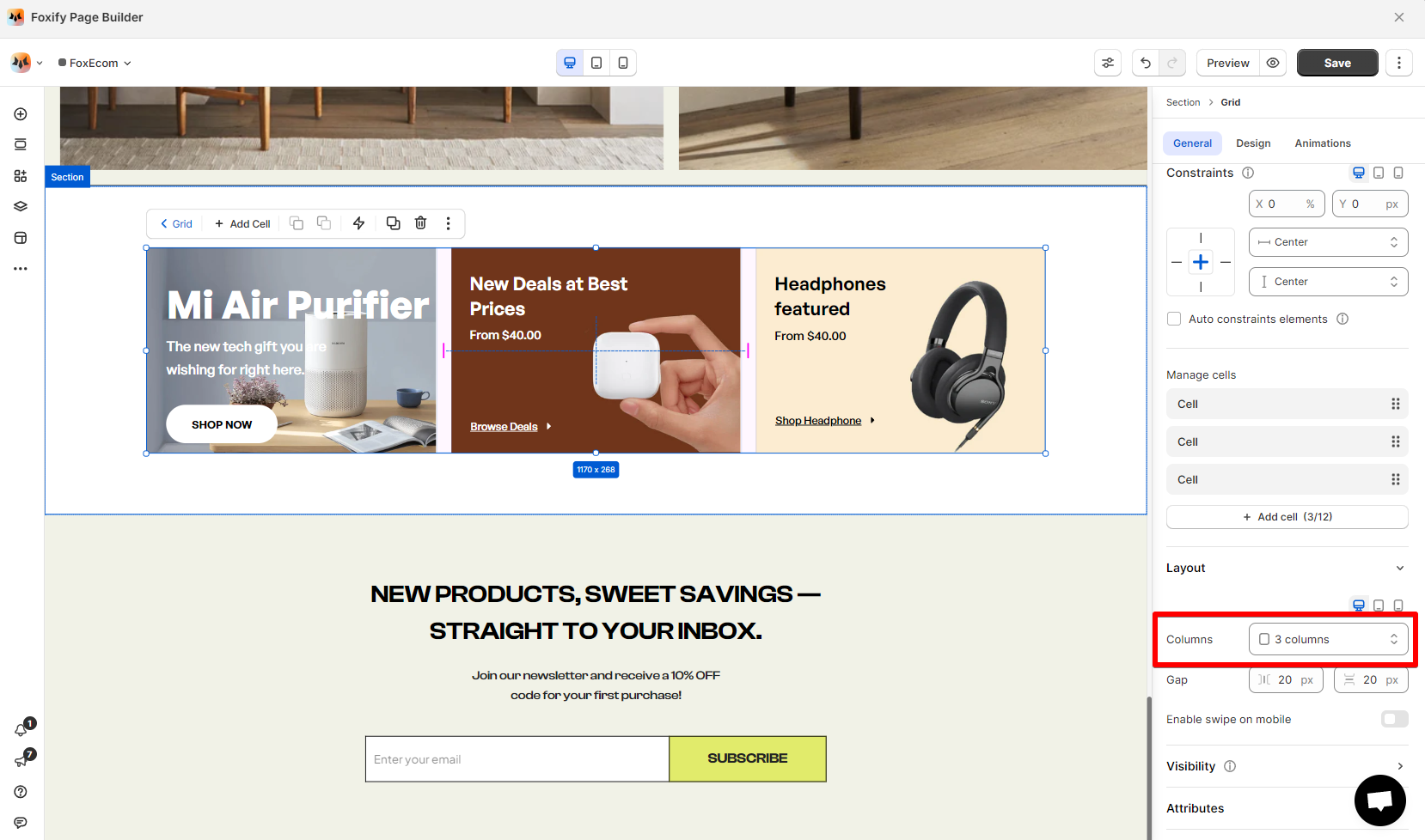
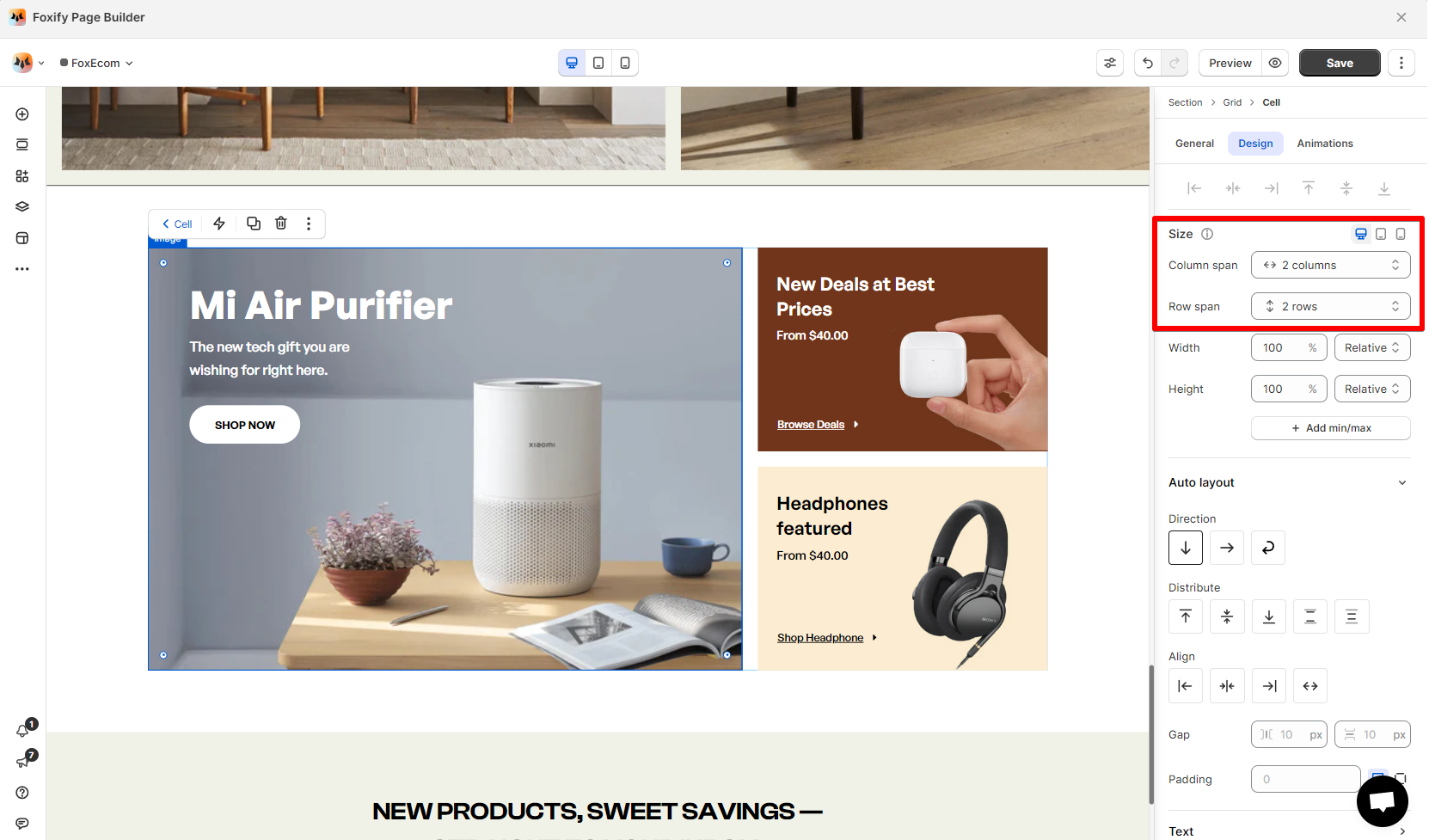
For example, in the grid below:
* [Grid layout](#change-a-grid-layout): Columns setting is set 3 columns.
* After setting the first cell is set to have:
* Column span: 2 columns.
* Row span: 2 rows.
### Delete a cell
You can remove a cell at any time. This deletes both the cell and the element within.
Steps:
1. Select the relevant cell.
2. Click the **Delete** button on your keyboard.
or
1. Select the grid that contains the cell you want to delete.
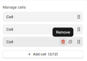
2. In the **Inspector** panel > **General** > **Manage cells**, click the **Remove** _reX9mp7g.svg) button next to the relevant cell.
button next to the relevant cell.
