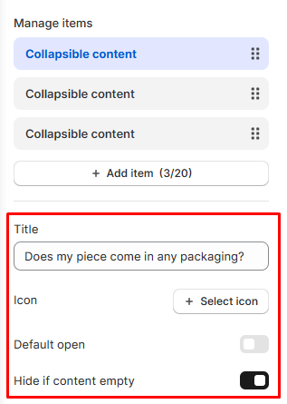
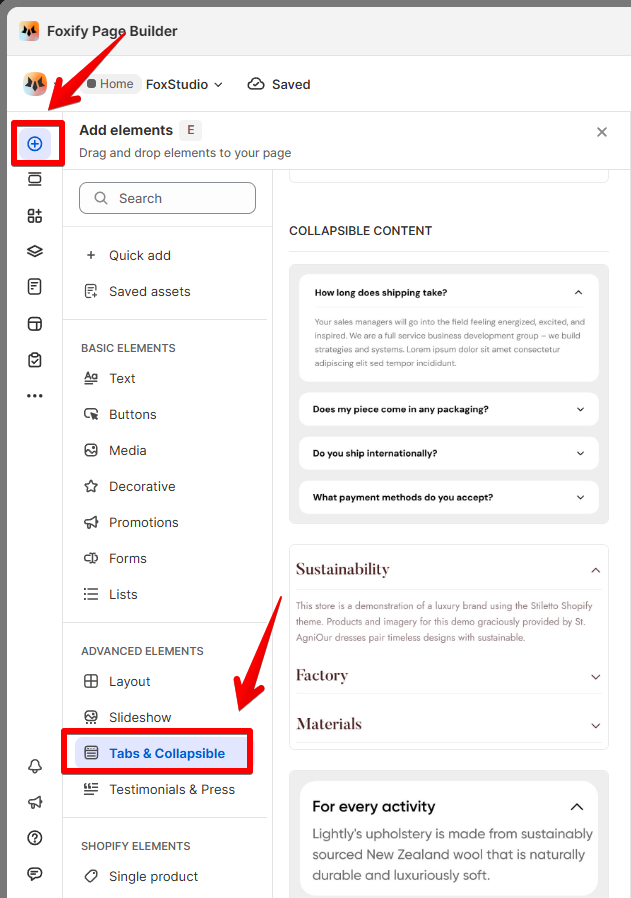
Collapsible content is a great way to organize content and improve the user experience on your website. Easily create and customize collapsible content to present information in a clean, space-saving format using FoxStudio.
🧐 What Are Collapsible content tabs?
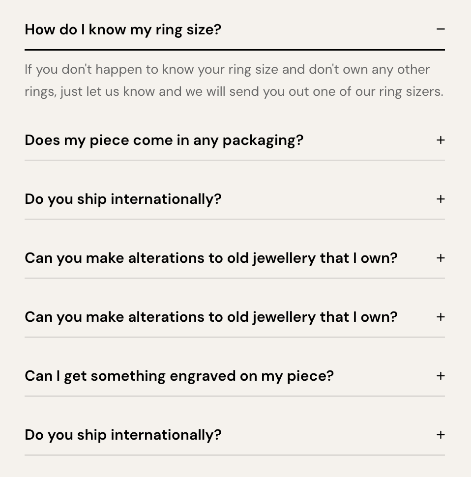
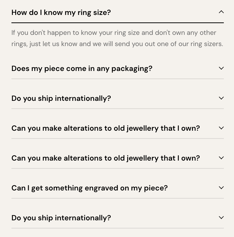
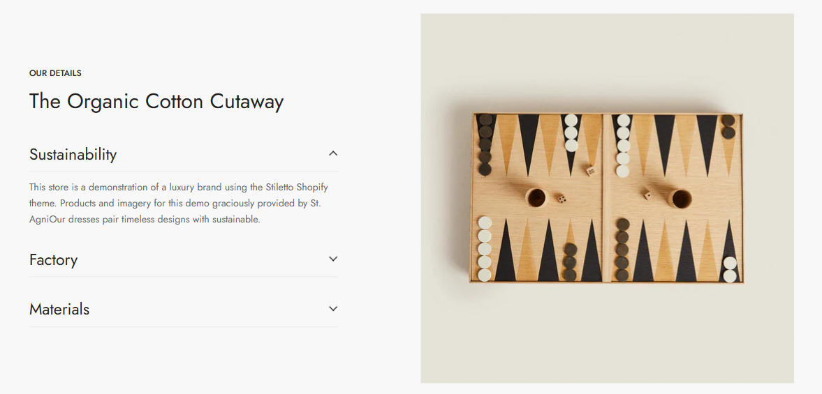
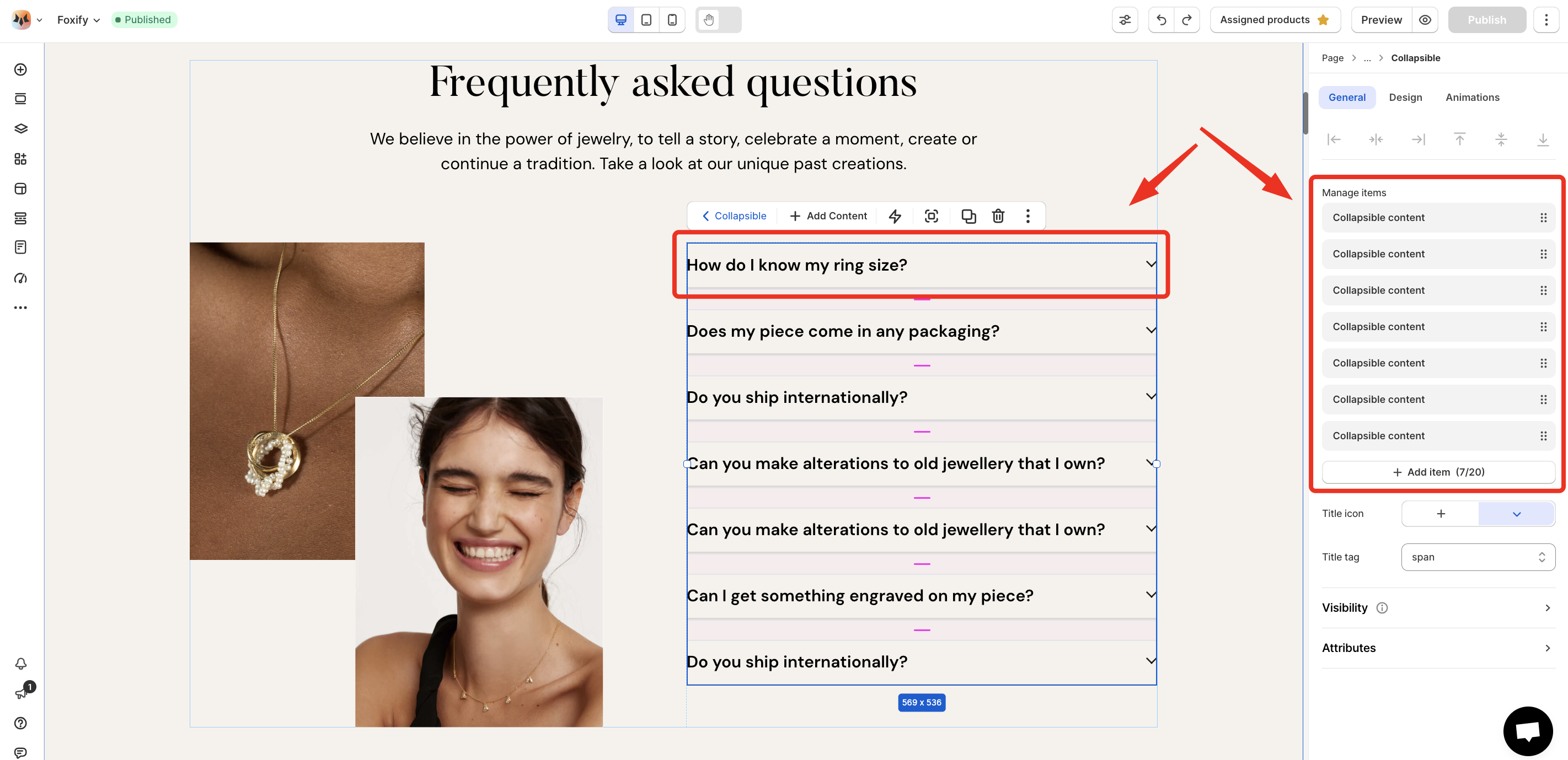
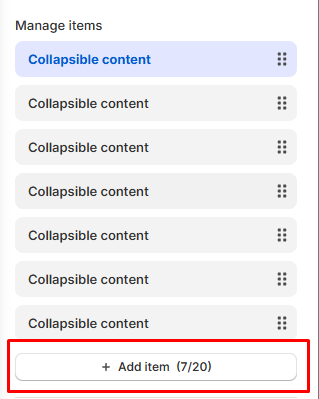
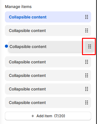
Collapsible tabs are content blocks that can be expanded or collapsed with a simple click. They help declutter pages by hiding less important details until the user chooses to see them. This feature is ideal for FAQs, product details, policies, or any other type of content that doesn’t need to be visible at all times.
Add whatever elements you want to your collapsible item including text, images, videos, and buttons. Using different content on each tab keeps visitors engaged and encourages them to explore your site further.
Pro tip: Make sure you test and ensure the collapsible tabs look good on mobile devices📱.
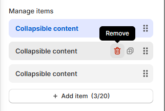
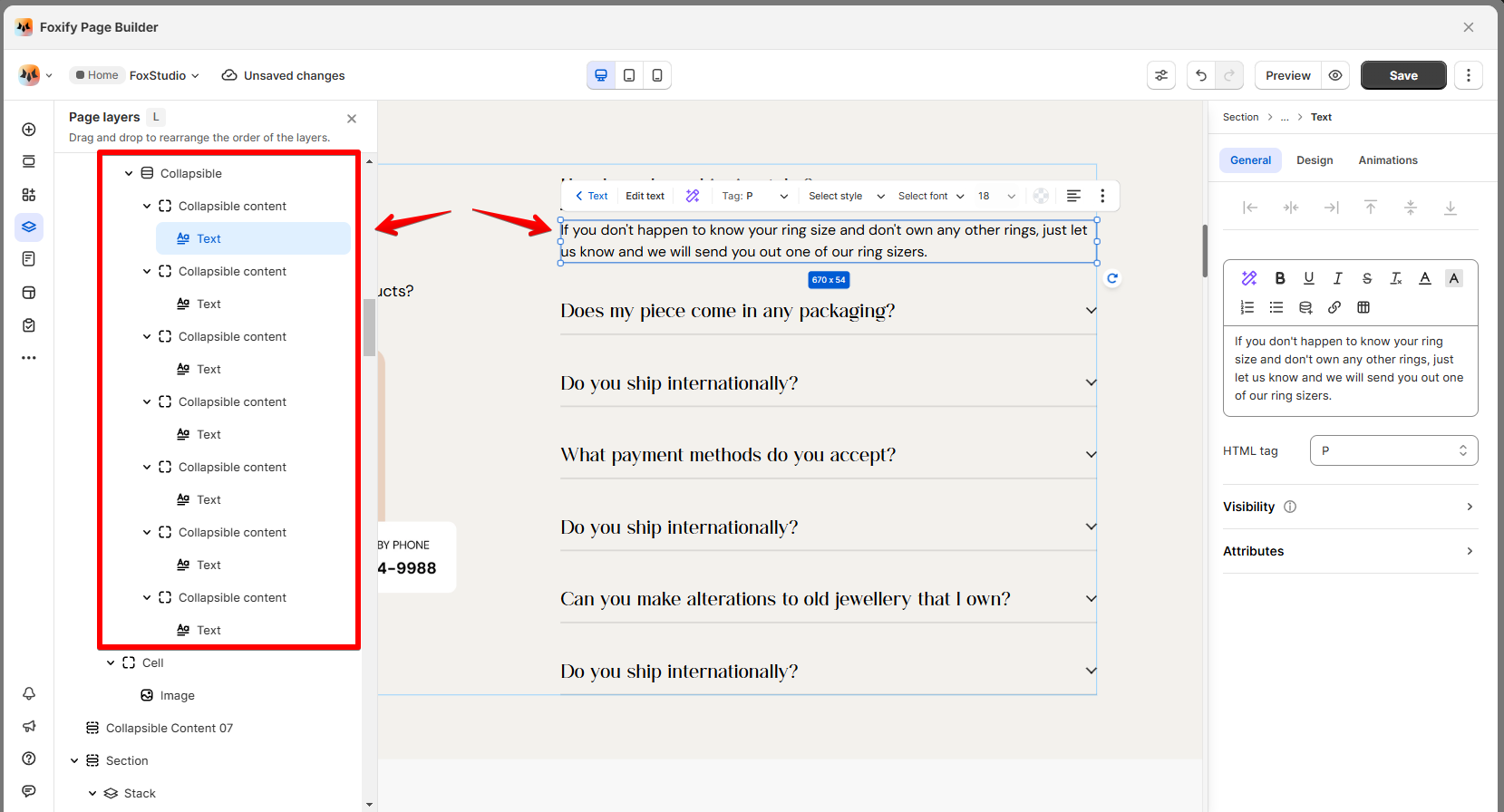
Use the Layers panel to easily navigate and manage the hierarchy of elements on your page.
Check if there are conflicting scripts on your page. If the issue persists, reach out to our Support team via in-app live chat or email happytohelp@foxecom.com ✅

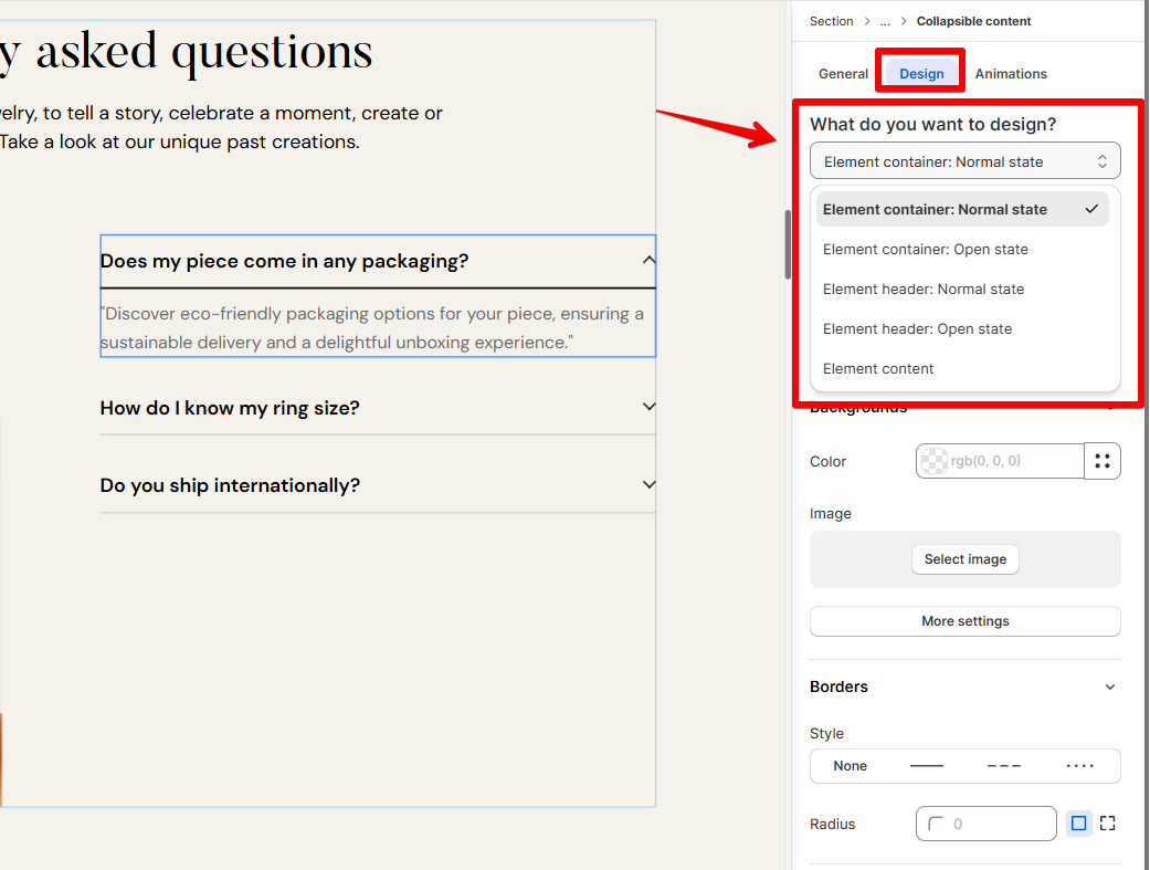
_reX9mp7g.svg) icon.
icon.