
FoxstudioAdd and edit elements
Carousel controls
2 min read
How to add a Carousel controls
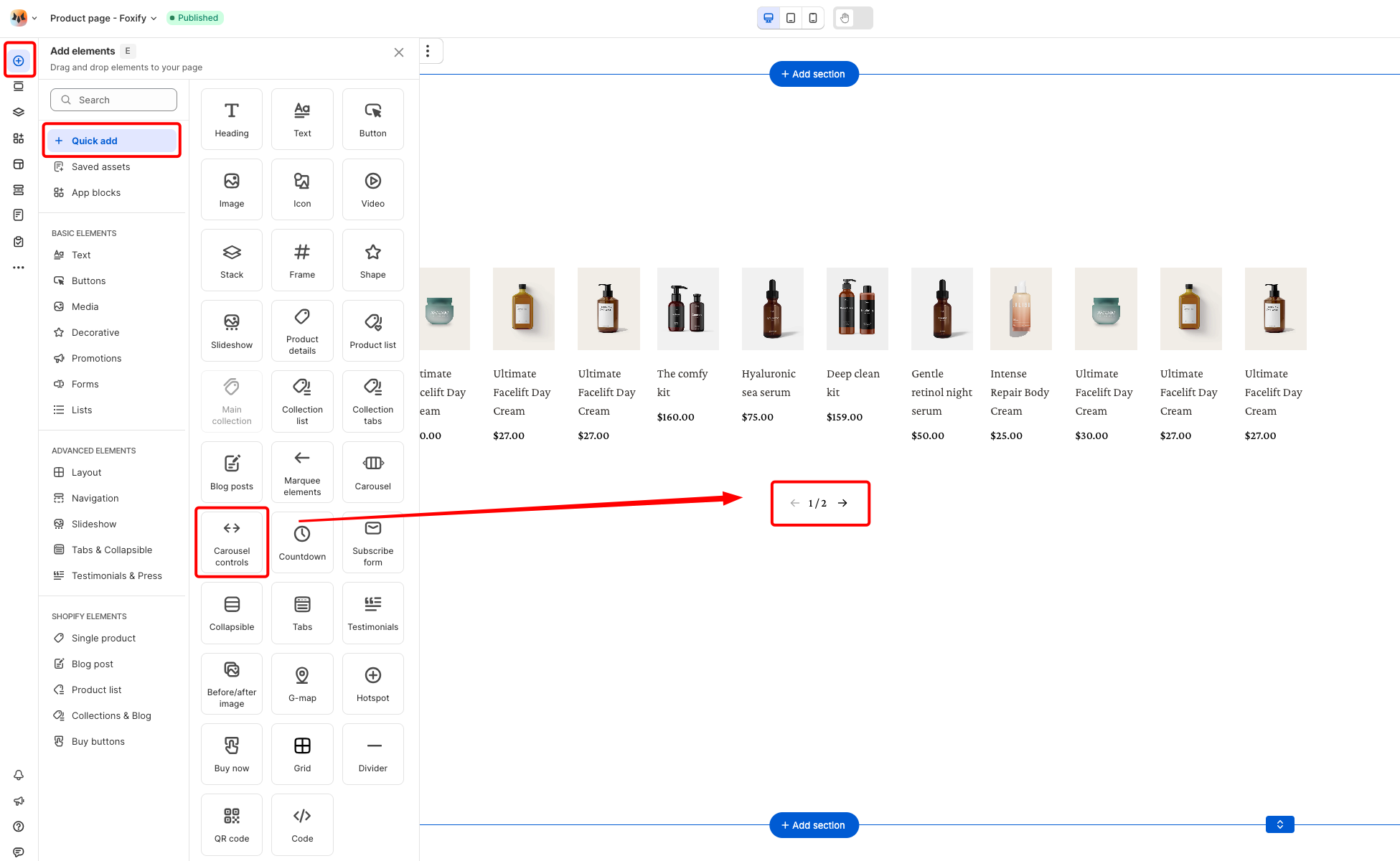
- In the FoxStudio editor, on the left Sidebar > Click Add elements, or press E.
- In Quick add, select Carousel controls.
- Drag the Carousel controls onto your carousel.
How to edit a Carousel controls
- Select the relevant carousel controls element in the editor.
- Use the tools bar above the selected element to quickly edit it.
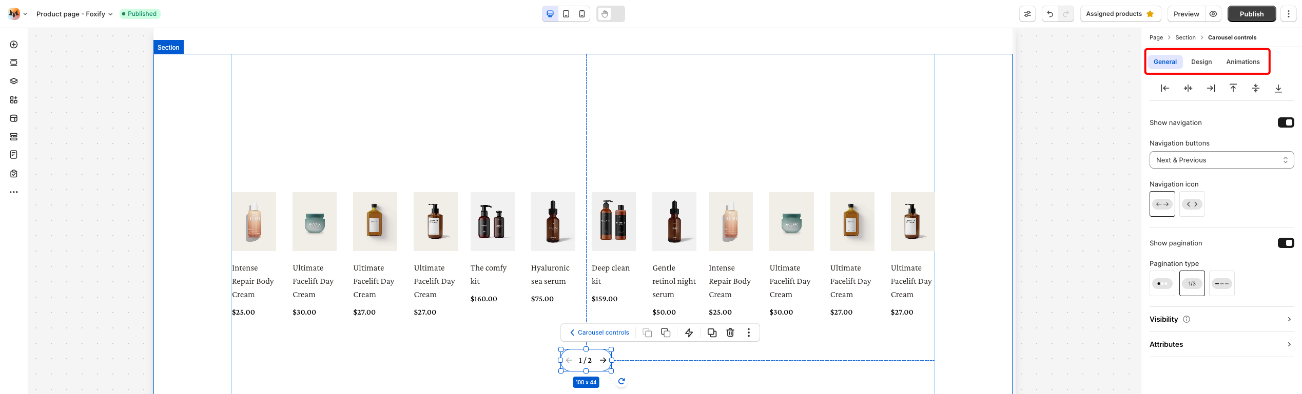
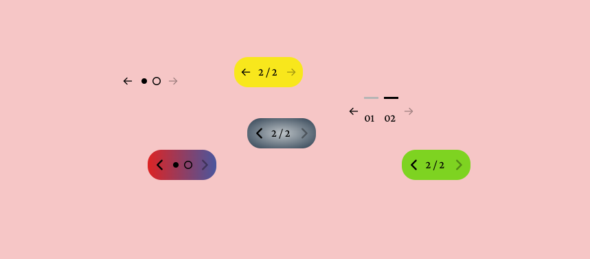
General settings
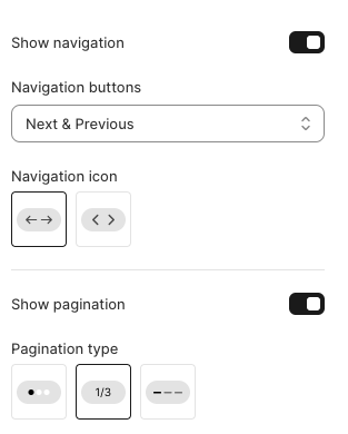
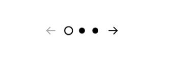
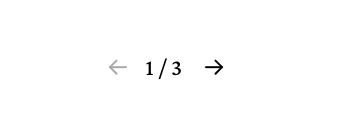
- Show navigation: Toggle this on to display navigation arrows.
- Navigation buttons:
- Next & Previous
- Prev button only
- Next button only


- Navigation icon: Choose Arrows/Chevrons


- Show pagination: Toggle this on to display pagination indicators.
- Pagination type: Choose Bullets/Number/Lines

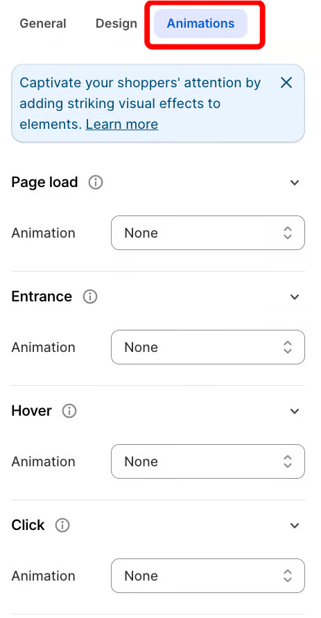
Design settings
Constraints
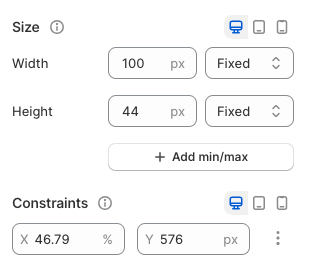
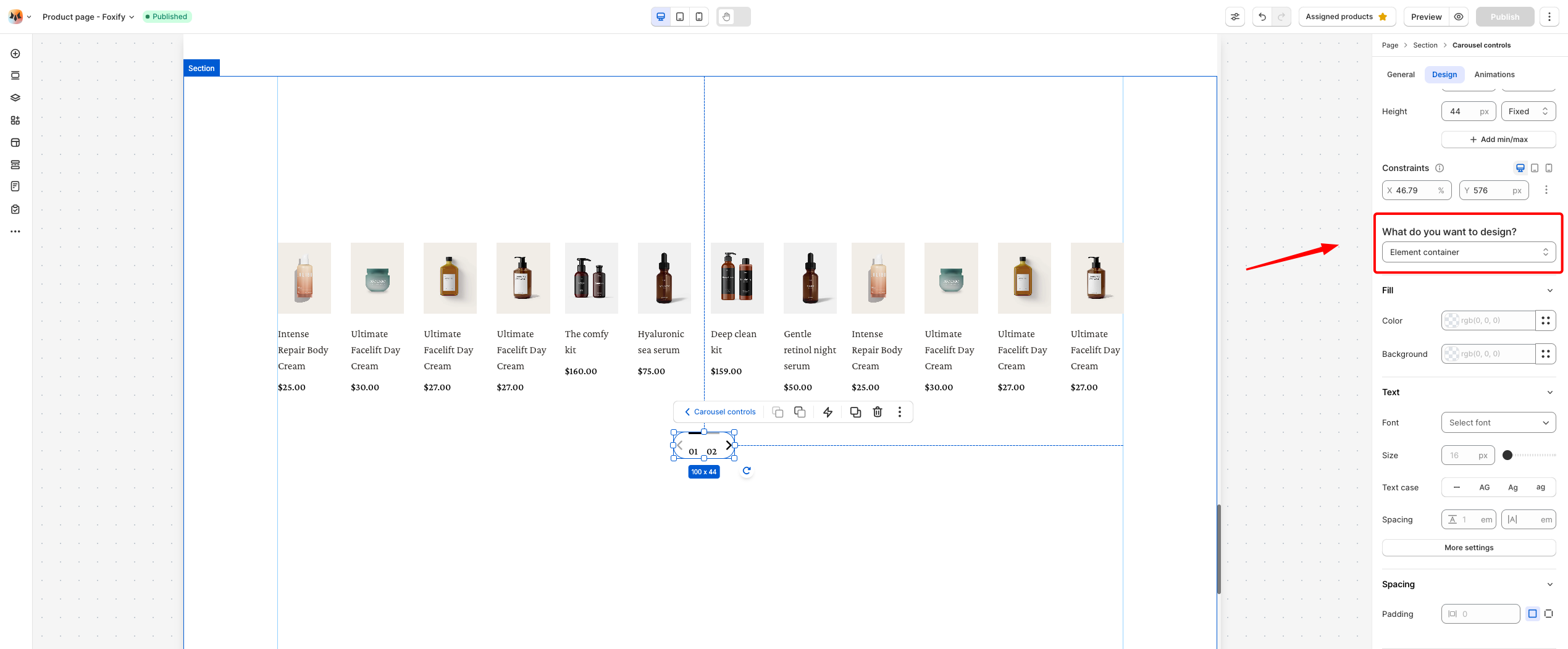
- Color Fill: Set the color and background color of the element.
- Text Font, Spacing, and Styles
- Font: Choose from hundreds of fonts. You can also upload your own fonts to Foxify.
- Weight and Size: Define the font weight and font size of the text.
- Text case: Click the icons to set the text's capitalization: As typed — , Upper case AG, Title case Ag, or Lower case ag.
- Spacing: Change the spacing between the lines and characters in the text box.
- Text style: Normal/Italic.
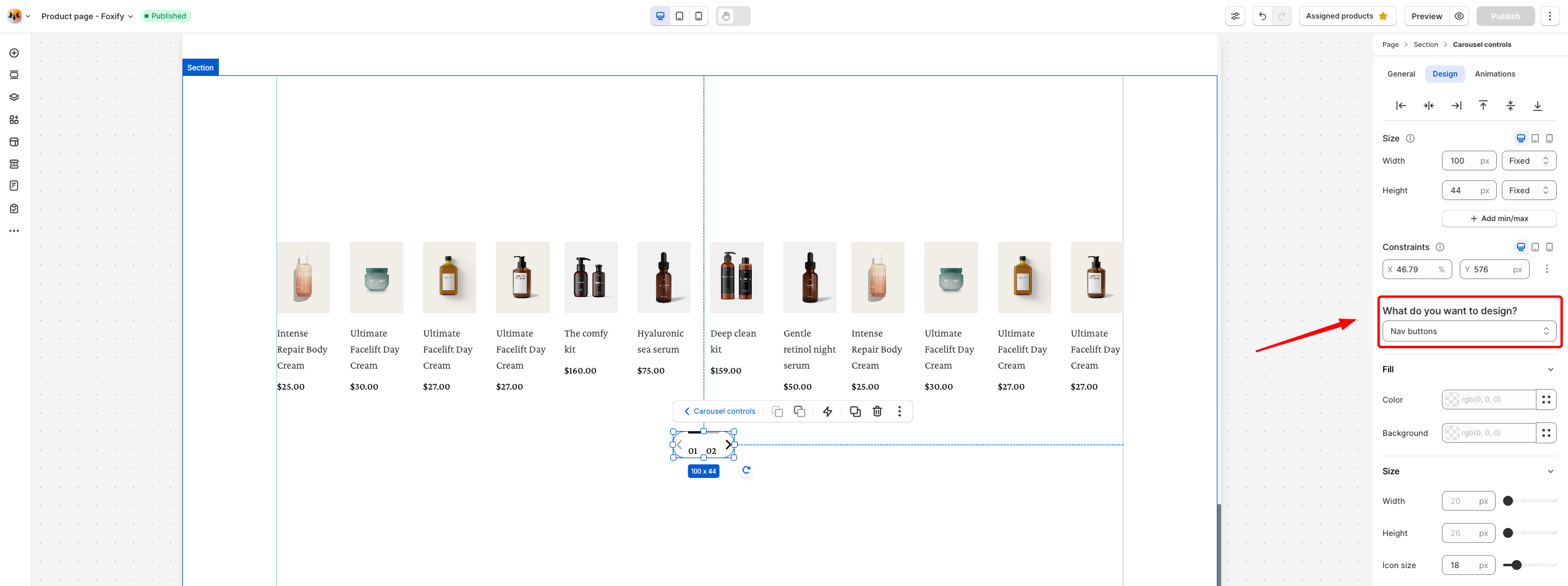
- Color Fill: Set the color and background color of the navigation buttons.
- Size: Adjust the width, height, and icon size of the navigation button to fit your design needs.
Animations
Animations
Last updated