
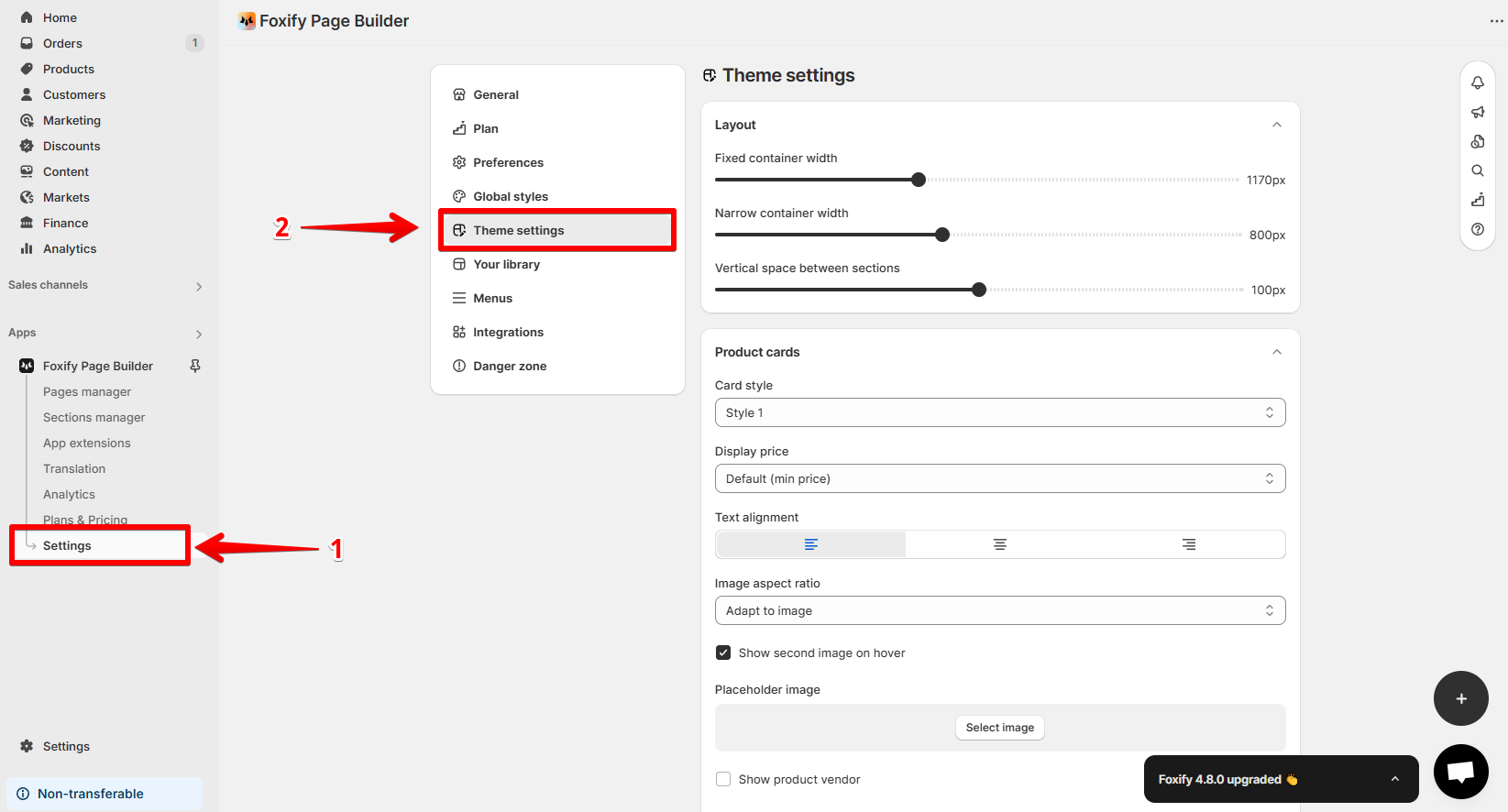
Page Management
Theme settings
5 min read
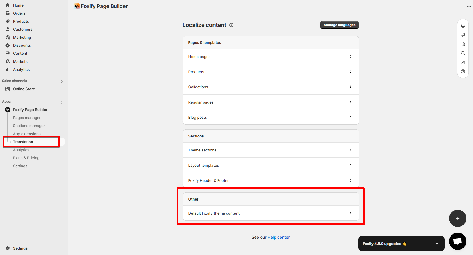
How to access Theme settings
- From the app dashboard:
- Open the Theme settings tab at the top of the right-hand panel in the page editor.
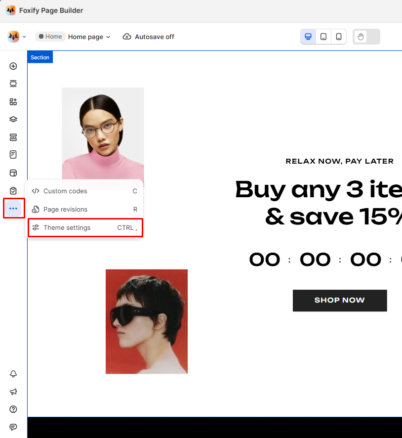
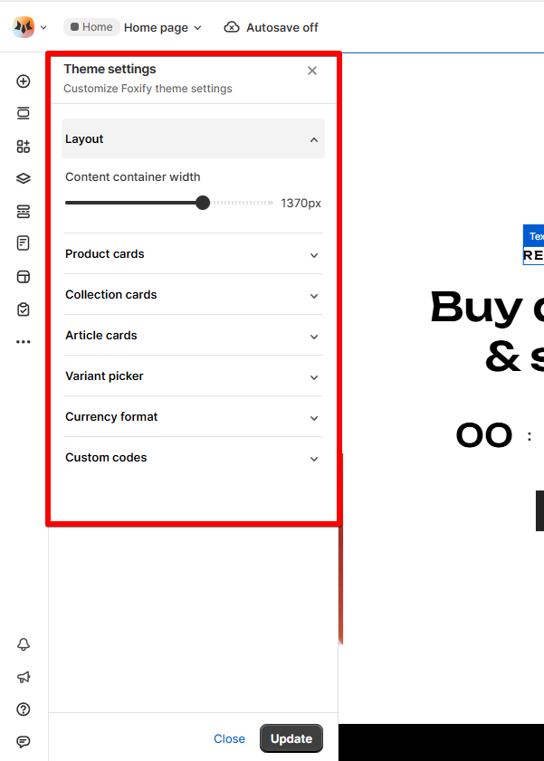
How to edit Theme settings
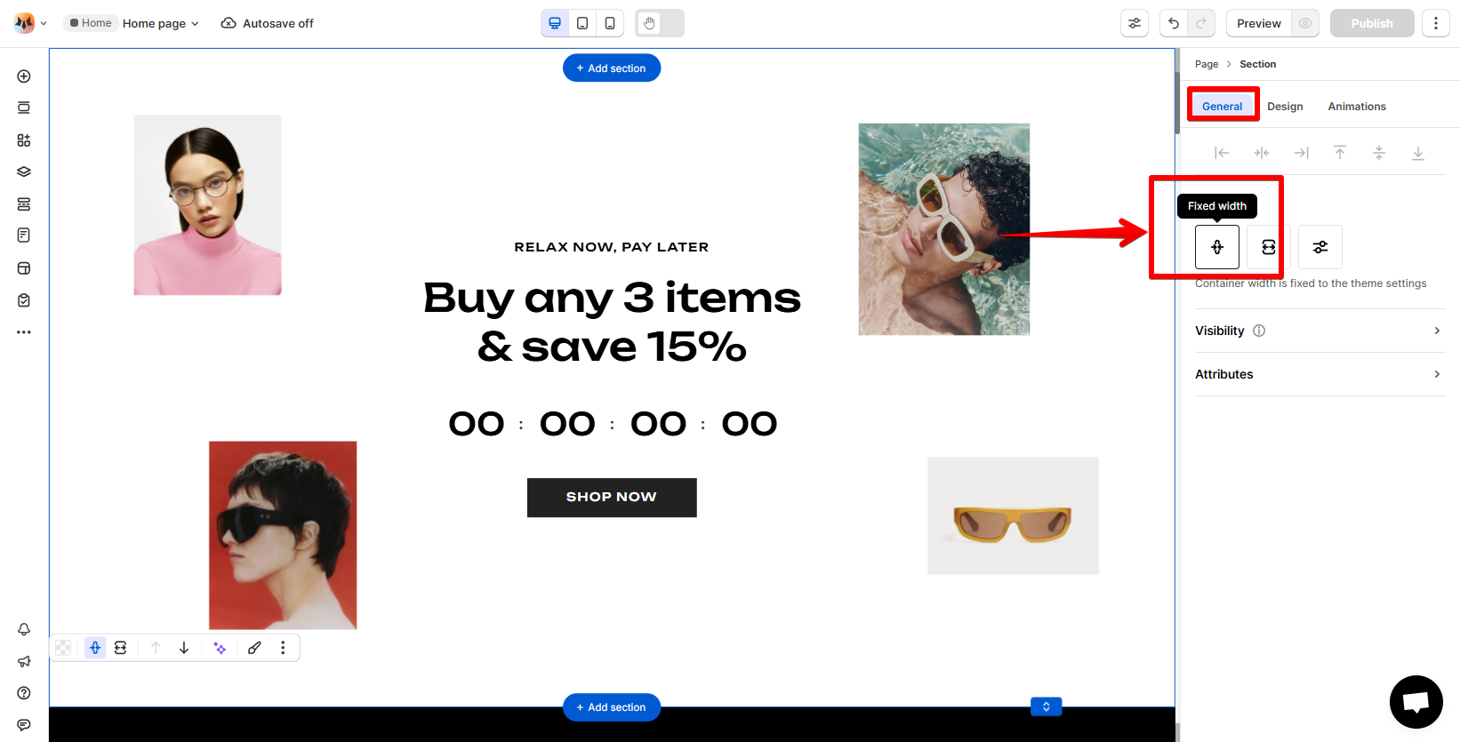
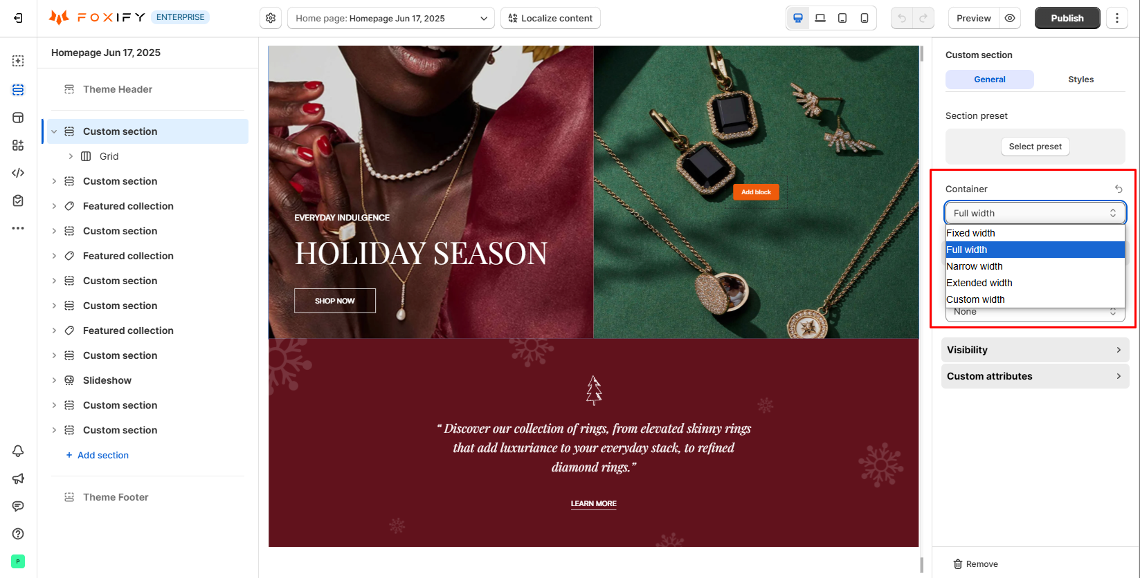
Layout settings
- Fixed container width: Adjusts the width of your page content across all pages. Drag the slider to set a specific width.
- Narrow container width: Allows you to set a narrower content width for sections or blocks that you want to be more compact.
This setting is for the Legacy editor (deprecated).
- Vertical space between sections: Adjust the space between sections to create more breathing room or tighter layouts, depending on your design preferences. This setting is for the Legacy editor (deprecated).
Product cards
- Card style: Choose the style for displaying product cards based on your design preferences.
- Display price: Set the price display option to show the default price (min price) or maximum price for variant-based products.
- Text align: Control the alignment of product information like title, price, and description (left, center, or right).
- Image ratio: Control how product images are displayed inside the cards.
- Show second image on hover: Display a second image of the product when customer hover over the card. This is especially useful for showcasing the product in a different angle or feature.
- Placeholder image: Select a placeholder image to show when no product image is available.
- Other addons: Enable other addons to show on product cards
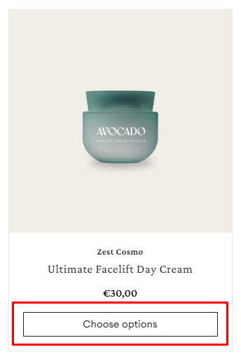
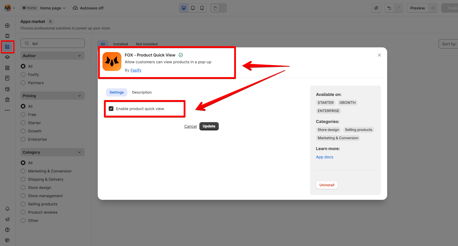
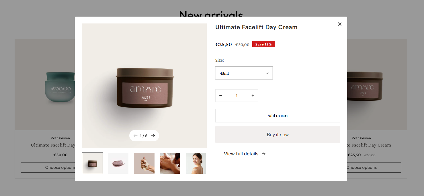
- If the product has variants → The Quick add button becomes the Select options button. Customer must enter the product page to select the variant before adding to the cart.
Learn more: Quick View
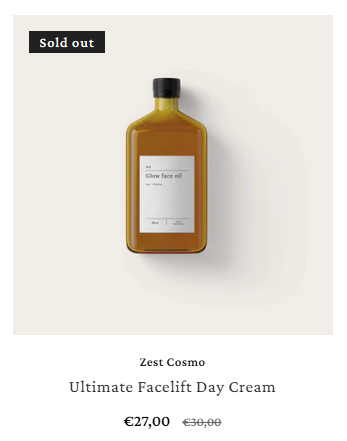
- When the item is out of stock, the Quick add button will be hidden.
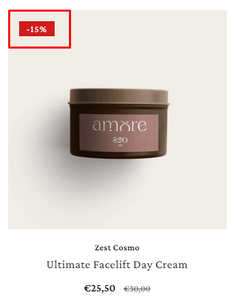
- Percentage
- Fixed price
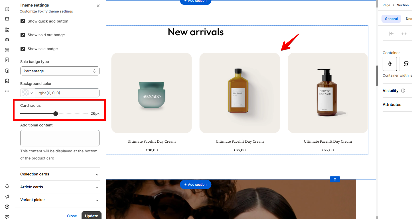
- Card radius: Adjust the card radius to round the corners of your product cards. Set it to 0px for sharp edges.
- Additional content: Add custom content to appear at the bottom of the product card.
The typography of the product info will follow the settings you've defined in Global styles
- For quick assistance or custom code issues, feel free to contact us via in-app live chat. We're happy to help! 💌
Collection cards
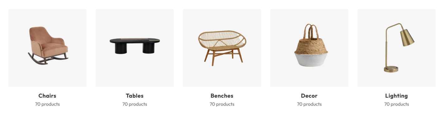
- Customize the collection cards appearance, including the display style, text alignment, and background color.
- Card radius: Adjust the border radius of collection cards to round or sharpen the corners as per your preference.
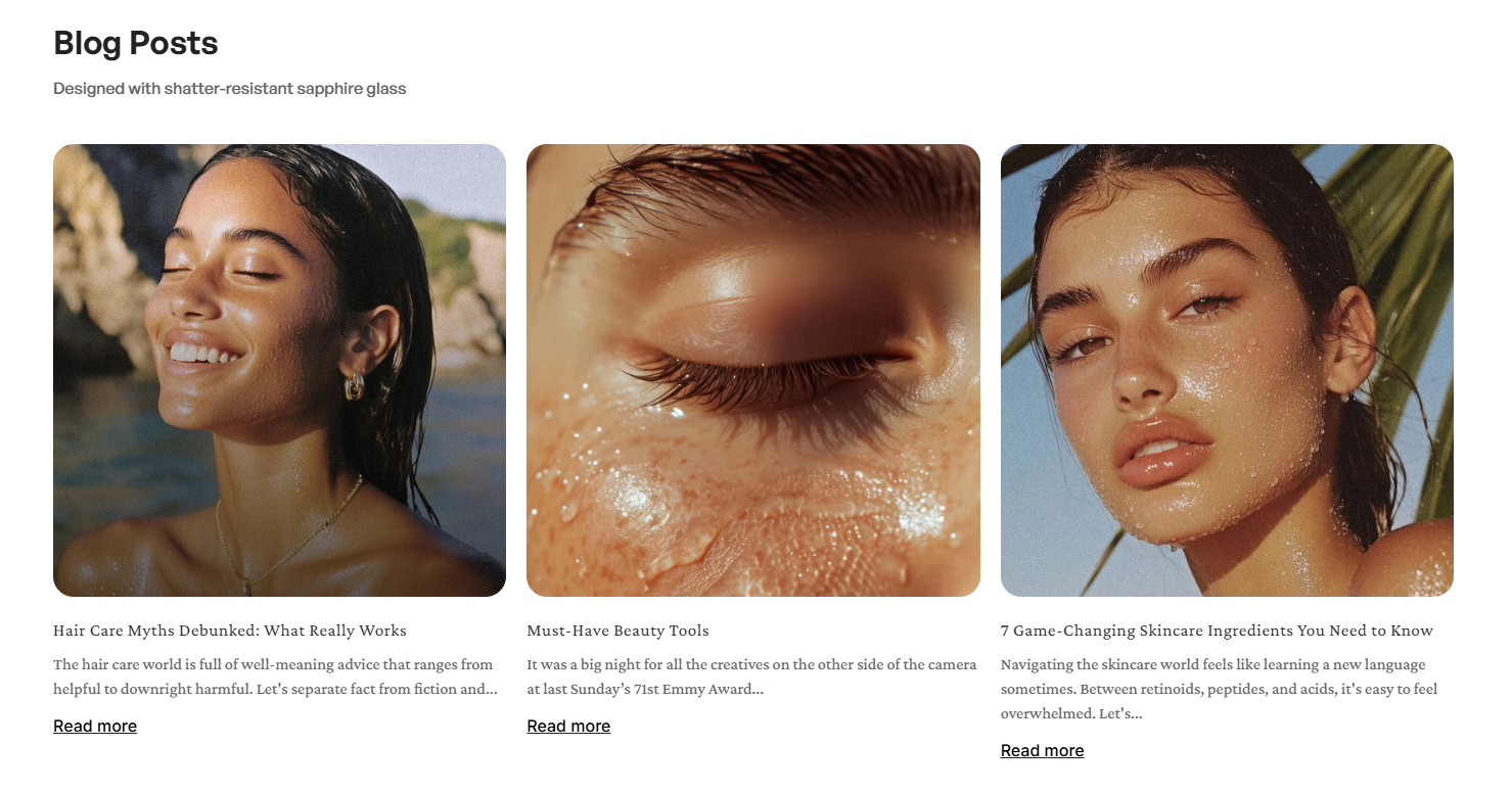
Article cards
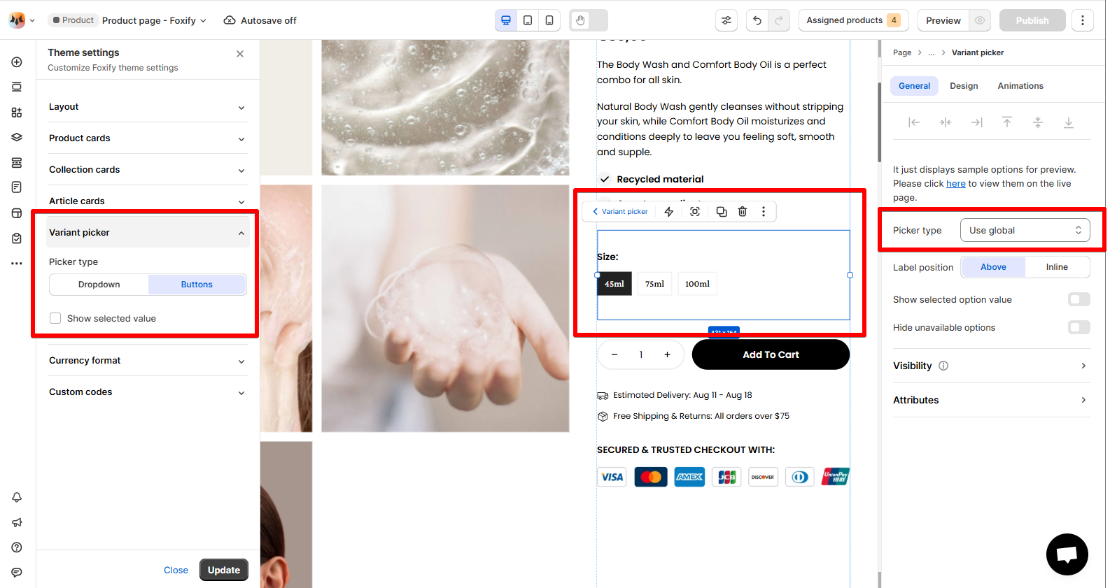
Variant picker
👉 See more: Product information
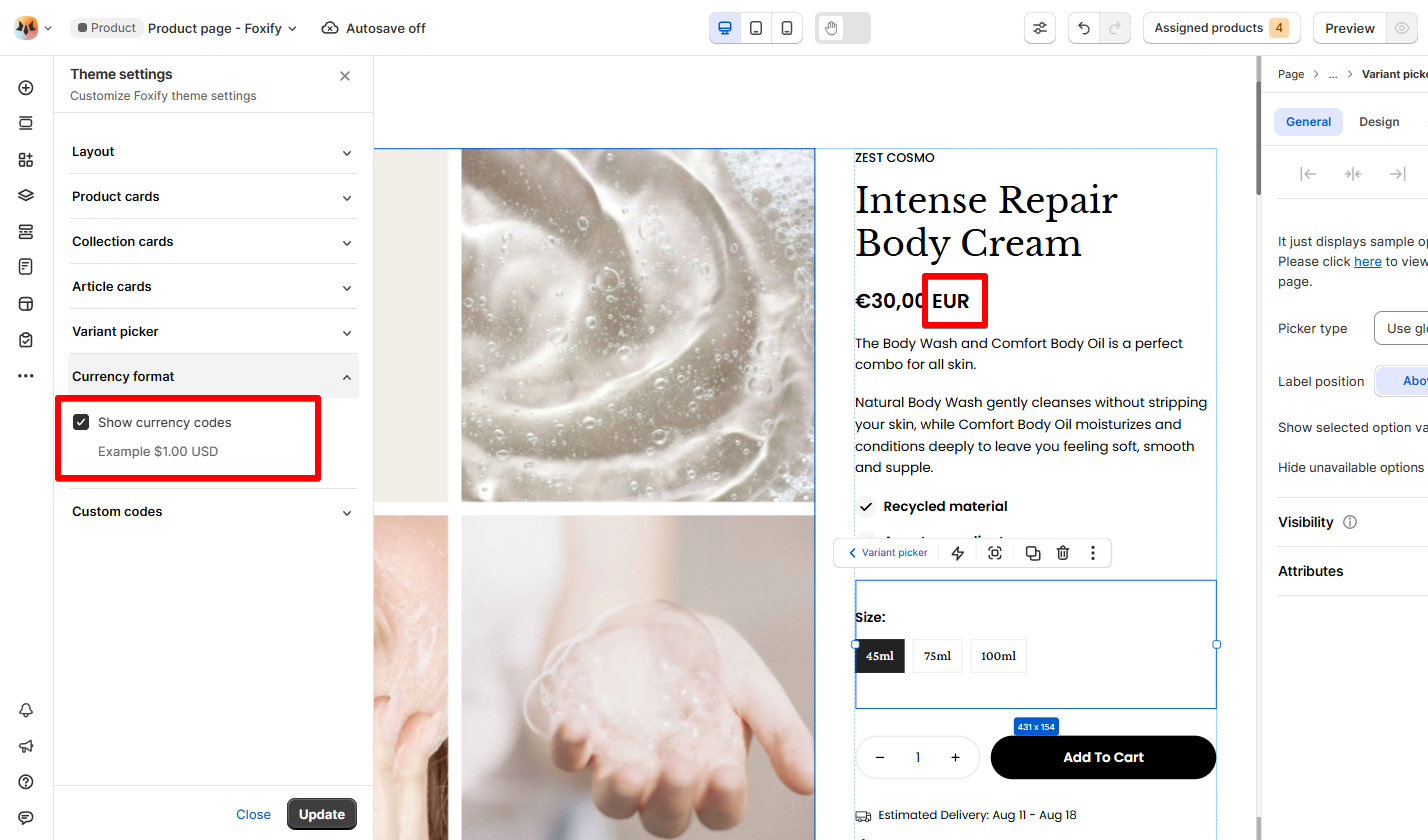
Currency format
Custom codes
- Remove the most recent code addition
- Check for syntax errors (missing semicolons, brackets, etc.)
- Validate your CSS using online CSS validators
- Clear your browser cache and refresh
- Contact us if issues persist
Last updated