# Styles settings

<div data-full-width="true"><figure><img src="/files/dHaPBf9wiTvRsPXBrcnP" alt=""><figcaption><p><a href="https://foxecom.com/pages/affiliate?utm_source=foxecom&#x26;utm_medium=help_center_foxify_styles_settings&#x26;utm_campaign=anchor-text&#x26;utm_term=explore_foxecom_affiliate_program_perks_now">Explore FoxEcom Affiliate program perks now</a> <span data-gb-custom-inline data-tag="emoji" data-code="2728">✨</span></p></figcaption></figure></div>

This article will walk you through common Foxify Styles options that you can find in most elements.

## Typography

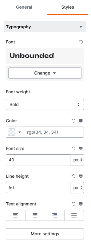
In this dropdown, you can edit and customize the text-related settings of the element.&#x20;

<figure><img src="/files/pm56iOJLbHSyYhpA45Ns" alt=""><figcaption></figcaption></figure>

* Choose your preferable font from a variety of options:

<figure><img src="/files/QTDLT4toyvBSHX1HxxHX" alt=""><figcaption></figcaption></figure>

* Adjust an element's font weight, color, size, line height, and text alignment with ease.
* Click **More settings** to set the text's letter spacing, transformation (uppercase, Title case, lowercase), style (regular/*italic*) and decoration.

<figure><img src="/files/HJuEPFPV785pTd3joRzB" alt=""><figcaption></figcaption></figure>

## Layout

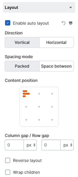
Quickly fine-tune your content layout by selecting the option **Enable auto layout**.

<figure><img src="/files/uajOOWyxmsroZWGFlVQ9" alt=""><figcaption></figcaption></figure>

<figure><img src="/files/dS3PzheddtEKBsLTFnWd" alt=""><figcaption></figcaption></figure>

Use the **Wrap children** option to wrap to additional lines when they no longer fit on the initial line.&#x20;

* The element(s) that don't fit will wrap to the bottom-left in the parent element.

## Spacing

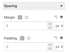
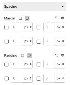
With Foxify, control of the element's margin and padding is easy.&#x20;

Margin and padding create spacing around your content and elemen.&#x20;

{% embed url="<https://youtu.be/BiWa8fKU9vA>" %}

Margins create extra space around the element, while padding pushes the content deeper inside the element border.

You can decide to use the same value for all four dimensions: top, right, bottom, and left, or adjust them separately.&#x20;

{% tabs %}
{% tab title="Spacing settings - Uniform values" %}

<figure><img src="/files/is3SXslG2Ikve6qQigkN" alt=""><figcaption></figcaption></figure>
{% endtab %}

{% tab title="Spacing settings - Separate values" %}

<figure><img src="/files/CE3l0w1MlJ7XlqY92YCr" alt=""><figcaption></figcaption></figure>
{% endtab %}
{% endtabs %}

You can also select the size unit you want to use: **px**, **rem**, or **em**. Want to know more about these measurement units? See this article:

{% content-ref url="/pages/noqAEdBFGRwMOnjWdRHL" %}
[Should I use Pixel, Rem, or Em?](/foxify-app/faqs-and-troubleshooting/faqs/should-i-use-pixel-rem-or-em.md)
{% endcontent-ref %}

## Sizing

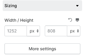
In this setting, you can change the section width and height of the element.&#x20;

The recommended size for each element is already filled in the field.&#x20;

<figure><img src="/files/Wb6zQFMcvt9jjcKTjiqO" alt=""><figcaption></figcaption></figure>

{% hint style="info" %}
You can also click on the image and drag it to resize directly.&#x20;

![](/files/UoE6552hwKkjWinpNelp)
{% endhint %}

If you decide on using dimensions to your liking, remember to double-check to make sure the new dimensions work out across different devices.&#x20;

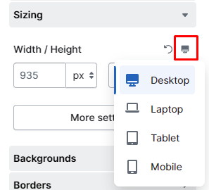
To create a customized experience for shoppers, click on the device selector icon to set the dimensions on different screen sizes.

<figure><img src="/files/qbTTlCThP4rDTX5IkttO" alt=""><figcaption></figcaption></figure>

The **More settings** button allows you to set the minimum and maximum values for the selected element width and height.

Similar to spacing, both **px**, **rem**, or **em** are available.

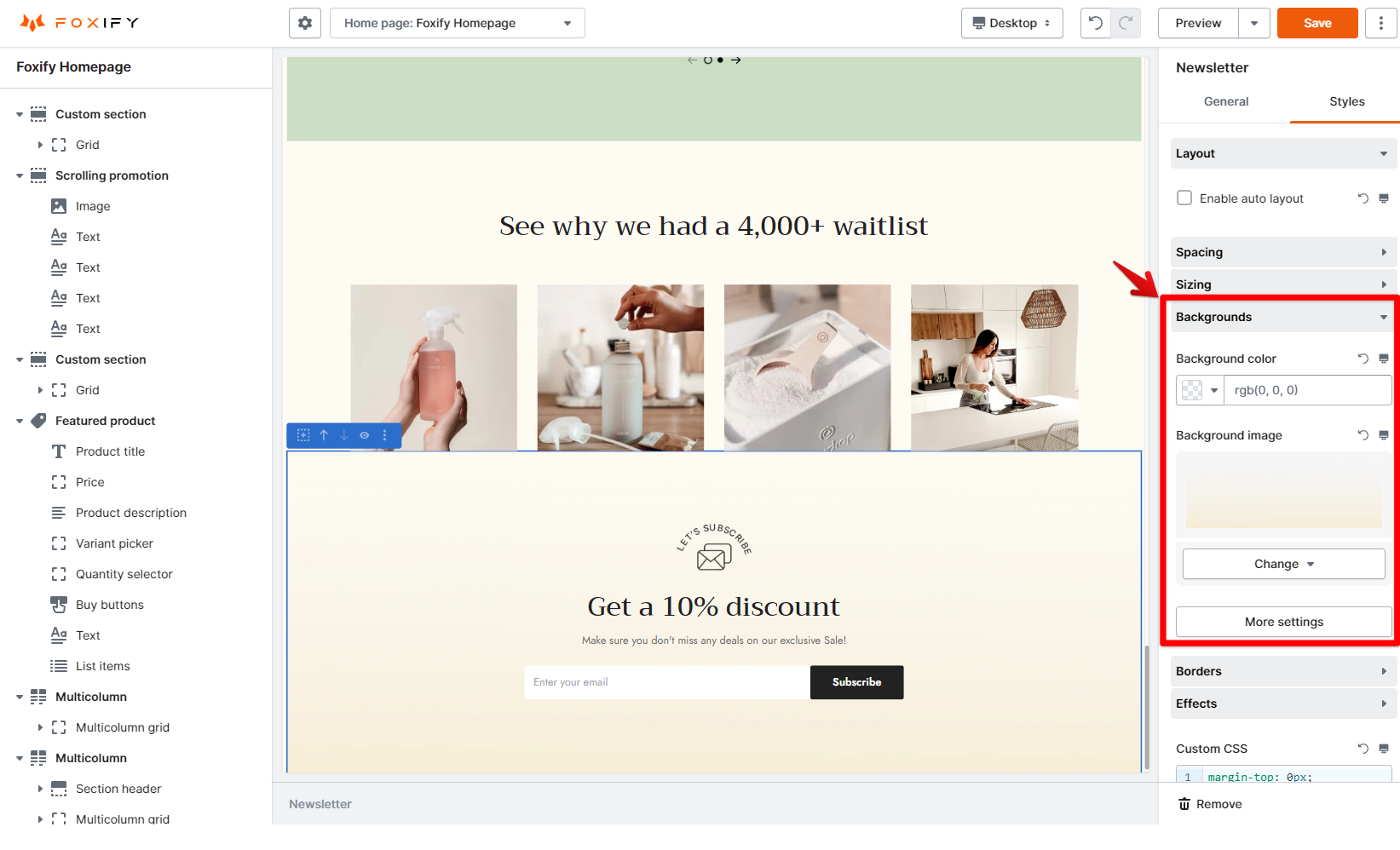
## Background

The **Background** section lets you change the element's background using a [color](#background-color) or an [image](#undefined).

### Background color&#x20;

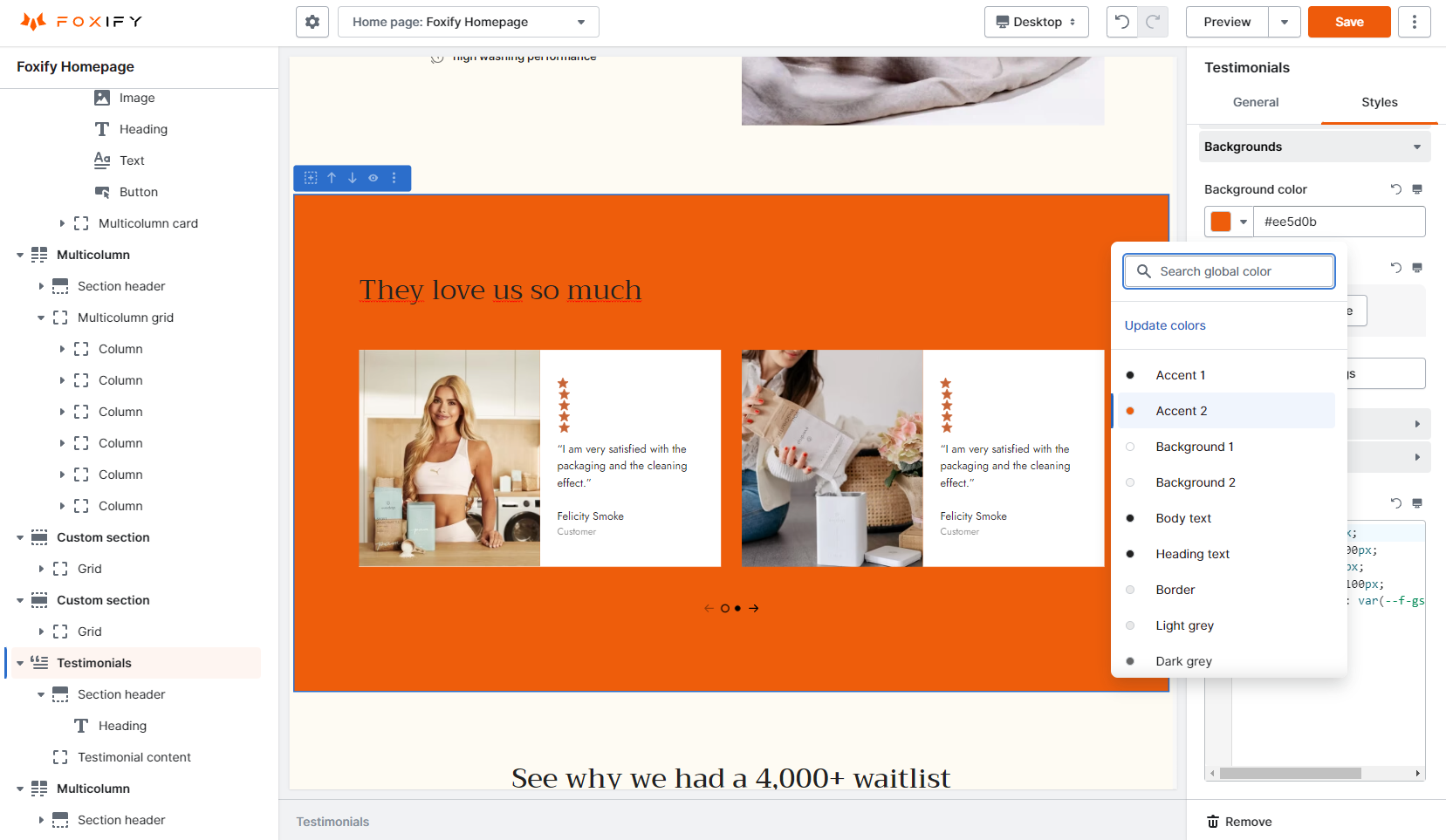
* Choose from your predefined colors list in [Global styles](/foxify-app/page-management/global-styles.md).

<figure><img src="/files/cN6Kosh2B5YQiHRwrq4U" alt=""><figcaption></figcaption></figure>

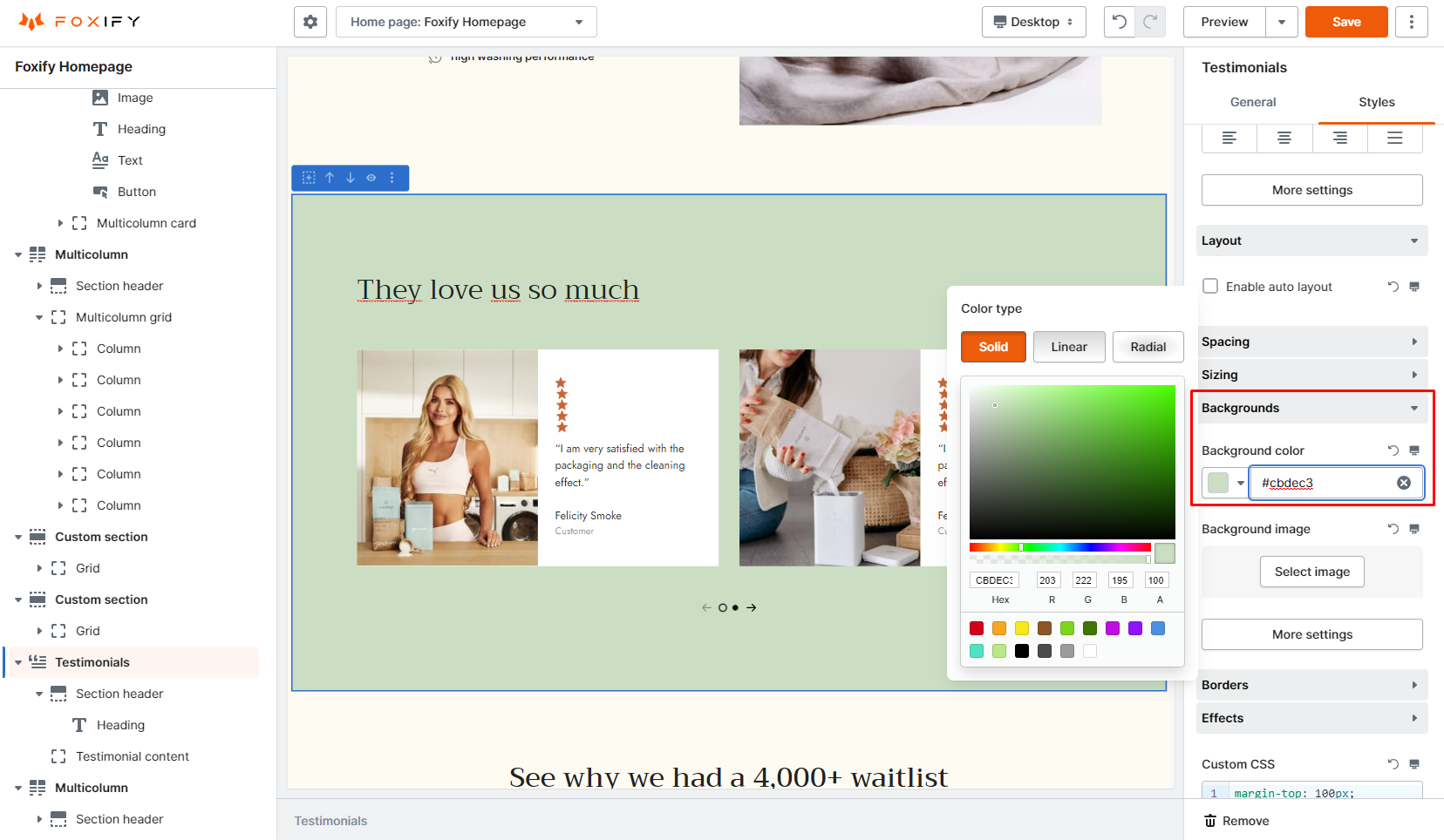
* Select a color from the color palette or input a [hex color code](https://htmlcolorcodes.com/).&#x20;

<figure><img src="/files/okewb2OP9sDbEmtVRFAy" alt=""><figcaption></figcaption></figure>

### Background image

Click on **Select image** to use an image as a background. You can select one from existing images (in your [Shopify Files](https://domain.myshopify.com/admin/settings/files)), free images, or upload a new image.&#x20;

<figure><img src="/files/YDXiJZEApyiyiUlOY8D2" alt=""><figcaption></figcaption></figure>

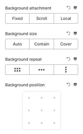
In **More settings**, you can find more options to adjust different properties of the background:

<figure><img src="/files/MSUOAznQvwsMQvXbBI8L" alt=""><figcaption></figcaption></figure>

#### Background attachment

The background-attachment property in CSS sets whether a background image's position is fixed within the [viewport](https://developer.mozilla.org/en-US/docs/Glossary/Viewport), or scrolls with its containing block.

**Fixed**: The background image stays fixed no matter what.

**Scroll**: The background image scrolls with the main view, but stays fixed inside the local view.

**Local**: The background images scroll with the element's content.

{% hint style="info" %}
Still not sure how the three values work? Check out this [demo](https://css-tricks.com/almanac/properties/b/background-attachment/).
{% endhint %}

#### Background size

The background-size CSS property sets the size of the element's background image. The image can be left to its natural size, stretched, or constrained to fit the available space.&#x20;

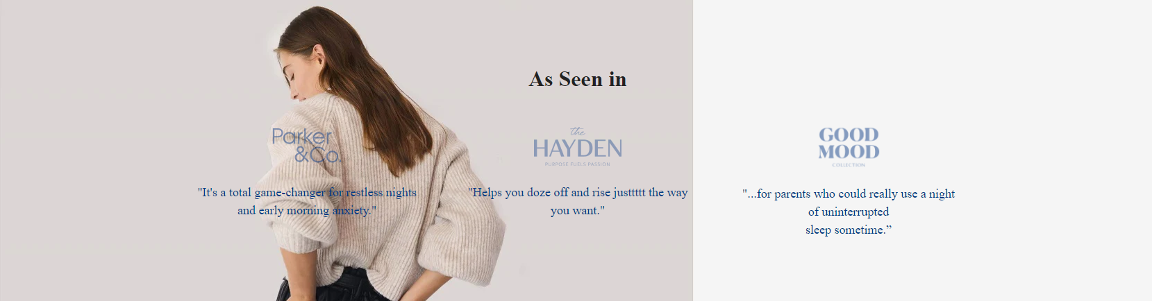
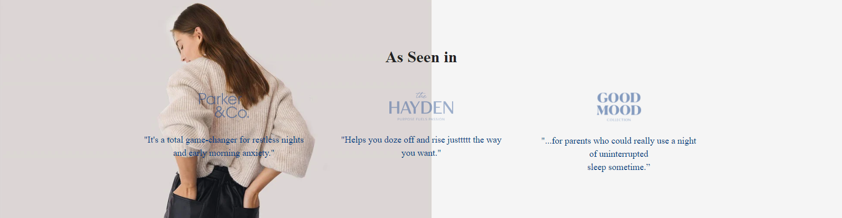
**Auto:** Default value. The background image is displayed in its original size.

**Contain**: Resize the background image to make sure the image is fully visible.&#x20;

**Cover**: Resize the background image to cover the entire container, even if it has to stretch the image or cut a little bit off one of the edges.

{% hint style="info" %}
Spaces not covered by a background image are filled with the background-color property, and the background color will be visible behind background images that have transparency.
{% endhint %}

For example: the image we're using is 1000 x 512 px, jpg. format.&#x20;

{% tabs %}
{% tab title="Background size: Auto" %}

<figure><img src="/files/yHMhTdDQA7e0ETkFasJe" alt="An example of Background size: Auto"><figcaption></figcaption></figure>
{% endtab %}

{% tab title="Background size: Contain" %}

<figure><img src="/files/dZiR6Po3rFIuOIhGv0G9" alt="An example of Background size: Auto"><figcaption></figcaption></figure>
{% endtab %}

{% tab title="Background size: Cover" %}

<figure><img src="/files/ham0BFAWyFhtIFumjSdf" alt="An example of Background size: Auto"><figcaption></figcaption></figure>
{% endtab %}
{% endtabs %}

#### Background repeat&#x20;

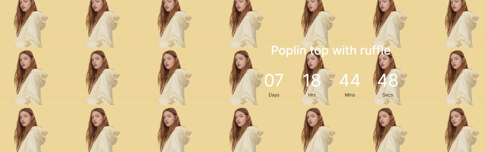
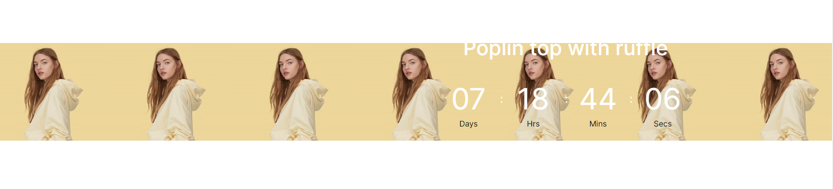
The background-repeat CSS property sets how background images are repeated. A background image can be repeated along the horizontal and vertical axes, or not repeated at all.

This setting works with **Auto** and **Contain** background size.&#x20;

* Repeat: tile the image in both directions
* Repeat x: tile the image horizontally
* Repeat y: tile the image vertically&#x20;

By default, the background image is set as no repeat.

For example: the image we're using is 250 x 200 px, jpg. format.

{% tabs %}
{% tab title="Background repeat: Repeat" %}

<figure><img src="/files/lWhbUTjuPmRtHn34Mn3c" alt=""><figcaption></figcaption></figure>
{% endtab %}

{% tab title="Background repeat: Repeat x" %}

<figure><img src="/files/uDgm12f55vkqriRAEPXd" alt=""><figcaption></figcaption></figure>
{% endtab %}

{% tab title="Background repeat: Repeat y" %}

<figure><img src="/files/2F8zVNGvuZENH3GGBz4a" alt=""><figcaption></figcaption></figure>
{% endtab %}
{% endtabs %}

#### Background position

This setting allows you to move your background image around within its container.

There are 9 options to place your background image:

* Top left/ top center/ top right
* Middle left/ middle center/ middle right
* Bottom left/ bottom center/ bottom right&#x20;

## Borders

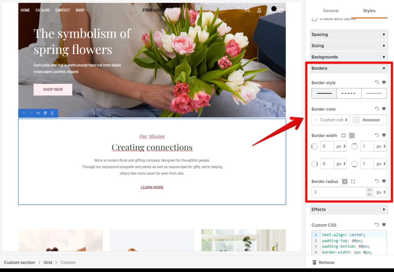
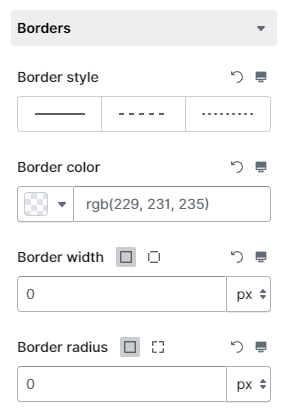
You can add and adjust the element's border in Styles settings.

<figure><img src="/files/Jcj4I6MulRoDTo10PGHO" alt=""><figcaption></figcaption></figure>

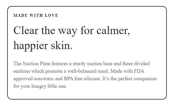
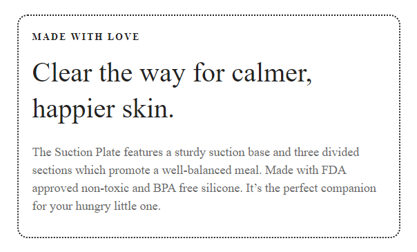
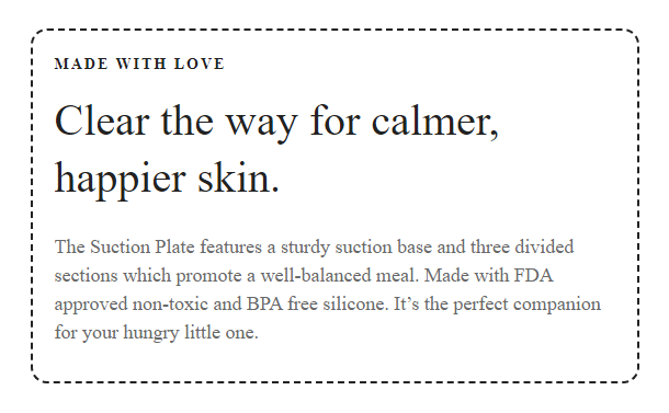
**Border style:** Choose from 3 available styles: **Solid line**, **Dotted line**, and **Dashed line**. By default, an element is set as no border.

{% tabs %}
{% tab title="Solid line" %}

<figure><img src="/files/YpbXis6ONnHzqizwxdI0" alt=""><figcaption></figcaption></figure>
{% endtab %}

{% tab title="Dotted line" %}

<figure><img src="/files/FVJACR1yyKTpHb0u8ENi" alt=""><figcaption></figcaption></figure>
{% endtab %}

{% tab title="Dashed line" %}

<figure><img src="/files/WEKjzA0oG5N5rTYvAscw" alt=""><figcaption></figcaption></figure>
{% endtab %}
{% endtabs %}

**Border color**

* Select from predefined [global styles colors](/foxify-app/page-management/global-styles.md#colors).
* Choose from the color palette or use a hex color code.

<figure><img src="/files/s6mfhoPtuVlOMjsUHzIR" alt=""><figcaption></figcaption></figure>

This section also allows you to control the width of the border and its roundness using **Border width** and **Border radius** settings.

## Effects

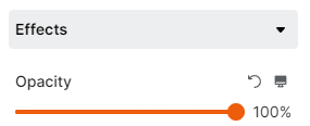
This section is for modifying the opacity of the whole section. Simply tweak the toggle to adjust it.

<figure><img src="/files/xOJLWPzeUSSos1Pcma61" alt=""><figcaption></figcaption></figure>

## Custom CSS

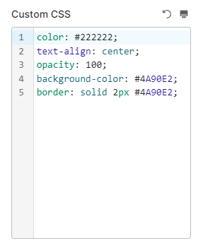
Changes you made in Styles settings will be shown here.&#x20;

You can edit the CSS code in **Custom CSS** and the changes will be reflected in the settings.&#x20;

Here is one example:&#x20;

<figure><img src="/files/VRqed3mfSFUhQqDUZSwr" alt=""><figcaption></figcaption></figure>


---

# Agent Instructions: Querying This Documentation

If you need additional information that is not directly available in this page, you can query the documentation dynamically by asking a question.

Perform an HTTP GET request on the current page URL with the `ask` query parameter:

```
GET https://docs.foxecom.com/foxify-app/legacy-editor/page-editor/styles-settings.md?ask=<question>
```

The question should be specific, self-contained, and written in natural language.
The response will contain a direct answer to the question and relevant excerpts and sources from the documentation.

Use this mechanism when the answer is not explicitly present in the current page, you need clarification or additional context, or you want to retrieve related documentation sections.