# Edit elements with the Inspector panel
Every element and section you add in FoxStudio is customized through the Inspector panel. This article covers the settings that show up across most elements — for settings that only exist on one specific element, check that element's own article instead.
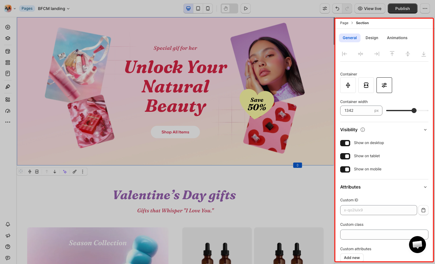
**Best fits for:**
* Adjusting size, spacing, or position of something you just added
* Controlling whether an element shows or hides on a specific device
* Fine-tuning visual details like backgrounds, borders, or shadows
* Adding custom attributes for tracking, integrations, or targeting with your own CSS
## Navigate with the breadcrumb
At the top of the panel, a breadcrumb shows where the currently selected item sits in the page hierarchy — for example, **Page > Section > Product details**.
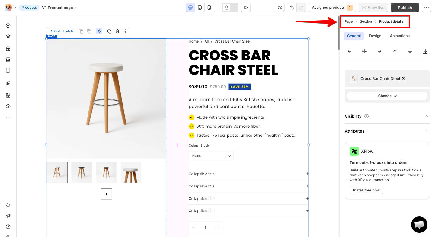
Why this matters: you don't need to click back through the canvas or scroll through Page layers to select a parent. Click any level in the breadcrumb to jump straight to it.
Example: you're deep inside a Product details element and want to adjust the Section's Container width instead — click **Section** in the breadcrumb to select it directly.
## The three tabs at a glance
The Inspector panel is split into three tabs, and which one you need depends on what you're trying to do:
* **General** — structural and behavioral settings
* **Design** — visual and layout settings
* **Animations** — entrance and scroll-triggered animations.
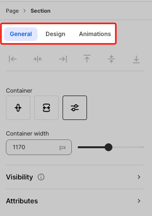
Not every element shows every setting. The Inspector adapts to what you've selected.
Some settings, like Size and Constraints, can also be set independently per device (Desktop, Tablet, Mobile); switch the device view first if that's what you need.
## Common settings across elements
| Setting | Tab |
| :--------------------------------------------------------------------- | :------ |
| [Container](https://docs.foxecom.com/foxify-app/foxstudio/editor-tools/inspector-panel#container) | General |
| [Visibility](https://docs.foxecom.com/foxify-app/foxstudio/editor-tools/inspector-panel#visibility) | General |
| [Attributes](https://docs.foxecom.com/foxify-app/foxstudio/editor-tools/inspector-panel#attributes) | General |
| [Size](https://docs.foxecom.com/foxify-app/foxstudio/editor-tools/inspector-panel#size) | Design |
| [Constraints](https://docs.foxecom.com/foxify-app/foxstudio/editor-tools/inspector-panel#constraints) | Design |
| [Background](https://docs.foxecom.com/foxify-app/foxstudio/editor-tools/inspector-panel#backgrounds) | Design |
| [Borders](https://docs.foxecom.com/foxify-app/foxstudio/editor-tools/inspector-panel#borders) | Design |
| [Effects](https://docs.foxecom.com/foxify-app/foxstudio/editor-tools/inspector-panel#effects) | Design |
| [Custom code](https://docs.foxecom.com/foxify-app/foxstudio/editor-tools/inspector-panel#custom-code) | Design |
### Container
**Applies to**: Section
Sections have an additional setting that regular elements don't: **Container**, which controls how wide the section's content area is relative to the full browser width.
* **Fixed width** — uses the container width value set in **Theme settings > Layout**, applied consistently across every section using this option. To change it, update it there rather than per-section.
* **Full width** — stretches the content area to the browser's edges.
* **Custom width** — set your own value via the **Container width** field.
### Visibility
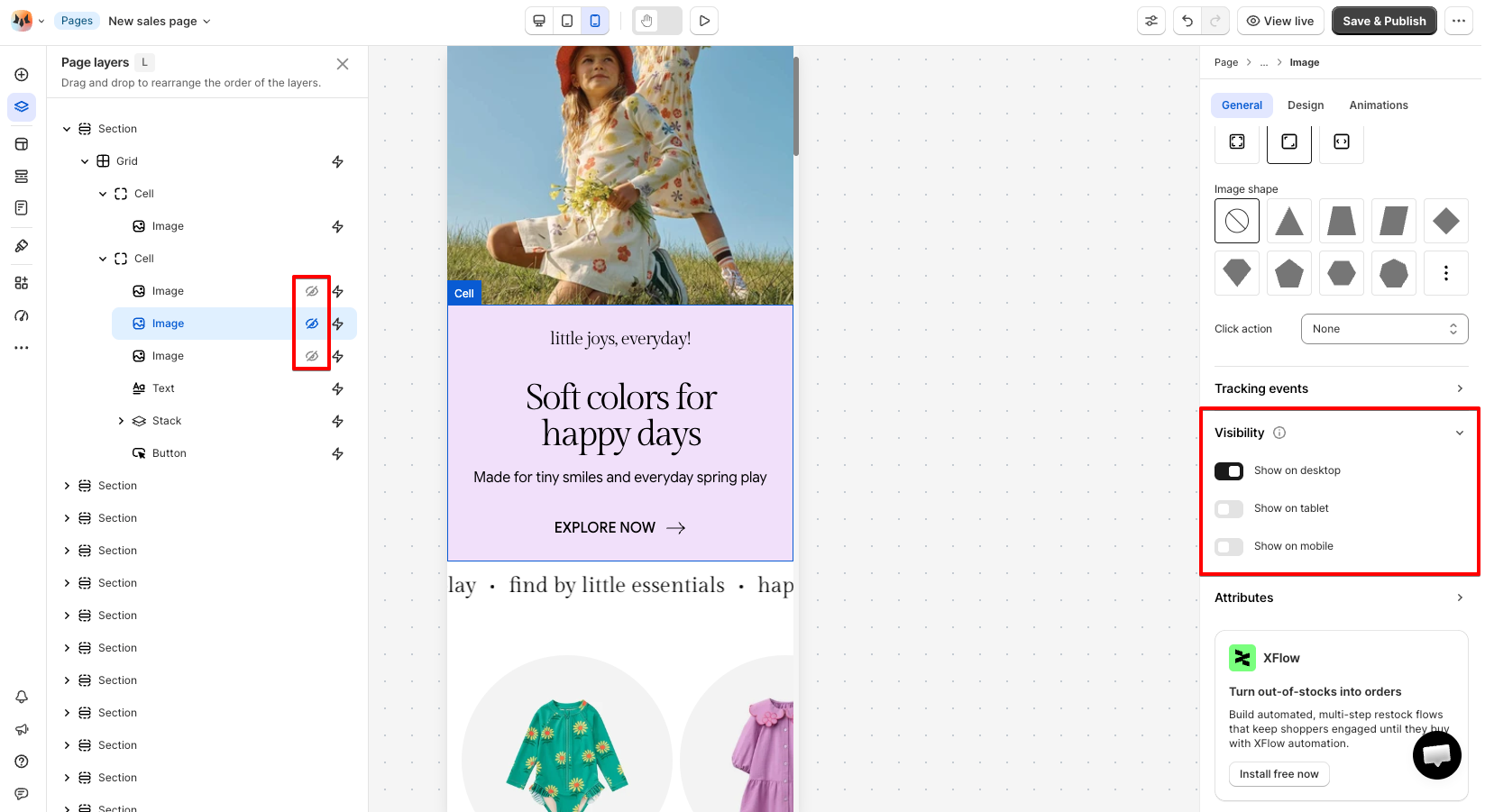
A layout that works on desktop often has too much going on for a small screen. Visibility lets you trim content per device without building separate pages or duplicating sections.
Every element or section can be shown or hidden independently on Desktop, Tablet, and Mobile. This doesn't delete the element — it just skips rendering it on the device(s) you turn off.
How to use it:
1. Select the element or section.
2. Open the Inspector panel > **General** tab > **Visibility**.
3. Toggle **Show on desktop**, **Show on tablet**, and **Show on mobile** individually.
A crossed-out eye icon next to a layer's name in the **Page layers** panel means it's hidden on the current device view — scan there instead of opening every element's Inspector panel one by one.
### Attributes
Add identifying information to an element so it can be targeted by your own CSS, scripts, or third-party integrations.
* **Custom ID** — a unique identifier for the element, auto-generated by default. Copy it to clipboard, or replace it with your own value.
* **Custom class** — a shared class name you assign to multiple elements, so they can all be targeted together — for example, applying the same Custom CSS rule to every element that shares a class, instead of repeating that CSS on each one individually.
* **Custom attributes** — add one or more **Attribute name / Value** pairs, then click **Add new** for each additional pair. Attribute names must be valid HTML attributes — see the [full list of accepted attributes](https://developer.mozilla.org/en-US/docs/Web/HTML/Reference/Attributes) on MDN. An unrecognized attribute name won't take effect.
If you're about to write Custom CSS for one element, check whether a Custom class would let you reuse that same style on similar elements later — it saves you from rewriting the same CSS repeatedly.
### Size
Set **Width**, **Height**, **Max width** and **Max height** for the element — either a fixed pixel value or a responsive one.
Learn more: [Resize an element](https://docs.foxecom.com/foxify-app/foxstudio/layout-and-styling/resize-an-element)
### Constraints
Anchor an element's position as the screen resizes — useful for elements you've placed and positioned manually.
Learn more: [Constraints](https://docs.foxecom.com/foxify-app/foxstudio/layout-and-styling/constraints)
### Spacing
Control the space around an element with Padding and Margin. Each set uniformly on all sides, or per side individually.
* **Padding** — space *inside* the element, between its edge and its content. Doesn't change the element's outer size.
* **Margin** — space *outside* the element, pushing neighboring elements away. Changes how much room this element takes up in the layout.
How to use it:
1. Open the Inspector panel > **Design** tab > **Spacing**.
2. Enter a value in px for Padding and/or Margin.
3. Use the uniform icon for the same value on all sides, or the per-side icon to set Top, Right, Bottom, and Left individually.
Watch our tutorial video: [How Padding and Margin work in Foxify](https://youtu.be/gnalrRojEik?si=x73FrIldameGEsDc)
### Backgrounds
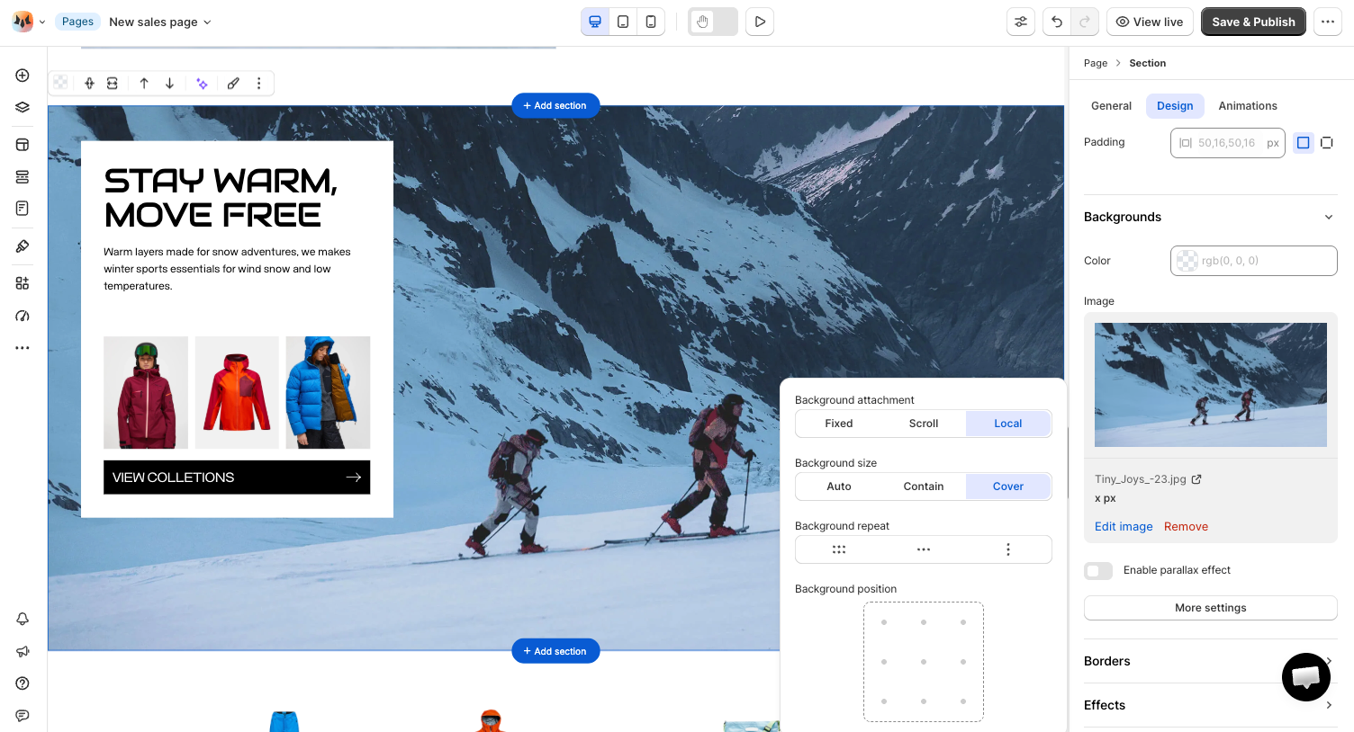
Add a background **Color**, **Image**, or (for Sections) **Video** behind an element's content.
* **Color** — pick a background color.
* **Image** — select an image via **Select image**.
* **Video** — select a video via **Select video** *(available for Sections)*.
* **More settings** — appears for every element with a Backgrounds section, and fine-tunes how a background image or video behaves:
* **Background attachment** — controls whether the background stays fixed on screen or moves as visitors scroll:
| Value | What it does |
| ------ | ------------------------------------------------------------------------------------------------------------------------------------------------------------------------------------------------------------------------------------------- |
| Scroll | The background moves together with the section itself, scrolling along with the rest of the page. This is the standard behavior most sections use. |
| Fixed | The background stays locked in place relative to the browser window. As visitors scroll, the section's content moves over it, creating a "parallax"-style effect where the image appears to stay still while everything else scrolls past. |
| Local | The background scrolls together with the section's own internal content, if that section has its own scrollable area (e.g. a horizontally scrolling row inside it). For sections without internal scrolling, it behaves the same as Scroll. |
* **Background size** — controls how the image or video scales to fill the element:
| Value | What it does |
| ------- | --------------------------------------------------------------------------------------------------------------------------------------------------------------------- |
| Auto | Displays the background at its original size — not stretched or scaled to fit the container. |
| Contain | Scales the background as large as possible while keeping the whole image visible — may leave empty space on the sides if its proportions don't match the container. |
| Cover | Scales the background to fully fill the container, cropping the edges if needed so no empty space is left. This is the most common choice for full-width hero images. |
* **Background repeat** — tile the background image, or don't.
* **Background position** — anchor the background (e.g. top-left, center, bottom-right).
### Borders
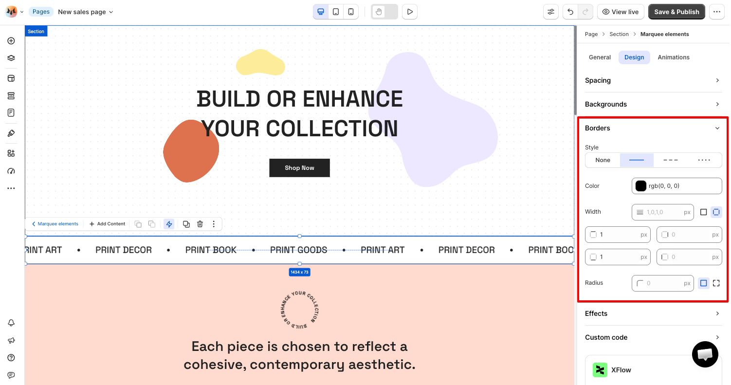
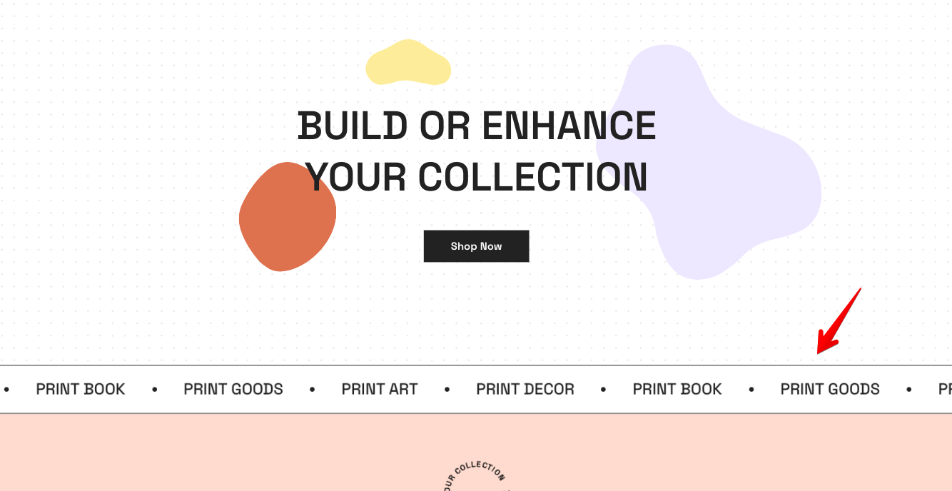
Borders and rounded corners are a quick way to visually separate or unify elements without adding a background color.
* **Style** — None, Solid, Dashed, or Dotted, selected as an icon.
* **Color** — pick a border color.
* **Width** — set a uniform value for all four sides, or switch to the per-side icon to set Top, Right, Bottom, and Left individually.
* **Radius** — set a uniform corner radius, or switch to the per-corner icon to set each corner individually.
### Effects
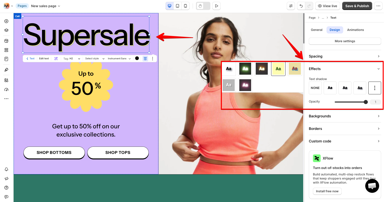
* **Box shadow** *(on Frames, Stacks, and similar container-type elements)* or **Text shadow** *(on Text elements)* — apply a preset shadow style, or None. The field name and preset thumbnails change depending on the type of element you've selected.
* **Opacity** — fade the whole element, from fully transparent (0) to fully opaque (1, the default).
### Custom code
Add **Custom CSS** scoped to this element and its children only — useful for fixing a detail the Design tab doesn't expose, like adjusting spacing inside a Slideshow's internal wrapper class. Because it's scoped to the element and its children, you can experiment without affecting anything else on the page.
If you need JavaScript, or a change that should apply consistently across every page sharing that template, use the [template's Custom code editor](https://docs.foxecom.com/foxify-app/foxstudio/editor-tools/custom-codes) instead.
### FAQs
**Do all elements show all these settings?**
No. The Inspector panel adapts to the element type you've selected.
**What's the difference between the General and Design tabs?**
General covers structure and behavior; Design covers how the element looks and is laid out.
**What's the difference between the element's Custom CSS and the Custom code editor?**
The element's own Custom CSS only affects that element and its children. The Custom code editor (CSS + JS) applies to every page using the same template.
**What's the difference between Padding and Margin?**
Padding adds space inside the element, between its edge and its content. Margin adds space outside the element, between it and its neighbors.
## Related articles
Resize an element
Constraints
Frame elements
Stack elements
Animations