# Resize an element

## Resize an element

Select an element and resize it either by:

* Dragging the size handles on the canvas.
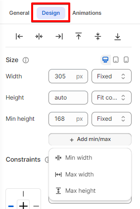
* Entering the width/height value in the Inspector panel.

{% hint style="info" %}
You can set the element's size per screen size.
{% endhint %}

<figure><img src="/files/BVcRaMBEAyRbBiRtmDkC" alt=""><figcaption></figcaption></figure>

You may want to set values that **never** let an element's width or height **go above or below a certain value**:&#x20;

* The  `max-width`  and  `max-height`  properties will ensure that an element is never wider or taller than the value you set, even if there's enough room on the page for it to take up more space.
* The  `min-width`  and  `min-height`  properties will ensure that an element is never narrower or shorter than the value you set, even if the browser window is too small to display the whole element.
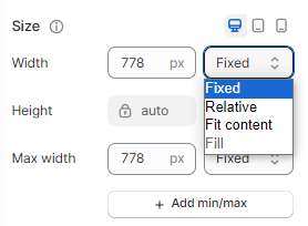
<figure><img src="/files/BGzlwmXahyfqZB8hpC4V" alt=""><figcaption></figcaption></figure>

## Size measurements

* **Pixels (px)** in **Fixed** sizing: If you want your element to stay the same when resizing.&#x20;
* **Percentage (%)** in **Relative** sizing: The width/height value of the element depends on its parent's dimensions. This ensures the element resizes in proportion to its parent.

For example, you can [add a text element to a stack](/foxify-app/foxstudio/layout-and-styling/stack-elements.md) and set its width to 50%. Your text then always takes up 50% of the stack container's width.&#x20;

{% hint style="warning" %}
For some elements, the height is already set to **Auto**. This means the element automatically adjusts its height based on its content, allowing you to add or remove content without manually resizing the element.&#x20;
{% endhint %}

<figure><img src="/files/JHxjCt68GRlLURayPWCy" alt=""><figcaption></figcaption></figure>

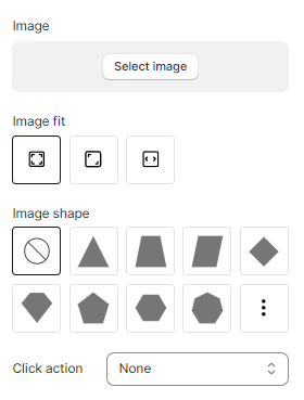
## Resize Image elements

When resizing an Image element, you can decide how the image is resized to fit its bounding box. Make the image either has the width and height stay proportional to each other, or stretch to fill the bounding box.

Specify how an image should be resized to fit its container (bounding box) using the **Image fit** setting:

* **Keep image ratio**: The image height is scaled proportionally when resizing the image width to keep its ratio.

<figure><img src="/files/fXH77bdubV6jnpfdu9Vt" alt=""><figcaption></figcaption></figure>

* **Fill bounding box**: The image is resized to fill the given dimension. If necessary, the image will be stretched or squished to fit.

<figure><img src="/files/L26XrUePtTu65CnczxYP" alt=""><figcaption></figcaption></figure>

* **Fit to bounding box**: The image keeps its aspect ratio, but is resized to fit within the given dimension.

<figure><img src="/files/oFKs2gjbh8NGS11sCNfe" alt=""><figcaption></figcaption></figure>

<figure><img src="/files/rFqRb4Wkspl6zyQIjDCk" alt=""><figcaption></figcaption></figure>


---

# Agent Instructions: Querying This Documentation

If you need additional information that is not directly available in this page, you can query the documentation dynamically by asking a question.

Perform an HTTP GET request on the current page URL with the `ask` query parameter:

```
GET https://docs.foxecom.com/foxify-app/foxstudio/layout-and-styling/resize-an-element.md?ask=<question>
```

The question should be specific, self-contained, and written in natural language.
The response will contain a direct answer to the question and relevant excerpts and sources from the documentation.

Use this mechanism when the answer is not explicitly present in the current page, you need clarification or additional context, or you want to retrieve related documentation sections.
