Foxify App
Foxify App
Legacy EditorSections & Presets

Collapsible content

2 min read
image

The Collapsible content section helps break up longer descriptions and make them more visually appealing.

This comes in handy when you want to show important notice or information without using up too much space.

Customize a Collapsible content section

A Collapsible content section has 2 blocks:

  • Section header and
  • Collapsible rows

Section header

Use this block to give your section a Heading, Text, Button, Image, Icon, or Custom code if needed.

image

Collapsible rows

You can change the Icon style for the Collapsible rows: Plus or Arrow.

image
image
image

Customize your Collection rows block

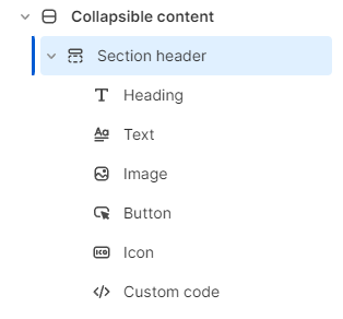
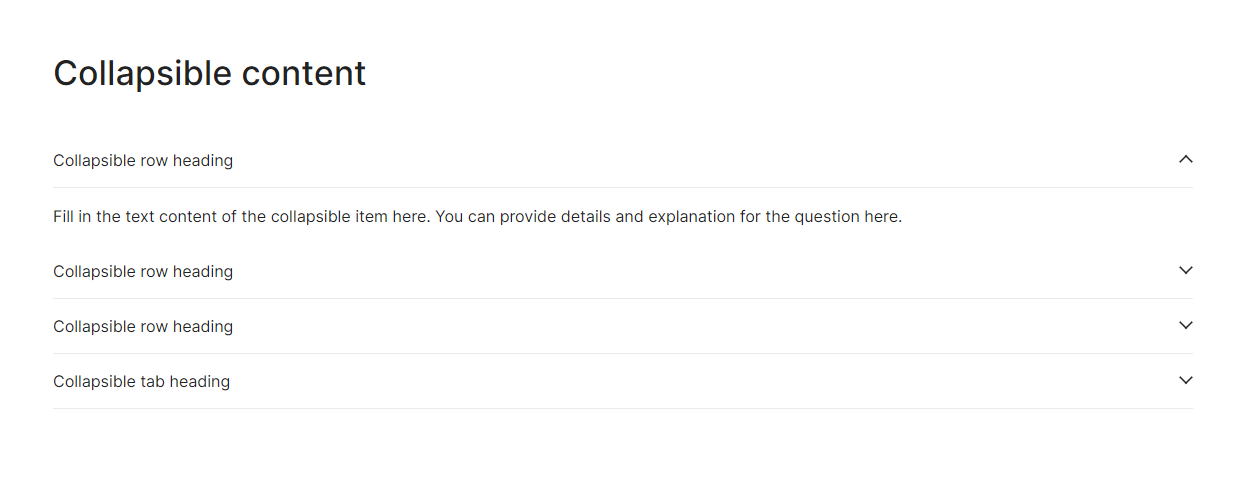
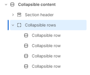
You can add or edit a maximum of only one type of child block - Collapsible row block - to the Collection rows block in the Collapsible content section.

image

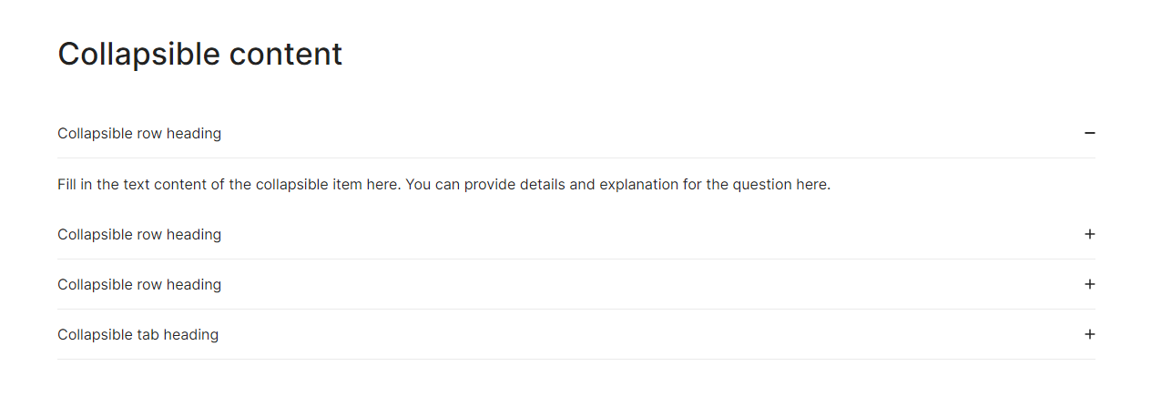
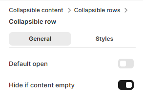
If you want the Collapsible row to always open when the page is loaded, enable the Default open toggle ✅

If you enable the Hide if content is empty toggle, the Collapsible row will be hidden then.

image

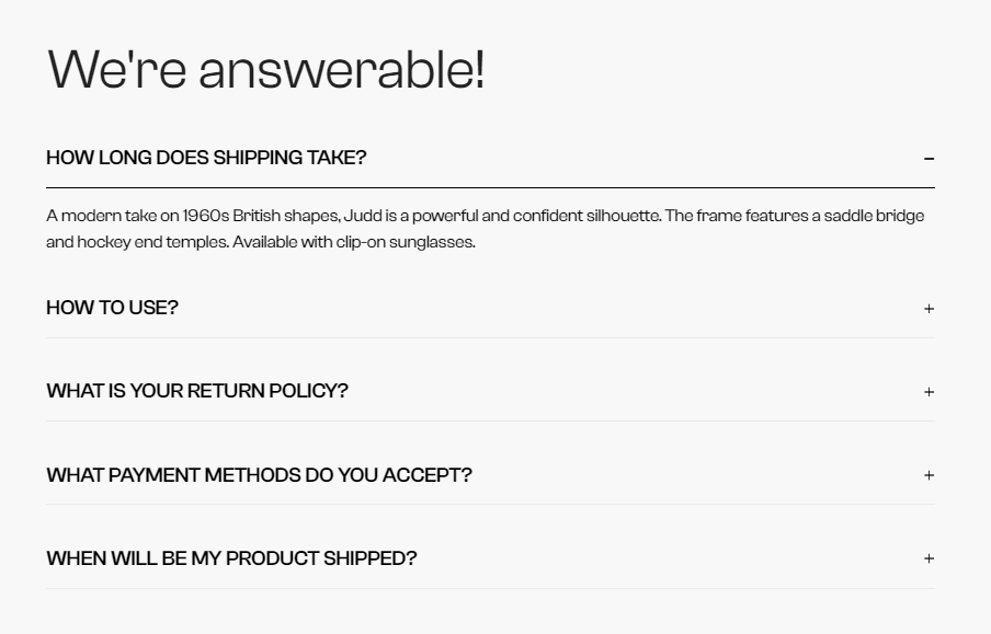
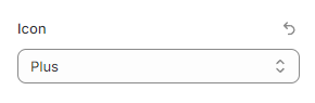
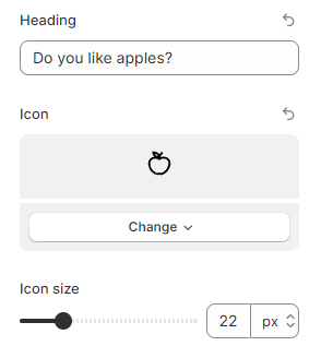
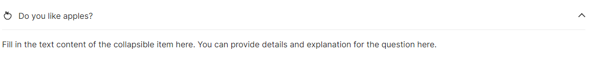
Add the suitable text into the Heading field, select an attractive Icon, and change the Icon size to draw the customer's attention.

image
image

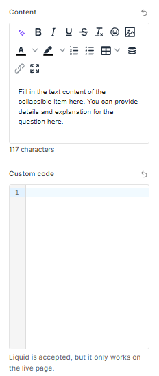
Moreover, you can add the extra information in the Content field.

Add content using Custom code (Liquid is accepted, but it only works on the live page).

image
Last updated