
FoxstudioAdd and edit elements
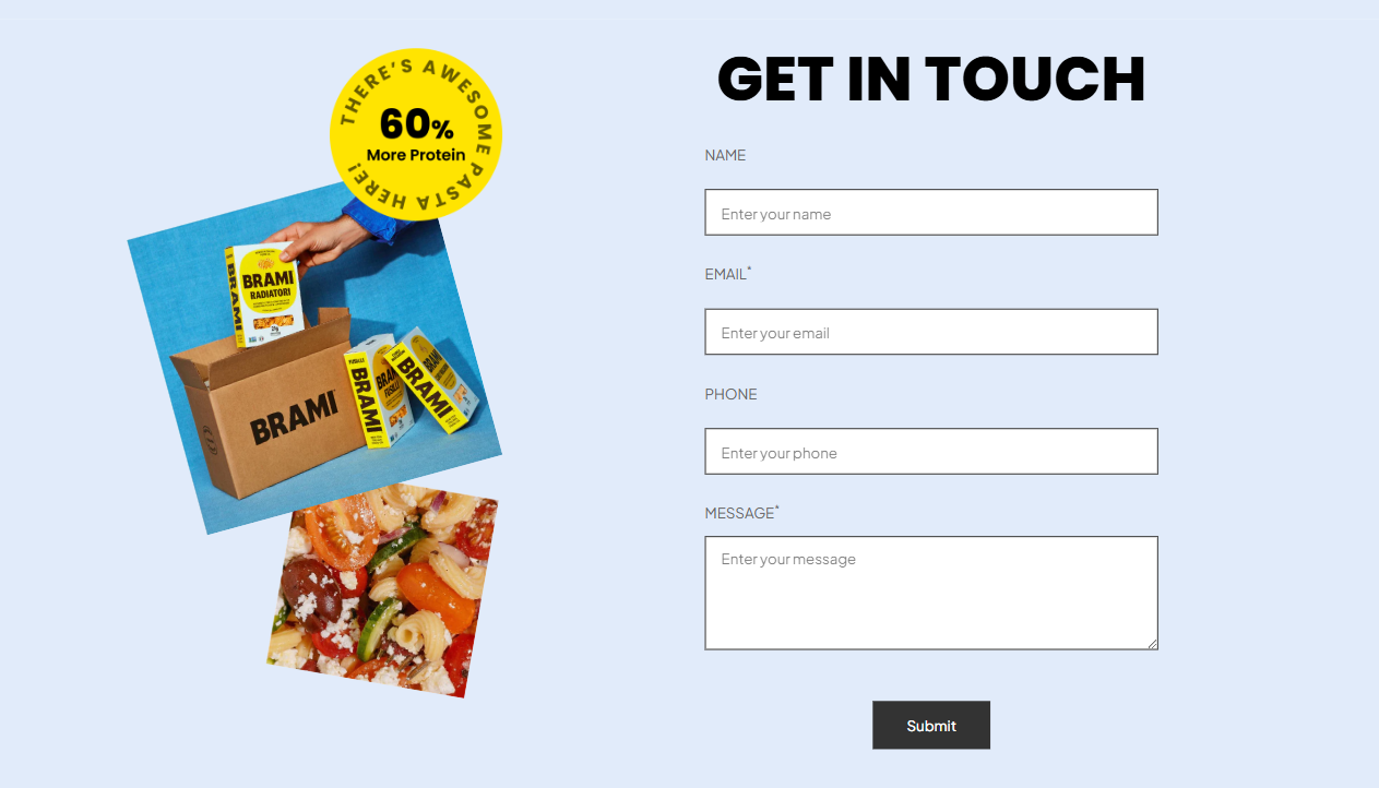
Contact form
3 min read
Your contact form sends all submissions to the sender email address of your store. You can change the sender email address in the Notifications settings page of your Shopify admin.
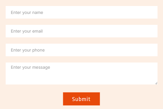
How to add a contact form
- In the FoxStudio editor, on the left Sidebar > Click Add elements (
_KqvedGnv.svg) ), or press E.
), or press E. - Select Forms > Contact form.
- Drag the Contact form onto your canvas.
How to edit a contact form
- Select the relevant contact form element in the editor.
- Use the tools bar above the selected contact form element to quickly edit it.
General settings
Contact fields
-
-
- Field names must be unique across the form.
- Used for mapping submissions to email integrations or databases.
-
- Enter each option on a new line.
Option 1 Option 2 Option 3- Placeholder: Displays sample text inside the field to guide users on what to enter.
- ID: Adds a custom HTML ID to the field for advanced customizations or integrations. Useful for developers who want to apply custom styles or scripts.
- Required: Makes the field mandatory for form submission.
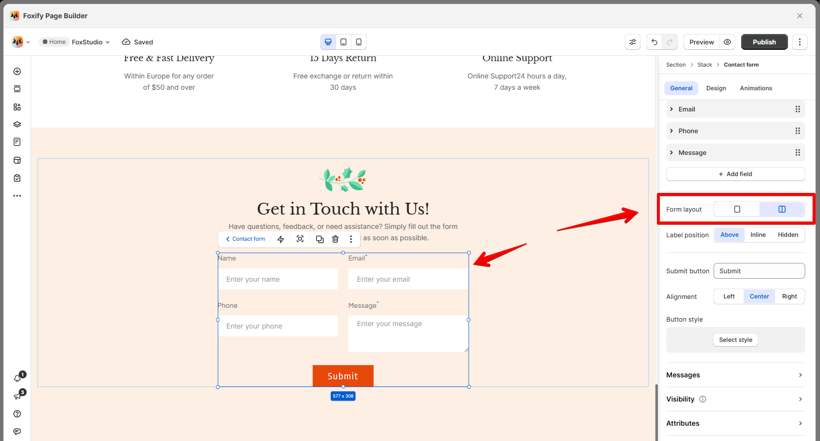
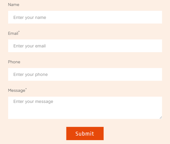
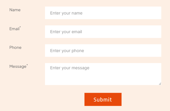
Form layout
Label position
Submit button
- Button label: Edit the text displayed on the submit button (e.g., "Submit" or "Send Message").
- Alignment: Align the submit button to the left, center, or right.
- Button style: Click Select style to choose from pre-defined styles in Global styles
Message
- Thank You Message: This message appears when the form is successfully submitted.
- Error Message: This message appears when the form submission fails due to an issue (e.g., missing required fields, or connectivity errors).
- Use a warm, reassuring tone to confirm the form submission and provide a timeline for follow-up.
- Keep the error message clear and concise. Optionally, suggest next steps like refreshing the page or double-checking required fields.
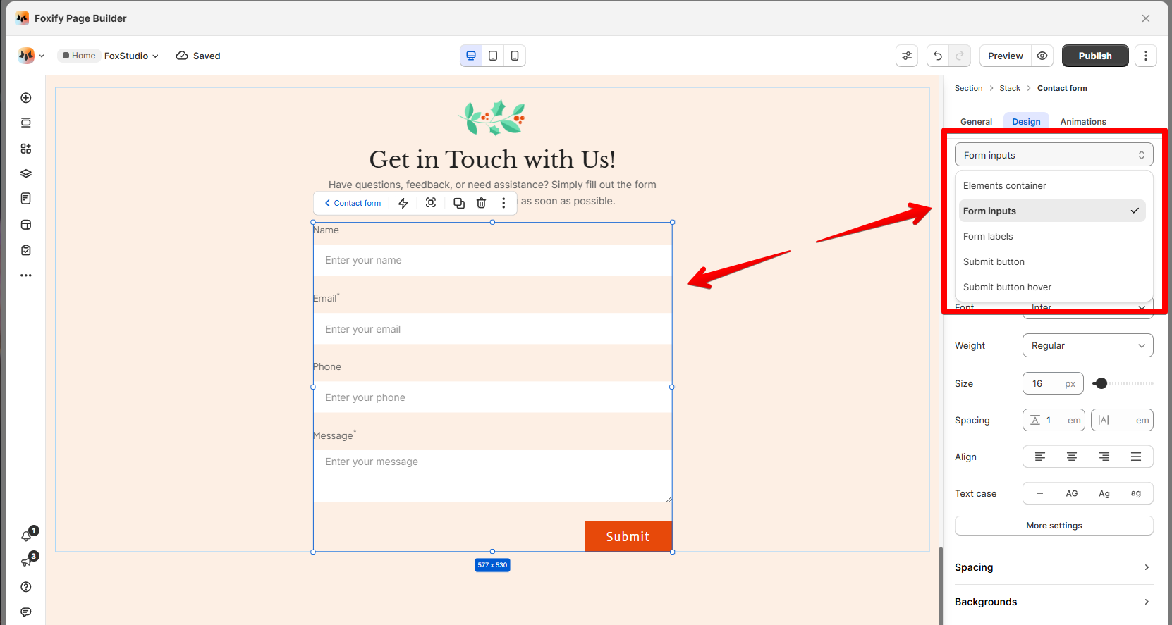
Design settings
- Element container: Adjust background colors, padding, borders, and spacing for the entire form container.
- Form inputs: Customize the appearance of input fields, including height, borders, background colors, text styles, and spacing.
- Form labels: Modify the font style, size, and colors of labels displayed in the form.
- Submit button: Design the submit button's appearance, including its background color, border, padding, and text styling.
- Submit button hover: Set styles for the button when hovered over (colors and borders).
Last updated