
Page ManagementApp extensions
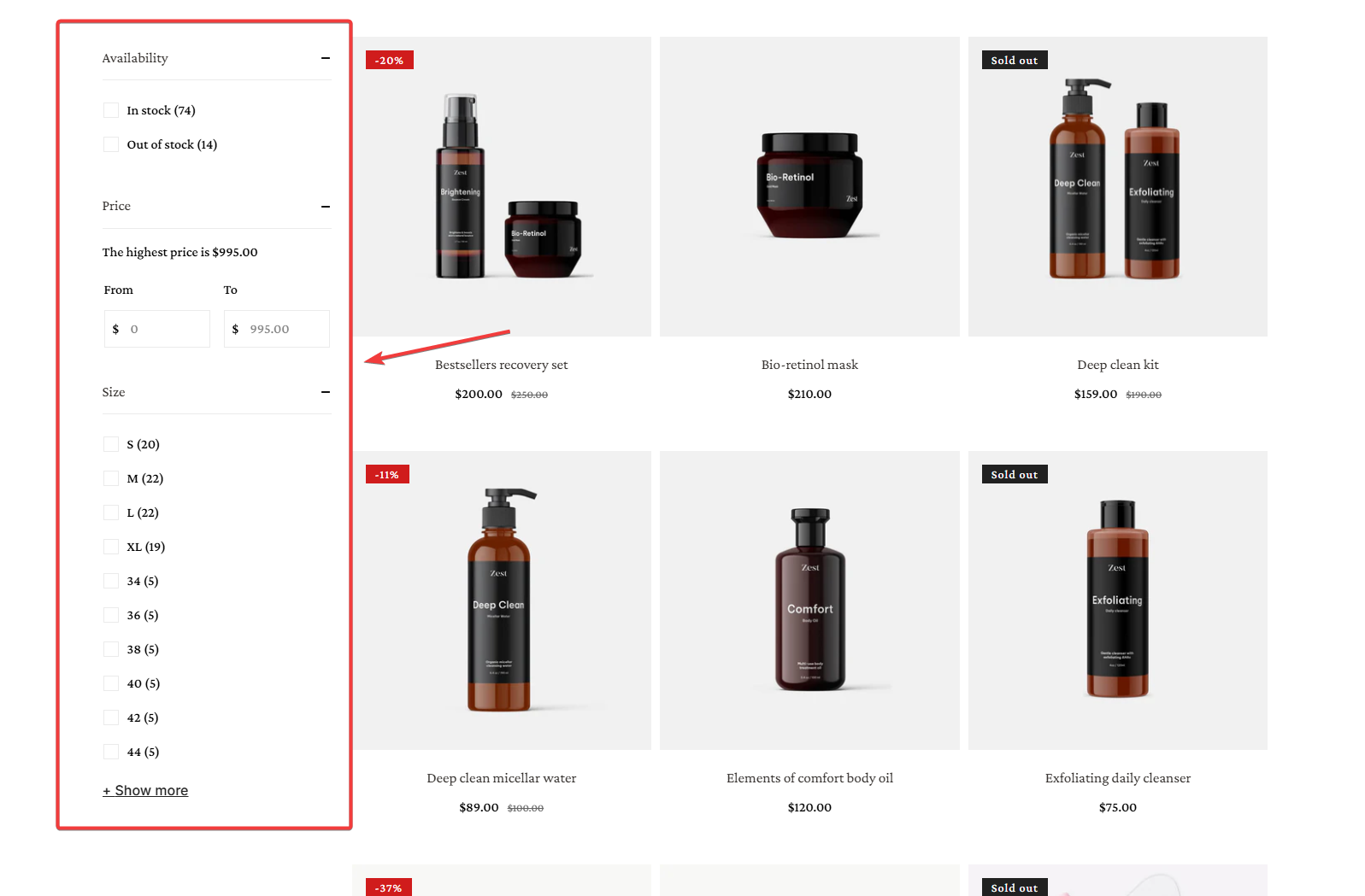
Storefront Filters
3 min read
How to use Foxify: Storefont Filters
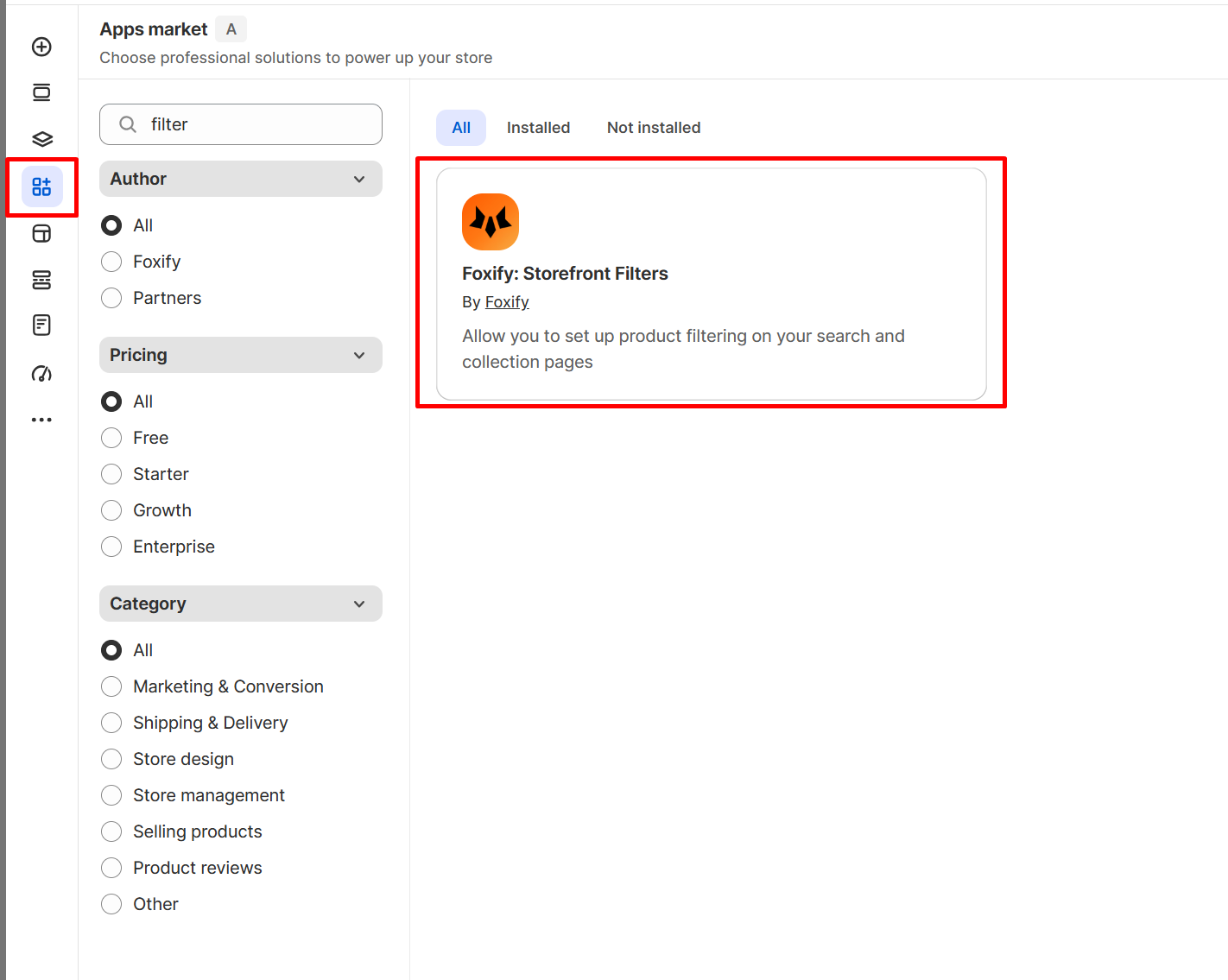
- In your Foxify dashboard go to App extensions or in your FoxStudio editor, on the left sidebar, click Manage apps (A).
- Filter for Foxify, look for Foxify: Storefont Filters
- Choose Install Extension.
To use this element, you must have the Shopify Search & Discovery app installed to customize your filter.
Learn how to customize filters with the app.
How to set up the Foxify: Storefront Filter widget
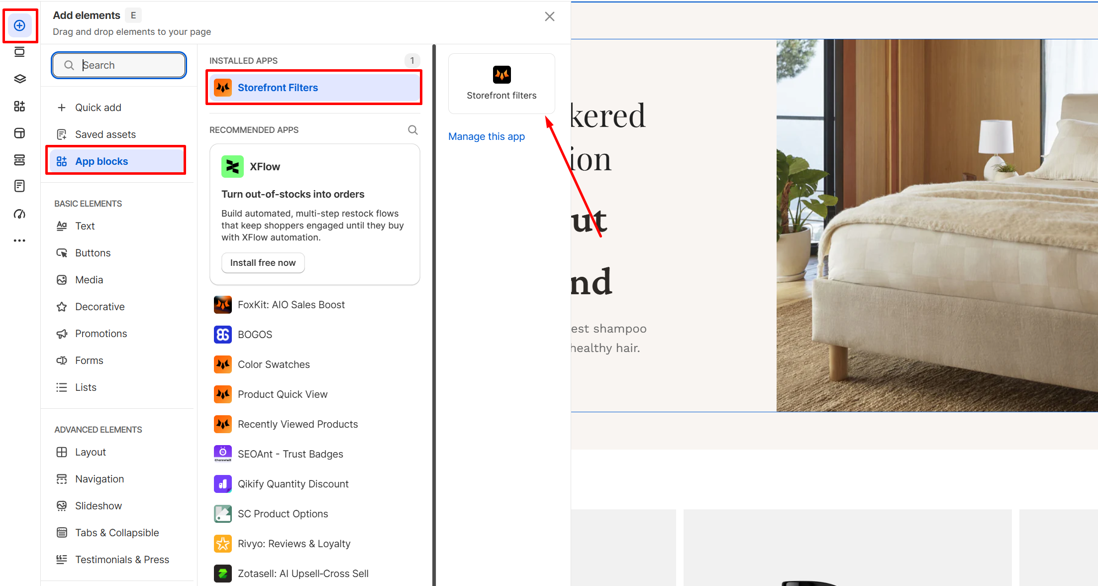
- In Pages manager, open the page you want to add the app features to. Select Add element > App blocks.
- Select Storefont filter from the Installed apps list, and drag the app widget you want to feature on your product page.
- Set up and edit Storefont filter widget.
How to edit the Foxify: Storefront Filter widget
- Select the Storefont filter element in the editor.
- Use the tools bar above the selected text element to quickly optimize it.
General Settings
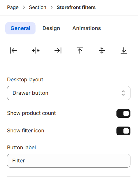
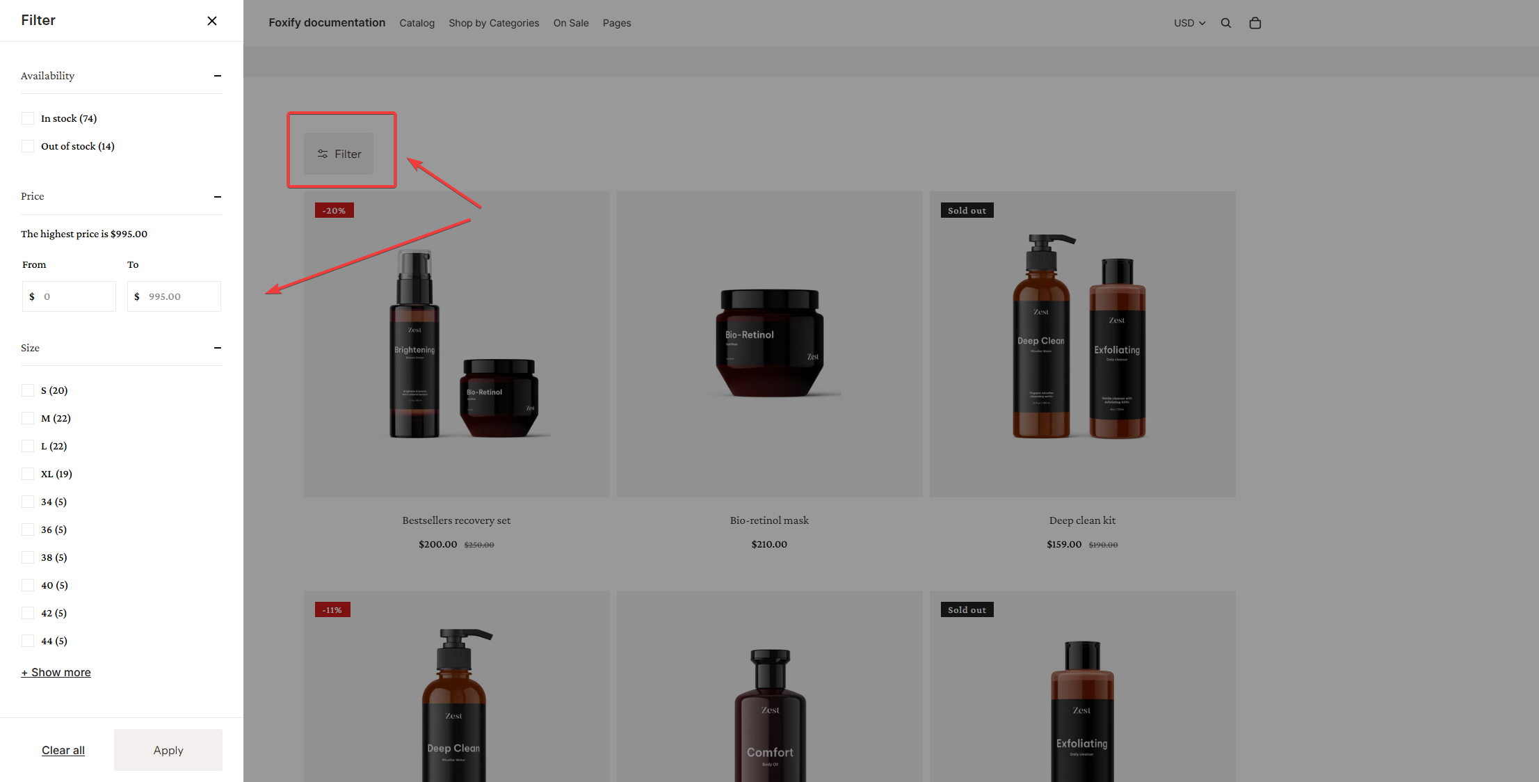
- Show product count: Toggle this to display the number of items available for each filter option.
- Show filter icon: Toggle to display a filter icon next to the button text.
- Button label: Enter the text you want to appear on the filter drawer button.
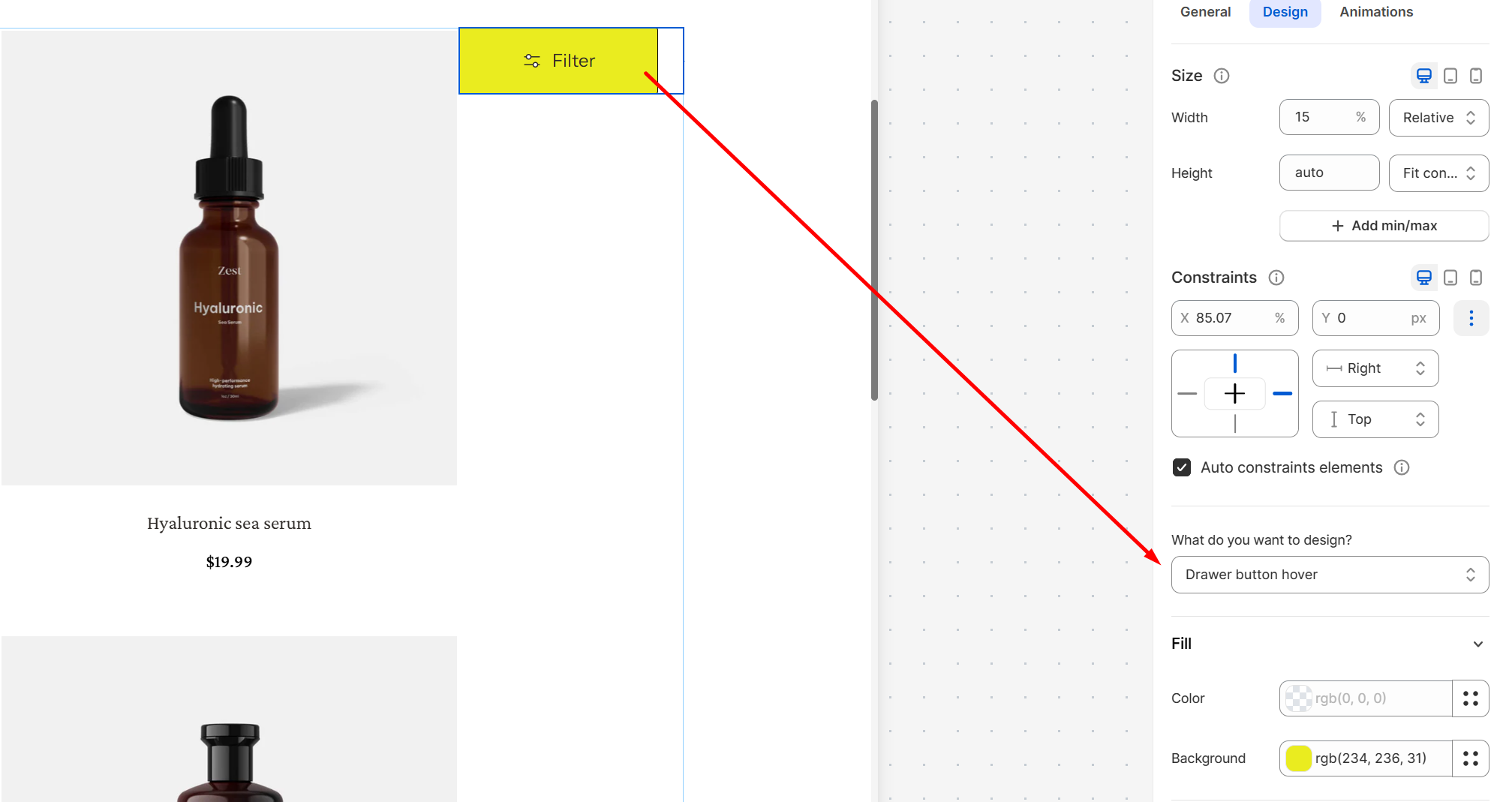
Design Settings
Constraints
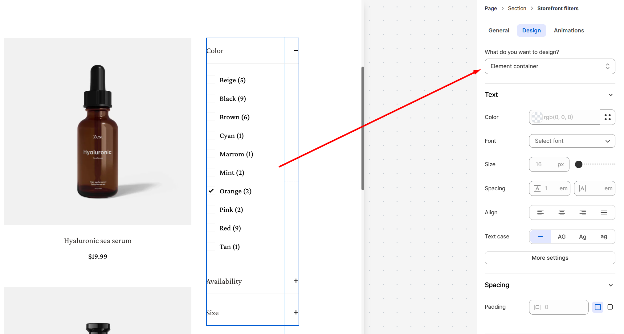
- Font: Choose from hundreds of fonts. You can also upload your own fonts to Foxify.
- Size: Define the font size of the text.
- Text case: Click the icons to set the text's capitalization: As typed — , Upper case AG, Title case Ag, or Lower case ag.
- Spacing: Change the spacing between the lines and characters in the text box.
- Text style: Normal/Italic.
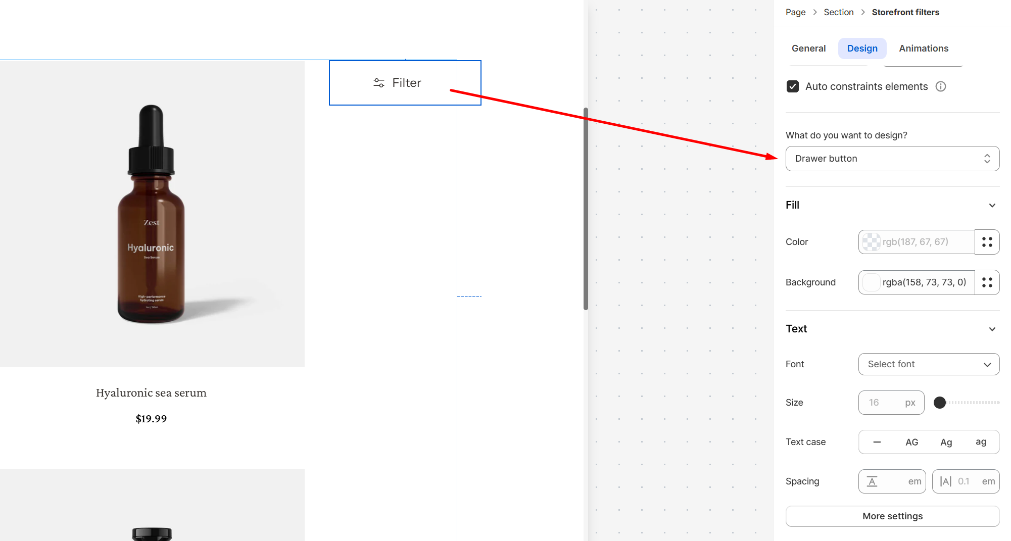
- Color Fill: Set text color and background color of the tabs.
- Font: Choose from hundreds of fonts. You can also upload your own fonts to Foxify.
- Size: Define the font size of the text.
- Text case: Click the icons to set the text's capitalization: As typed — , Upper case AG, Title case Ag, or Lower case ag.
- Spacing: Change the spacing between the lines and characters in the text box.
- Text style: Normal/Italic.
Animations
Animations
Last updated