
FoxstudioAdd and edit elements
Button
3 min read
How to add a Button
- In the FoxStudio editor, on the left Sidebar > Click Add elements, or press E.
- Select Buttons.
- Drag the button onto your canvas.
How to edit a Button
- Select the relevant button element in the editor.
- Use the toolbar above the selected button element to quickly edit it.
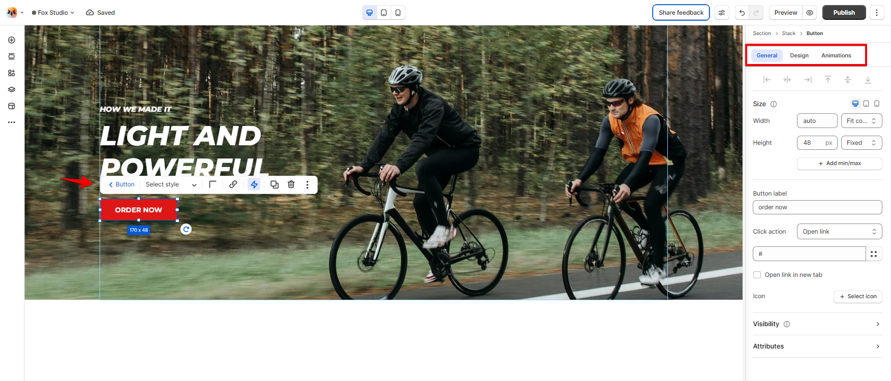
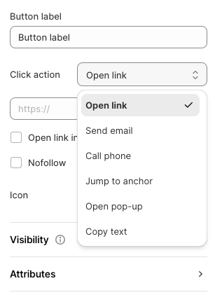
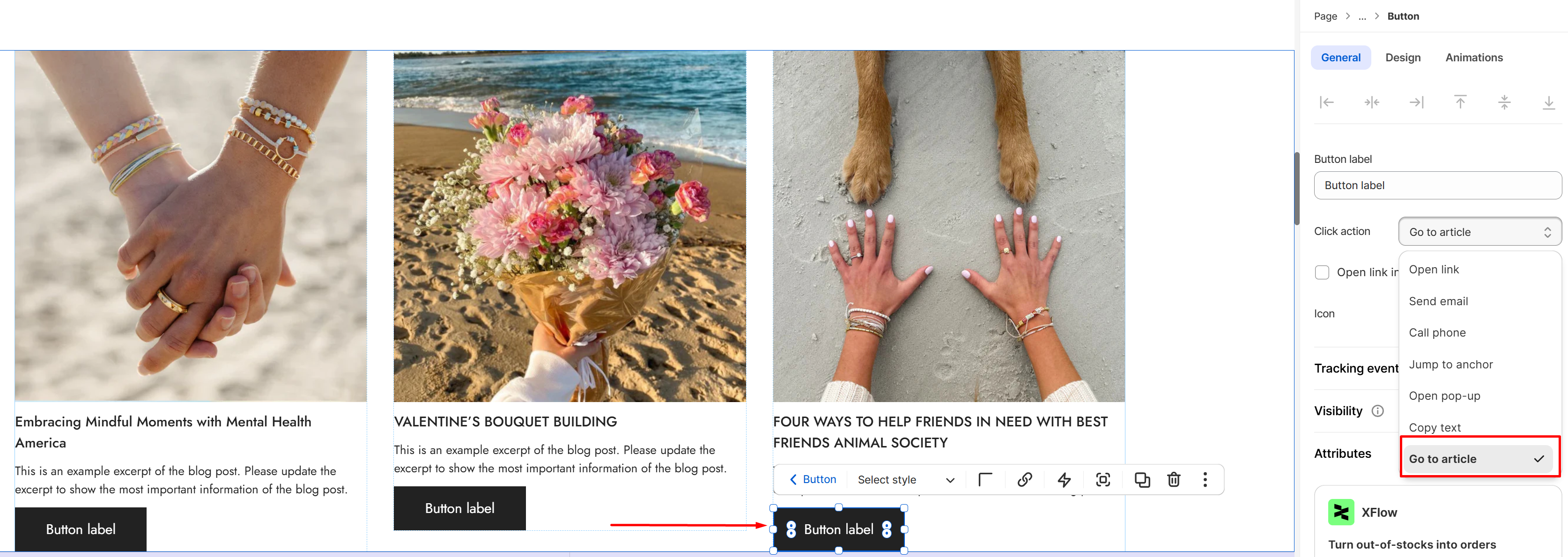
Button label and Click action
- Open link: Insert a page URL or select a Shopify page to open the link when clicked.
- Send email: Enter the email address to let customers send an email when clicked.
- Call phone: Enter your phone number.
- Jump to anchor: Insert the section ID to jump to that specific section when clicked. See more: Create an anchor link
- Open pop-up: Insert the pop-up content to open a pop-up when clicked.
- Copy text: When the button is clicked, a specific piece of text will be automatically copied to the user's clipboard.
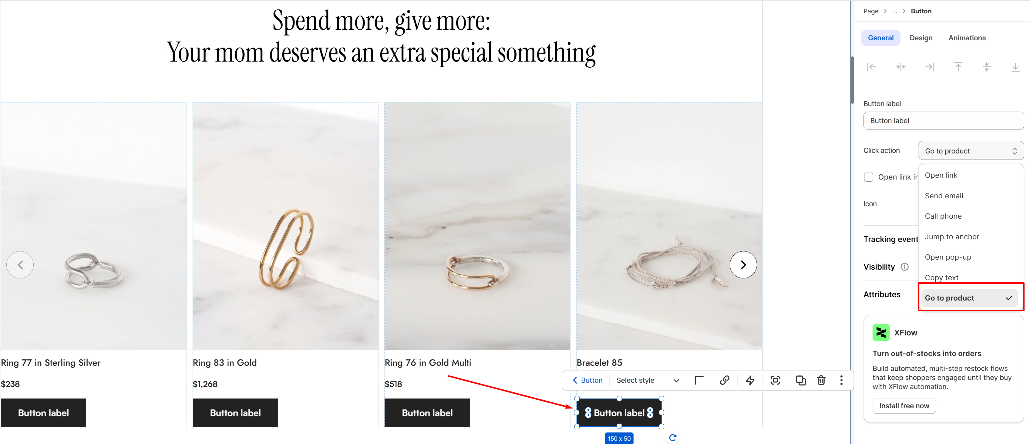
Button element will have an additional Click action "Go to product/article" when added to a Product/Blog Card. This is useful when a product is added directly to the cart without redirecting to the product page, or when a Blog Card has no default button — allowing you to manually add a link to the detail page.
Tracking events
- Enable Tracking Events: Toggle the Enable tracking events option to ON.
- Configure GA Event: Under GA Event Name, enter the name of the event you want to track (e.g.,
button_click). - Facebook Pixel Event: Select the relevant event from the dropdown list:
- ViewContent
- AddToCart
- InitiateCheckout
- Purchase
- Lead
- CompleteRegistration
- Custom: If you want to create a custom event, select Custom and name it (e.g.,
BuyNowClick).
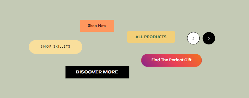
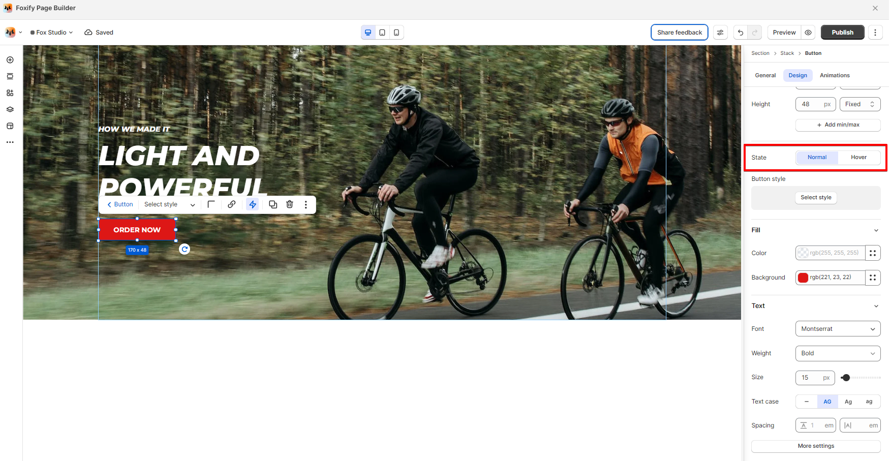
Button State
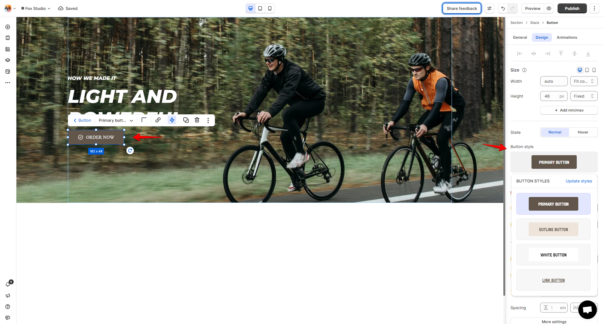
Button Style
See more: Global styles
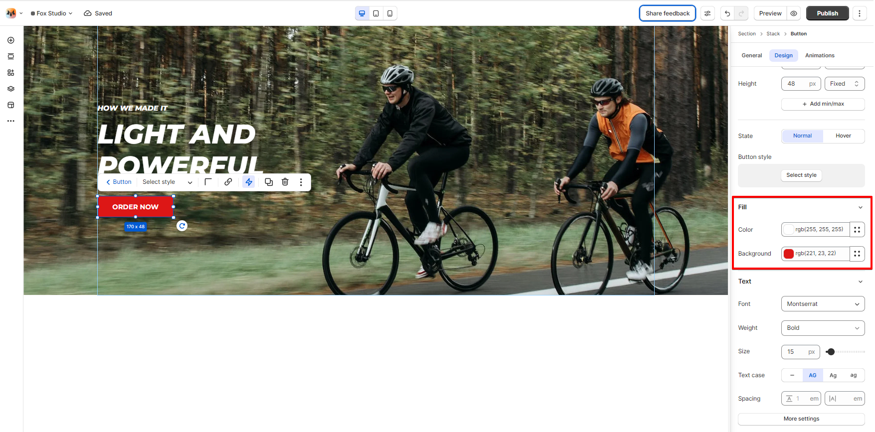
Color Fill
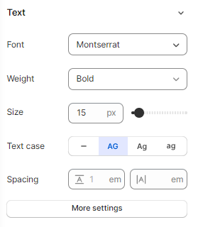
Text Font, Spacing, and Styles
-
Font: Choose from hundreds of fonts. You can also upload your own fonts to Foxify.
-
Last updated