Multicolumn
You can utilize a multicolumn section to showcase your store's services and other details.
#Customize a multicolumn section header
First, you need to add a multicolumn section to your page. Choose a preset that best fits your needs.
In your section header block, you can easily add, remove, or reorder child blocks.
- Child block can be a heading, sub-heading, or rich text.
#Customize your multicolumn grid
#Grid settings
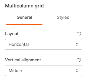
#Layout settings
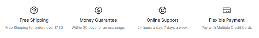
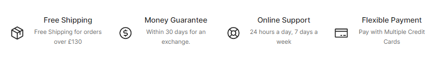
Here you can set your column layout for column elements and image /icon for vertical alignment.
- Vertical alignment settings work with horizontal layout only.
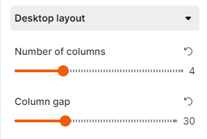
#Desktop layout
Select your number of columns between 1 and 12 and the column gap by tweaking the toggles.
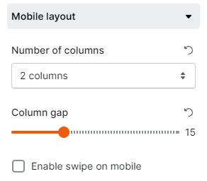
#Mobile layout
Similar to desktop layout, mobile layout lets you set your number of columns shown on mobile view (1 column/2 columns) and the column gap.
Check Enable swipe on mobile to display the blog posts grid in horizontal order with a slider on mobile view.
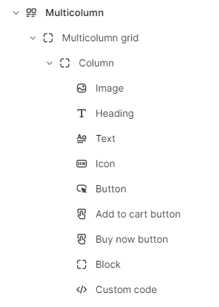
#Customize your column
You can add and edit a maximum of nine child blocks to each column in the multicolumn section, namely:
- Image
- Icon
- Heading
- Text
- Button
- Add to cart button
- Buy now button
- Block
- Custom code
Last updated