# Edit a Section
Sections let you structure your content clearly and effectively.
Once you've [added the section](https://docs.foxecom.com/foxify-app/foxstudio/page-customization/add-a-section) you want, edit it however you want.
Add your own unique flair, including background changes, size adjustments, and additional elements.
Speed up Shopify page creation using **pre-designed sections** 🚀. [See our tutorial](https://youtu.be/lgFnPS3nYQs)
***
## Add an element to the section
**Steps:**
1. On the Left Sidebar, click **Add elements**
2. Select a category > the element type you want to add to the section
3. Drag and drop the element to the section.
_tmrQCPl6.gif)
## Add a background to the section
Transform the look and feel of your sections with a variety of background options. Choose a color for a clean aesthetic or add visual interest with an image or video.
**Steps:**
1. Click the section in your editor or in the layers panel to open the Inspector of the section.
2. In the **Design** tab, click **Backgrounds.**
3. Select the option you want to apply to your section for a unique touch:
* **Video**: Upload and add your own video to the background
* **Image**: Upload and add your own image to the background
* **Color**: Select a color from the picker. You can choose a solid, linear or radial color.
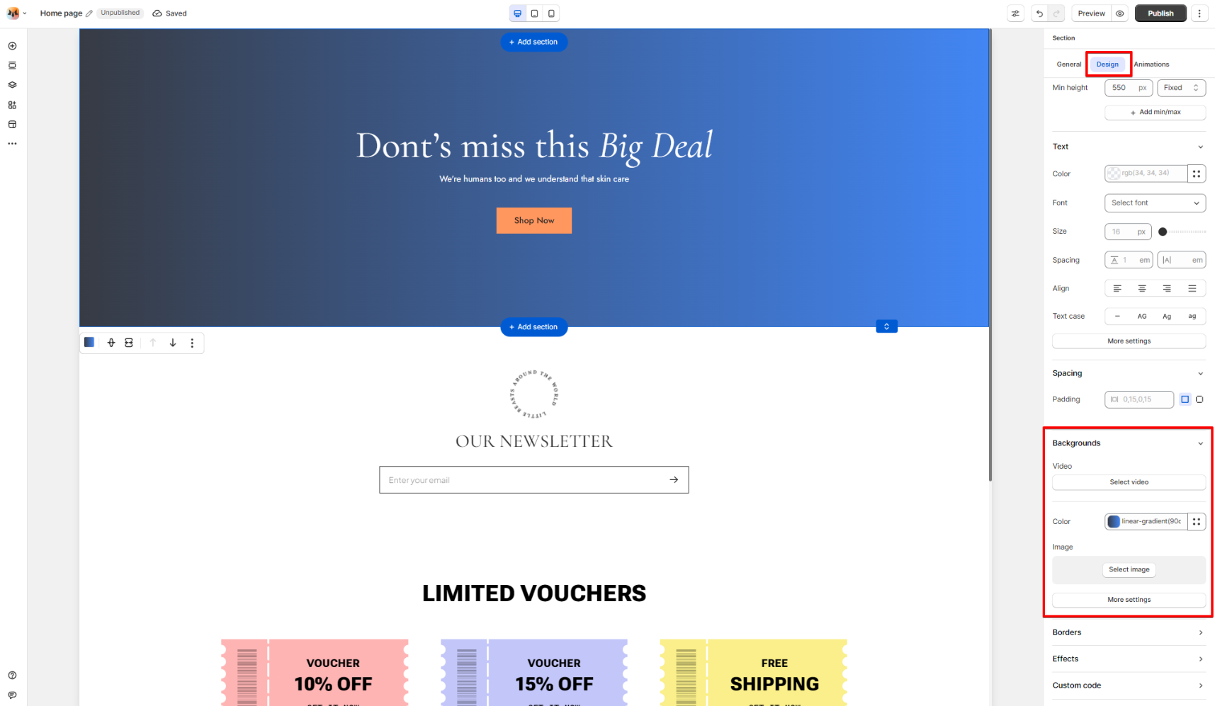
In **More settings**, you can find more options to adjust different properties of the background.
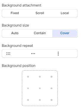
**Background attachment**
The background-attachment property in CSS sets whether a background image's position is fixed within the [viewport](https://developer.mozilla.org/en-US/docs/Glossary/Viewport), or scrolls with its containing block.
* **Fixed**: The background image stays fixed no matter what.
* **Scroll**: The background image scrolls with the main view, but stays fixed inside the local view.
* **Local**: The background images scroll with the element's content.
Still not sure how the three values work? Check out this [demo](https://css-tricks.com/almanac/properties/b/background-attachment/).
**Background size**
The background-size CSS property sets the size of the element's background image. The image can be left to its natural size, stretched, or constrained to fit the available space.
* **Auto:** Default value. The background image is displayed in its original size.
* **Contain**: Resize the background image to make sure the image is fully visible.
* **Cover**: Resize the background image to cover the entire container, even if it has to stretch the image or cut a little bit off one of the edges.
Spaces not covered by a background image are filled with the background-color property, and the background color will be visible behind background images that have transparency.
**Background repeat**
The background-repeat CSS property sets how background images are repeated. A background image can be repeated along the horizontal and vertical axes, or not repeated at all.
This setting works with **Auto** and **Contain** background size.
* Repeat: tile the image in both directions
* Repeat x: tile the image horizontally
* Repeat y: tile the image vertically
By default, the background image is set as no repeat.
**Background position**
This setting allows you to move your background image around within its container.
There are 9 options to place your background image:
* Top left/ top center/ top right
* Middle left/ middle center/ middle right
* Bottom left/ bottom center/ bottom right.
You can quickly change the color used as your section background by clicking on the section > quick actions bar.
_8TvLbhJ1.gif)
## Change the section size
Change your section size and container width anytime to fit your desire.
### Change the section size
**Steps:**
1. Click on the section in the editor.
2. Click and drag the Adjust section height handle  at the bottom of the section to make it taller or shorter.
_kJR9dey4.gif)
### Change the section container width
Section container is used to control the alignment of its content.
**Steps:**
1. Click on the section in the editor.
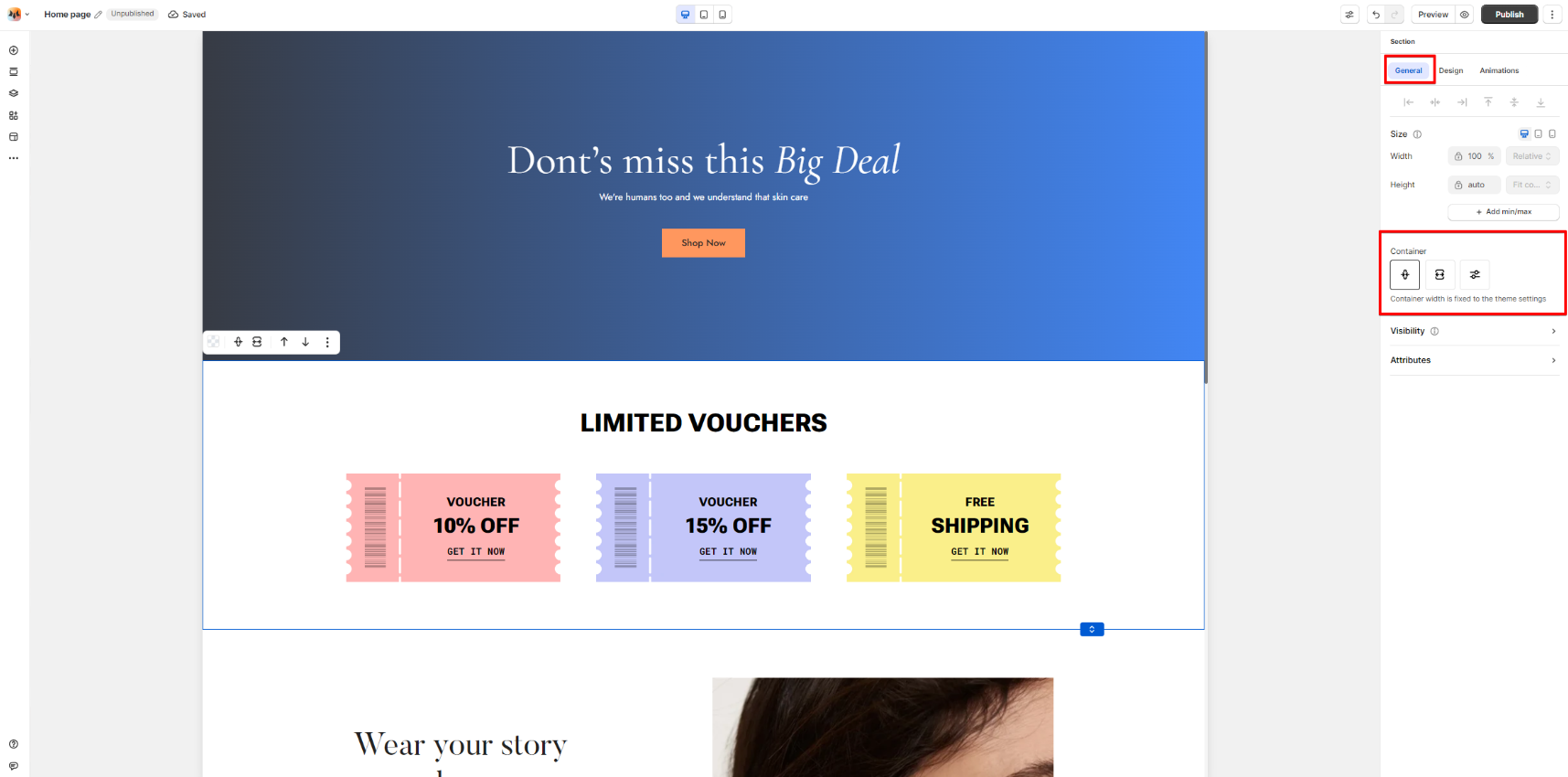
2. In the **Inspector** panel of the section > **General** tab > **Container** setting:
* **Fixed width**: set the section width as in **Theme settings** > **Layout**.
* **Full width**: set the section to always full to the screen.
* **Custom width**: give a custom container width to the section between 800 - 1600 px.
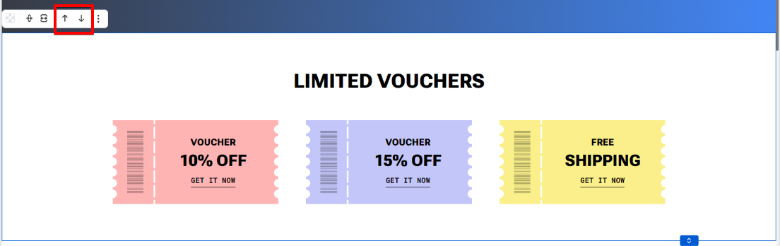
You can quickly change your section width to either Fixed width/Full width by clicking on the section > quick actions bar.
***