Global styles is a system of reusable design variables and presets. Instead of styling each element individually, you set your brand's colors, font sizes, and button styles in one place — then apply them across your store with a single click.
Any change you make to Global styles is automatically applied everywhere that style is used, keeping your store visually consistent without manual rework.
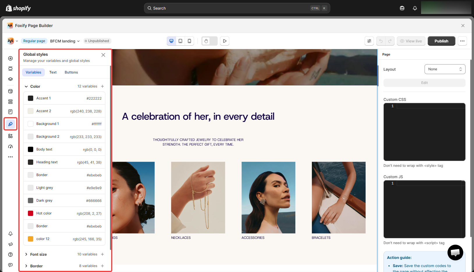
Variables are reusable values you define once and apply across your pages. The Variables tab has 5 categories, each with default presets you can edit or extend.
Category
What it controls
Color
Brand colors: Accent 1 & 2, Background 1 & 2, Body text, Heading text, Border, Light grey, Dark grey, Hot color, and more
Font size
Reusable size variables used across text elements
Border
Border width and radius presets for consistent edge styling
Space
Spacing variables for padding and gap — keeps layout rhythm consistent
Custom
Any additional variables your store needs beyond the defaults. Learn more
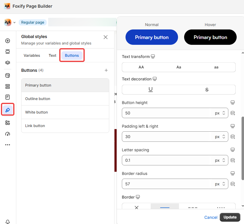
Click on any button style to open its settings. Each button has two states — Normal and Hover — and you can configure: Color, Background color, Font family, Font size, Font weight, and more.
You can edit Foxify's default button styles but cannot delete them. You can add your own custom button styles in addition to the defaults.