
Legacy EditorSections & Presets
Product tabs
1 min read
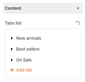
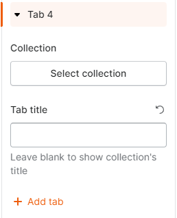
Content settings
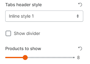
- Tabs header style:


- Divider: This option is available when the Tabs header style is Inline style 1.

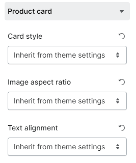
Product card settings
Device responsiveness
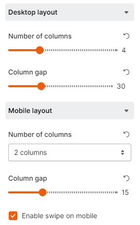
Desktop layout
- Number of columns per tab: between 1 and 12.
- Column gap: between 0 - 100px.
Mobile layout
- Number of columns: to display the products in 1 or 2 columns.
- Column gap (when the number of columns is set as 2 columns): between 0 - 50px.
- Swipe on mobile: when enabled, the number of columns you set earlier will no longer work.
Last updated