Scrolling promotion
A scrolling promotion section lets you display an eye-catching auto-scroll row of logos or images.
You will find it helpful in showcasing your promotions, brand lists, featured products, or any trust-boosting information.
In this article, we will show you how to add a Scrolling promotion section.
Steps:
- In the theme editor (Customize),> click Add section.
- Select Scrolling promotion.
- Make necessary changes.
- Save the settings.
#Section settings
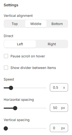
#Settings
This is where you can update scroll direction, pause scroll on hover, and adjust scroll speed, item gap on desktop, and item gap on mobile.
- Vertical alignment: Set how the text is aligned - Top/Middle/Bottom
- Direct: The scroll direction of the section - from left to right or vice versa.
- Pause scroll on hover: When hovering over the section, the scrolling stops.
- Show divider between items: Add borders between the section's blocks.
- Speed: The speed of the section when scrolling (0.1x to 3x).
- Horizontal spacing: The spacing between items in a section.
- Vertical spacing: The padding between the items and the section's container.
#Block settings
There are three block types can be added to this section:
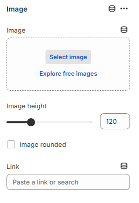
#Image
Add an Image to promote your vendor, brand, featured products, etc.
Adjust the Image height on the desktop between 20px and 400px.
Select the Image rounded checkbox if you want the image to have rounded borders.
Then, provide the image with a specific Link to the desired page where you want to direct customers when they click it.
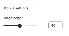
Additionally, you can change the Image height on the mobile device from 20px to 200px.
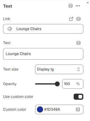
#Text
Add a text, link the text and adjust how it show on the section.
Last updated