
Theme Sections
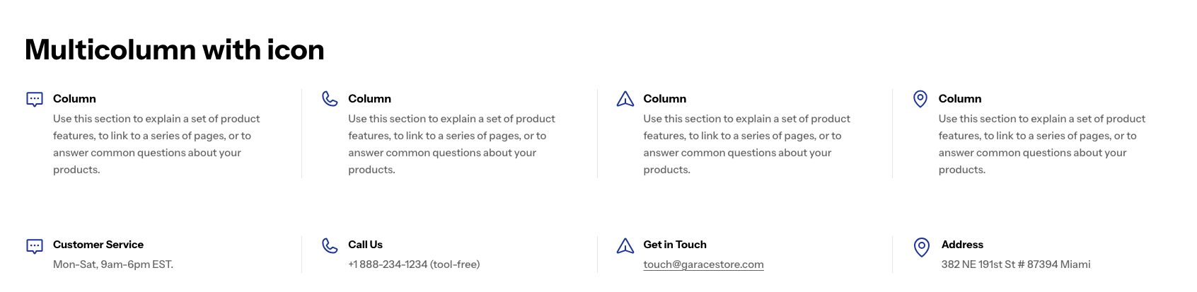
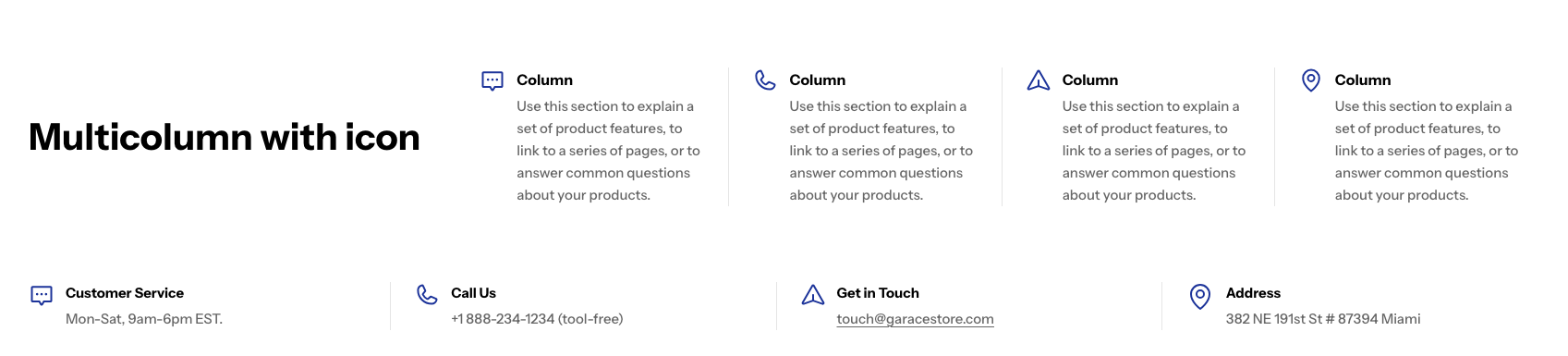
Multicolumn with icon
2 min read
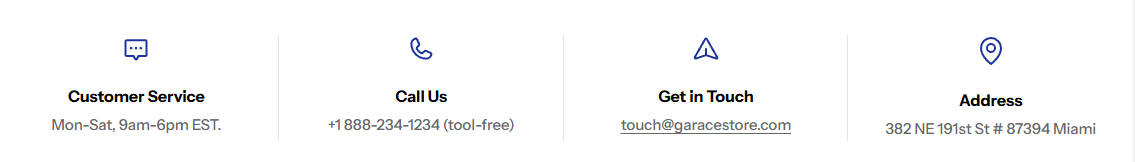
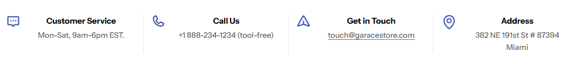
_jr5dM6tE.jpg)
How to add a Multicolumn with icon section to your Shopify store
- In the theme editor (Customize), click Add section
- Locate Multicolumn with icon section
- Make necessary changes
- Save.
How to edit a Multicolumn with icon section
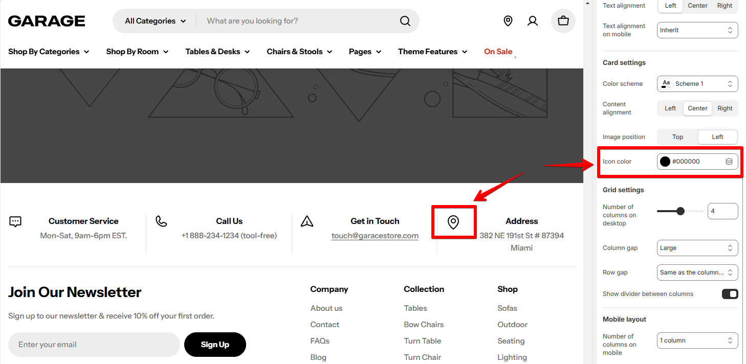
Section settings
Section header
- Layout: Choose the layout for desktop view (Vertical/Standing column)
Card settings
- Content alignment:

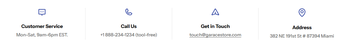
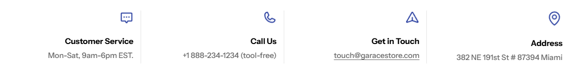
- Image position:
- Icon color:
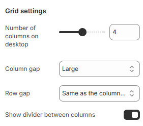
Grid settings
Mobile layout
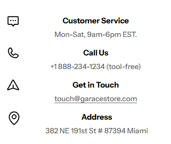
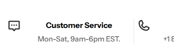
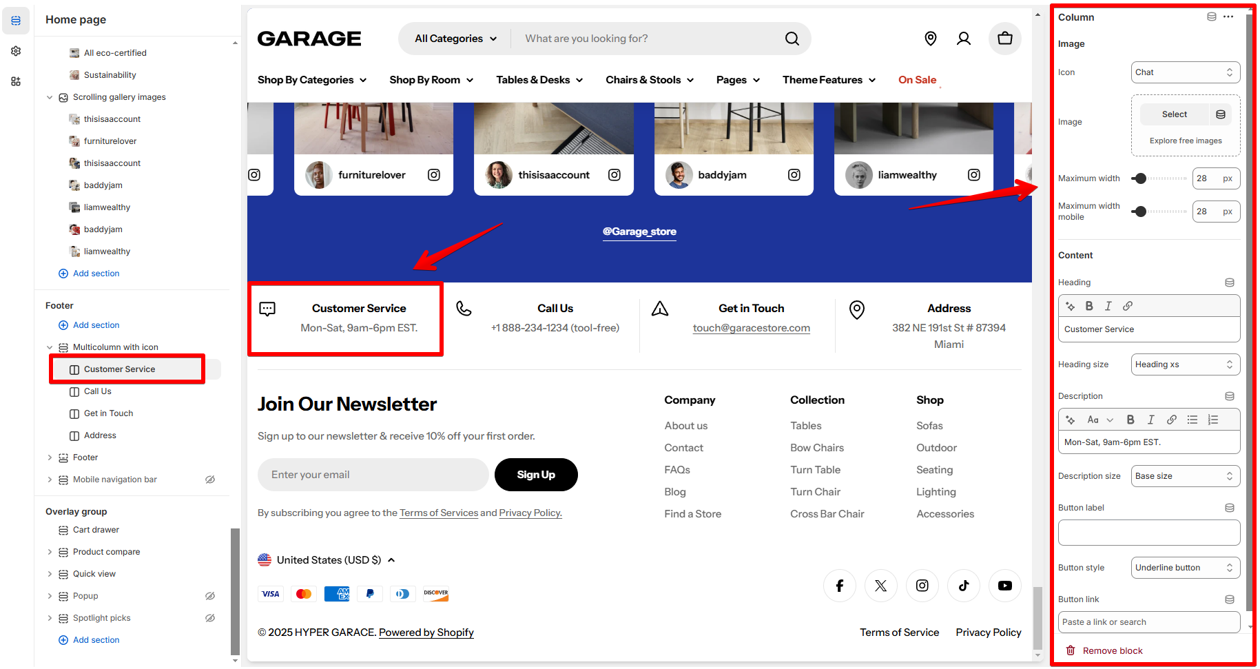
Block settings
- Choose an appropriate icon from the available options or upload an image.
- Maximum width: Set maximum with of the icon/image for mobile and desktop view separately.
- Card content
Last updated