
Pages Global Sections
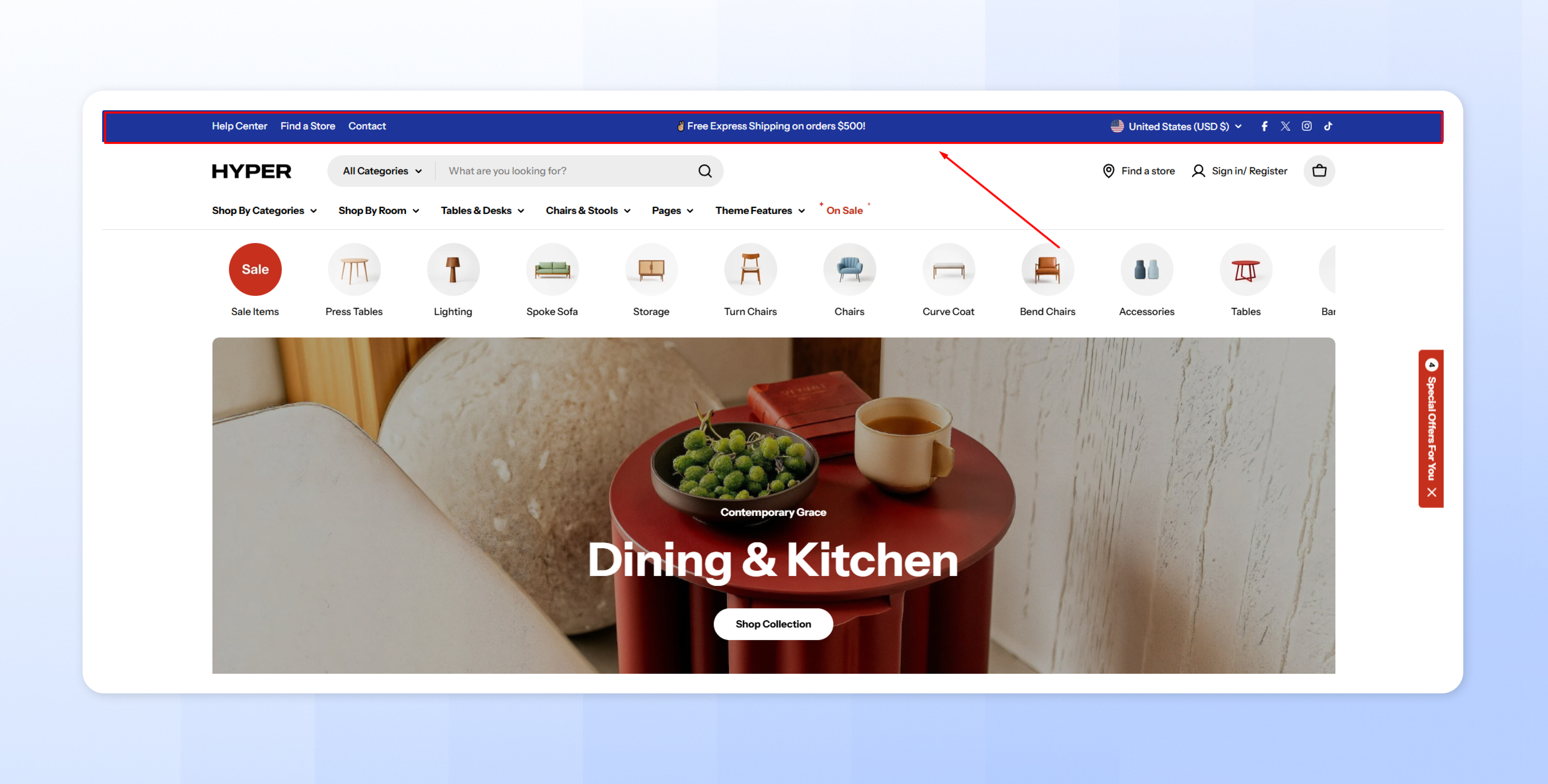
Top bar
3 min read
How to add a Top bar section to your Shopify store
- In the theme editor (Customize), navigate to the Header group and click Add section.
- Select the Top bar.
- Make necessary changes.
- Save the settings.
How to edit a Top bar section
Section settings
- Container width: Choose between Fixed width or Full width, depending on your store’s design.
- Color scheme: Select a color scheme that aligns with your branding. A contrast with the header color works best for visibility. See how to set up Colors: Colors
- Show separator line: Delineate the top bar from other sections with a separator line.
- Section padding: Adjust the top and bottom padding to control spacing around the Top Bar.
Block settings
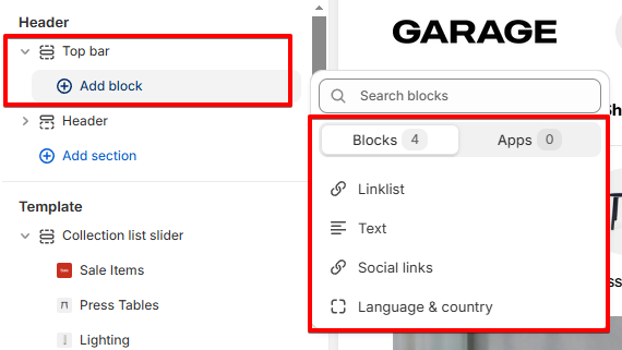
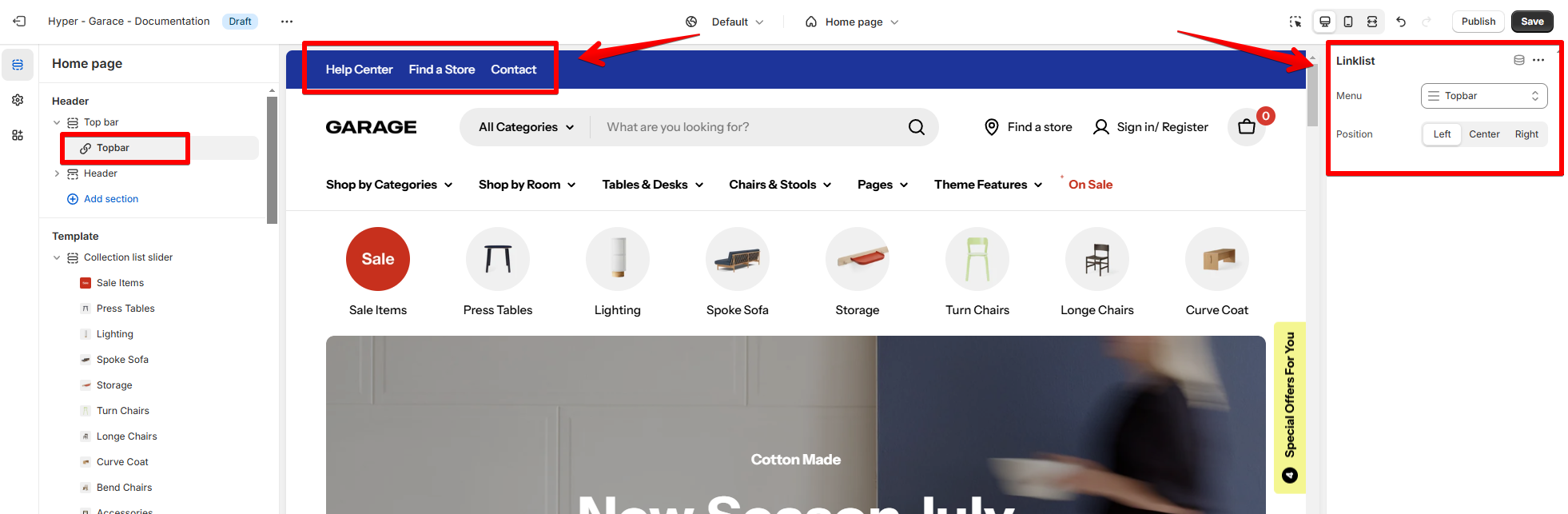
- Menu: Select a menu from your Shopify to display in the Top Bar.
- Position: Choose to align the menu Left, Center, or Right within the Top Bar.
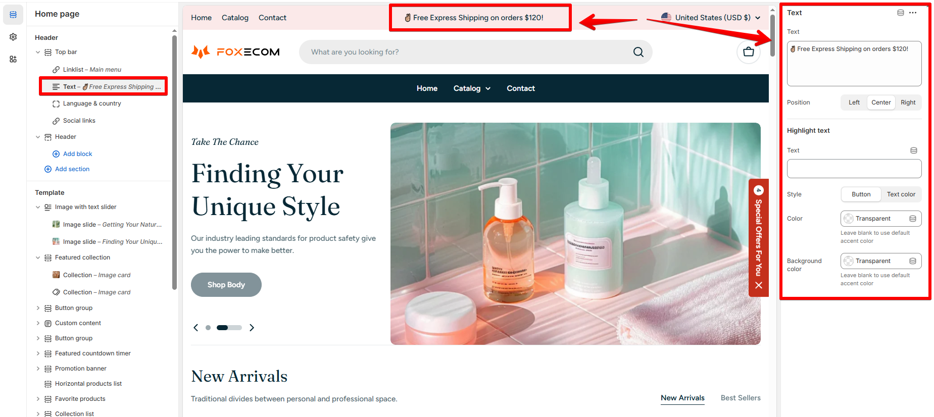
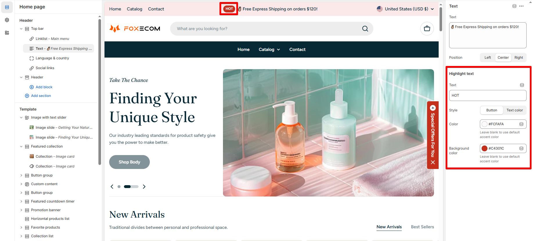
- Text: Add a short message like "🚚 Free Express Shipping on Orders Over $50!" or "📞 Contact us for bulk orders!"
- Position: Align the text Left, Center, or Right.
- Highlight text: Include a highlighted text in button style or different color.
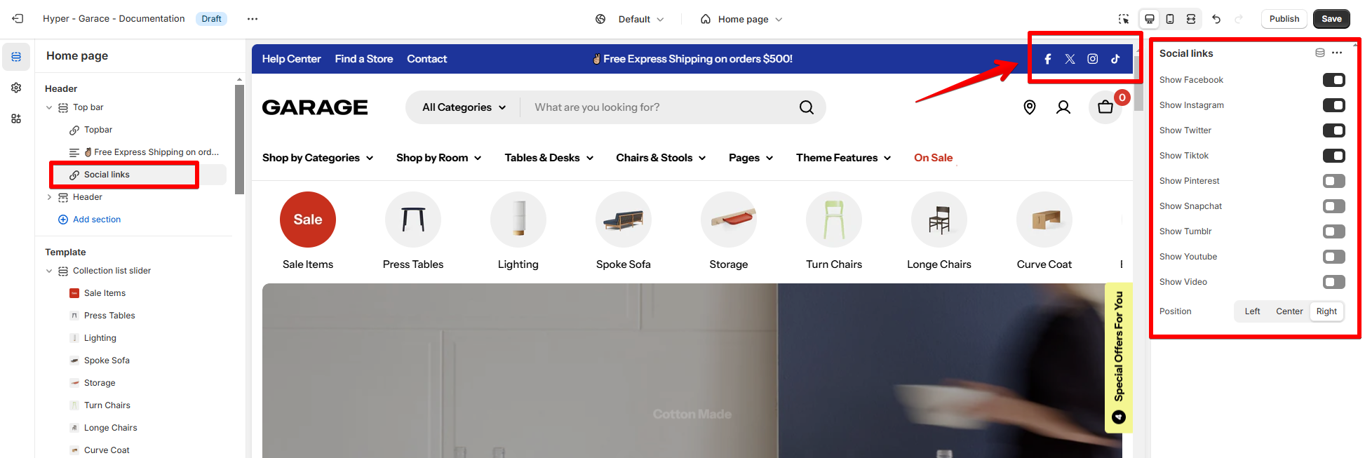
- Enable/Disable social platforms: Toggle options for platforms like Facebook, Instagram, Twitter, TikTok, and more.
- Position: Align the icons to the Left, Center, or Right.
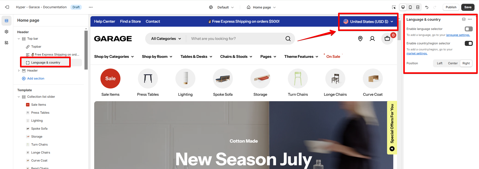
- Enable language selector: Toggle this on to display a dropdown for selecting a language.
Use Language selector
- Enable country/region selector: Toggle this on to let customers choose their country or region.
Use Country/ Region selector
- Position: Align the selectors Left, Center, or Right.
Last updated