
Theme Settings
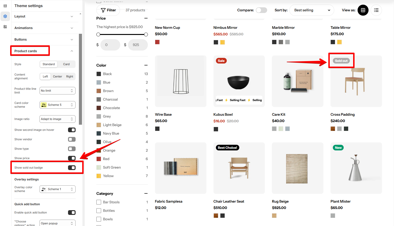
Product cards
3 min read
_mLFrDk2d.jpg)
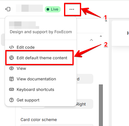
- In the theme editor (Customize), click Theme settings.
- Locate Product cards.
- Make necessary changes.
- Save.
Product cards
- Style: Choose the style for product cards as Standard/Card.
- Content alignment: Define the alignment of the text and elements on each product card as Left/Center/Right.
- Card color scheme: Set the color scheme for product cards. You can edit the colors in Theme Settings > Colors. Learn more Colors
- Image ratio: Adjust the aspect ratio of the product images to fit your preference.
- Adapt to image
- Square (1:1)
- Portrait (3:4)
- Landscape (4:3)
- Show the second image on hover: Enable this to show the second product image when a customer hovers over a product card.
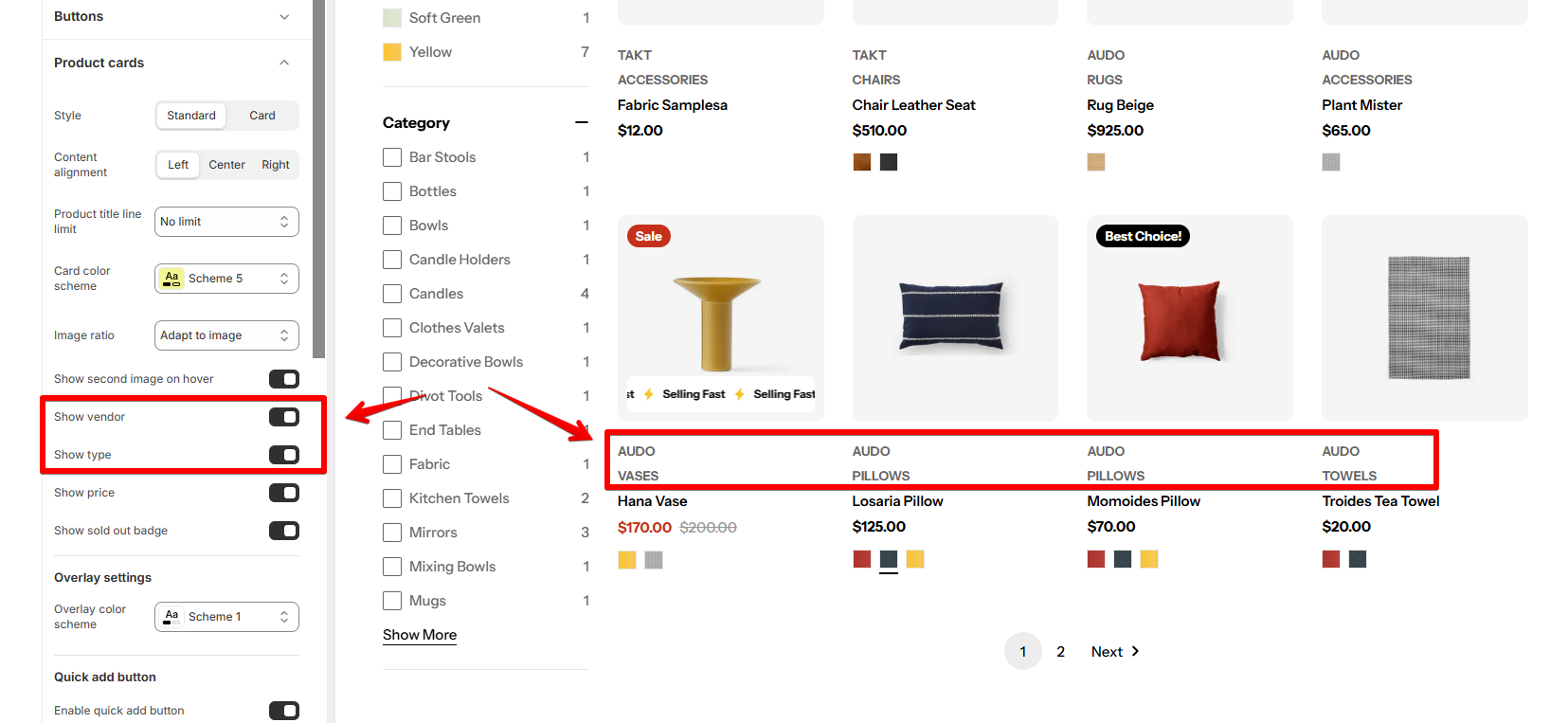
- Show vendor: Display the vendor name on the product card.
- Show type: Show the product type on the card.
- Show price: Toggle the option to hide/show prices in the product cards.
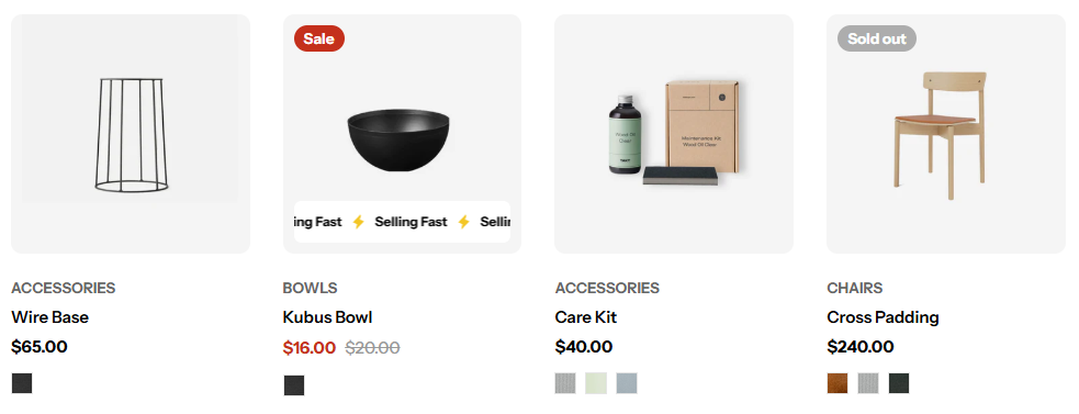
- Show sold out badge: Display a "Sold Out" badge on out-of-stock products.
See Badges
Quick add & Quick view button
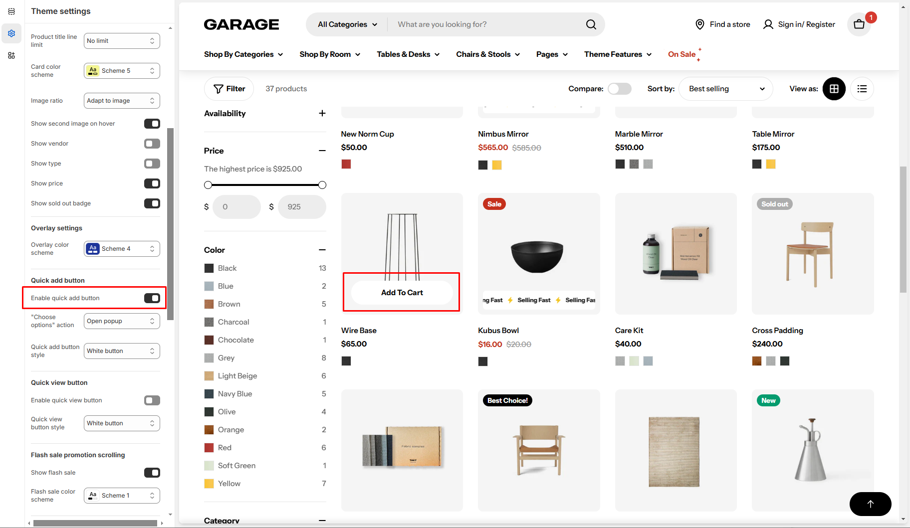
- Quick add button: Let customers add items to their cart without visiting the product page (only for products without variants).
- "Choose options" action:
- Open popup: Open a Quick View popup with the detailed product information.
- Go to product page.
- Quick view button: Allow customers to preview product details in a quick view modal without leaving the page.
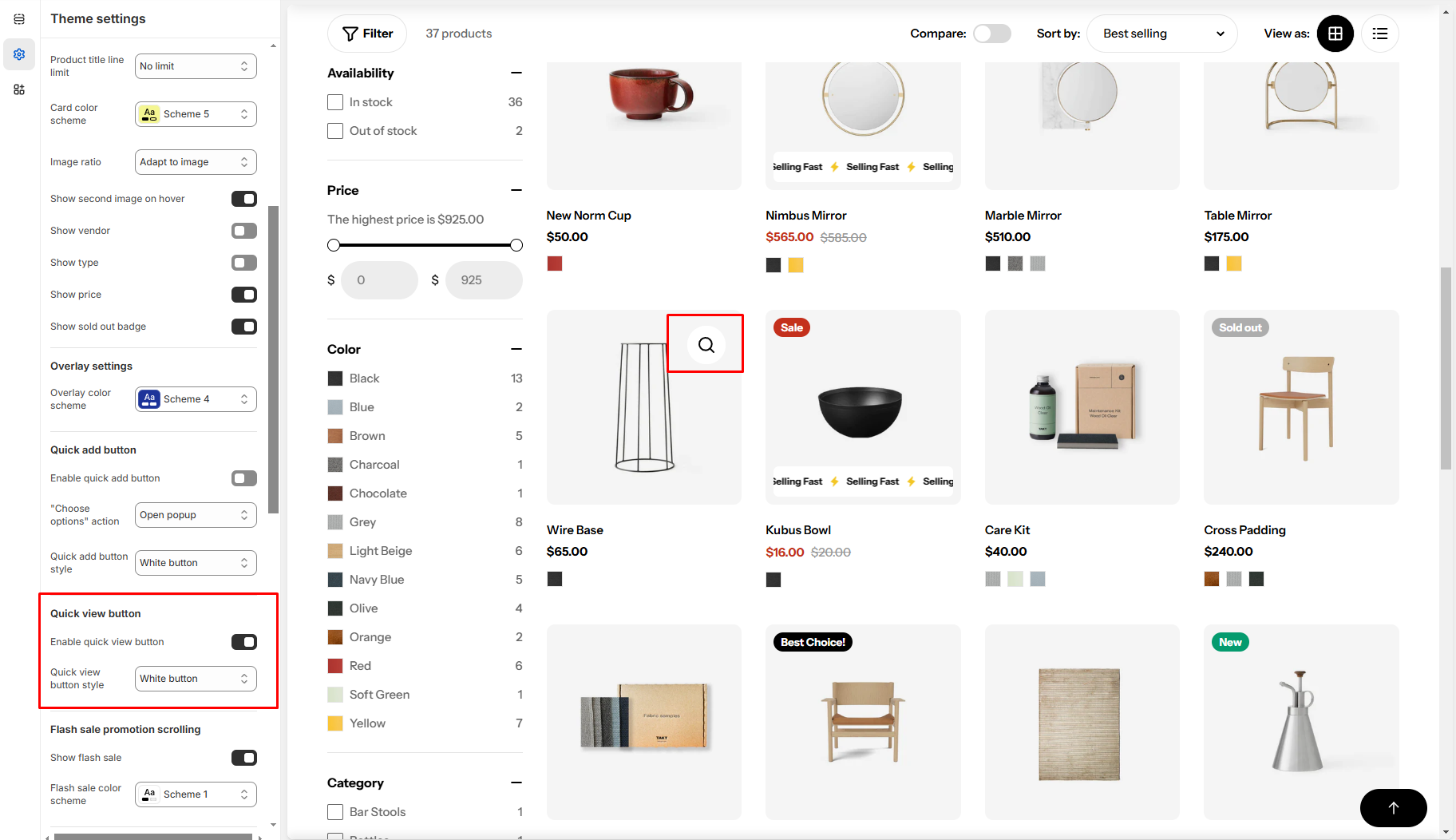
To customize your Quick view, see Quick view
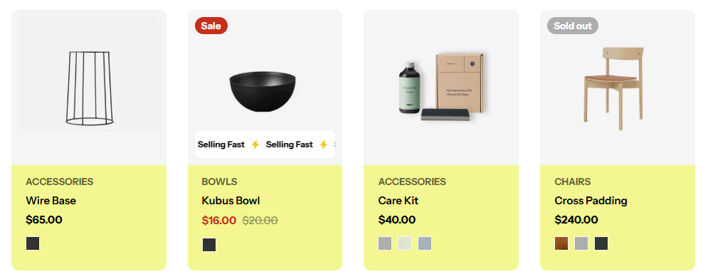
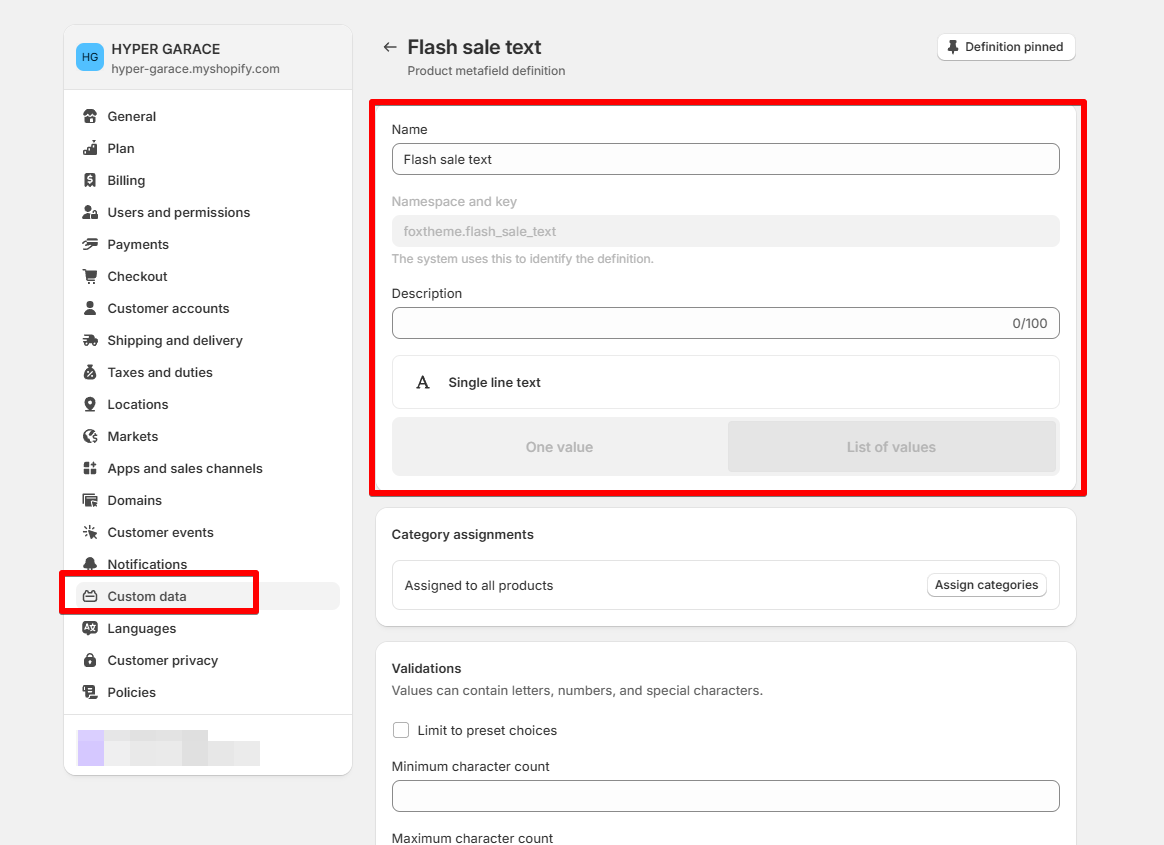
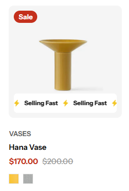
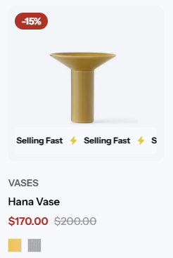
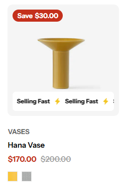
Flash sale promotion scrolling
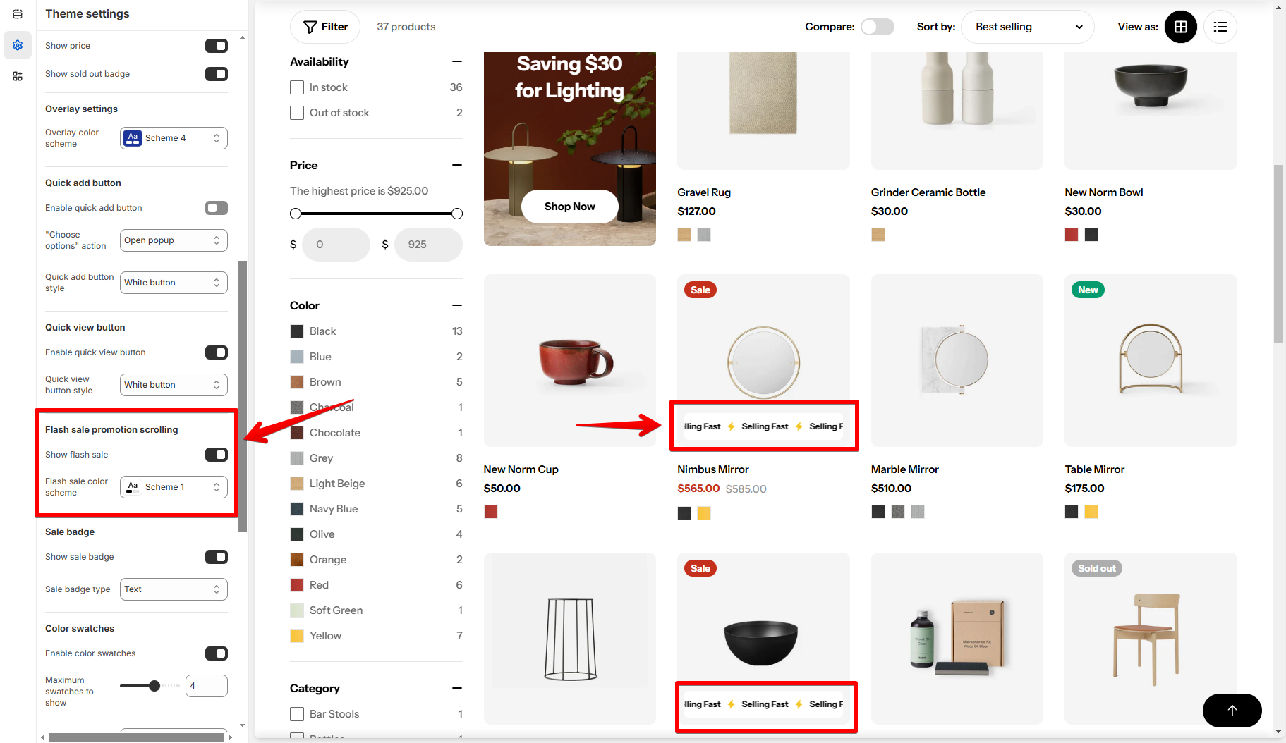
- To set this up, you need to create a Product metafield definition with the following settings:
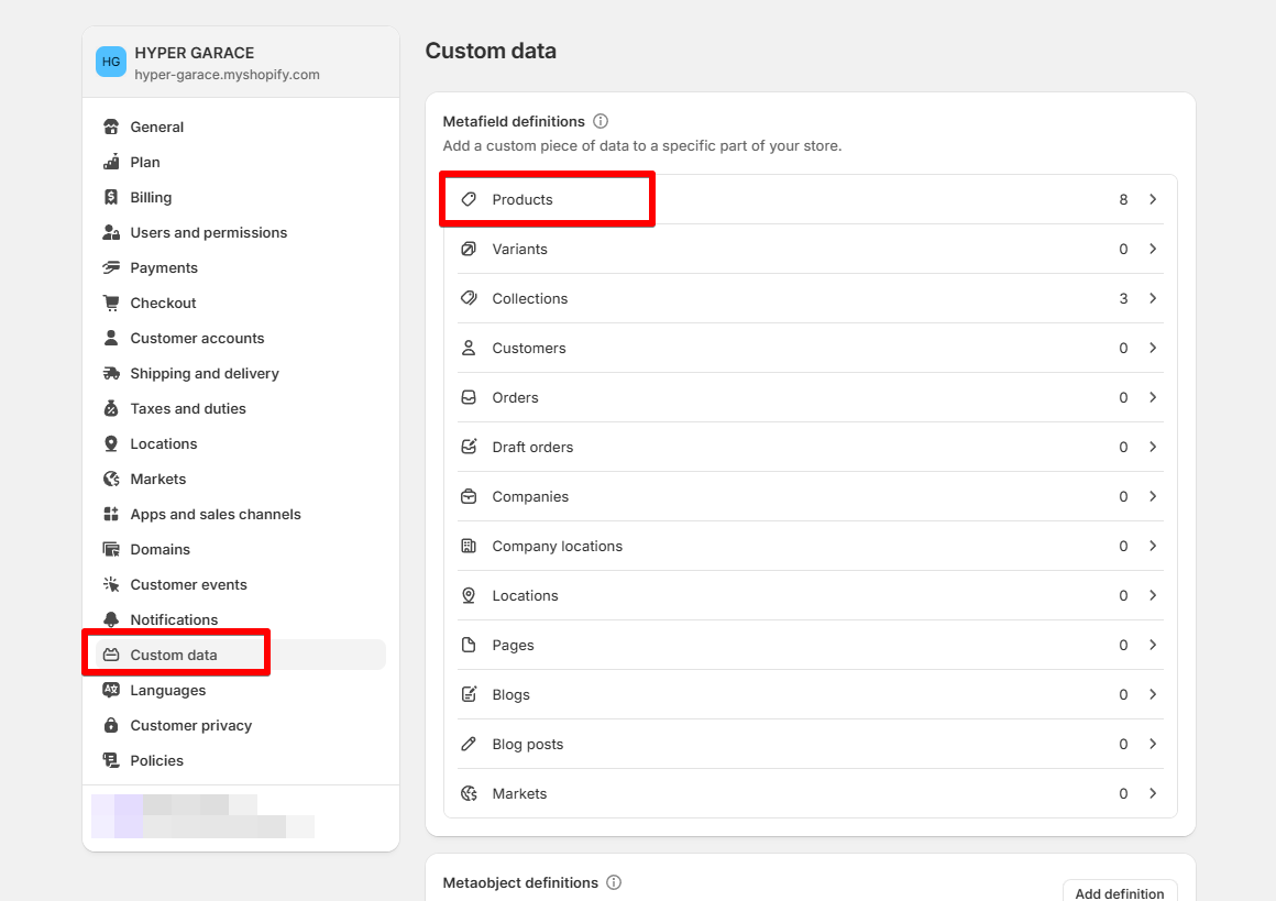
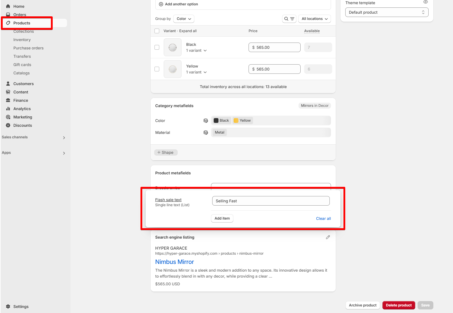
- Once done, go to Shopify Products and select the product you want to show the flash sale promotion scrolling on, and enter the label for it.
Sale badge
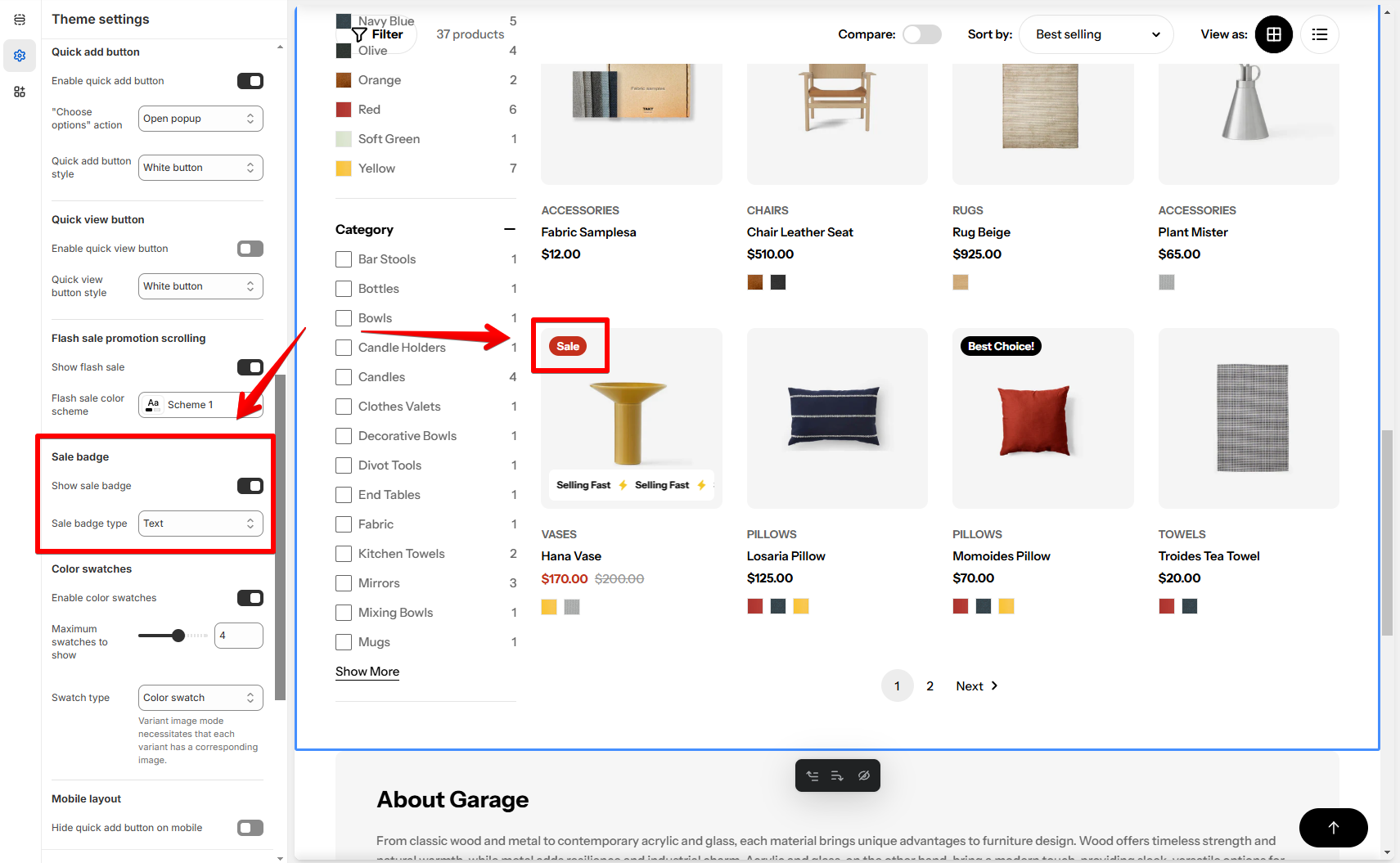
- Show sale badge: Display a sale badge for products with a discount (Compare-at price).
- Sale badge type: Choose the badge type (Text, Percentage, or Fixed amount).
Color swatches
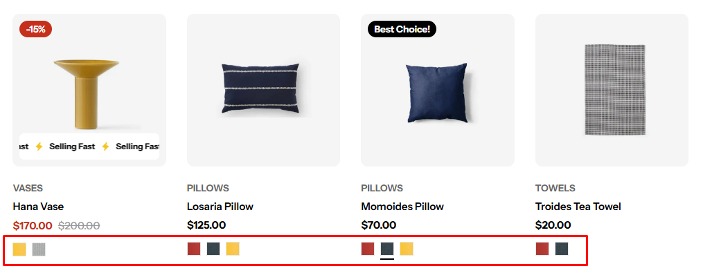
Make sure you have entered your Color swatch trigger in Theme settings > Color swatches
- Set the number of maximum swatches to show in the product cards: between 1-6.
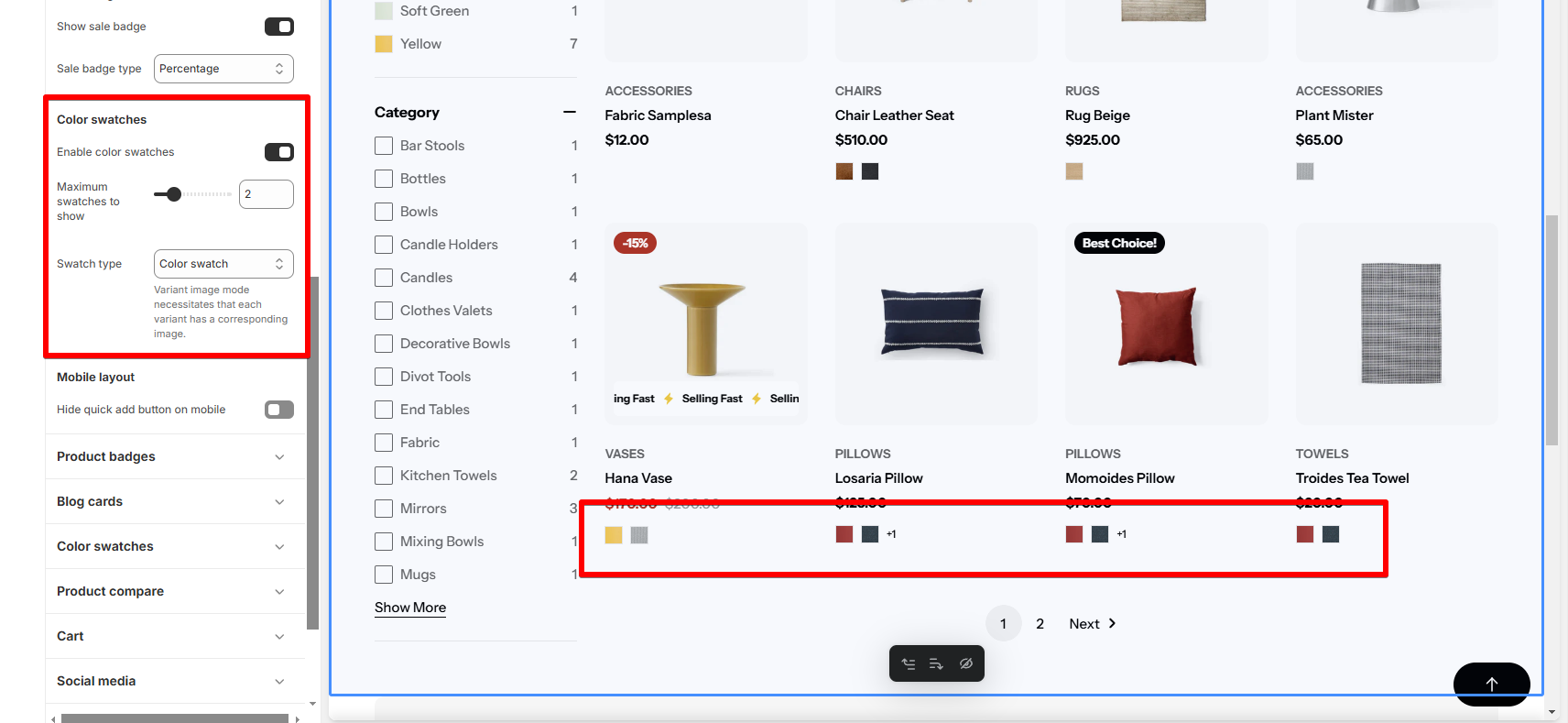
- Swatch type: Choose between Color swatch or Variant image (each variant must have a corresponding image).
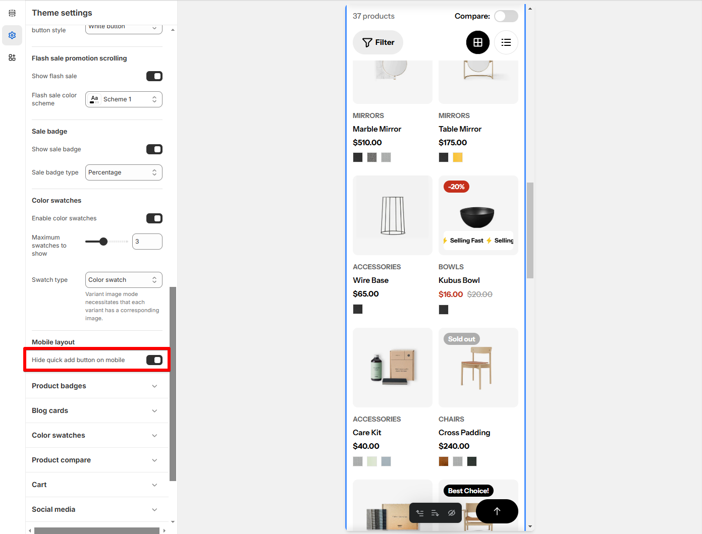
Mobile layout
- Hide Quick add button on mobile: Hide the quick add button for mobile views to streamline the mobile shopping experience.

Last updated