
Theme Sections
Testimonials masonry
2 min read
_ed2L4quU.jpg)
How to add a Testimonials masonry section to your Shopify store
- In the theme editor (Customize), click Add section.
- Locate Testimonials masonry.
- Make necessary changes.
- Save.
How to edit a Testimonials masonry section
Section settings
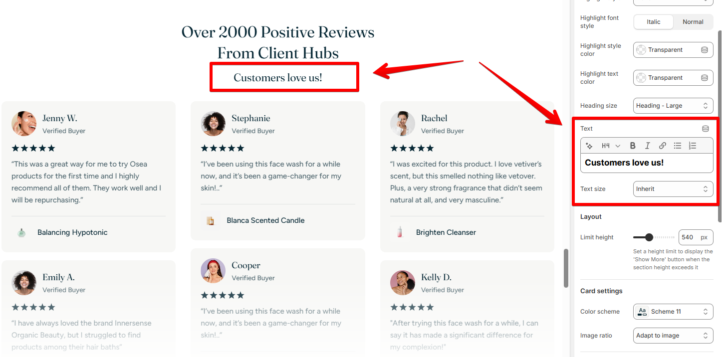
Section header
- Text alignment: Align the section header on desktop and mobile view separately.
- Heading & subheading: Add an optional subheading and title for the section.
👀 You might be interested: Add Highlighted text to your Headings
- Text: Add description to the section header
- Text size: Small/ Base size/ Large/ Inherit
- Go to Theme settings > Typography to change the store's Base size.
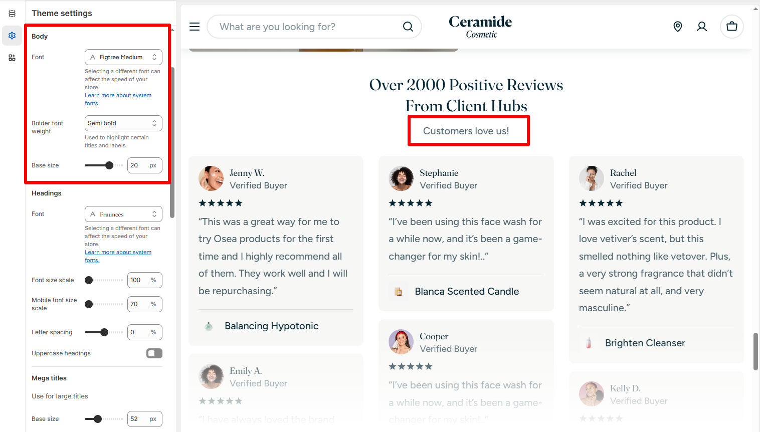
- Select Inherit to apply your rich text editor setting for the text.
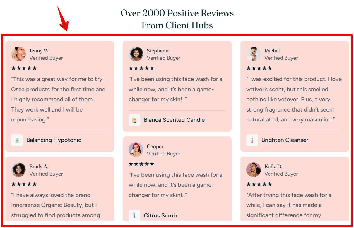
Layout settings
- Limit height: Set a height limit to enable a 'Show More' button.
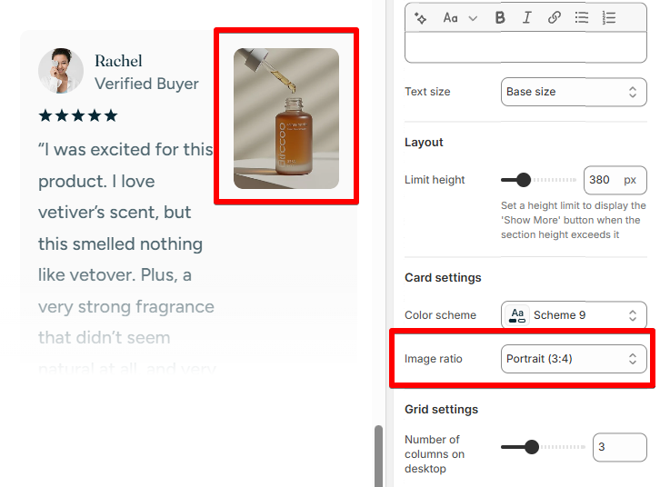
Cart settings
- Color scheme: Select a set of colors you want to use for your testimonial cards.
Colors
- Image ratio: Control how testimonial images display — set fixed ratios (e.g. 1:1) or allow them to adapt naturally.
Grid settings
- Number of columns on desktop: Control how many testimonials are shown in a row (between 2-5).
- Column gap and Row gap: Adjust space between column and row.
Mobile layout
- Enable swipe on mobile: When on, testimonials display in a horizontal scroll format, great for touch-friendly browsing.
- When off, testimonials stack vertically like a traditional grid.
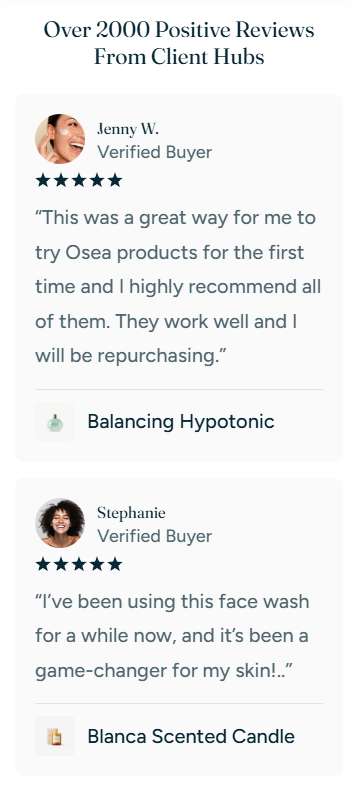
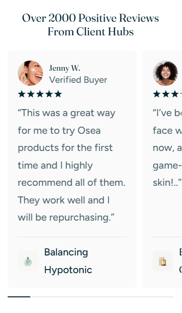
Block settings
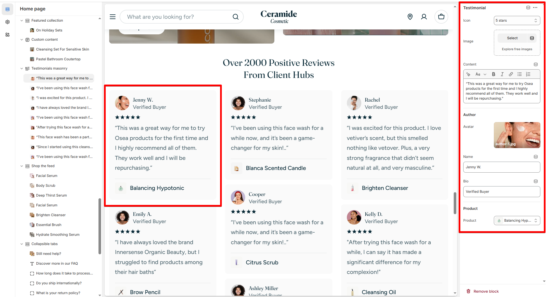
- Icon: Choose to display 1-5 stars symbol or not.
- Image: Upload an image to support the review visually.
- Content: The main review text written by customer.
- Author:
- Avatar: Customer photo.
- Name: Author name.
- Bio: Optional label like 'Verified buyer'.
- Product: Link the testimonial to a product in your store. Great for social proof and product trust.
Best practices
Last updated