
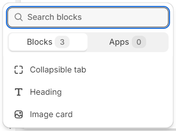
Theme Sections
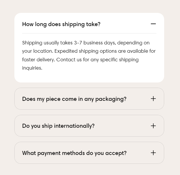
Collapsible tabs
3 min read
_njBFluvX.jpg)
How to add a Collapsible tabs section to your Shopify store
- In the theme editor (Customize), click Add section.
- Select Collapsible tabs.
- Make necessary changes.
- Save the settings.
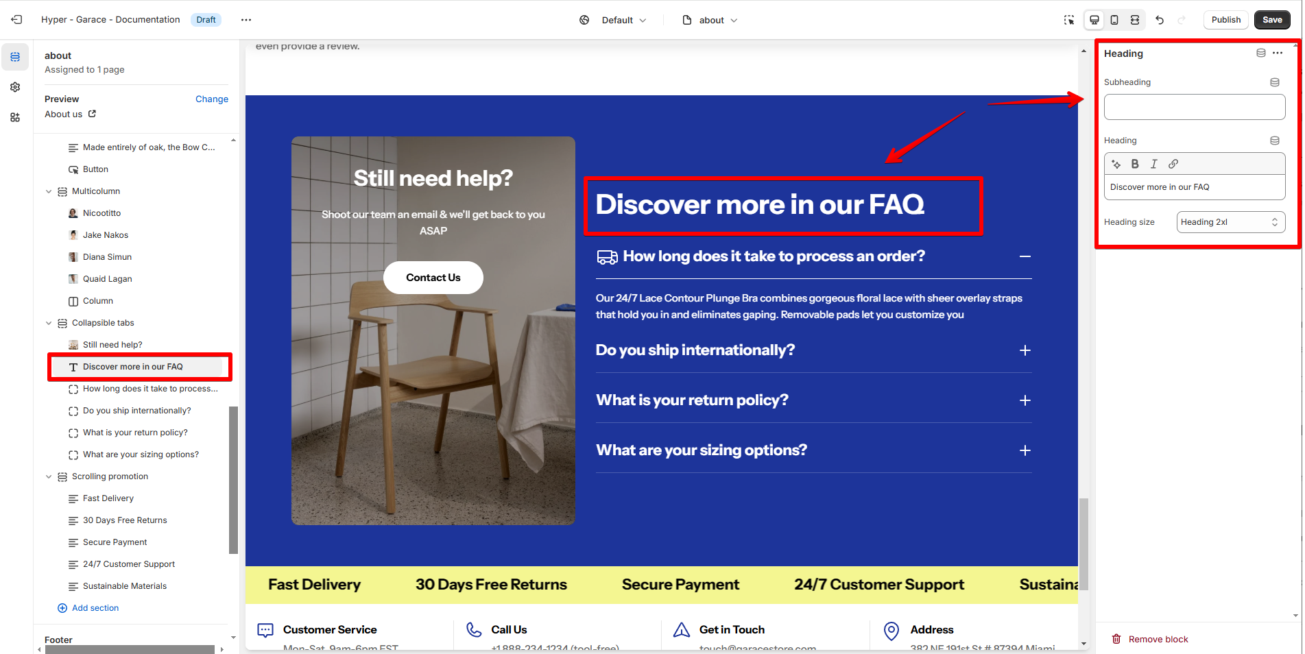
How to edit a Collapsible tabs section
Section settings
Section header
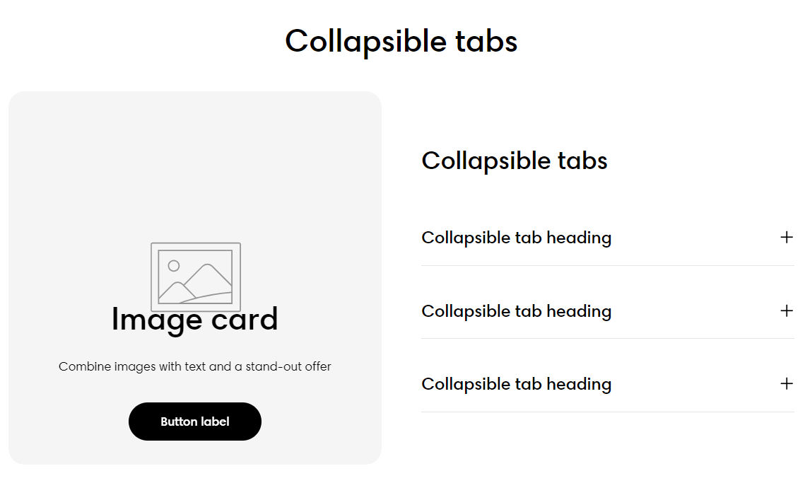
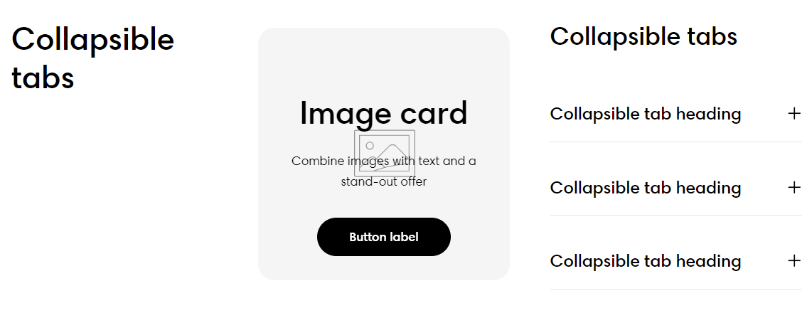
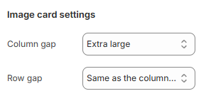
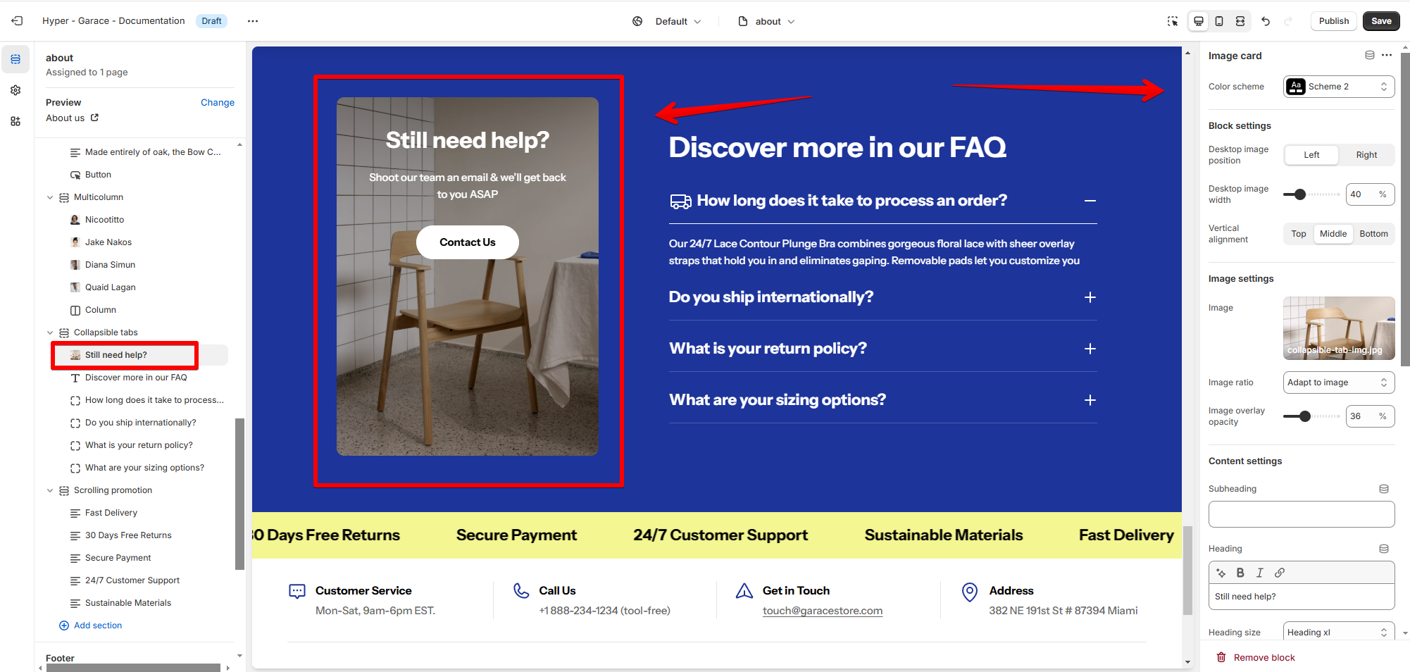
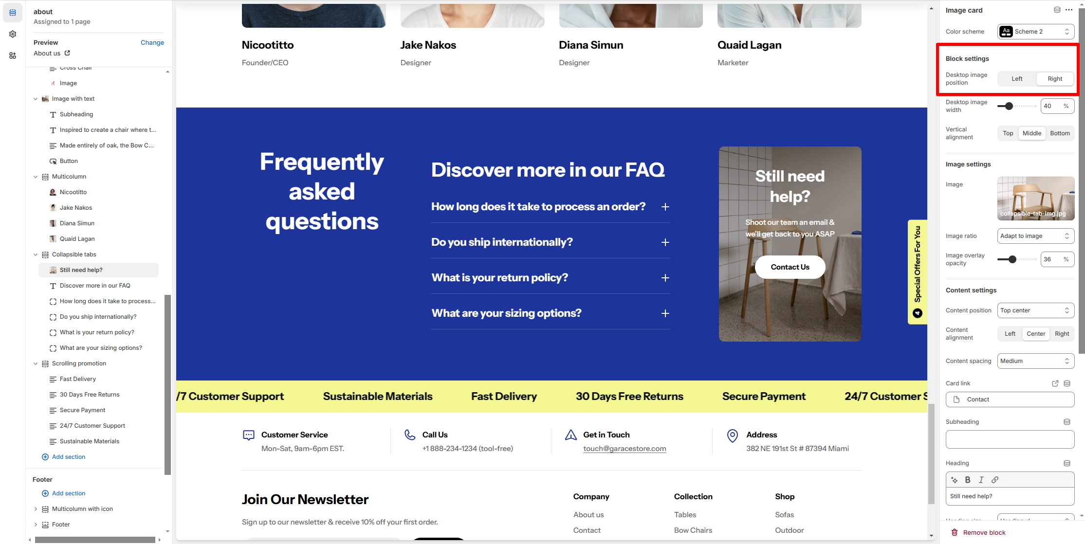
Image card settings
Collapsible tab settings
Block settings
You can add more blocks to the collapsible tabs (Collapsible tab/ Heading/ Image card).
Heading
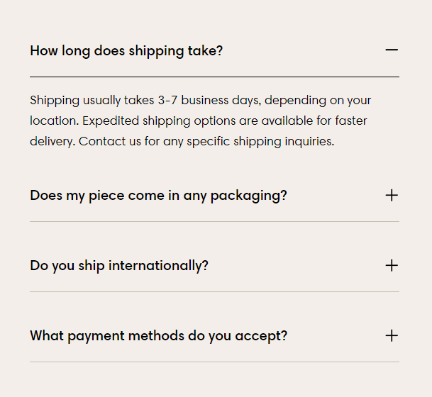
Collapsible tab
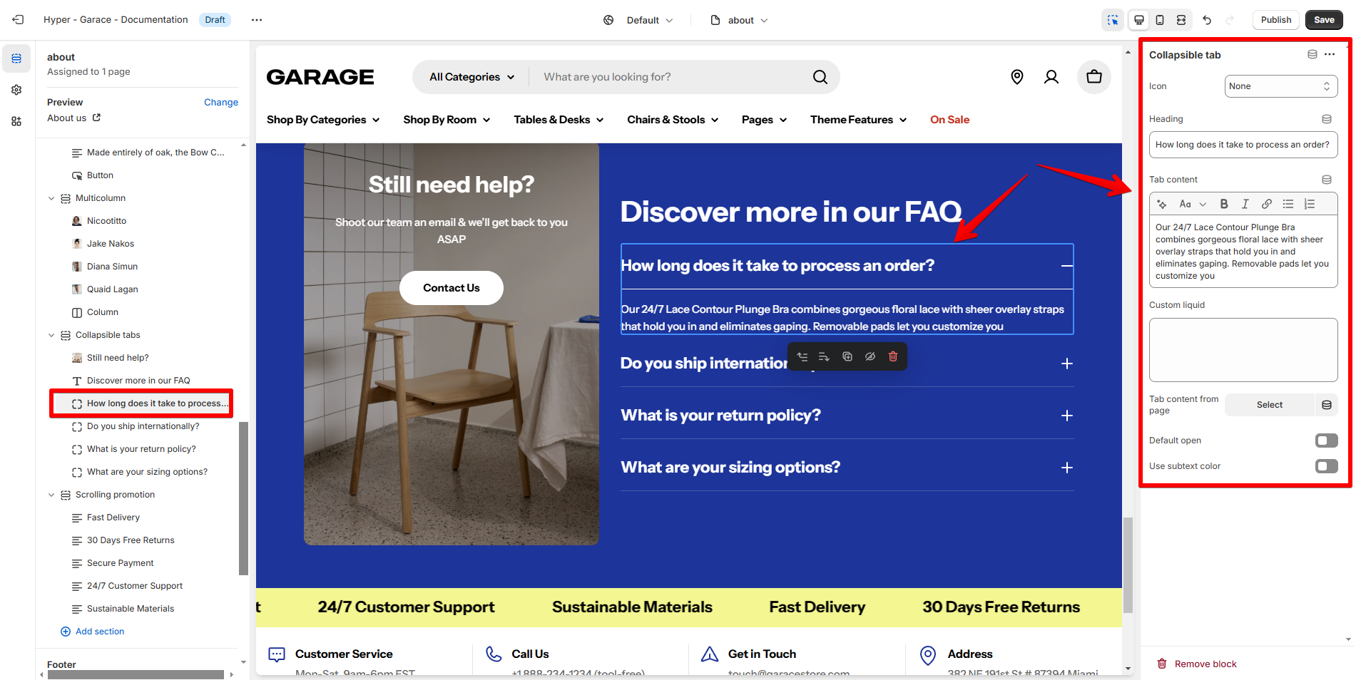
- Icon: Add a visual cue next to the tab heading for better clarity or emphasis.
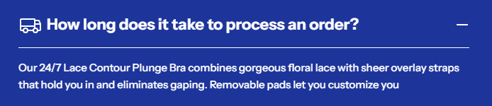
- Heading: Enter a clear and concise title for the tab in the Heading field.
- Tab content: Enter text, links, or formatted content into the Tab Content editor. Use the formatting options (e.g., bold, italic, lists) to structure the content for readability.
- Custom liquid: For advanced customization, add Liquid code to display dynamic content.
- Tab content from page: Dynamically populate the tab content by linking it to a specific Shopify page.
- Default open: Toggle Default Open to make the tab open when the page loads.
- Use subtext color: Apply a subtext color to the tab content to match your theme’s style.
Image card
Last updated