
Theme Sections
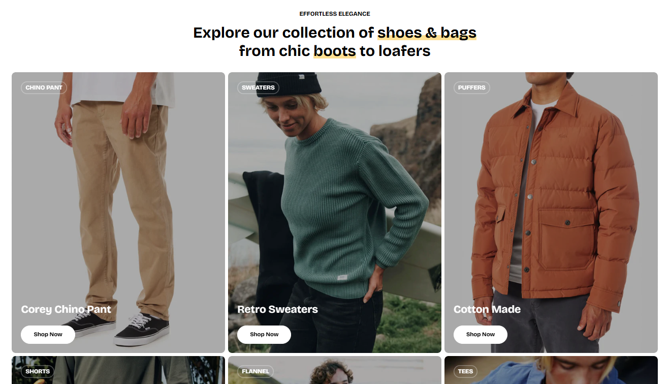
Image cards 🔥
4 min read
_vzbuTzmT.jpg)
See: Changelog
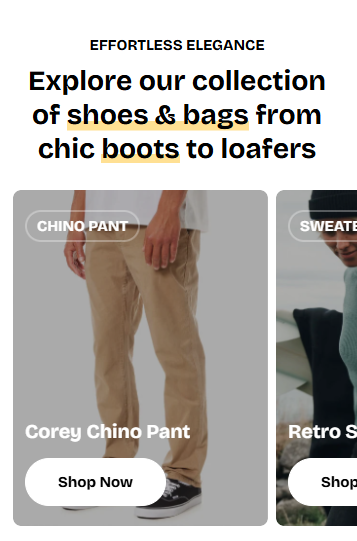
How to add an Image cards section to your Shopify store
- In the theme editor (Customize) > click Add section
- Select Image cards.
- Make necessary changes.
- Save.
How to edit an Image cards section
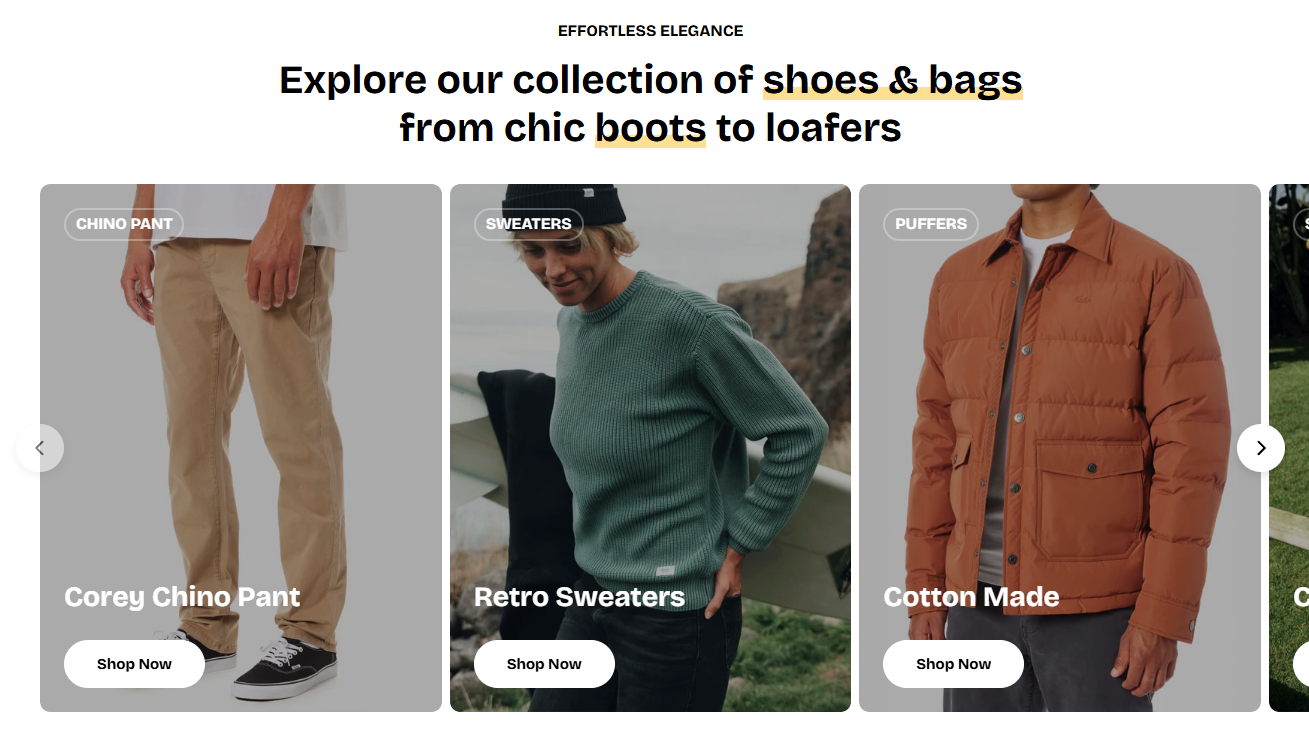
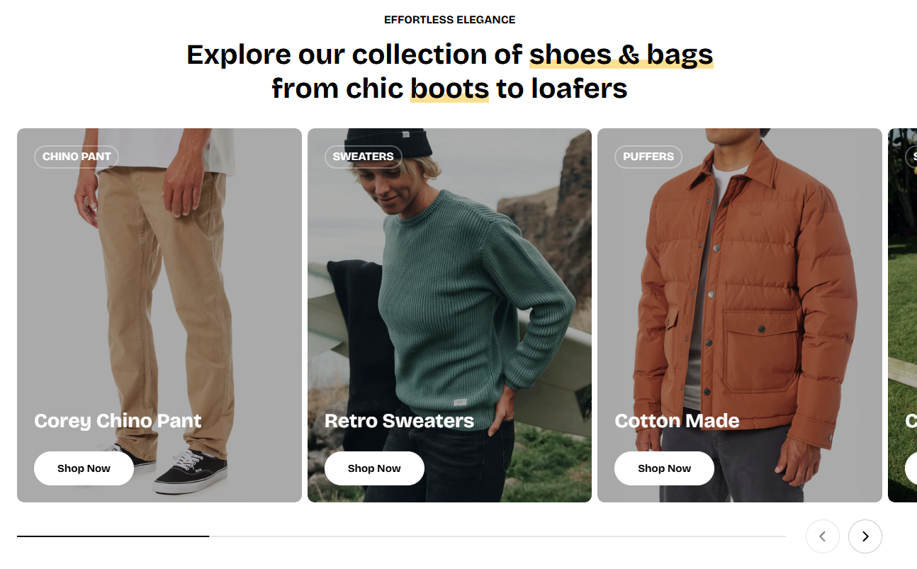
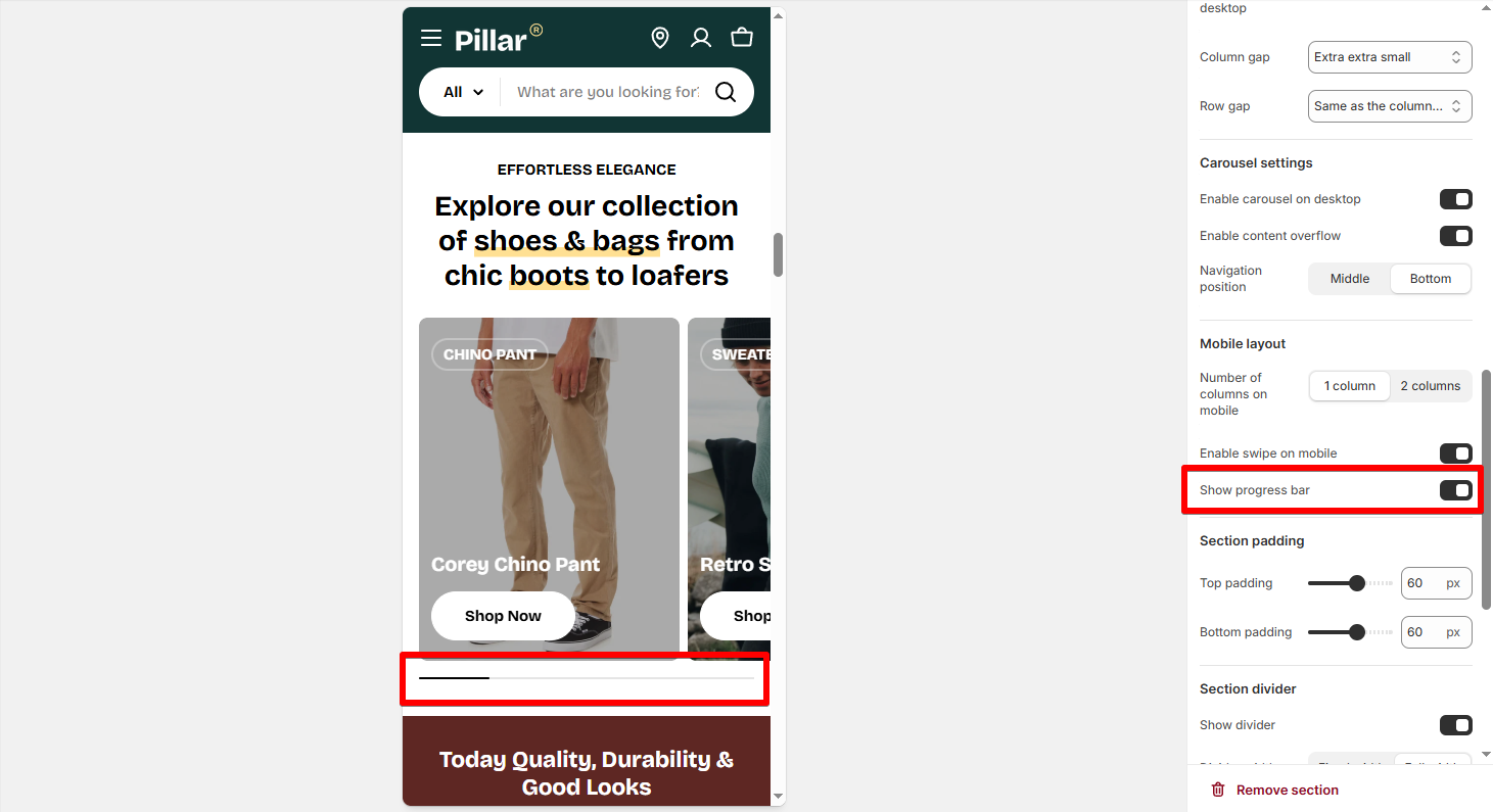
Section settings
- Number of columns on desktop: Choose between 2-6 columns on desktop.
- Control the Column gap and Row gap.
- Enable carousel on desktop: Turn this on to display cards in a horizontal slider format with arrows for navigation.
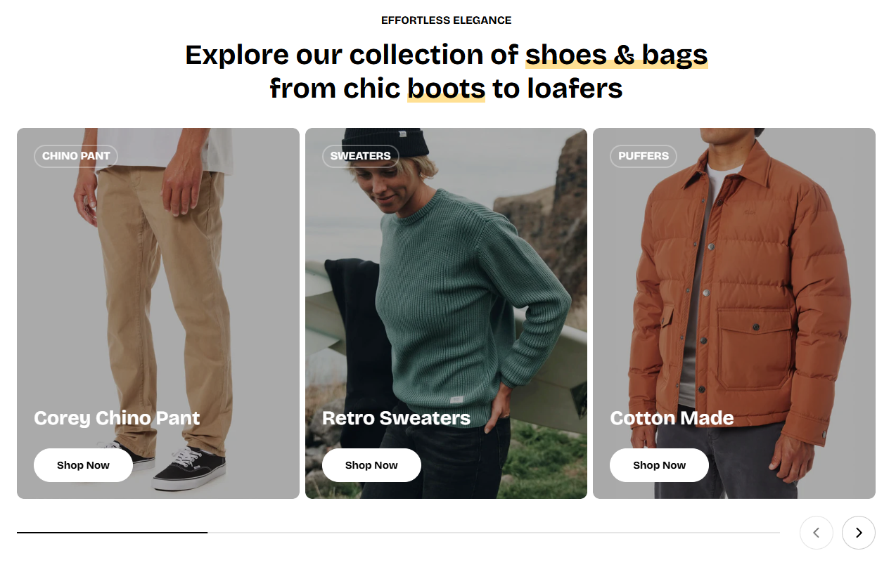
- Enable content overflow: Allows part of the next card to peek into view, giving a swipe-preview effect.

-
- Middle:
- Bottom:
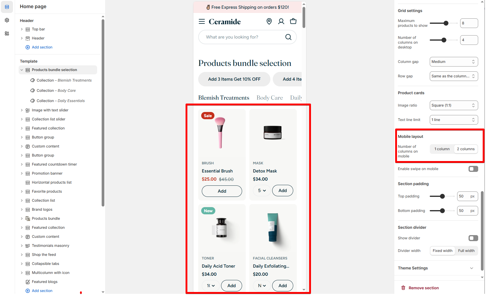
- Number of columns on mobile: Choose between
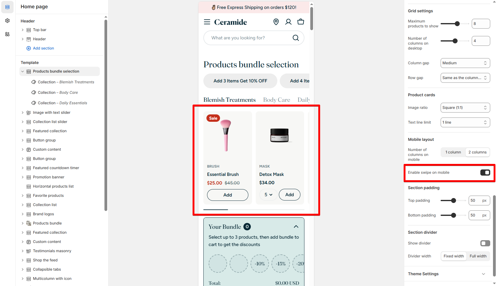
1 columnor2 columnsstacked vertically. - Enable swipe on mobile: Turn on for a smooth horizontal scroll experience on touch devices.
- Show progress bar: Display a progress indicator for carousels to show users how many slides remain.
- Number of columns on mobile: Choose 1 or 2 product cards per row.
- Enable swipe on mobile: Toggle ON to allow horizontal swiping for a smoother user experience.
Block settings
-
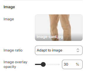
Adapt to image: Maintains the original image ratio.Square,Portrait,Landscape: Crop the image to a fixed ratio for uniformity.
-
0%= No overlay100%= Fully opaque (black cover)
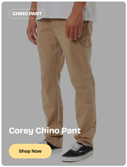
- Content position: Determine where the text/button appears inside the card.
- Standard:
Top left,Middle center,Bottom right, etc. - Split layout options:
Top subheading,Bottom button,Middle contentallow for more control. - Below image: Display the content under the image.
- Standard:
- Content alignment: Control text and button alignment (
Left,Center, orRight) relative to the content position. - Content spacing: Adjust the internal padding of the content (e.g.,
Extra small,Medium,Large). Useful for cards with more or less text. - Content gap: Control the spacing between elements like tag, heading, and button.
- Card link: Choose where the entire card and the button should lead: a product, collection, or page. Clicking anywhere on the card will navigate to this link.
- Show badge: Toggle ON to display a promotional badge (e.g., “Save 20%”, “New”).
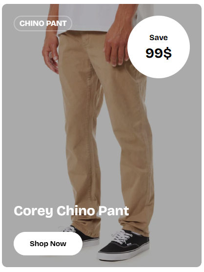
- Color scheme: Choose a color preset for the badge's label and background that contrasts well with the image background.
- Shape:
Circle– Best for prices or short attention-grabbing text.Square– Great for labels or rectangular highlights.
- Position: Select from corners like
Top right,Bottom left, etc. - Subtext: Add a smaller caption above the main badge text (e.g., “Save”).
- Text: The main value or highlight (e.g., “99$”, “New”).
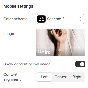
- Color scheme: Select a different color preset specifically for mobile view. This is useful if the mobile image or background needs higher contrast for readability.
- Image (Mobile specific): Upload a mobile-optimized image (e.g., vertically cropped or simplified).
If provided, this image will replace the desktop version on mobile devices.
- Show content below image: Toggle this ON to move card content (heading, button) underneath the image rather than overlaying it.
Ideal for clean layouts or when text overlaps key parts of the image. - Content alignment: Choose how the mobile text and button are aligned:
LeftCenterRight
Last updated