
Theme Sections
Multiple product bundles 🔥
3 min read
_tcpqn3YN.jpg)
_re2qnWzY.jpg)
See: Changelog
What this section does
- Add one introductory image card (optional).
- Add multiple bundle blocks, each featuring up to 5 products.
- Let customers add full bundles to cart in one click.
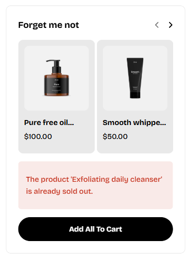
- Display a sold-out warning if any product in a bundle is unavailable.
See Shopify’s guide here → Create Discounts
How to add a Multiple product bundles section to your Shopify store
- In the theme editor (Customize) > click Add section
- Select Multiple product bundles.
- Make necessary changes.
- Save.
How to edit a Multiple product bundles section
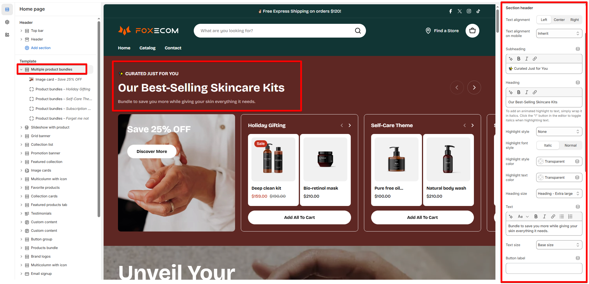
Section settings
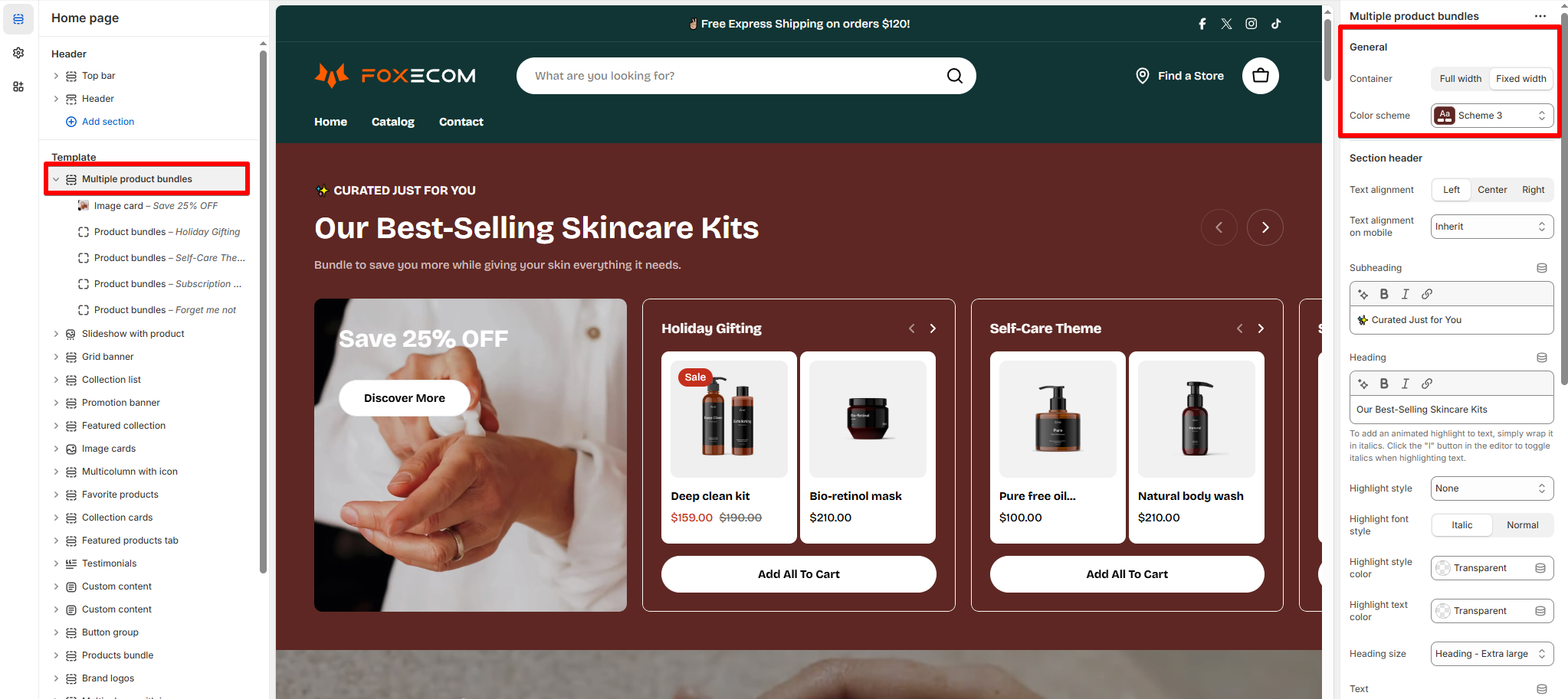
- Container:
Full widthorFixed widthlayout - Color scheme: Choose color preset for the section. This will affect the background, text, and button colors.
- Learn more: Colors
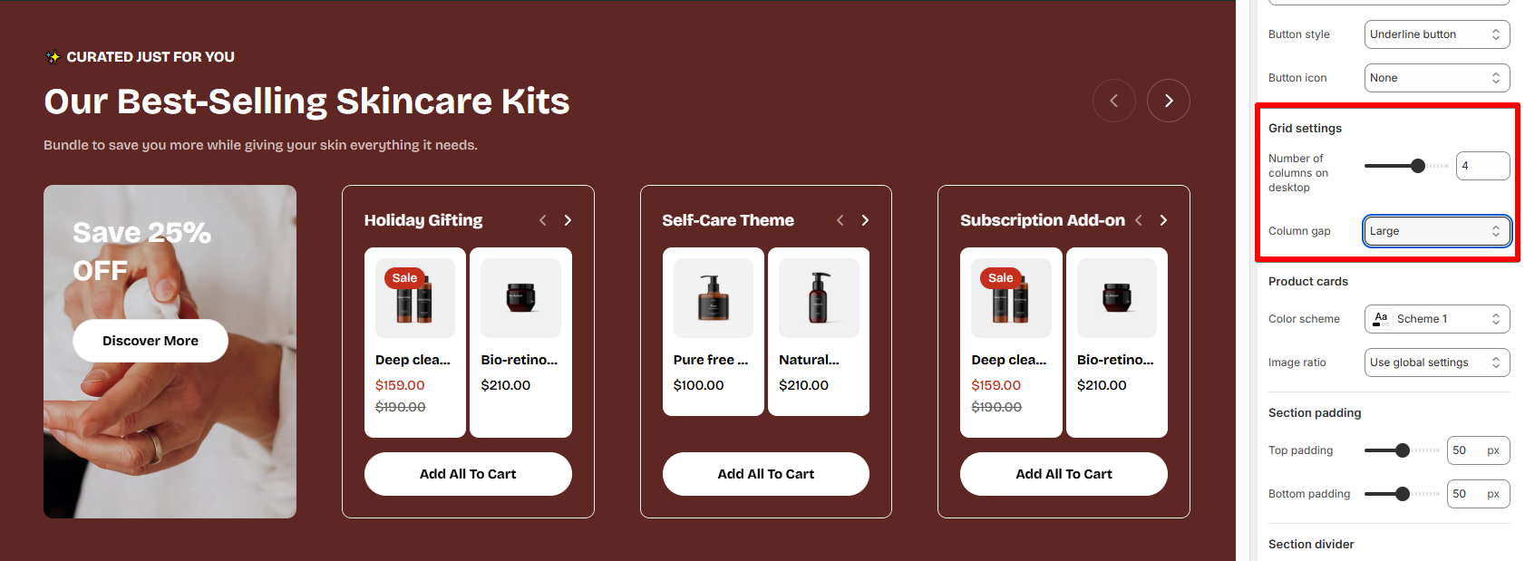
- Number of columns on desktop: 2–5 block columns on desktop.
- Column gap: Adjust spacing between blocks.
- Color scheme: Select a color preset used for the product cards.
- Image ratio: Set the ratio of the product cards' images.
Block settings
- Image card – Visual hook at the start of the section.
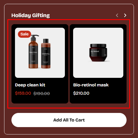
- Product bundles – Each block = one bundle of 2–5 products.
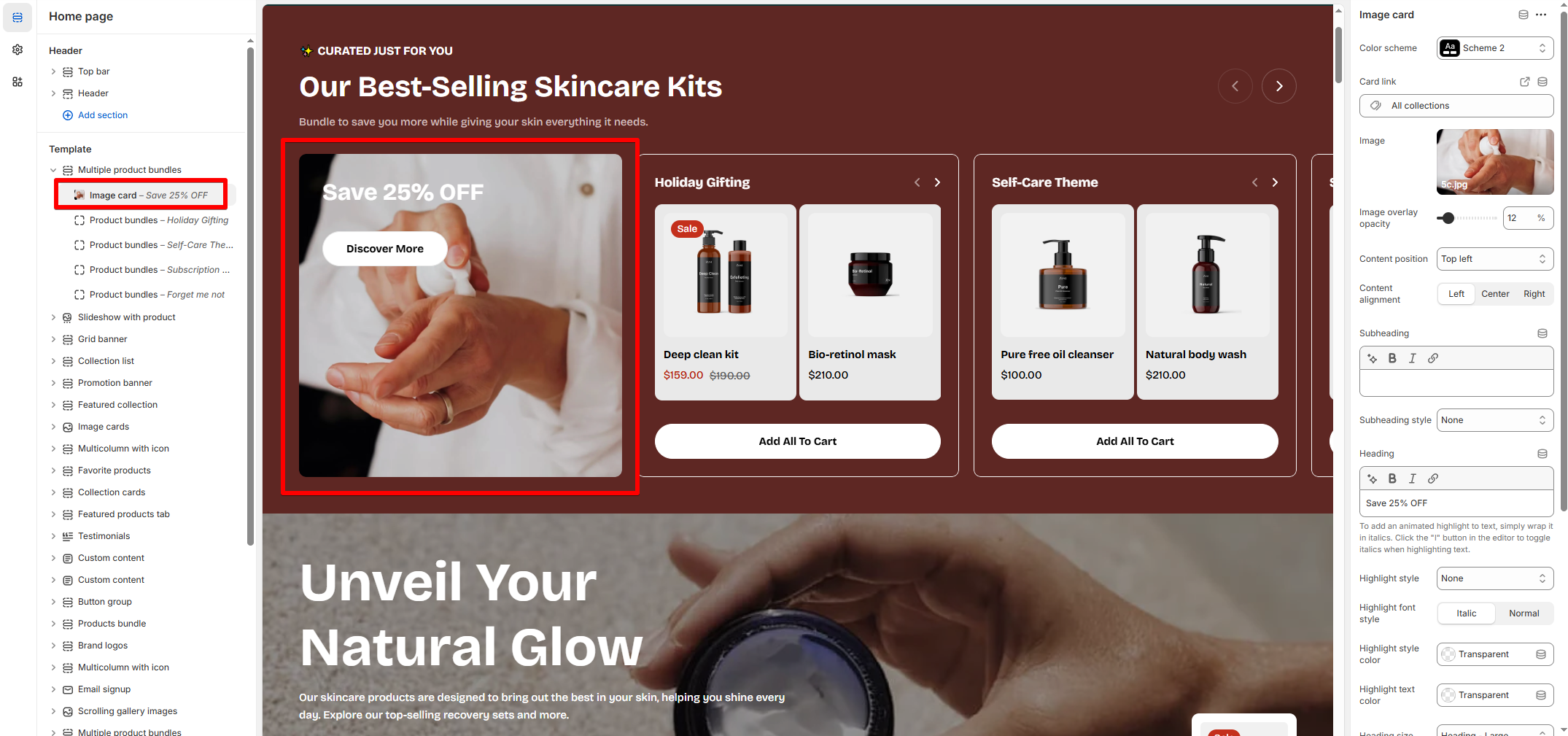
- Image upload: Use lifestyle or campaign visuals
- Image overlay opacity: Add a semi-transparent layer over the image to improve text readability.
0%= No overlay100%= Fully opaque (black cover)
- Overlay text: Add heading/subheading over the image
- CTA button: Link to a landing page, collection, or promotion
- Overlay opacity: Adjust for better text readability
- Content alignment: Control position on desktop and mobile
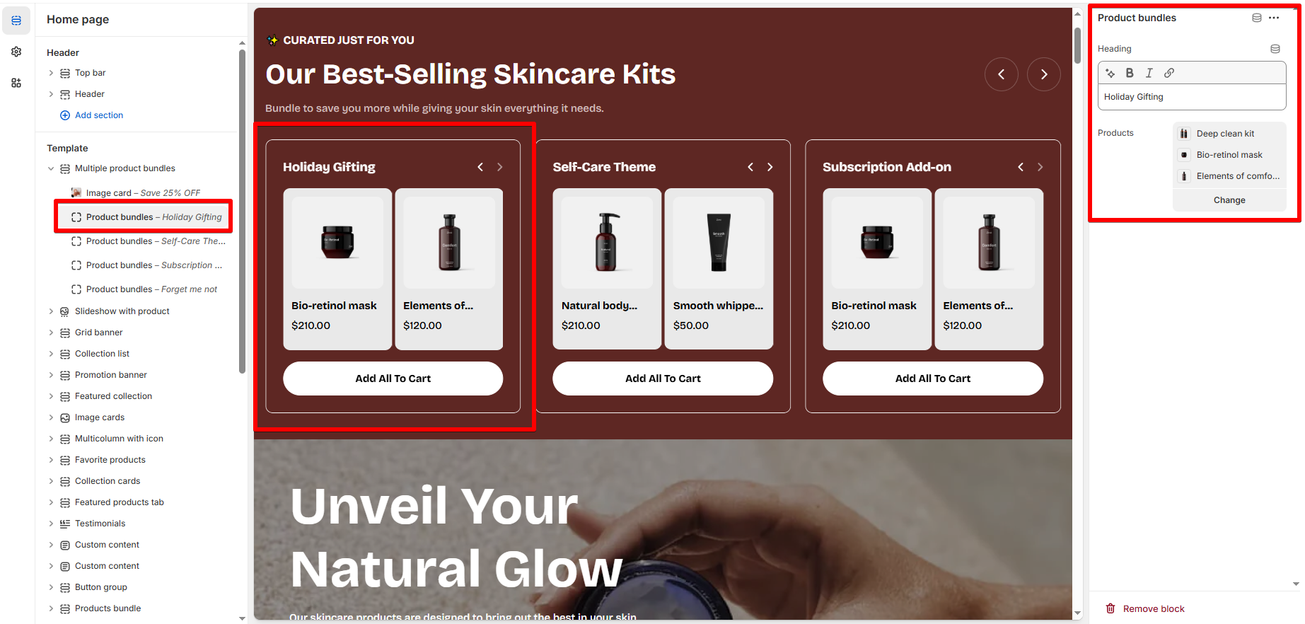
- Heading: Title for the bundle.
- Products: Select 2–5 products for each bundle.
Last updated