HYPER theme
Try Hyper freeResourcesOther solutions
  • What is Hyper theme
  • Changelog
  • Refund policy
  • Support policy
  • Getting started
    • Install Hyper theme
    • Set up my store as Hyper demo
    • Update Hyper theme
    • Theme license & Transfer
  • Page's global sections
    • Announcement bar
    • Top bar
    • Header
      • Mega menu
      • Use Country/ Region selector
      • Use Language selector
    • Footer
    • Cart drawer
    • Popup
    • Product compare
    • Quick view
    • Spotlight picks
  • Theme sections
    • Banner with hotspots
    • Before/after image slider
    • Brand logos 🔥
    • Button group
    • Collapsible tabs
    • Collection list
    • Collection list slider
    • Collection tabs
    • Contact form
    • Countdown timer
    • Custom content
    • Custom liquid
    • Email signup
    • Favorite products 🔥
    • Featured blogs
    • Featured collection
    • Featured countdown timer 🔥
    • Featured product
    • Horizontal products list 🔥
    • Image with text
    • Image with text overlay
    • Image with text slider 🔥
    • Lookbook slider
    • Multicolumn
    • Multicolumn with icon
    • Press 🔥
    • Products bundle 🔥
    • Promotion banner
    • Recently viewed products
    • Rich text
    • Shop the feed 🔥
    • Scrolling banner
    • Scrolling gallery images
    • Scrolling promotion
    • Slideshow
    • Tabs content
    • Testimonials
    • Testimonials masonry 🔥
    • Video
    • Video hero
  • Theme settings
    • General
    • Animations
    • Blog cards
    • Buttons
    • Cart
    • Color swatches
    • Colors
    • Currency format
    • Custom CSS
    • Layout
    • Logo
    • Product badges
    • Product cards
    • Product compare
    • Quick view
    • Search behavior
    • Social media
    • Typography
  • Collections & Products
    • Product page
      • Product template
      • Breadcrumbs
      • Product information
      • Quick comparision table
      • Quick order list
      • Related products
    • Collection page
      • Collection template
      • Collection banner
      • Product grid
    • Collections list page
  • Other pages
    • Blogs
    • Blog posts
    • Cart
    • Password
    • Search page
  • FAQs
    • Add Highlighted text to your Headings
    • Add gift wrap option to my cart
    • Combined listings app
    • Set up Local Pickup option
    • Set up quantity rules and volume pricing in B2B
    • Show Payment icons
Powered by GitBook
On this page
  • How to add a Collection banner section to your Shopify store
  • How to show collection-specific banners
  • How to edit a Collection banner
  • Section settings
  • Block settings
  1. Collections & Products
  2. Collection page

Collection banner

PreviousCollection templateNextProduct grid

Last updated 3 months ago

Display a banner/ background with highlighted features/ offers on a collection page can effectively improve customers' shopping experiences and boost your sales.

How to add a Collection banner section to your Shopify store

Steps:

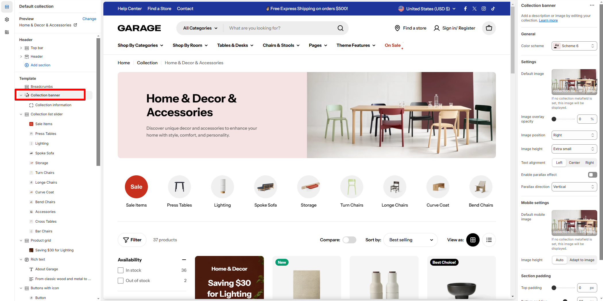
  1. In the theme editor (Customize), open the template selector.

  2. Select Collections, then Default collection.

  3. On the left-side bar, add Collection banner section.

How to show collection-specific banners

To display unique images for each collection, you can use Shopify metafields, which allows you to assign a banner image for desktop and mobile view per collection dynamically.

Steps to Add Collection Banner Metafields:

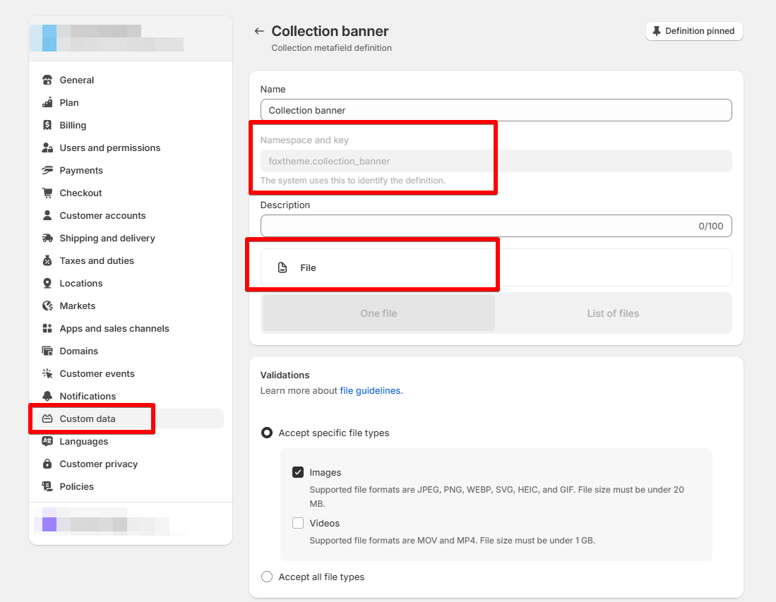
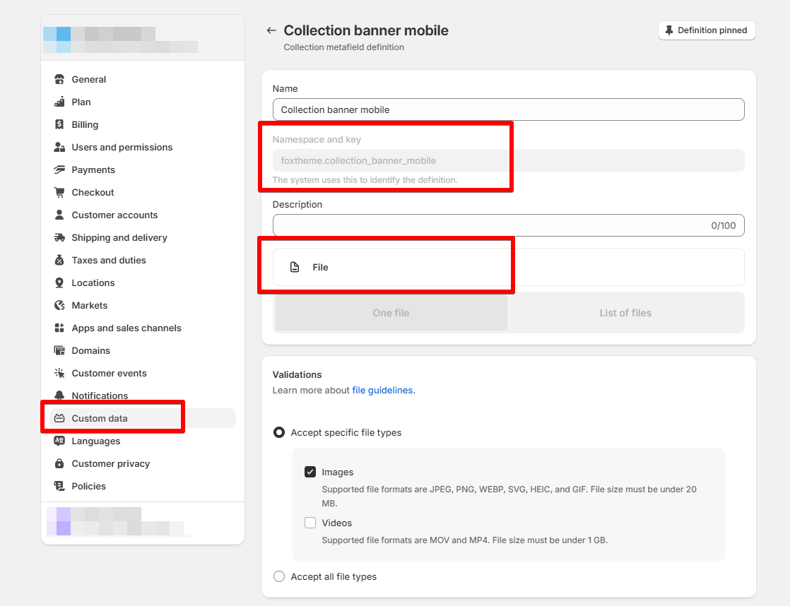
You need to create two metafield definitions, one for desktop and one for mobile view.

  1. Go to Shopify Admin > Settings > Custom Data > Collections.

  2. Create 2 new metafield definitions:

    • Namespace and key:

      • For desktop banner: foxtheme.collection_banner

      • For mobile banner: collection_banner_mobile

    • Type: File (Image)

  3. Save the metafield definition.

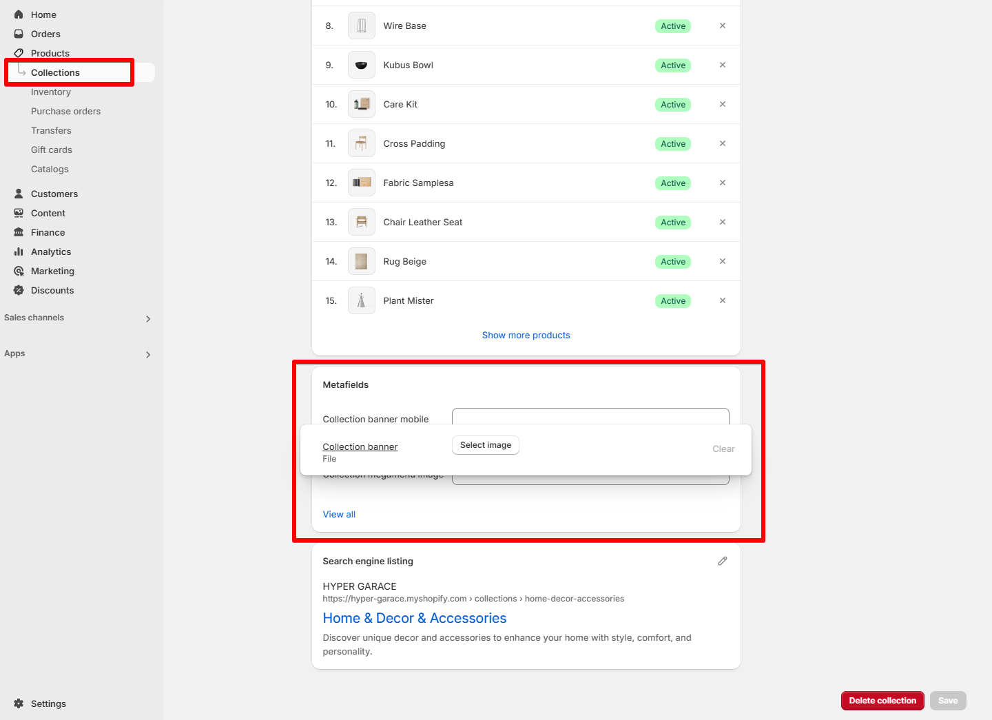
  4. Navigate to Products > Collections, select a collection, and upload an image under the new metafield.

Once set up, your collection pages will dynamically display the assigned banner image.
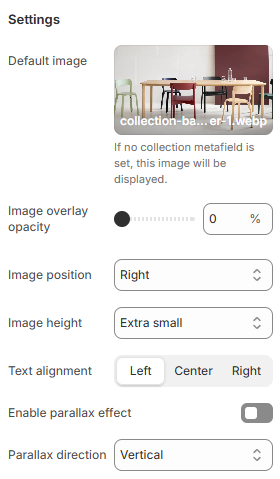
How to edit a Collection banner

Section settings

Settings

  • Image position can be set as Top/ Left/ Right/ Bottom/ Use image as background to the content (Collection title and description).

  • Set an Image height for the banner:

    • Adapt to image

    • Large

    • Extra medium

    • Medium

    • Small

    • Extra small

  • and Text alignment (Left/ Center/ Right)

  • Select your preferred direction for this effect in the Parallax direction field (Vertical/ Horizontal/ Zoom)
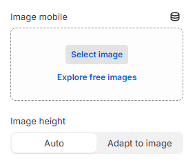
Mobile settings

This setting allows you to add a different default image for the banner on the mobile view.

  • You have 2 options for adjusting the Image height (Auto/ Adapt to image).

Block settings

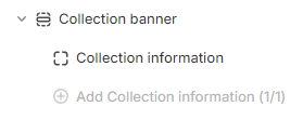
In the Collection banner section, you can add 1 Collection information block.

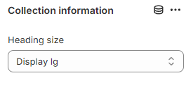
Change the Heading size to a suitable option (Heading xs/ Heading sm/ Heading md/ Heading lg/ Heading xl/ Heading 2xl/ Display md/ Display lg/ Display xl).

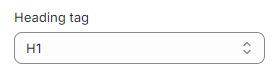
Especially, choose the suitable Heading tag for the collection title (H1/ H2/ H3/ H4/ H5/ H6).

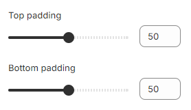
You can also modify the spacing above and below the Collection information block by adjusting the slider to change the values of the Top padding and Bottom padding.

Default image: If no for banner is set, this image will be displayed as the collection banner.

If you want to make your website more visually appealing and dynamic, consider using the parallax effect by selecting the Enable parallax effect checkbox.

Additionally, you can enable the Show collection description checkbox to display the collection description.

✅
✅
colletion metafield