
Theme Sections
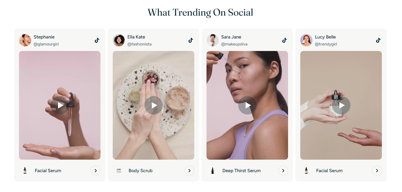
Shop the feed
3 min read
_iiHWfZqv.jpg)
- A social media-style layout
- Video autoplay on hover (desktop)
- Product tag and direct shopping link
How to add a Shop the feed section to your Shopify store
- In the theme editor (Customize), click Add section.
- Locate Shop the feed.
- Make necessary changes.
- Save.
How to edit a Shop the feed section
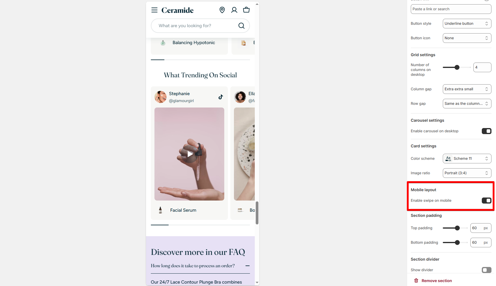
Section settings
General
- Color scheme: Choose a theme color preset. Learn more: Colors
Section header
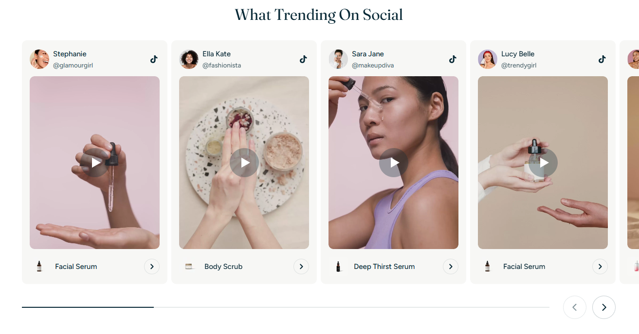
Grid settings
- Number of columns on desktop: Choose how many posts show in a row (2–6).
- Column gap / Row gap: Control spacing between cards.
Carousel setting
- Enable carousel on desktop: Toggle to make the feed swipeable (good for larger lists).
Card settings
- Color scheme: Set a specific color scheme for the feed cards.
- Image ratio: Choose between Adapt to image, Square, Portrait (3:4), or Landscape.
Mobile layout
- Enable swipe on mobile: Activate swipe interaction for smoother mobile experience.
Block settings
Media
- Image: Thumbnail to display if the video doesn't play or for fallback.
- Video: Upload a short .mp4 file (recommended size: under 5MB for performance).
Info
- Link: Optional link for the card (e.g., blog, product, collection).
- Avatar: Upload the influencer or author profile picture.
- Author: Name of the influencer or social media poster.
- Account: Social handle (e.g., @glamourgirl).
- Icon: Choose a social media platform (TikTok, Instagram, YouTube, etc.).
- Product: Connect the post to a product on your store. The product name and icon will display below the video.
Best practices
FAQs
Do video autoplay?
Why isn’t my video playing on mobile?
Last updated