
Theme Sections
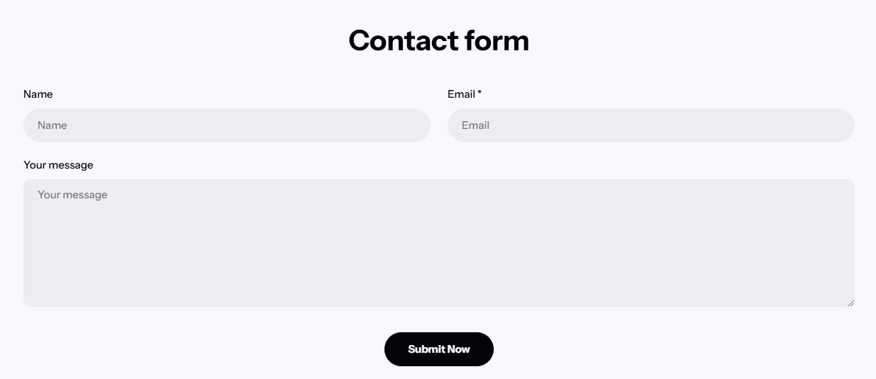
Contact form
2 min read
_vNONiXZj.jpg)
Your contact form sends all submissions to the sender email address of your store. You can change the sender email address in the Notifications settings page of your Shopify admin.
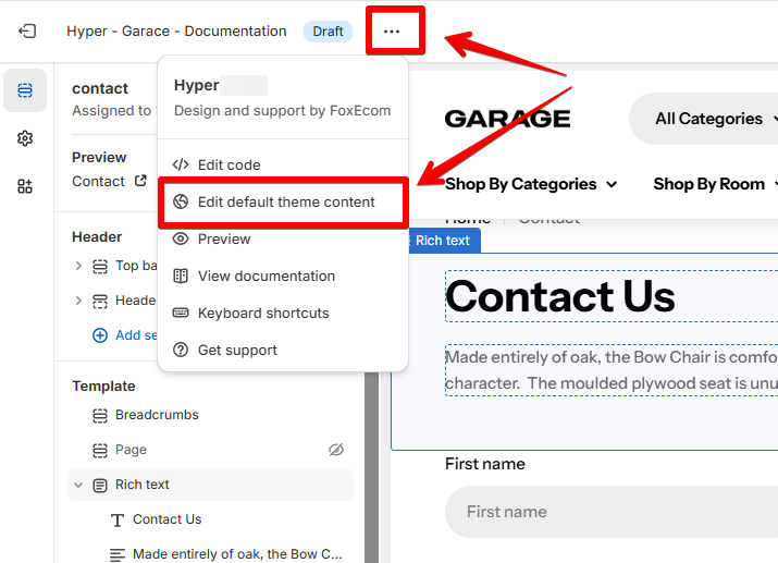
How to add a Contact form section to your Shopify store
- In the theme editor (Customize), click Add section.
- Locate Contact form.
- Make necessary changes.
- Save.
How to edit a Contact form section
In addition to the default fields, you can add custom fields to gather extra information or a sidebar next to the form.
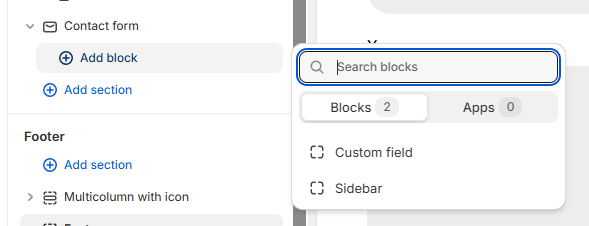
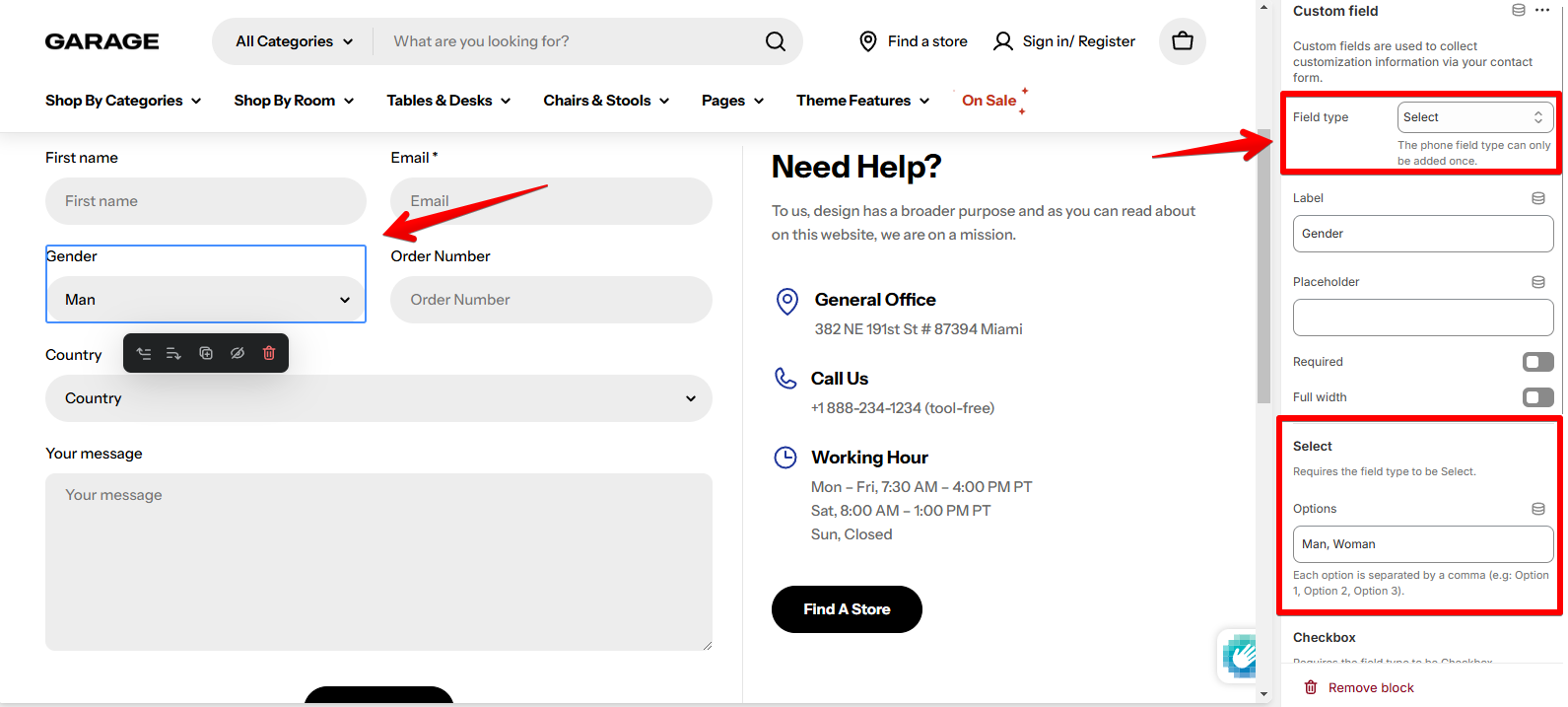
Custom field
-
- Text: For short responses like names, subjects, etc.
- Textarea: Ideal for collecting longer responses, such as inquiries or detailed feedback.
- Phone: Collect customers' phone numbers for contact purposes.
- Select (dropdown list): Allow customers to choose one from predefined options.
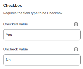
- Checkbox: For consent agreements, terms acceptance, or opt-ins.
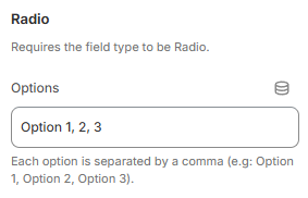
- Radio: Let the customer select a single option from a set of predefined choices.
Sidebar
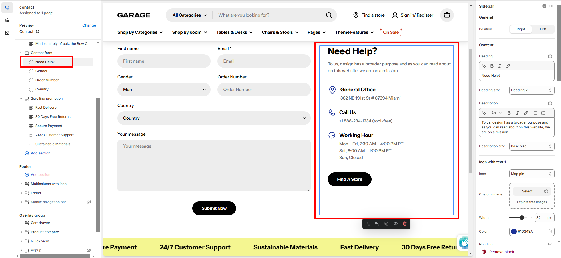
- Position: Choose whether the sidebar should appear (on the left or right side of the form).
- Content: Add the sidebar content to show customers what is it about.
- Icon with text: You can add up to 3 icon with text items to the sidebar.
- Button: Add a button with a custom link at the end of the sidebar.
Last updated