
Theme Sections
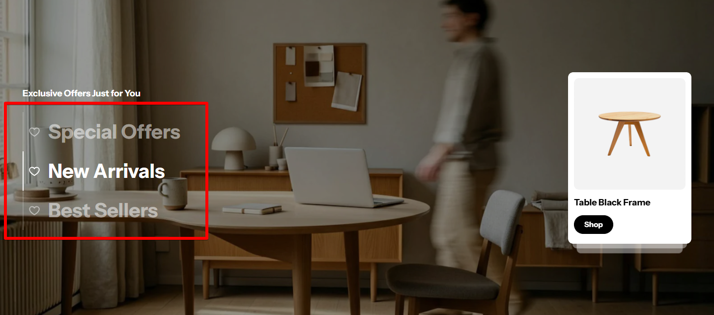
Banner with tabs
3 min read
_xAgFReZD.jpg)
How to add a Banner with tabs section to your Shopify store
- In the theme editor (Customize), click Add section.
- Locate Banner with tabs section.
- Make necessary changes.
- Save.
How to customize a Banner with tabs section
Section settings
General settings
- Color scheme: Select predefined set of colors for the section. This color scheme affects the text color of the section.
- Desktop height: Define the height of the banner on desktop devices.
- Image overlay opacify 🌓: Controls the opacity (transparency) of the image overlay within the section.
Section header
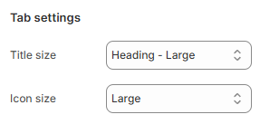
Tab settings
Card settings
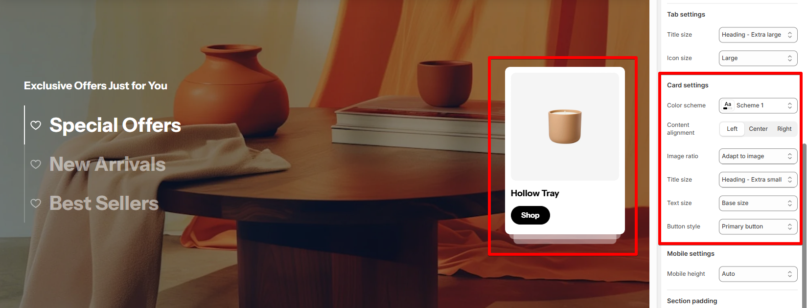
- Color scheme: Select a color scheme for your image card. This color scheme affects the image card's background, text, and button color.
- Content alignment: Adjusts how the content within the image card (e.g., button, text) is aligned.
- Image ratio: Define the aspect ratio for the image displayed on the card. It helps adjust the shape and size of the image.
- Adapt to image: The card adjusts the image to fit without stretching.
- Fixed ratios: You can set the image to a specific ratio (square, landscape, portrait).
- Title size: Control the font size of the title within the image card.
- Text size: Adjust the font size for any descriptive text within the card.
- Button style: Define the style of the button inside the card.
Mobile setting
- Mobile height: Adjust the height of the card for mobile devices.
Block settings
General
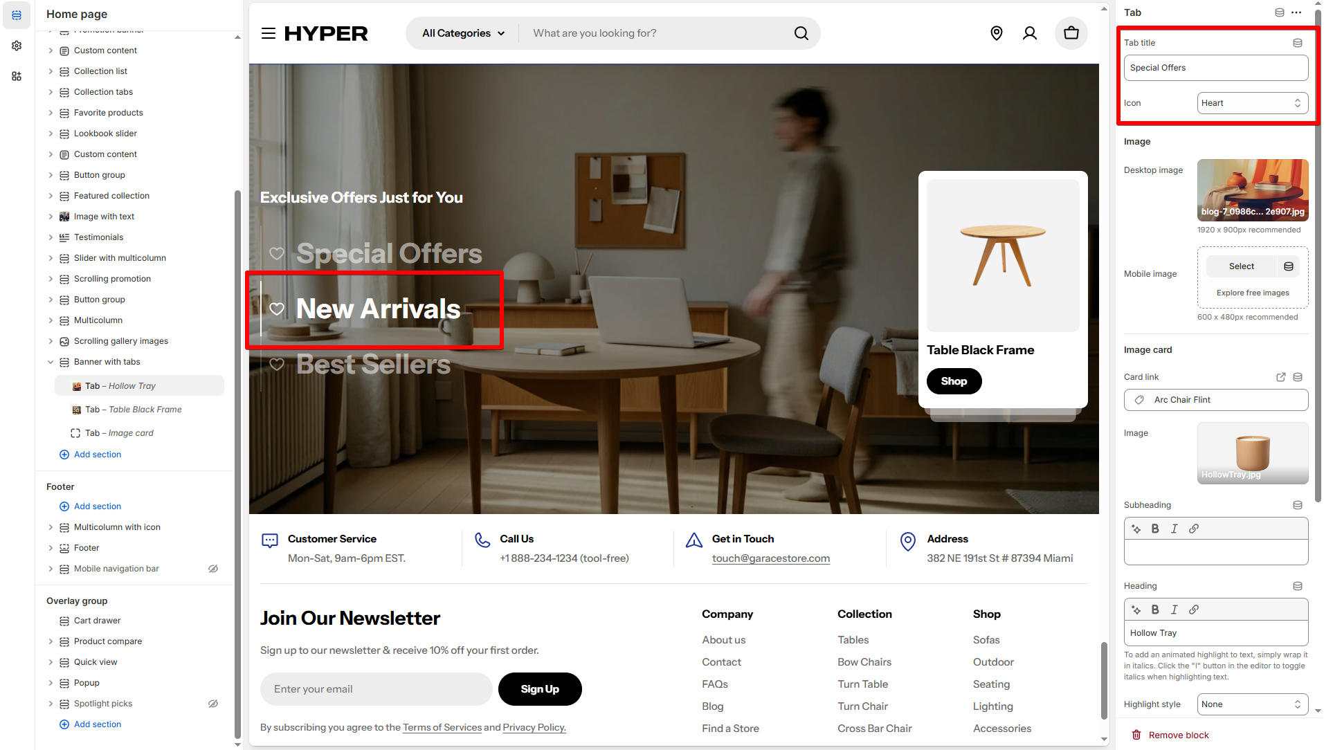
Image
Image card
- Card link: Link the image card to a specific URL. When visitors click on the image card, they will be directed to the destination URL you specify here.
- Image: Select an image that will be displayed on the image card.
- Content: Add a heading, subheading, and a button to the image card if needed.
Change the image card ratio and content alignment in the section settings. Card settings
Last updated