
Pages Global Sections
Footer
4 min read
_NAuZEybQ.jpg)
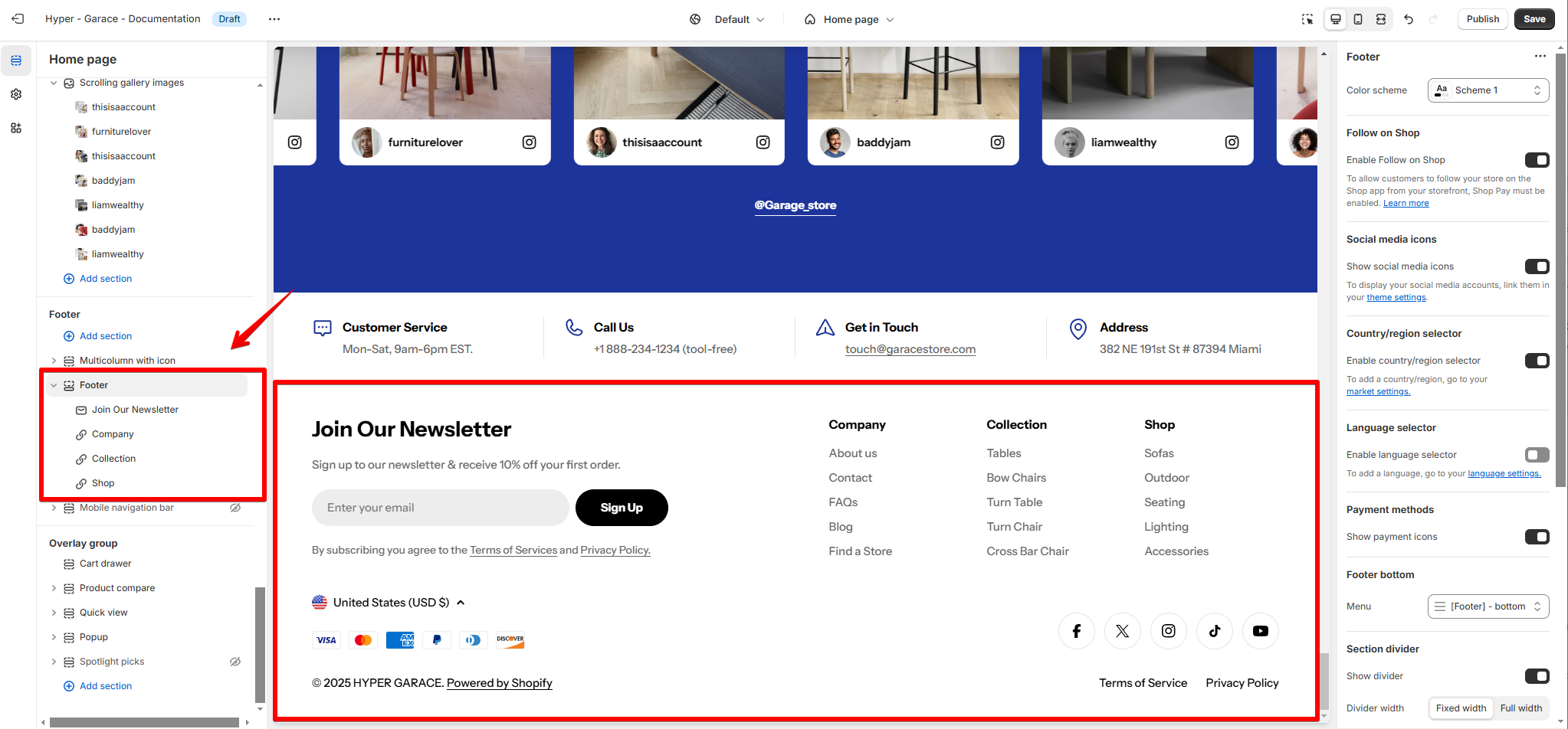
What is Footer?
How to edit the Footer section
- In the theme editor (Customize), click Footer.
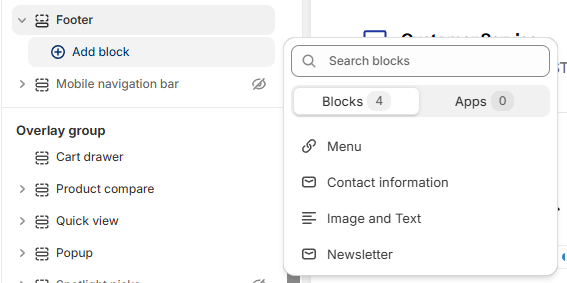
- Locate and add suitable blocks.
- Save the changes.
Section settings
Follow on Shop
Follow on Shop allows customers to follow your store on the Shop app. When a customer follows your store, they can receive personalized recommendations and notifications about your products. This helps you to create a more personalized shopping experience for your customers.
To enable the Follow on Shop button, you need to have the Shop channel installed, and Shop Pay activated on your store.
Social media icons
- Toggle Show social media icons to display icons for platforms like Facebook, Instagram, and TikTok.
- Add the respective social media links under Theme Settings > Social Media.
Country/Region selector
Use Country/ Region selector
Language selector
Use Language selector
Payment methods
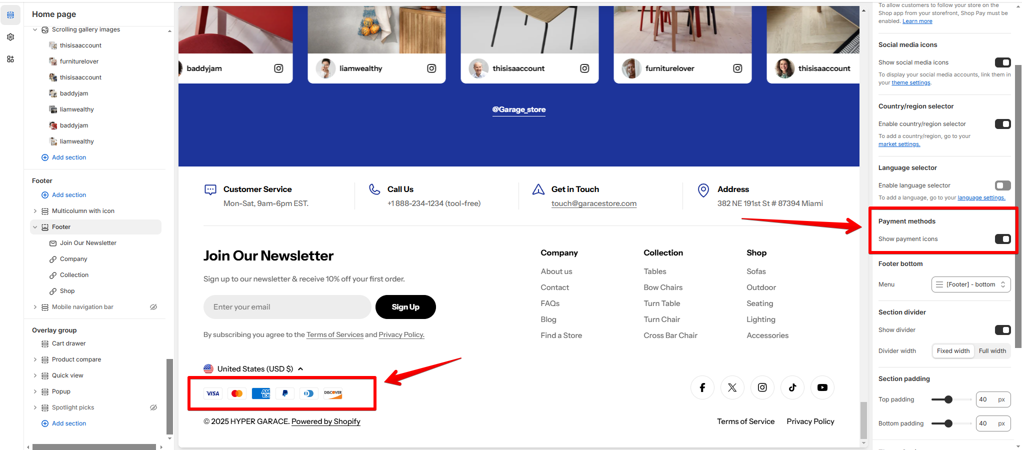
The payment methods here reflect the settings configured in Payments.
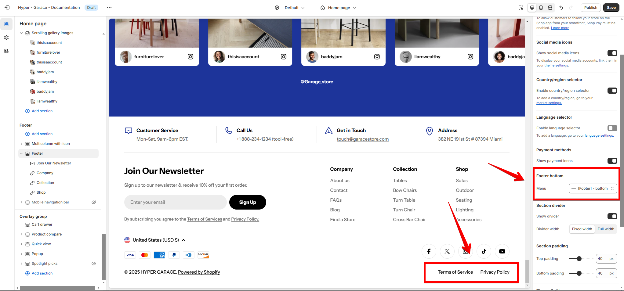
Footer bottom
Block settings
- Width (%): Adjust the block's width taken up in the Footer.
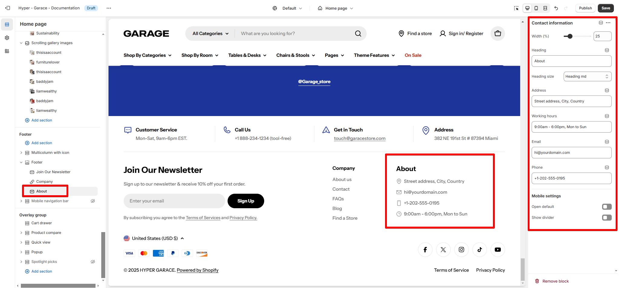
- Heading: Add a title such as "About" or "Contact Information."
- Heading size: Choose "Heading md" for medium-sized text.
- Content:
- Address: Add a physical location (e.g., "Street Address, City, Country").
- Working Hours: Specify operating hours (e.g., "9:00 AM - 6:00 PM, Mon to Sun").
- Email: Add a support email (e.g., "hi@yourdomain.com").
- Phone: Include a customer support number (e.g., "+1-202-555-0195").
- Mobile Settings:
- Open Default: Enable for better visibility on mobile.
- Show Divider: Add a separator line if needed.
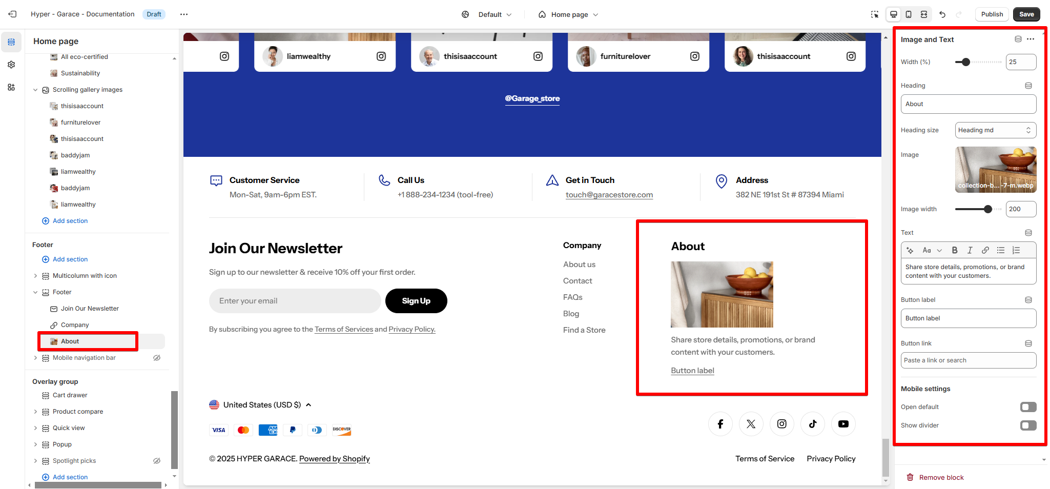
- Width (%): Adjust the block's width taken up in the Footer.
- Heading: Add a title like "About" or "Promotion."
- Heading Size: Use "Heading md" for medium-sized text.
- Image:
- Upload a visually appealing image (e.g., product or branding).
- Adjust the Image Width (e.g., 200px).
- Text: Add a short description or promotion text.
- Button Label: Add a call-to-action like "Learn More" or "Shop Now."
- Button Link: Link to a relevant page or collection.
- Width (%): Adjust the block's width taken up in the Footer.
- Heading: Add a title such as "Company" or "Shop."
- Heading Size: Choose a size like "Heading xs" for smaller text.
- Menu: Link to a menu in Online Store > Navigation (e.g., Footer - Company or Footer - Collection).
- Mobile Settings:
- Open Default: Enable to expand the menu on mobile devices by default.
- Show Divider: Add a line to separate this block visually.
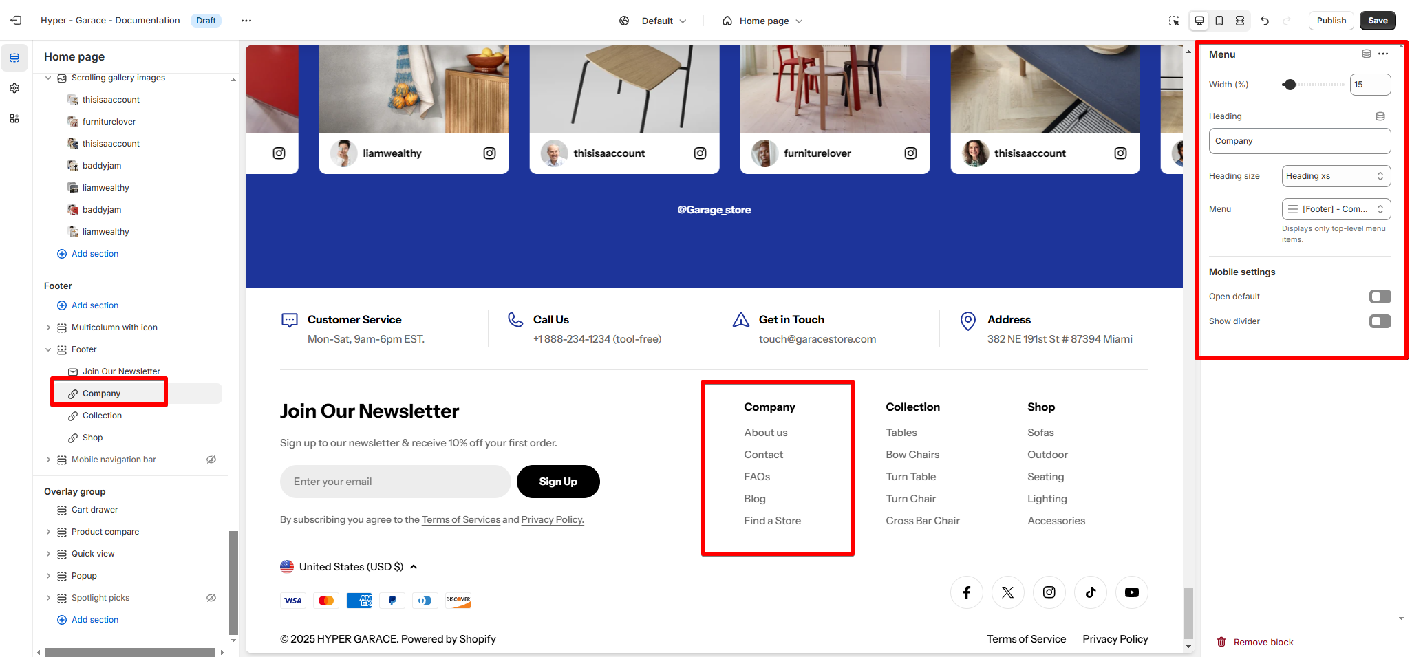
To add and edit menus, see Shopify official documentation.
- Width (%): Adjust the block's width taken up in the Footer.
- Heading: Add a title like "Join Our Newsletter."
- Heading Size: Set the size (e.g., "Heading lg" for large text).
- Description: Add a description such as "Sign up to our newsletter & receive 10% off your first order."
- Term & Policy Text: Include a short disclaimer with links to your Terms of Service and Privacy Policy.
- Text Alignment: Align text to Left or Center as needed.
- Form Width (px): Adjust the email input field width (e.g., 465px).
- Mobile Settings:
- Order First: Enable this to show the newsletter block first on mobile devices.
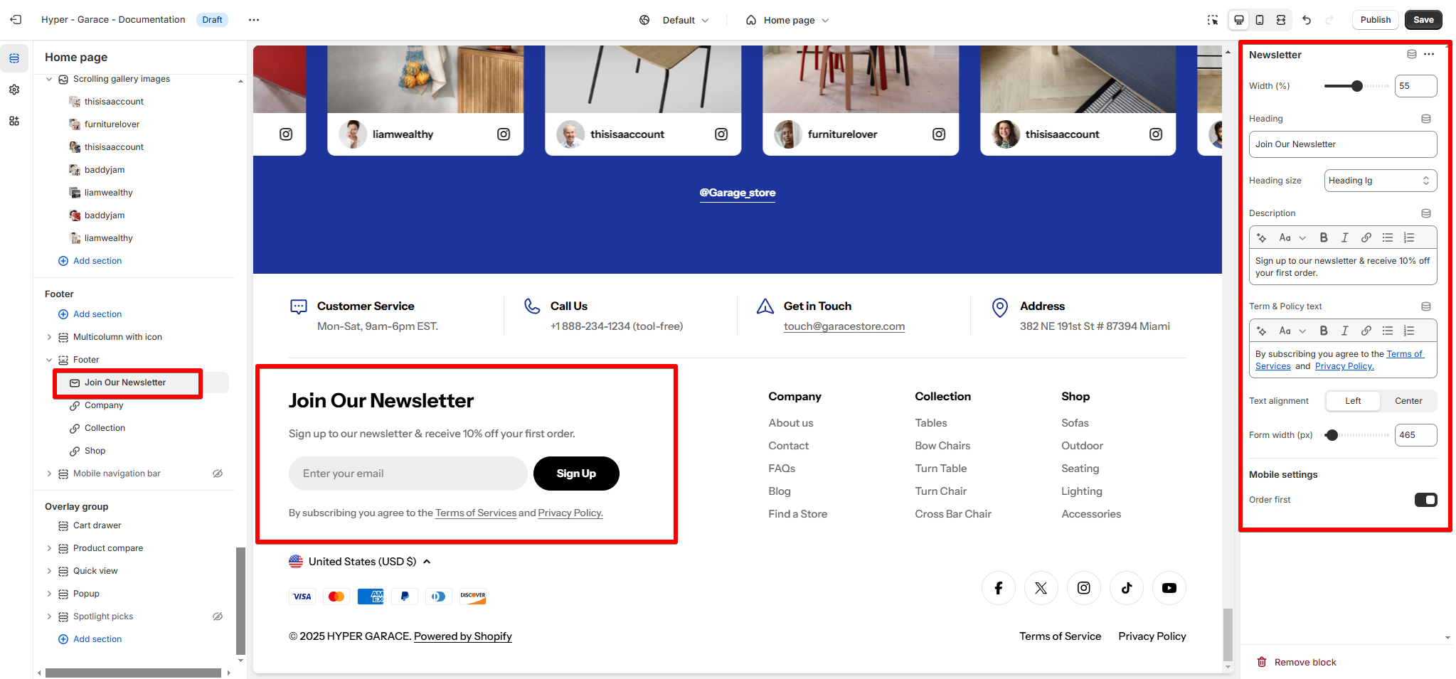
Newsletter submissions are saved on the Customers page of your Shopify admin.
Last updated