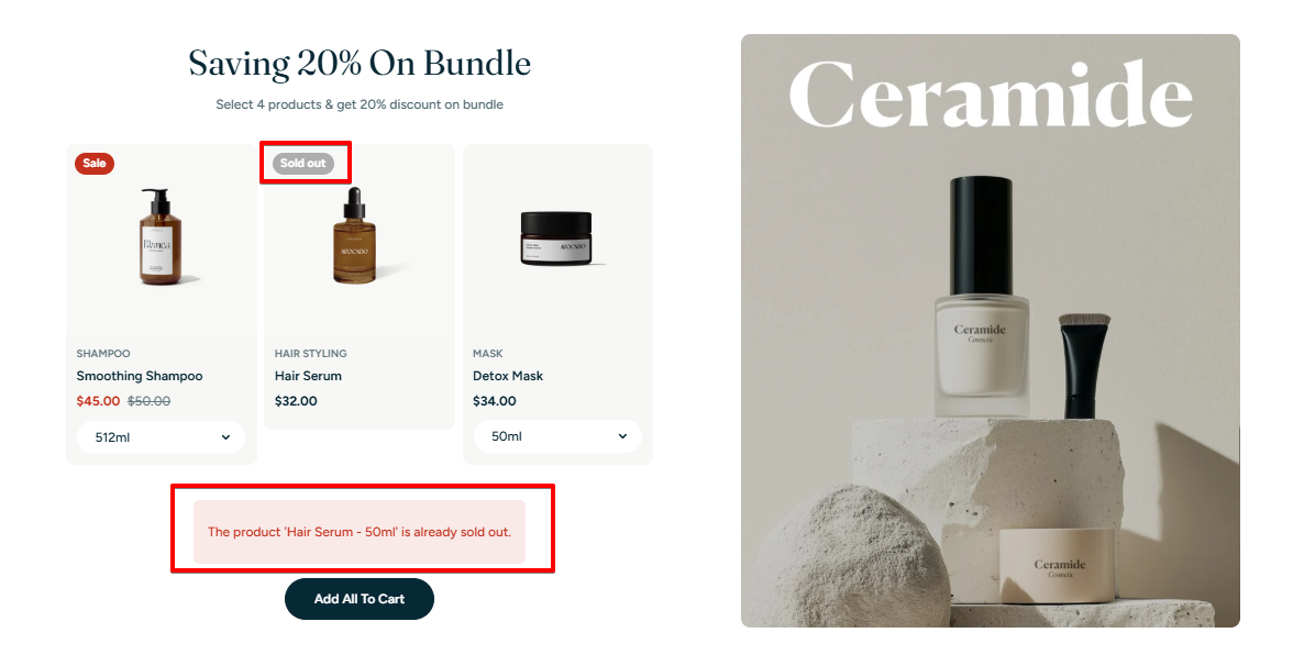
HYPER theme
Try Hyper freeResourcesOther solutions
  • What is Hyper theme
  • Changelog
  • Refund policy
  • Support policy
  • Getting started
    • Install Hyper theme
    • Set up my store as Hyper demo
    • Update Hyper theme
    • Theme license & Transfer
  • Page's global sections
    • Announcement bar
    • Top bar
    • Header
      • Mega menu
      • Use Country/ Region selector
      • Use Language selector
    • Footer
    • Cart drawer
    • Popup
    • Product compare
    • Quick view
    • Spotlight picks
  • Theme sections
    • Banner with hotspots
    • Before/after image slider
    • Brand logos 🔥
    • Button group
    • Collapsible tabs
    • Collection list
    • Collection list slider
    • Collection tabs
    • Contact form
    • Countdown timer
    • Custom content
    • Custom liquid
    • Email signup
    • Favorite products 🔥
    • Featured blogs
    • Featured collection
    • Featured countdown timer 🔥
    • Featured product
    • Horizontal products list 🔥
    • Image with text
    • Image with text overlay
    • Image with text slider 🔥
    • Lookbook slider
    • Multicolumn
    • Multicolumn with icon
    • Press 🔥
    • Products bundle 🔥
    • Promotion banner
    • Recently viewed products
    • Rich text
    • Shop the feed 🔥
    • Scrolling banner
    • Scrolling gallery images
    • Scrolling promotion
    • Slideshow
    • Tabs content
    • Testimonials
    • Testimonials masonry 🔥
    • Video
    • Video hero
  • Theme settings
    • General
    • Animations
    • Blog cards
    • Buttons
    • Cart
    • Color swatches
    • Colors
    • Currency format
    • Custom CSS
    • Layout
    • Logo
    • Product badges
    • Product cards
    • Product compare
    • Quick view
    • Search behavior
    • Social media
    • Typography
  • Collections & Products
    • Product page
      • Product template
      • Breadcrumbs
      • Product information
      • Quick comparision table
      • Quick order list
      • Related products
    • Collection page
      • Collection template
      • Collection banner
      • Product grid
    • Collections list page
  • Other pages
    • Blogs
    • Blog posts
    • Cart
    • Password
    • Search page
  • FAQs
    • Add Highlighted text to your Headings
    • Add gift wrap option to my cart
    • Combined listings app
    • Set up Local Pickup option
    • Set up quantity rules and volume pricing in B2B
    • Show Payment icons
Powered by GitBook
On this page
  • How to add a Products bundle section to your Shopify store
  • How to edit a Products bundle section
  • Section settings
  • Block settings
  • Best practices
  • FAQs
  • Can customers buy individual items from the bundle?
  • What happens if a product goes out of stock?
  1. Theme sections

Products bundle 🔥

Boost your average order value with bundled product offers that encourage bulk buying

PreviousPress 🔥NextPromotion banner

Last updated 11 days ago

This design is available from version 1.1.0 and above.

See: Changelog

The Products Bundle section allows you to display a featured product image with optional hotspot tags, alongside a list of bundled products customers can add to cart with one click.

  • Hotspots highlight products on image hover (desktop) or scroll to the product (mobile).

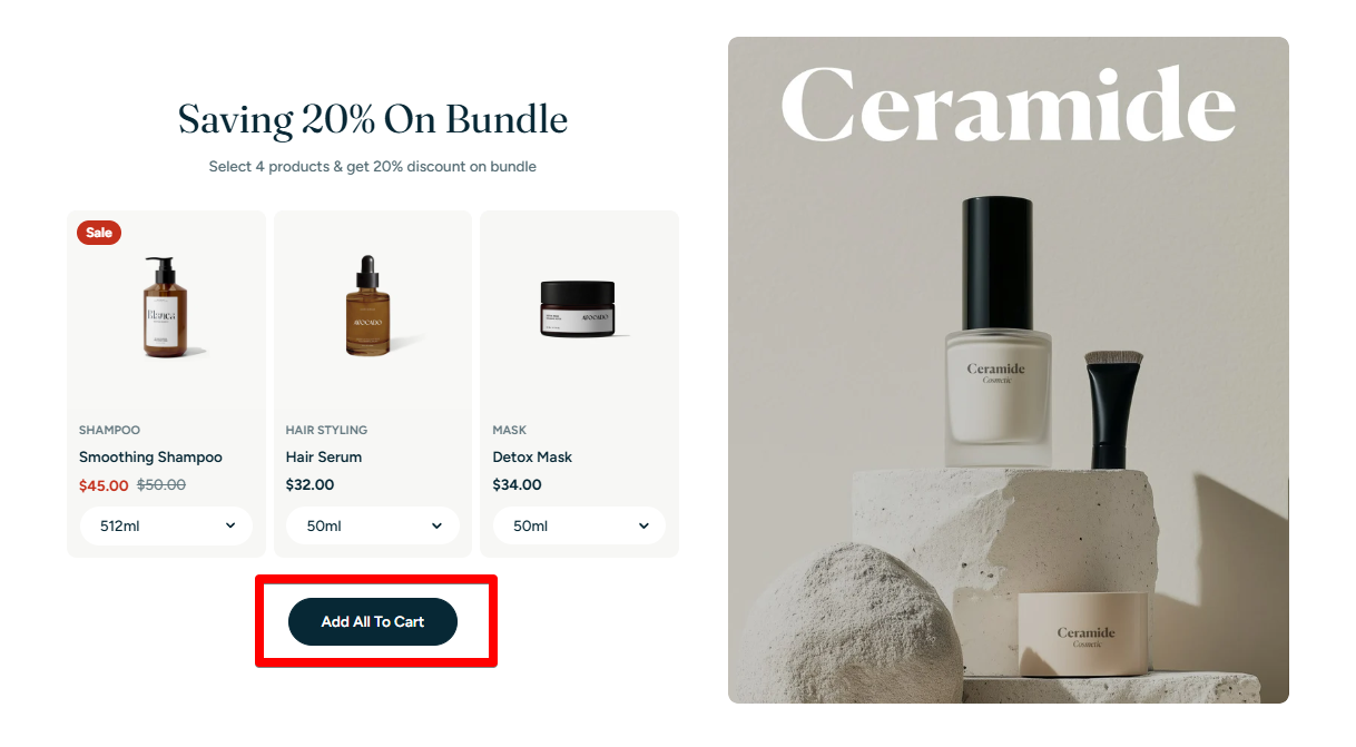
  • Customers can choose variants before adding the bundle to the cart.

  • Perfect for seasonal sets, starter kits, or curated collections.

How to add a Products bundle section to your Shopify store

Steps:

  1. In the theme editor (Customize) > click Add section

  2. Select Products bundle.

  3. Make necessary changes.

  4. Save.

How to edit a Products bundle section

Section settings

General

Image

  • Image: Upload a main visual for the bundle.

  • Desktop image position: Align the image to the Left or Right of the products list.

  • Image ratio: Choose Adapt to image or Full section height.

  • Show hotspot: Toggle ON to activate clickable product hotspots on the image.

    • On desktop, hovering over a hotspot highlights the corresponding product card, helping users quickly identify the item in the bundle.

    • On mobile, tapping a hotspot automatically scrolls to the relevant product card, ensuring smooth navigation in smaller viewports.

Section header

The Section header display above the products list.

See settings
  • Subheading: Add a short, secondary heading to complement the main heading. This can provide additional context or detail.

  • Heading: Enter the primary title for your banner.

  • Heading size: Adjust the size to fit your design preference and ensure readability. Choose from available heading sizes.

  • Text: Add a detailed explanation or summary for the banner. Use rich text formatting like bold, italic, links, and lists for better visual emphasis.

Grid settings

  • Number of columns on desktop: Set how many product cards appear in a row (2–4).

  • Column gap: Adjust the horizontal spacing between cards.

Product cards

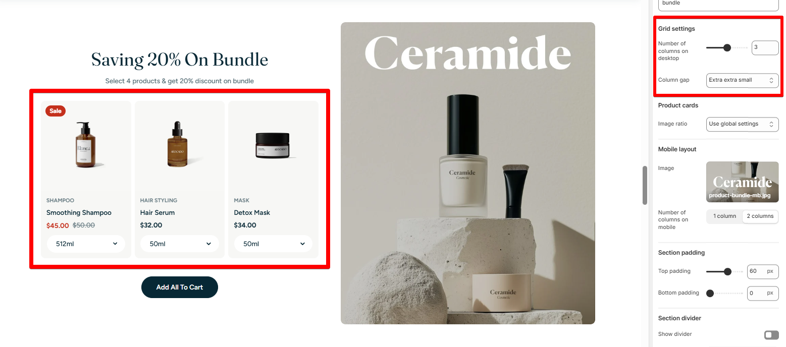
  • Image ratio: Choose a custom image ratio for the product cards in this section or use the global setting.

Mobile layout

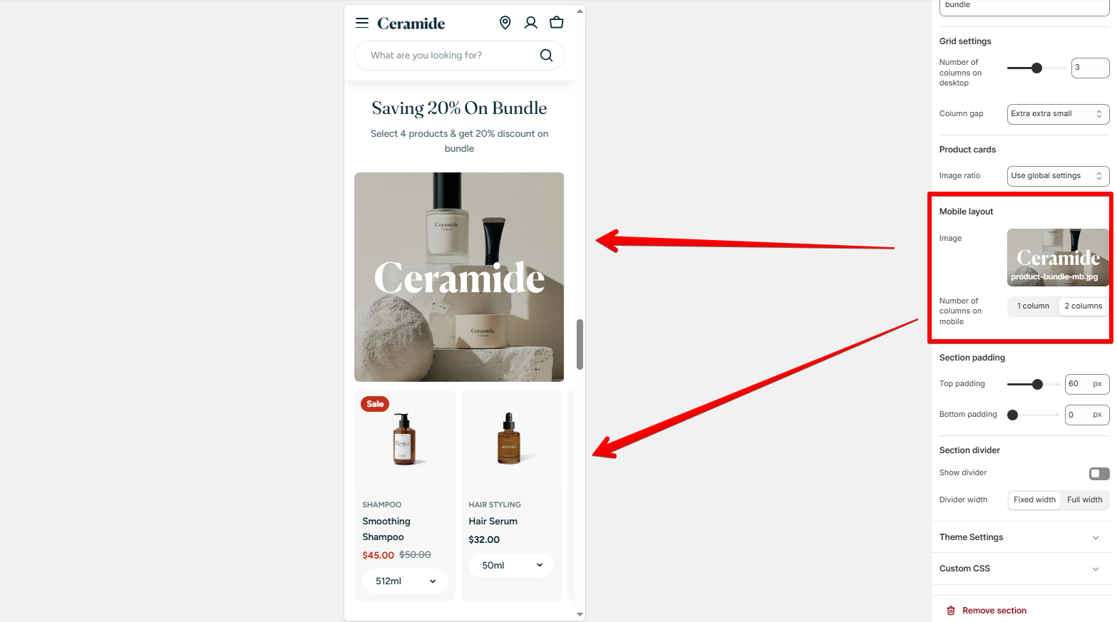
  • Mobile image: Upload an optimized version for mobile.

  • Number of columns on mobile: Choose 1 or 2 product cards per row.

The section show a Add all to cart button at the bottom of the bundled products list.

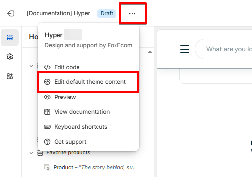
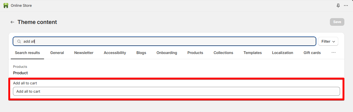
  • To change this button label, go to Actions > Edit default theme content.

Block settings

Each bundled product is added as a block.

Product

  • Product: Select a Shopify product.

Hotspot (only if enabled)

  • Color scheme: Set the color preset for the hotspot marker. The hotspot's background color inherits the Background color 1 of the selected Color scheme.

  • Horizontal position / Vertical position: Drag or manually set hotspot placement (desktop view).

  • Mobile settings: Fine-tune hotspot position for mobile view separately.

Best practices

✅ Use high-quality hero images with good contrast for hotspots.

✅ Bundle 3–5 products for best visual balance.

✅ Use consistent background colors between image and product cards.

FAQs

Can customers buy individual items from the bundle?

👉 Yes. Each product is still clickable to access the product details page and purchase separately.

What happens if a product goes out of stock?

👉 The unavailable product will show "Sold out" but won't break the entire bundle layout. However, customers won't be able to add the bundled products as a whole. So make sure you keep track of the product inventory for timely updates!

Color scheme: Choose a theme color preset.

Add Highlighted text to your Headings

Customers can pick the variant (e.g., size, color) before adding everything to their cart.

✍️
✅
Learn more →
✨
✨