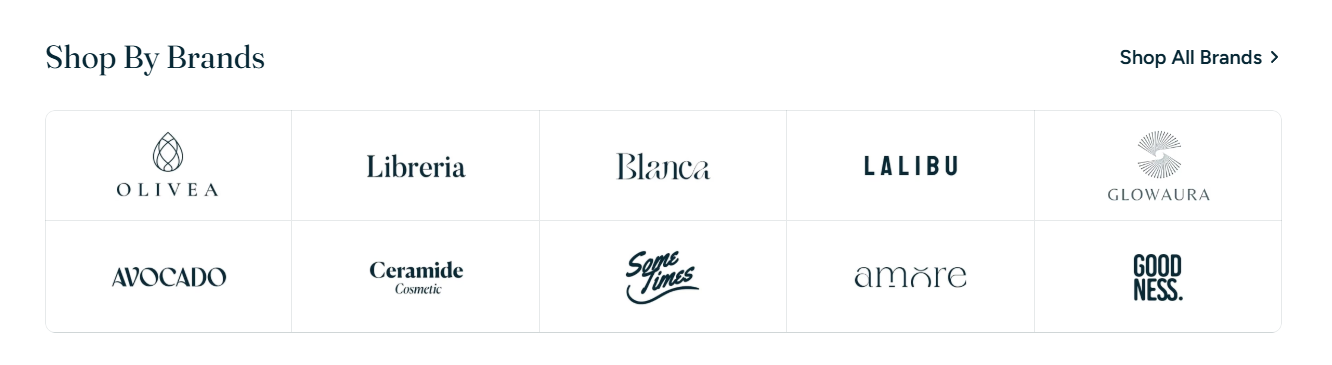
HYPER theme
Try Hyper freeResourcesOther solutions
  • What is Hyper theme
  • Changelog
  • Refund policy
  • Support policy
  • Getting started
    • Install Hyper theme
    • Set up my store as Hyper demo
    • Update Hyper theme
    • Theme license & Transfer
  • Page's global sections
    • Announcement bar
    • Top bar
    • Header
      • Mega menu
      • Use Country/ Region selector
      • Use Language selector
    • Footer
    • Cart drawer
    • Popup
    • Product compare
    • Quick view
    • Spotlight picks
  • Theme sections
    • Banner with hotspots
    • Before/after image slider
    • Brand logos 🔥
    • Button group
    • Collapsible tabs
    • Collection list
    • Collection list slider
    • Collection tabs
    • Contact form
    • Countdown timer
    • Custom content
    • Custom liquid
    • Email signup
    • Favorite products 🔥
    • Featured blogs
    • Featured collection
    • Featured countdown timer 🔥
    • Featured product
    • Horizontal products list 🔥
    • Image with text
    • Image with text overlay
    • Image with text slider 🔥
    • Lookbook slider
    • Multicolumn
    • Multicolumn with icon
    • Press 🔥
    • Products bundle 🔥
    • Promotion banner
    • Recently viewed products
    • Rich text
    • Shop the feed 🔥
    • Scrolling banner
    • Scrolling gallery images
    • Scrolling promotion
    • Slideshow
    • Tabs content
    • Testimonials
    • Testimonials masonry 🔥
    • Video
    • Video hero
  • Theme settings
    • General
    • Animations
    • Blog cards
    • Buttons
    • Cart
    • Color swatches
    • Colors
    • Currency format
    • Custom CSS
    • Layout
    • Logo
    • Product badges
    • Product cards
    • Product compare
    • Quick view
    • Search behavior
    • Social media
    • Typography
  • Collections & Products
    • Product page
      • Product template
      • Breadcrumbs
      • Product information
      • Quick comparision table
      • Quick order list
      • Related products
    • Collection page
      • Collection template
      • Collection banner
      • Product grid
    • Collections list page
  • Other pages
    • Blogs
    • Blog posts
    • Cart
    • Password
    • Search page
  • FAQs
    • Add Highlighted text to your Headings
    • Add gift wrap option to my cart
    • Combined listings app
    • Set up Local Pickup option
    • Set up quantity rules and volume pricing in B2B
    • Show Payment icons
Powered by GitBook
On this page
  • How to add a Brand logos section to your Shopify store
  • How to edit a Brand logos section
  • Section settings
  • Block settings
  • FAQs
  • Can I link each logo to a unique page?
  • Can I use brand logos in the header or footer too?
  1. Theme sections

Brand logos 🔥

Showcase your partner brands or product labels with a clean, organized logo grid

PreviousBefore/after image sliderNextButton group

Last updated 21 days ago

The Brand logos section allows you to display logos in a customizable grid format—ideal for building trust, showcasing retail partnerships, or promoting house brands.

How to add a Brand logos section to your Shopify store

Steps:

  1. In the theme editor (Customize), click Add section.

  2. Locate Brand logos.

  3. Make necessary changes.

  4. Save.

How to edit a Brand logos section

Section settings

General

  • Color scheme: Apply one of your theme’s preset color styles. Learn more: Colors

Section header

  • Text alignment: Set heading/subheading alignment (Left, Center, Right).

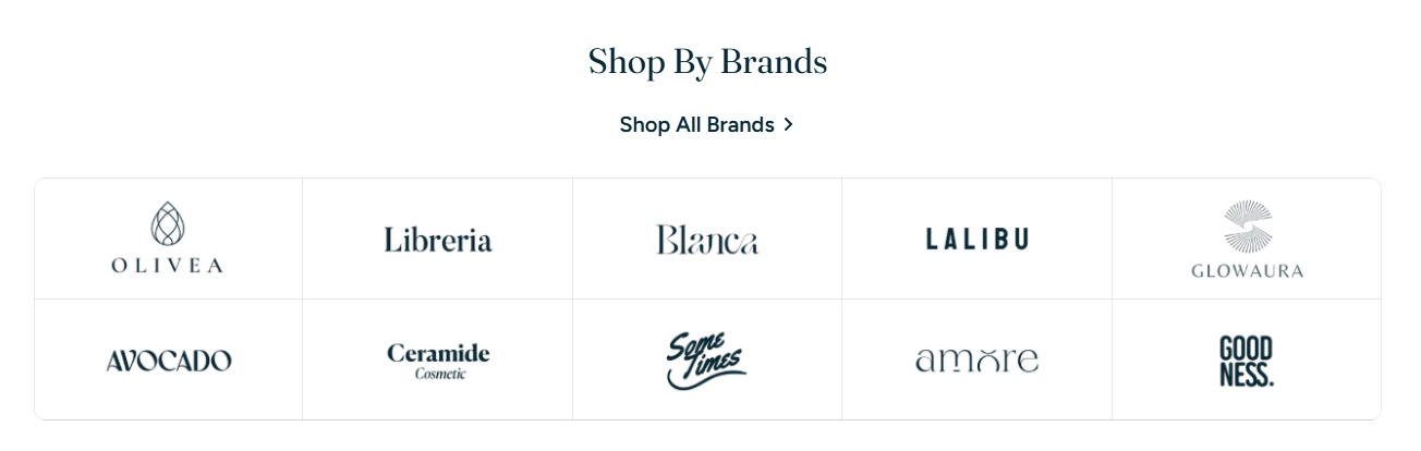
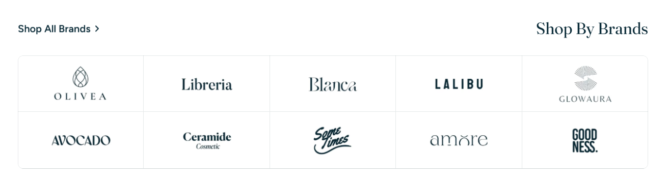
  • Text alignment on mobile: Control mobile-specific header alignment.

  • Subheading & Heading: Add section titles.

    • For animated heading, learn more: Add Highlighted text to your Headings

  • Highlight settings: Customize style, font, and text color for animated headings.

  • Heading size & description size: Set appropriate font sizes for title and supporting text.

  • Button settings:

    • Button label: Set a call-to-action label like "Shop All Brands".

    • Button link: Add a URL to your brand collection or all-collections page.

    • Button style: Control what style the button uses.

    • Button icon: Add an icon after the label.
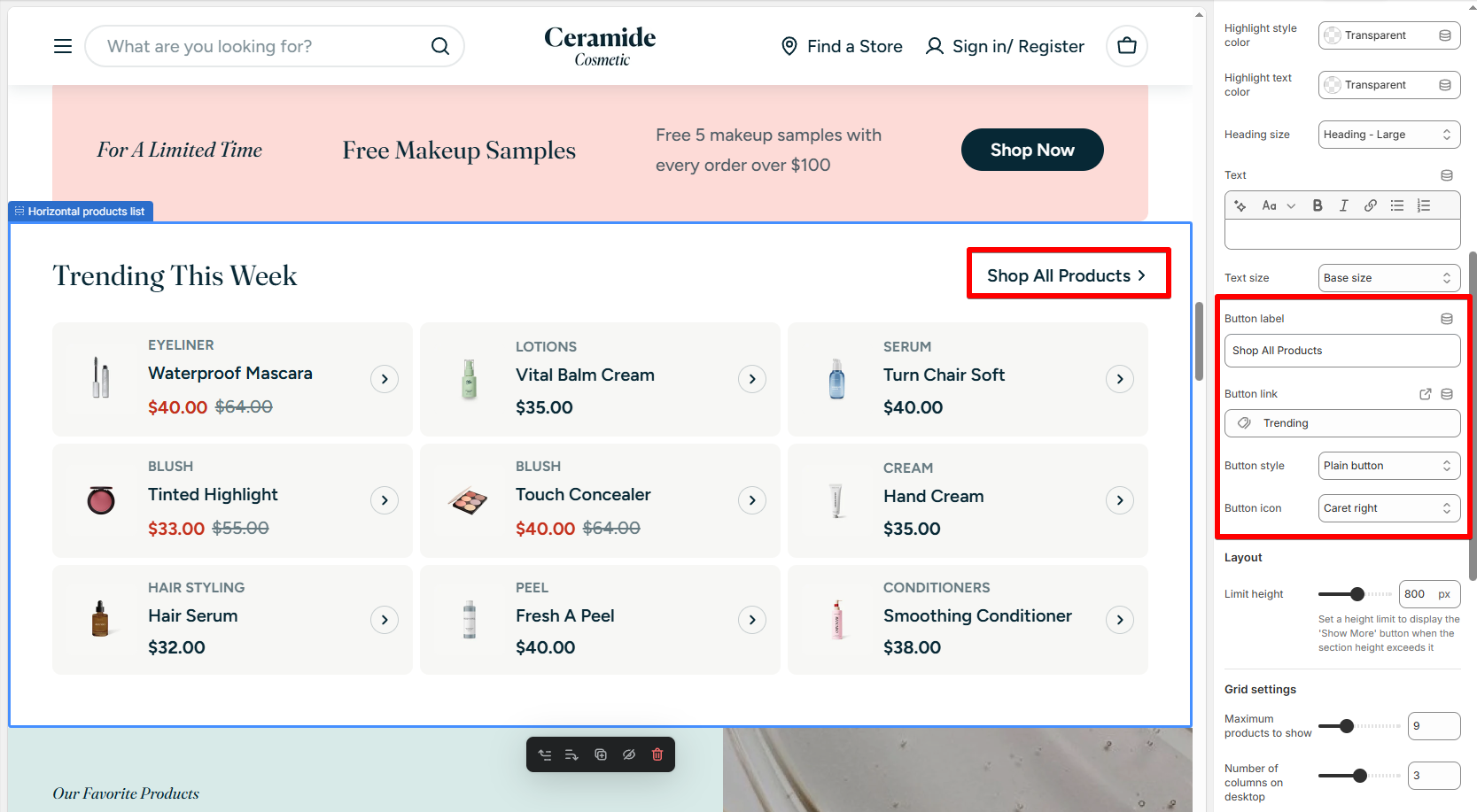
Image settings

  • Image padding: Add spacing around each logo (None, Small, Medium).

  • Image width: Define the size of each logo (Medium/Large/Full width).

Grid settings

  • Number of columns on desktop: Choose how many logos to show in a row (2–10).

  • Column gap & Row gap: Adjust spacing between logos.

  • Show grid border: Add borders between each logo for visual structure.

Mobile Layout

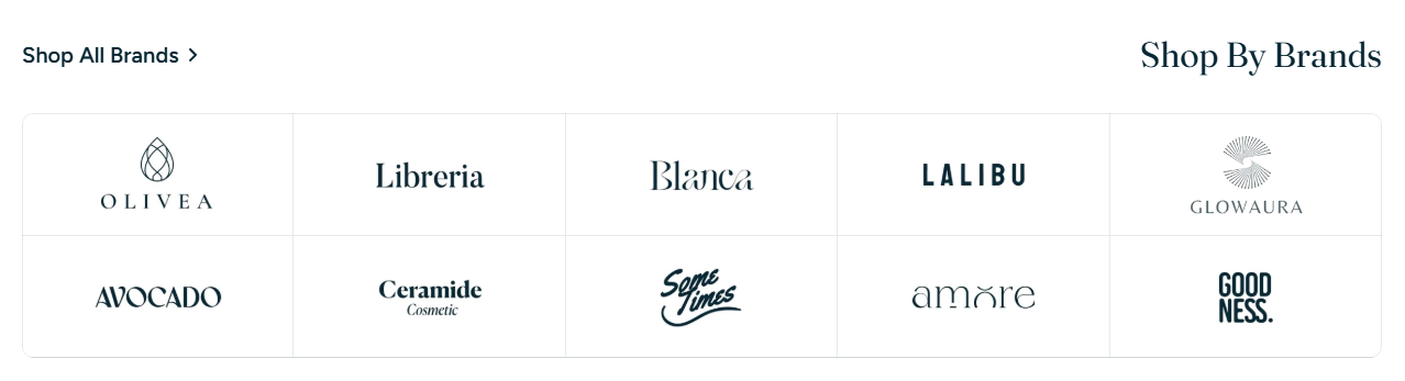
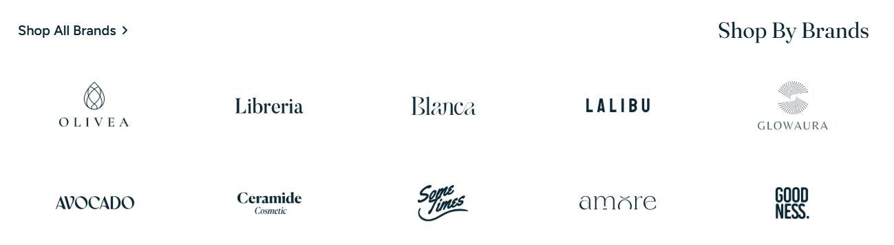
  • Number of columns on mobile: Choose 1–3 logos per row.

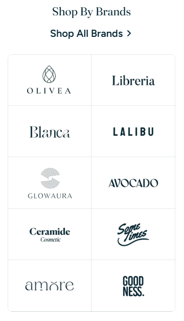
  • Enable swipe on mobile: Activate horizontal scroll behavior for mobile users.

Block settings

Each logo is a block under the Brand logos section.

Steps:

  1. Click Add Log.

  2. Upload a logo image.

  3. Add a Link if you'd like the logo to redirect to a collection or brand page.

✅ Tip: All logos should be the same color scheme and dimensions for a clean look.

FAQs

Can I link each logo to a unique page?

👉 Yes! Use the link field in each logo block.

Can I use brand logos in the header or footer too?

👉 This section is currently supported in the Template content.