# Layout
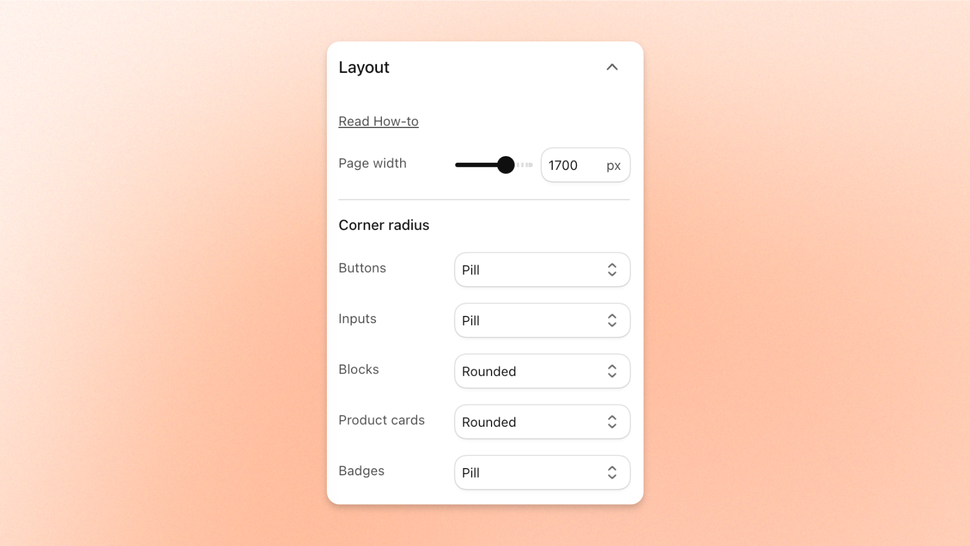
Make your store's layout fit your brand. The **Layout** settings set how wide your pages are, and how square or round the corners of your buttons, input fields, blocks, product cards, and badges look across your store.
## How to edit Layout
1. Go to **Online Store > Themes** in your Shopify admin.
2. Click **Edit theme** next to Hyper.
3. Click the **Theme settings** icon in the left sidebar.
4. Click **Layout**.
5. Adjust the settings described below.
6. Click **Save**.
## Settings
### Page width
| Setting | Description | Options |
| -------------- | ---------------------------------------- | --------------------------------------------------------------------------------------------------------------------- |
| **Page width** | The overall width of your store's pages. | **1000–2000 px.** A wider page works well for large screens, while a narrower page creates a compact, focused layout. |
### Corner radius
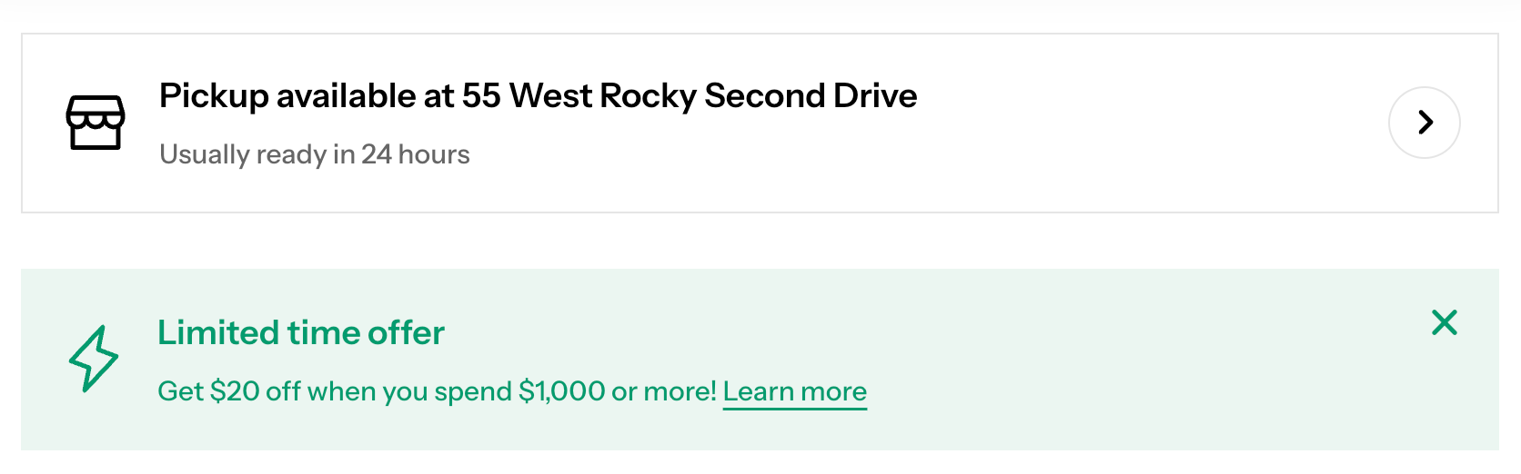
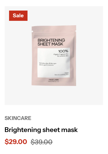
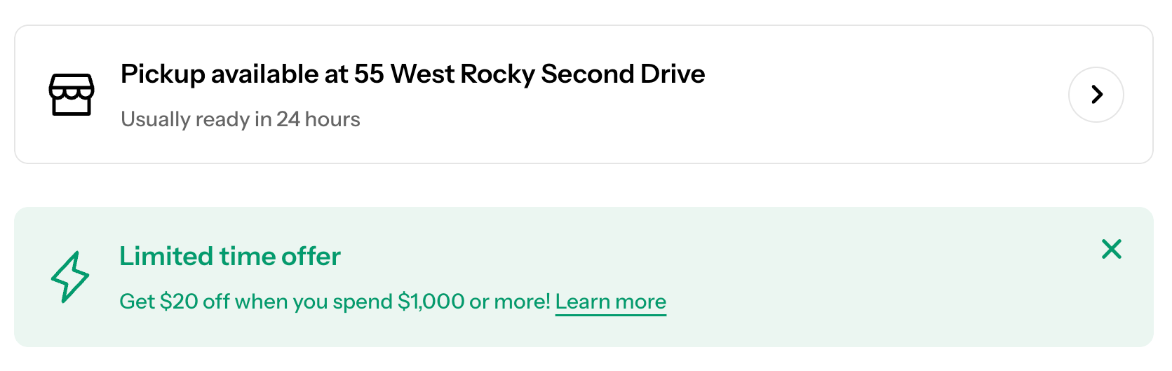
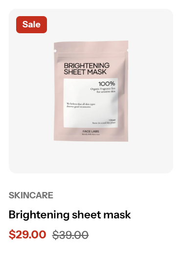
Sets how round the corners of each type of element are. **Square** gives sharp corners, and each option after it rounds the corners more, up to **Pill**. The exact roundness differs by element, as shown below.
| Setting | Description | Options |
| ----------------- | ------------------------------------------------------- | ---------------------------------------------------------------------------------------- |
| **Buttons** | The corners of buttons, such as call-to-action buttons. | **Square** (0 px), **Slightly round** (5 px), **Rounded** (10 px), or **Pill** (100 px). |
| **Inputs** | The corners of input fields. | **Square** (0 px), **Slightly round** (5 px), **Rounded** (10 px), or **Pill** (100 px). |
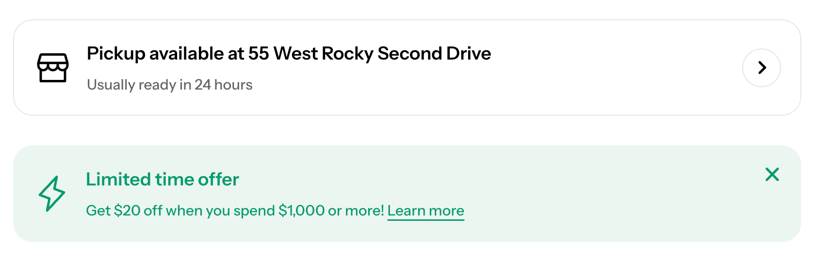
| **Blocks** | The corners of content blocks. | **Square** (0 px), **Rounded** (10 px), or **Pill** (20 px). |
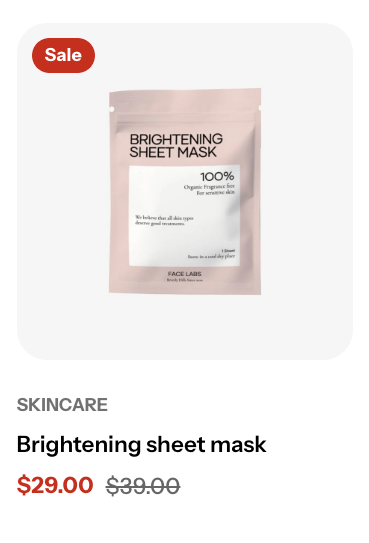
| **Product cards** | The corners of product cards. | **Square** (0 px), **Rounded** (10 px), or **Pill** (20 px). |
| **Badges** | The corners of badges, such as **Sale** or **New**. | **Square** (0 px), **Rounded** (5 px), or **Pill** (40 px). |
See how each option looks on buttons, input fields, blocks, product cards, and badges:
Buttons and Inputs: Square
Blocks: Square
Product cards and Badges: Square
Buttons and Inputs: Slightly round (5 px)
Buttons and Inputs: Rounded (10 px)
Blocks: Rounded (10 px)
Product cards: Rounded (10 px) · Badges: Rounded (5 px)
Buttons and Inputs: Pill (100 px)
Blocks: Pill (20 px)
Product cards: Pill (20 px) · Badges: Pill (40 px)
Your pages, buttons, input fields, blocks, product cards, and badges show the width and corner shapes you chose.
## Related articles
ButtonsProduct cardsProduct badges