
Theme Sections
Custom content
8 min read
_WjX2d9KF.jpg)
How to add a Custom content section to your Shopify store
- In the theme editor (Customize), click Add section
- Select Custom content.
- Make necessary changes.
- Save the settings.
How to edit a Custom content section
Section settings
General
- Container: Choose between Full width or Fixed width layout.
- Color scheme: Select a background/text color combo to match your brand. Learn more: Colors
- Enable sticky columns on desktop: Stick a column while the user scrolls (optional, for advanced storytelling layouts).
Section header
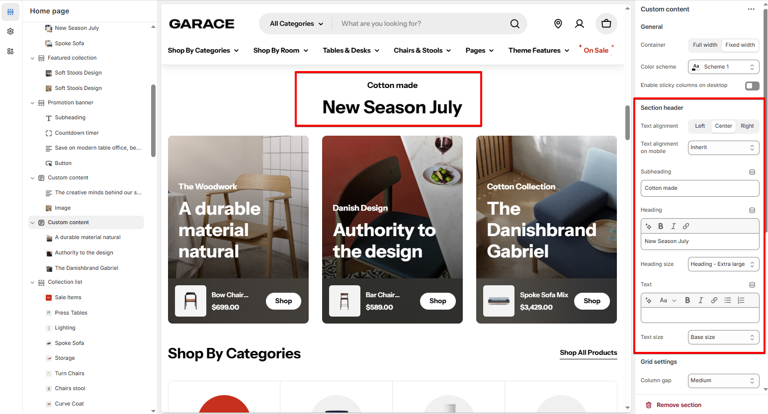
- Subheading, Heading, and Text: Introduce your section with clear messaging.
- Text alignment: Align left, center, or right.
- Heading size and Text size: Control typography hierarchy.
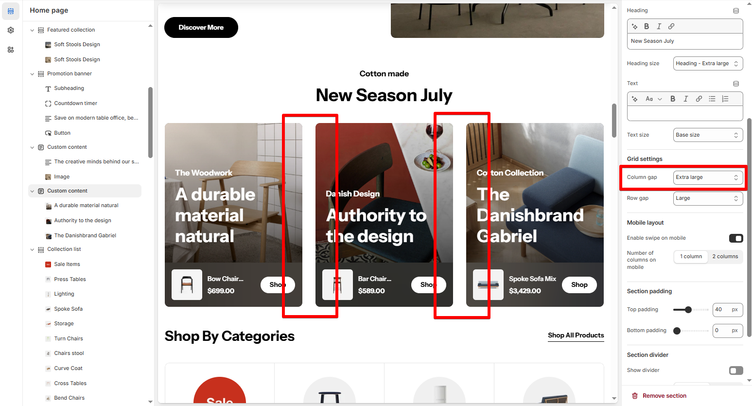
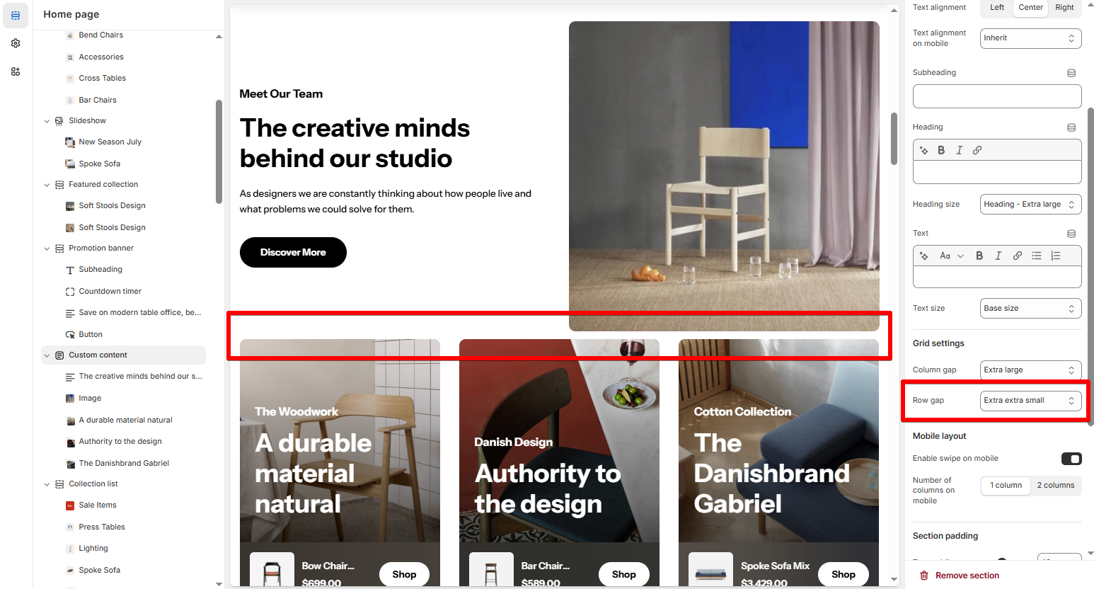
Grid settings
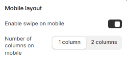
Mobile layout
Block settings
- Container width: Choose how wide the block.
- Vertical alignment: Align the block vertically within its section (Top, Middle, Bottom).
Last updated