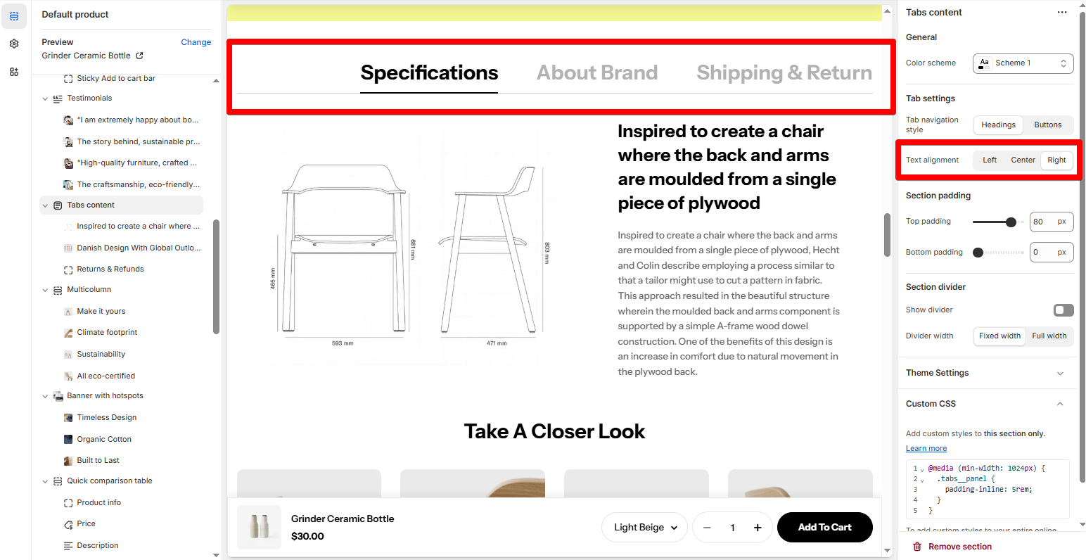
Tabs content
The Tabs content section lets merchants present essential info—like specifications, brand story, shipping policies, and more—in a clean, collapsible tab format. This improves user experience and keeps your pages streamlined.
# How to add a Tabs content section to your Shopify storeSteps
In the theme editor (Customize ), click Add section.
Locate Tabs content.
Make necessary changes.
Save. # How to edit a Tabs content# Section settings# Color schemeSelect a color scheme that matches your aesthetic.
🎨 Learn how to set up your Color schemes:
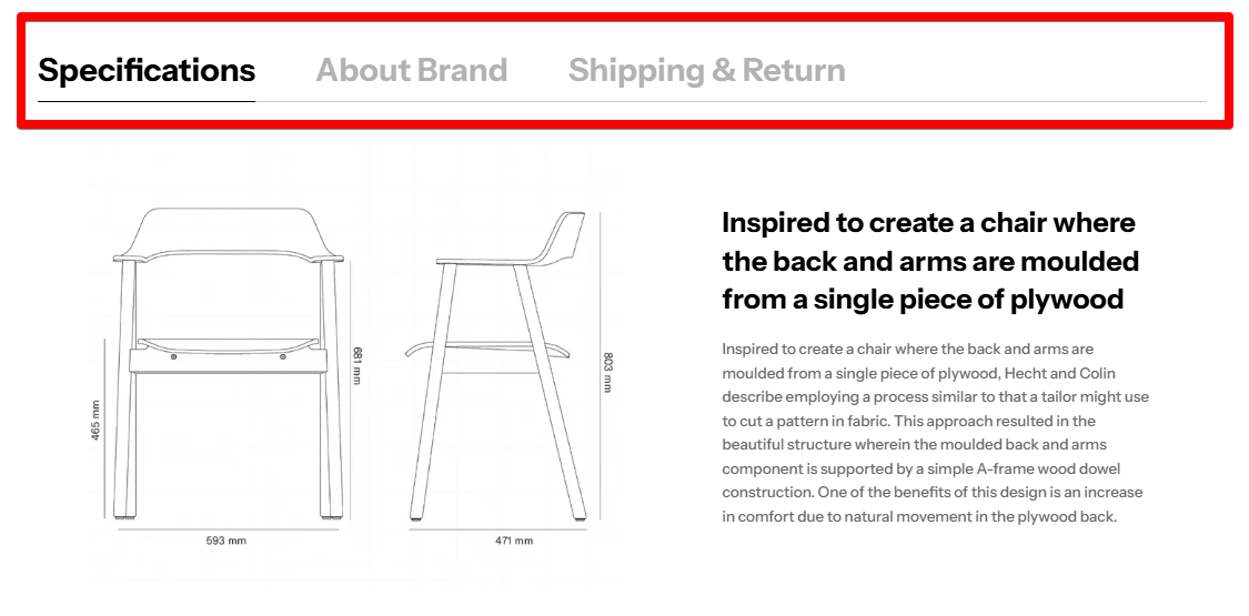
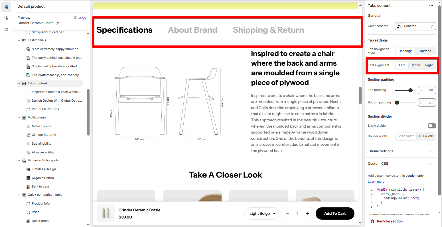
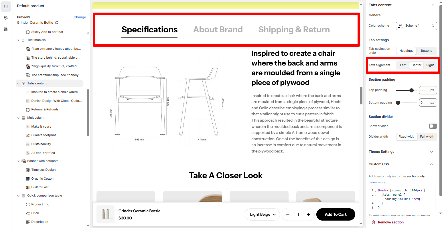
# Tab settingsHeadings are cleaner for simple layouts, while Buttons add more visual weight for a more interactive look.
Text alignment : Align your tab content to the left, center, or right.
# Block settingsAvailable blocks:
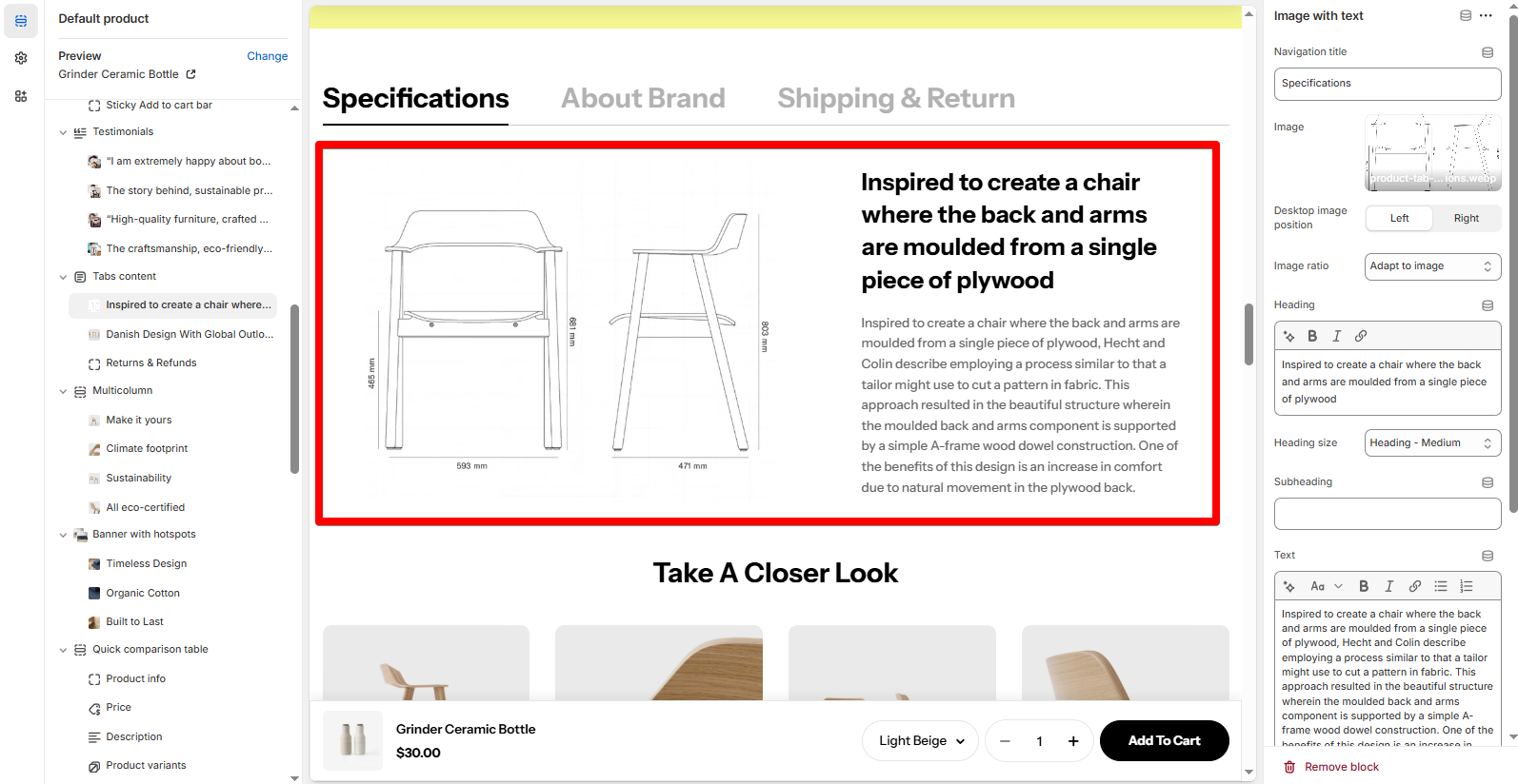
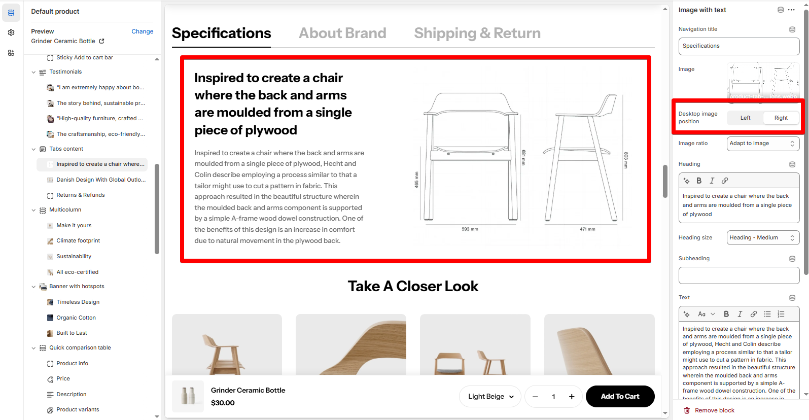
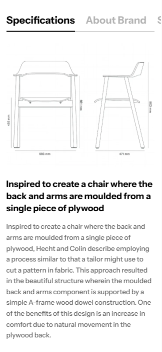
# Image with textCombine a heading, paragraph, and image—great for product specs or storytelling.
Choose Desktop image position as Left/Right based on visual flow.
On mobile, the image and content are vertically stacked by default.
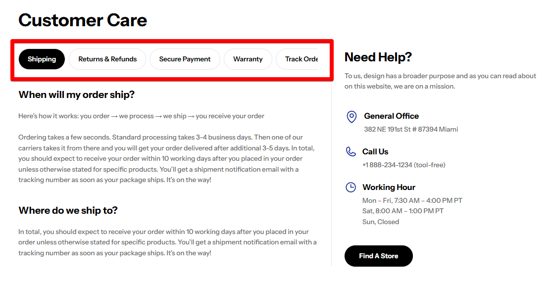
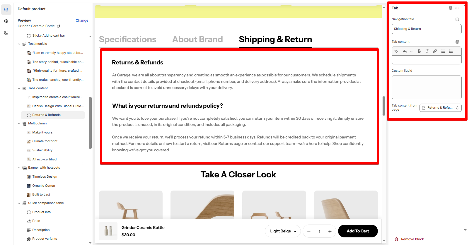
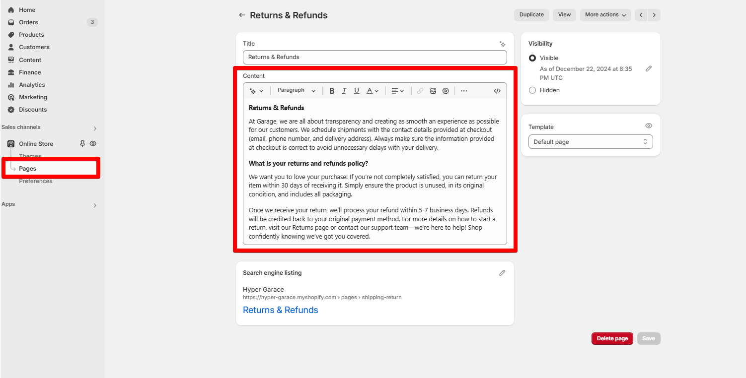
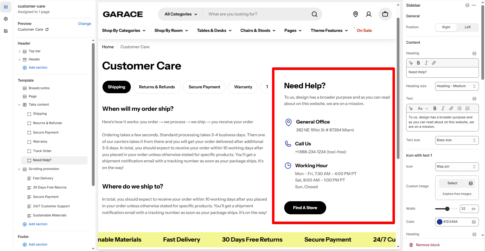
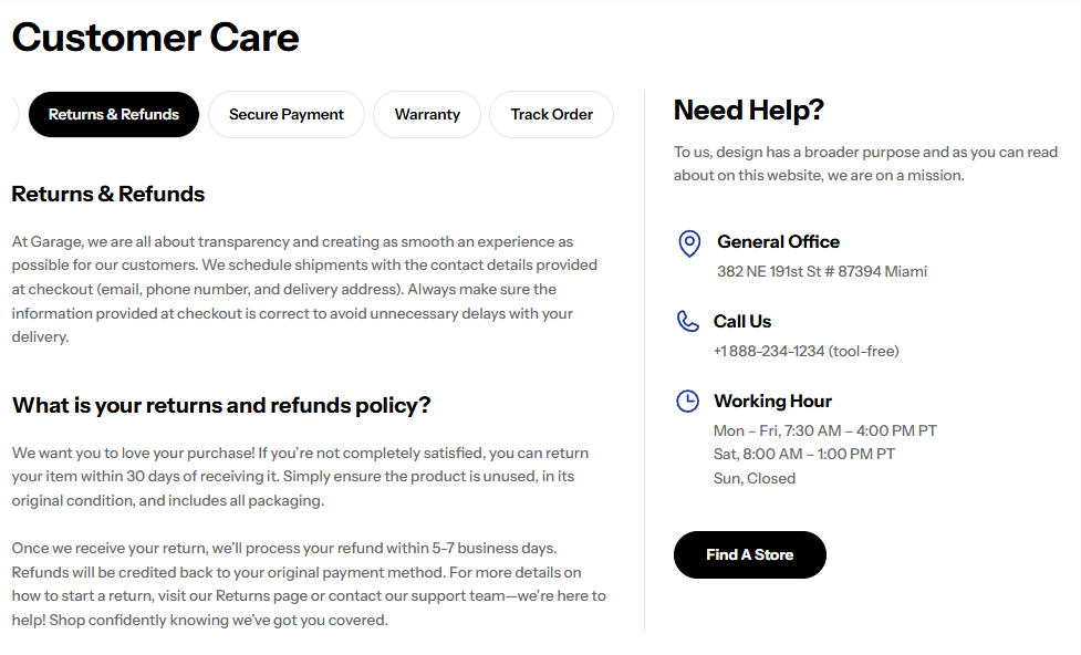
# TabShowcase content using Rich text editor, Custom liquid , or pull a page's content .
A great space for additional highlights, icons, or CTAs that complement the main tab content.
✅ Notes:
You can only add one sidebar block per Tabs content section.
The Sidebar block is not scroll-sticky , so keep it simple and concise.
On mobile view, the Sidebar block shows at the end of the section .
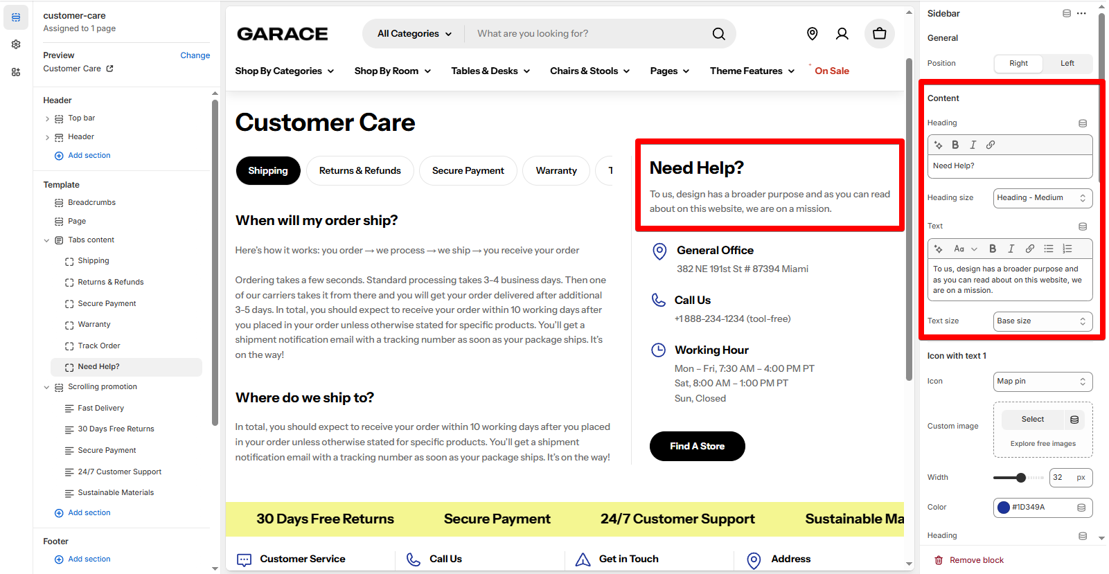
Position : Place the Sidebar at the Right/Left of the section.
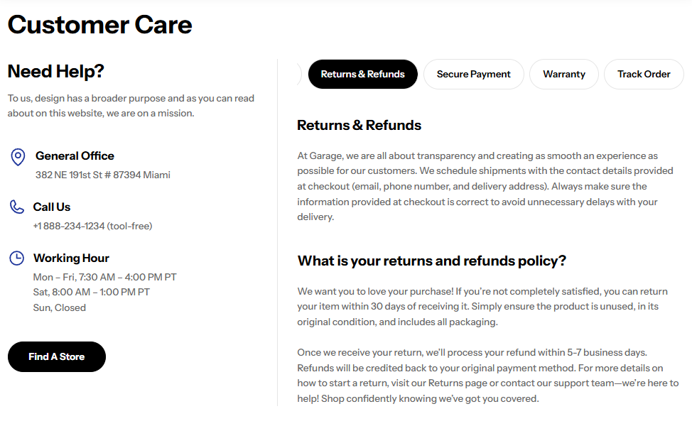
Content: Add a Heading and Description to the Sidebar.
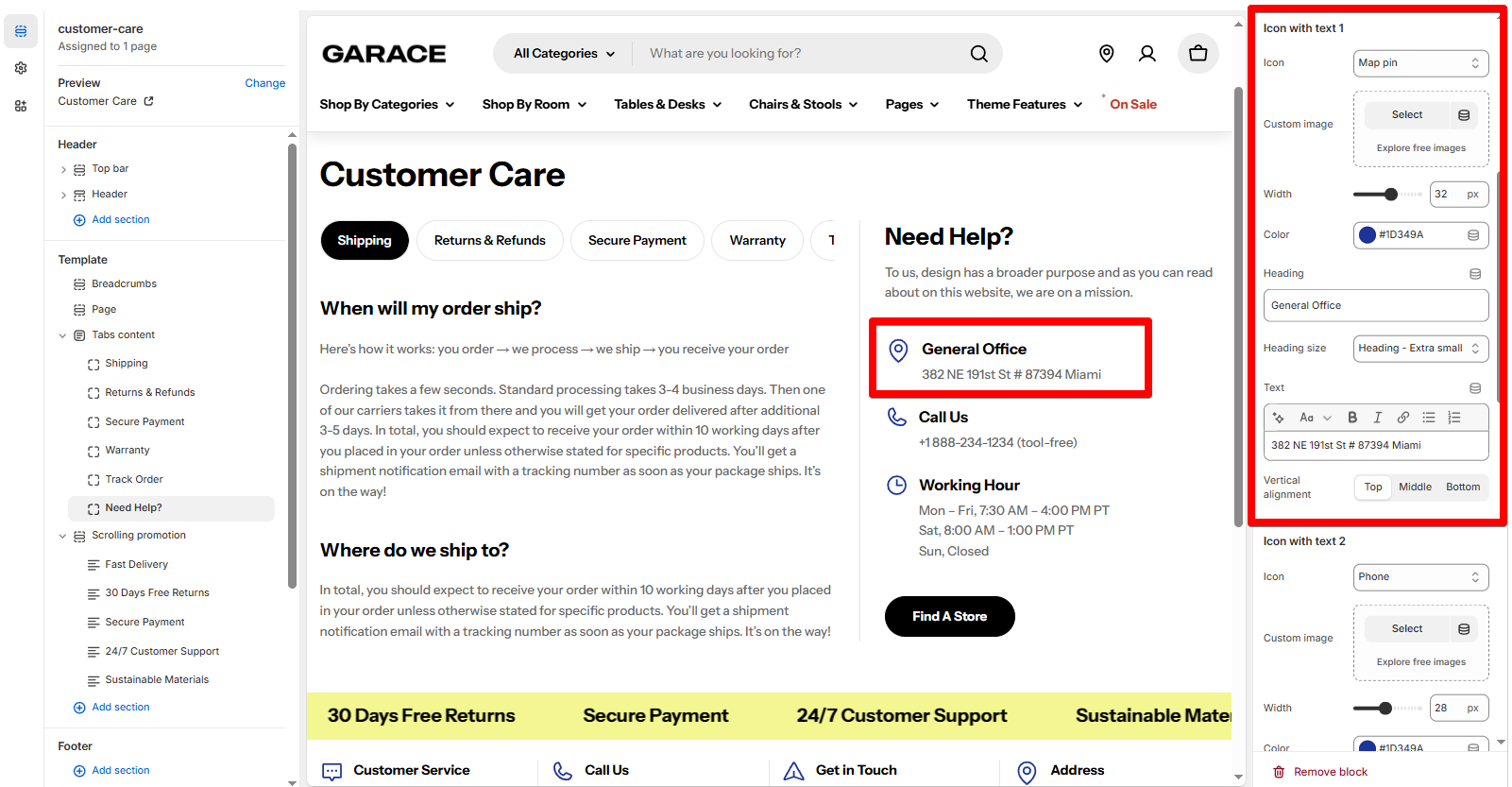
You can add up to 3 icon + text rows.
Each one includes:
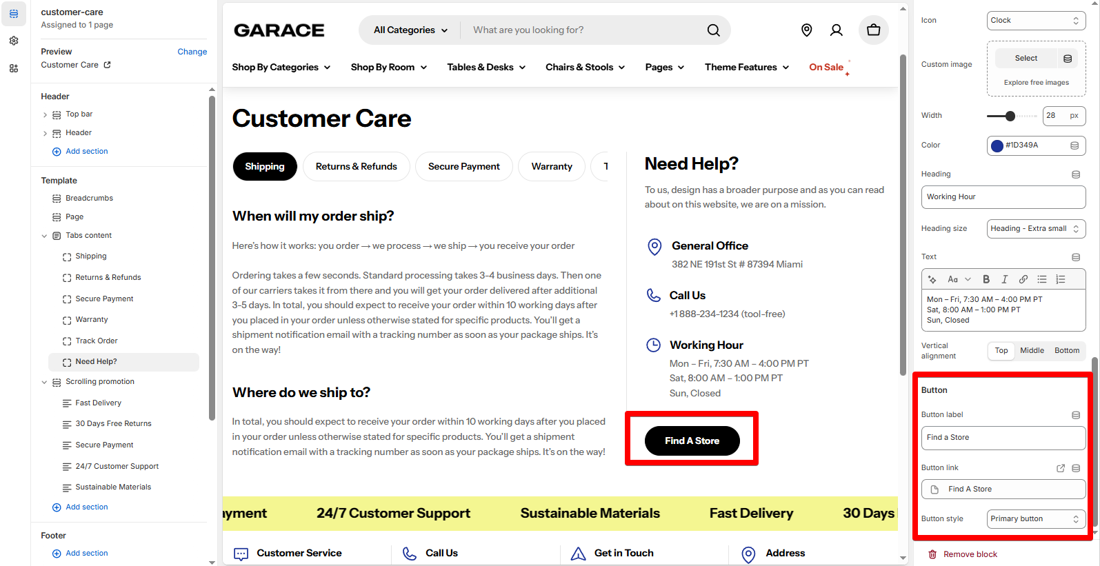
Icon from the built-in library (like Heart or Truck)Custom Image if you prefer using branded iconsWidth and Color to control icon size and match your brandingHeading for the text that appears next to the icon
Button : Optional call-to-action with label text. Good for linking to another section or page.
Last updated about 2 months ago

_zATITNqz.jpg)