
Theme Sections
Featured countdown timer
3 min read
_mYjHjuhI.jpg)
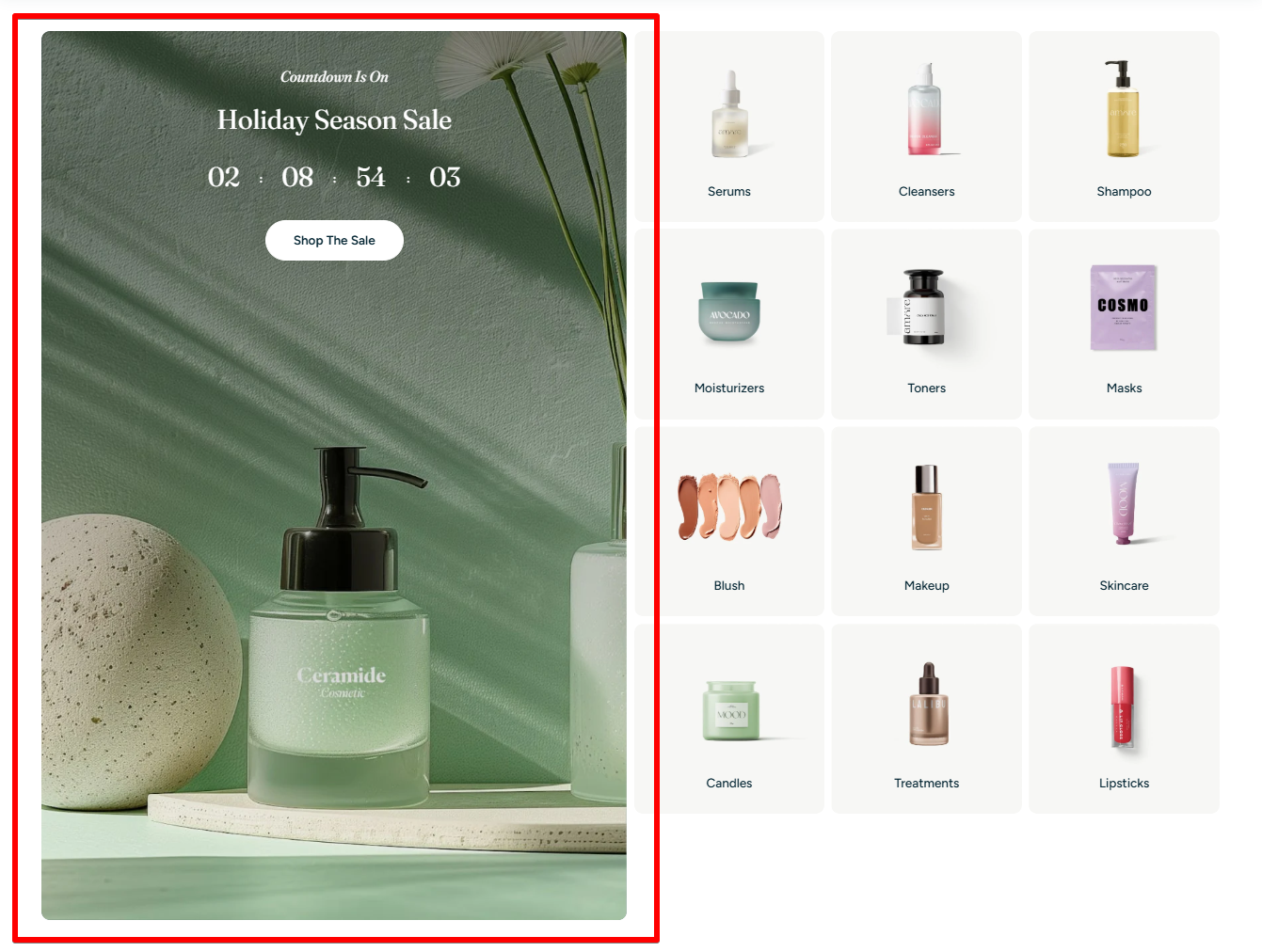
- 1 Countdown timer block (Evergreen or Fixed time)
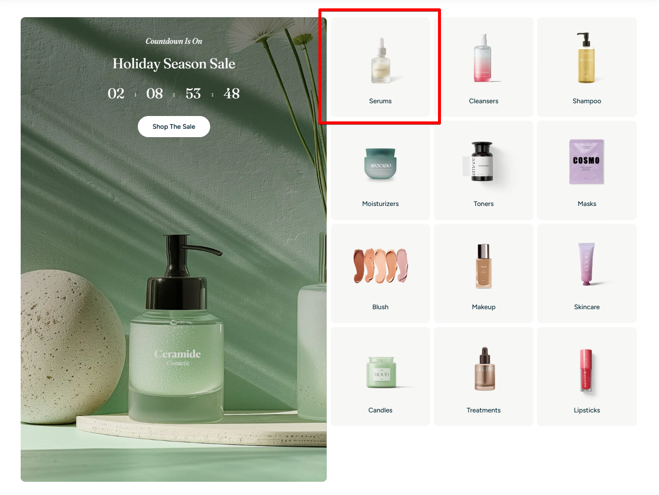
- Up to 12 Image cards (categories, products, or collections)
How to add a Featured countdown timer section to your Shopify store
- In the theme editor (Customize), click Add section.
- Locate Featured countdown timer.
- Make necessary changes.
- Save.
How to edit a Featured countdown timer section
Section settings
General
- Color scheme: Apply one of your theme's preset styles to the section.
✍ Learn more: Colors
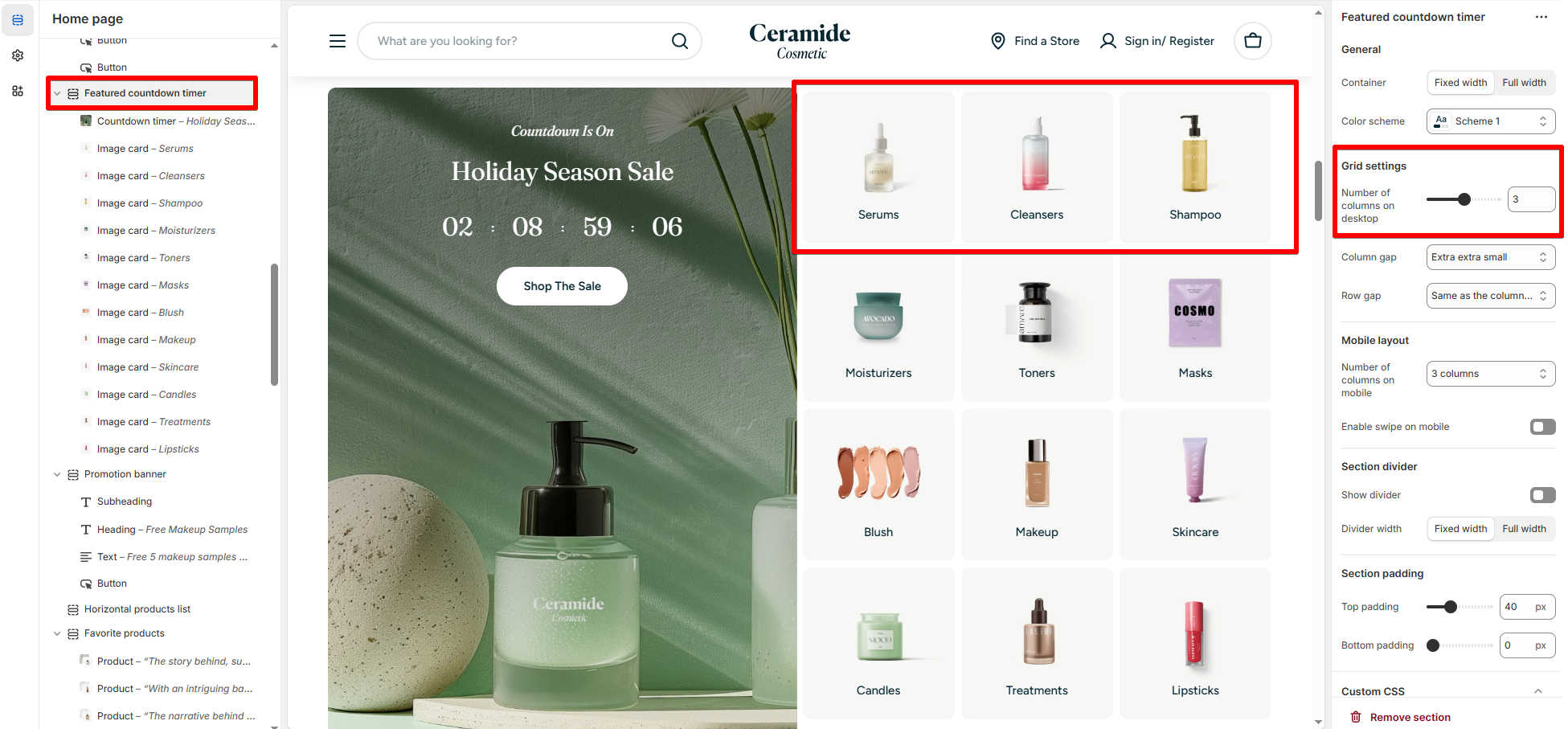
Grid settings
- Number of columns on desktop: Set how many image cards appear per row (2–4 columns).
- Column gap / Row gap: Adjust the spacing between cards.
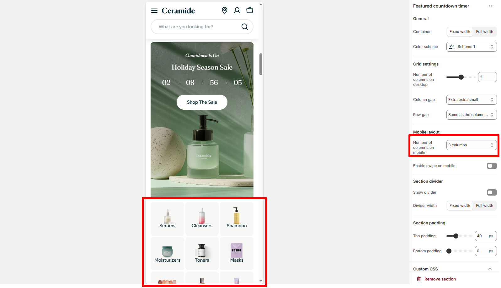
Mobile layout
- Number of columns on mobile: Choose 1-2–3 columns for smaller screens.
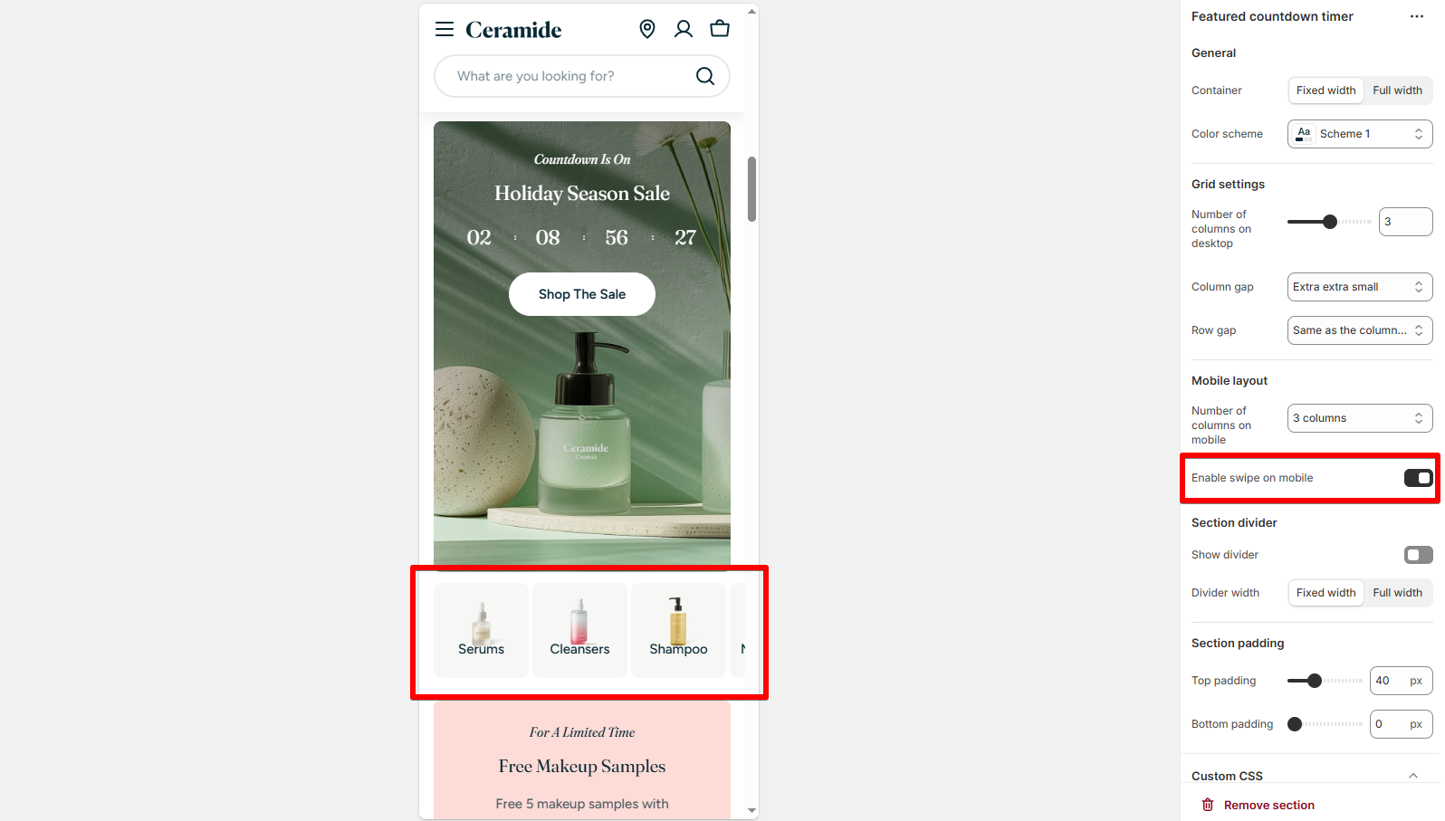
- Enable swipe on mobile: Allow horizontal swipe if you have many items.
Block settings
General
- Color scheme: Apply a custom style for the timer block.
- Background image: Upload a banner image.
- Image overlay opacity: Dim the background image for better text visibility.
- Content spacing: Adjust padding around content.
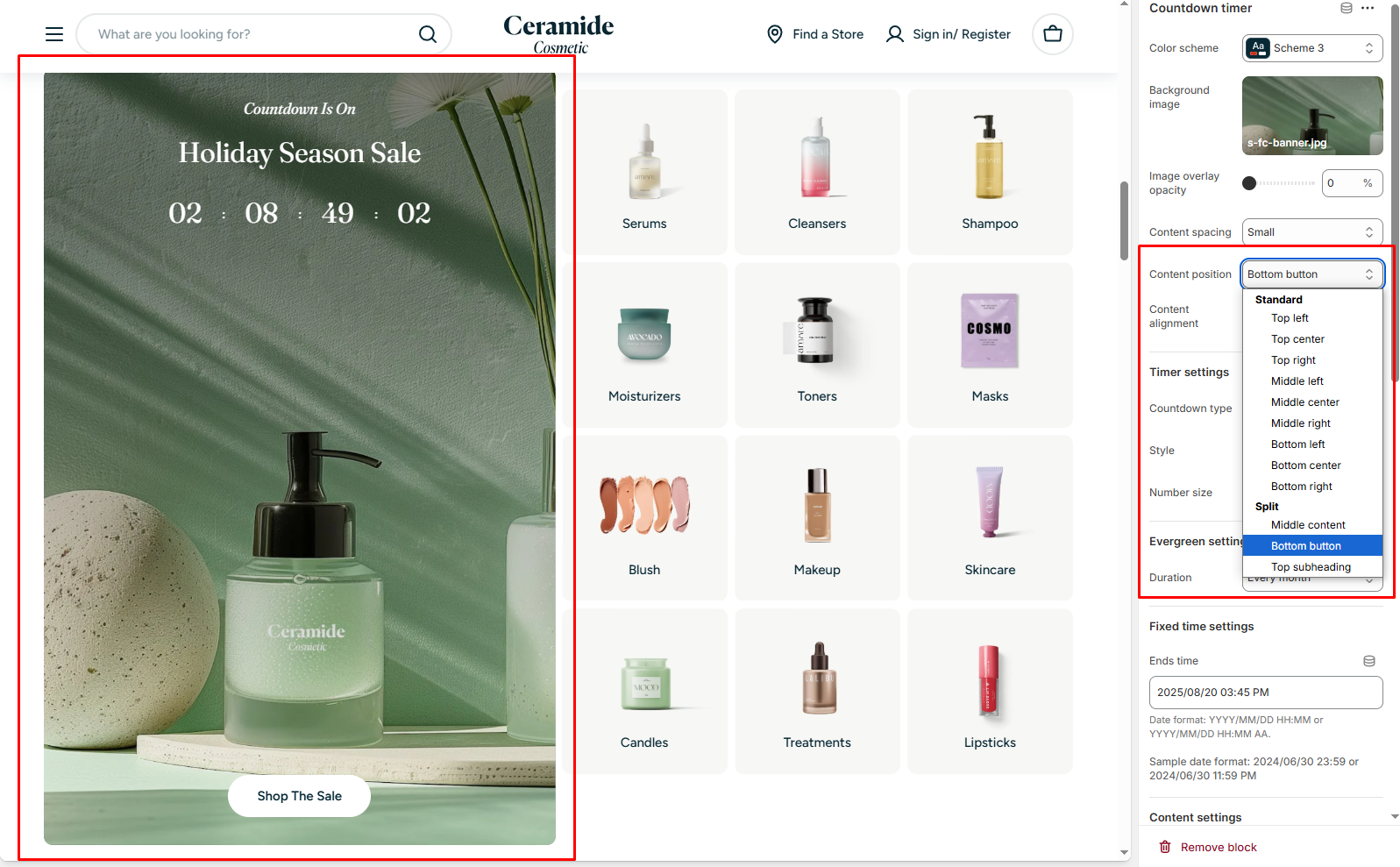
- Content position: Choose where to place the content. You can also choose the split the content.
- Content alignment: Align the content (Left, Center, Right).
Timer settings
- Countdown type:
- Evergreen: Auto-reset timer that repeats every defined cycle.
- Fixed time: Set a specific end date and time.
- Style:
- Only number: Shows only numbers.
- Number with text: Shows numbers with 'days, hours, minutes, seconds' labels.
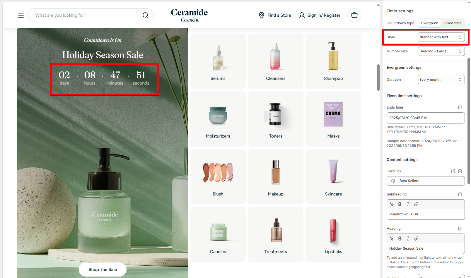
- Number size: Adjust the size of the countdown numbers.
- Fixed time: Select the exact end date/time (Format: YYYY/MM/DD HH:MM or YYYY/MM/DD HH:MM AA).
YYYY/MM/DD HH:MM | YYYY/MM/DD HH:MM AA |
|---|---|
| 2024/06/30 23:59 | 2024/06/30 11:59 PM |
- Evergreen duration: Define cycle duration (e.g.: Every 2 hours, every day, every month, etc.).
Countdown Text Content
- Card link: Paste a link or select a page from your Shopify store to link the card image and button to.
- Subheading & Heading: Add promotional text above the timer.
- Highlight styles: Animate or emphasize important words.
Learn more: Add Highlighted text to your Headings
- Heading size: Adjust size of the main heading.
- Text (optional): Add a supporting paragraph or short promotional description.
- Button label: Add call-to-action text like "Shop Now" or "View Deals".
- Button style: Choose Primary, Secondary, Underline or Plain.
- Button icon: Add optional icons to the button.
- Enable preload image: Optimize Largest Contentful Paint (LCP) by preloading background image for faster speed (for sections that are above the fold).
- Image: Upload the promotional image.
- Link: Direct customers to a collection or product page.
- Content alignment: Align the text overlay (Left, Center, Right).
- Heading: Add the title (e.g., "Moisturizers").
- Highlight styles: Optional highlight or animate key words.
Learn more: Add Highlighted text to your Headings
- Heading size: Control heading font size.
- Text (optional): Add a short supporting line.
Best practices
Last updated