
Theme Sections
Banner with hotspots
3 min read
_SNg1k0ib.jpg)
How to add a Banner with hotspots section to your Shopify store
- In the theme editor (Customize), click Add section.
- Locate Banner with hotspots section.
- Make necessary changes.
- Save.
How to customize a Banner with hotspots section
Section settings
Section header
Banner settings
- Image and Mobile image: You can upload different images for desktop and mobile view separately.
- Icon style: Choose the apprearance of the hotspot icon.

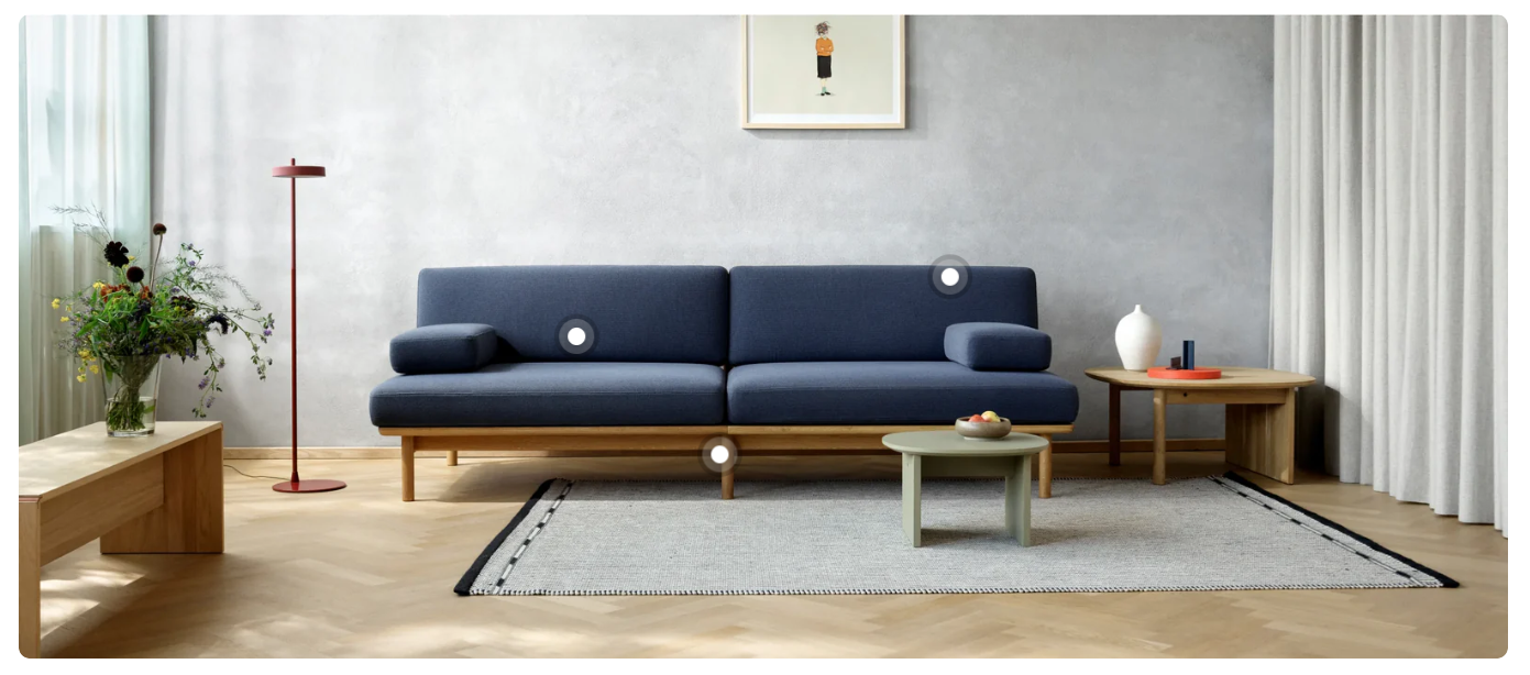
- Icon color: Customize the color of the icons based on the banner’s background:
- Light: Ideal for darker images.
- Dark: Perfect for lighter backgrounds.
Block settings
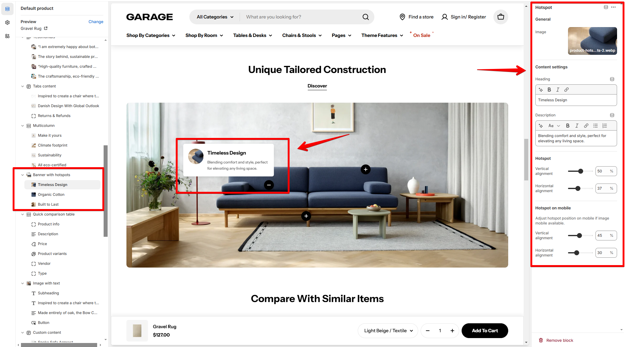
General settings
- Image: Upload an optional image to represent the content in the hotspot pop-up card.
Content settings
- Heading: Enter a concise title for the hotspot.
- Description: Add a brief description to provide more information about the feature or product.
Hotspot positioning
- Vertical alignment: Adjust the vertical position of the hotspot on the banner. The slider allows precise placement.
- Horizontal alignment: Adjust the horizontal position of the hotspot.
Hotspot on mobile
Last updated