
Theme Sections
Collection list banner 🔥
4 min read
_kaMLrodq.jpg)
How to add a Collection list banner section to your Shopify store
- In the theme editor (Customize), click Add section
- Locate Collection list banner
- Make necessary changes
- Save.
✍ To know more about creating and editing collections, see: This tutorial.
How to edit a Collection list banner section
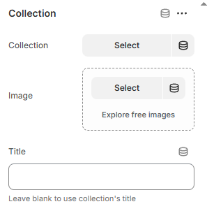
Section settings
Block settings
Adjust the Color scheme for the block. Learn more Colors
Image settings
- Image: Upload an image for the card.
- Image overlay opacity: Add a dark overlay for better text readability.
Content settings
- Content position: Choose where the text/button appears.
- Content alignment: Align text left, center, or right.
- Content spacing: Adjust padding around the text.
- Content gap: Adjust the gap between elements in the content.
- Card link: Add a link to the image that directs customers to a desired page.
- Subheading & Heading: Add eye-catching titles.
- Text: Add supporting promo or product details.
- Button label: Add a call-to-action button to the card content.
- Button style: Choose between primary, secondary, underline, etc.
Badge settings
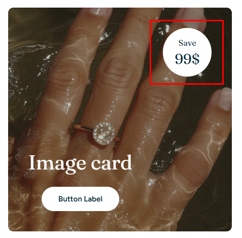
- Show badge: Toggle on/off.
- Color scheme: Style it to match your theme.
- Shape: Circle or Square.
- Position: Top right/Top left/Button right/Button left.
- Subtext & Text: Customize your badge message (e.g. Save / 40%).
Mobile settings
- Choose a mobile-specific image if needed for better display.
- Set how the content is aligned on mobile: Left/Center/Right.
Last updated