
Theme Sections
Collection list
2 min read
_P872SmBb.jpg)
How to add a Collection list section to your Shopify store
- In the theme editor (Customize), click Add section
- Locate Collection list
- Make necessary changes
- Save.
To know more about creating and editing collections, see: This tutorial.
How to edit a Collection list section
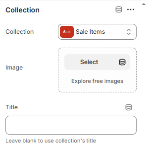
Section settings
Section header
Card settings
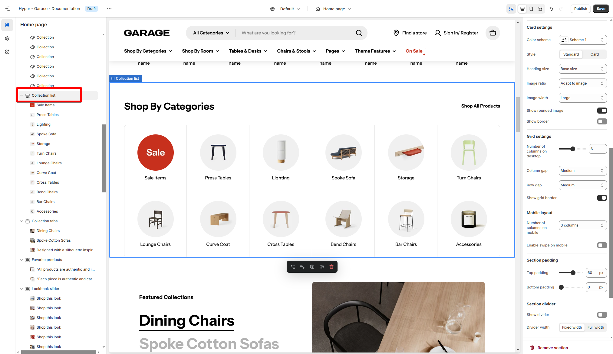
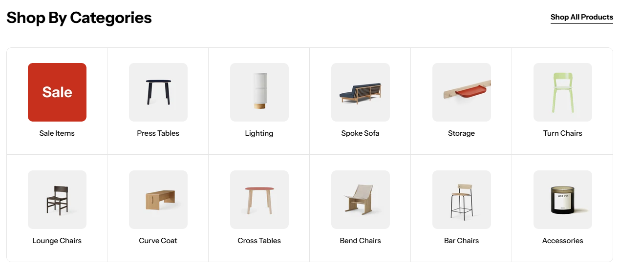
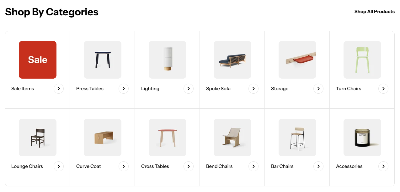
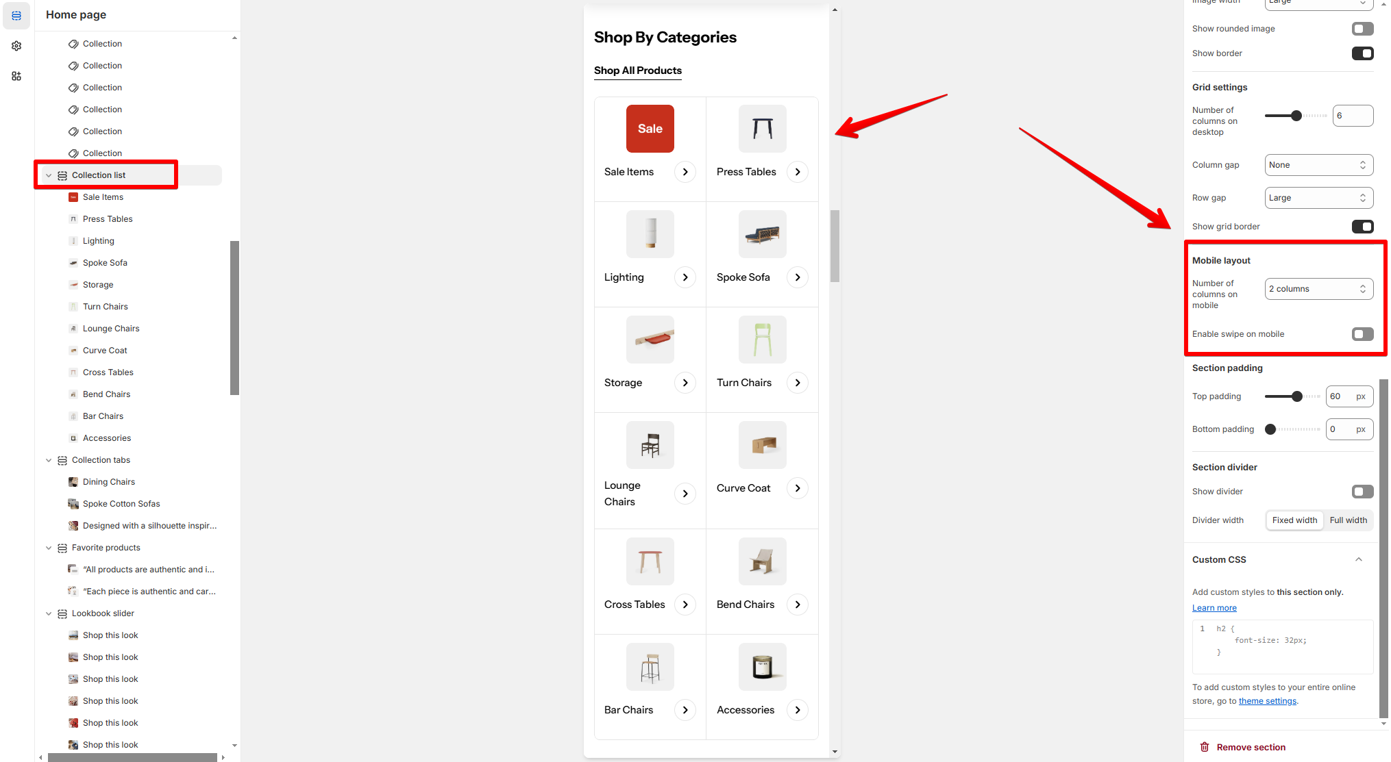
Grid settings
- Number of columns on desktop: Adjust the slider to set the number of columns.
- Column gap and Row gap: Adjust the spacing between collections.
- Grid border: Enable if you want a clear separation between items. The Grid border once enabled will override the card's border.
Mobile layout
Block settings
Last updated