
Theme Sections
Recently viewed products
2 min read
_RE70SmF2.jpg)
How to add a Recently viewed products section
- In the theme editor (Customize), click Add section.
- Locate Recently viewed products.
- Make necessary changes.
- Save.
How to edit a Recently viewed products section
Section header
Grid settings
- Maximum products to show: between 2-12 products.
- Number of columns on desktop: between 2-6 products.
- Column gap: Set the gap between product columns.
- Row gap: Set the gap between product rows.
Carousel settings
- Enable carousel on desktop: Display the product list on a carousel (when the number of recently viewed products > the number of columns on the desktop).
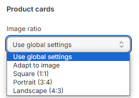
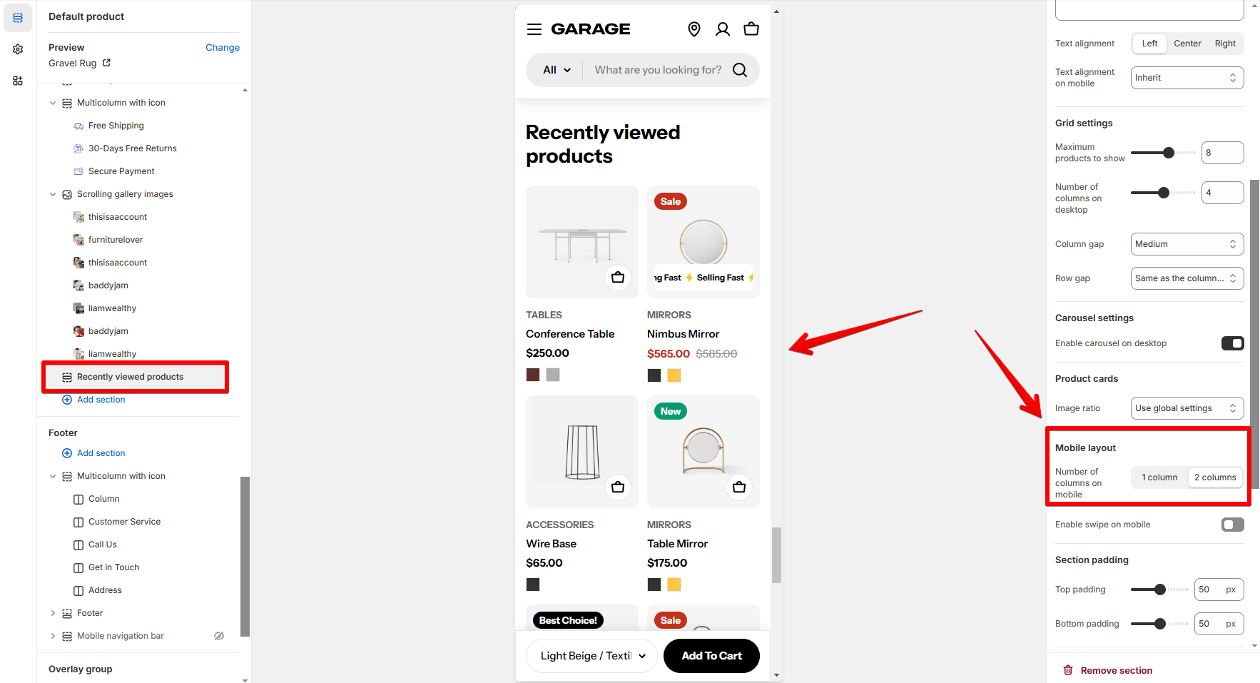
Product cards
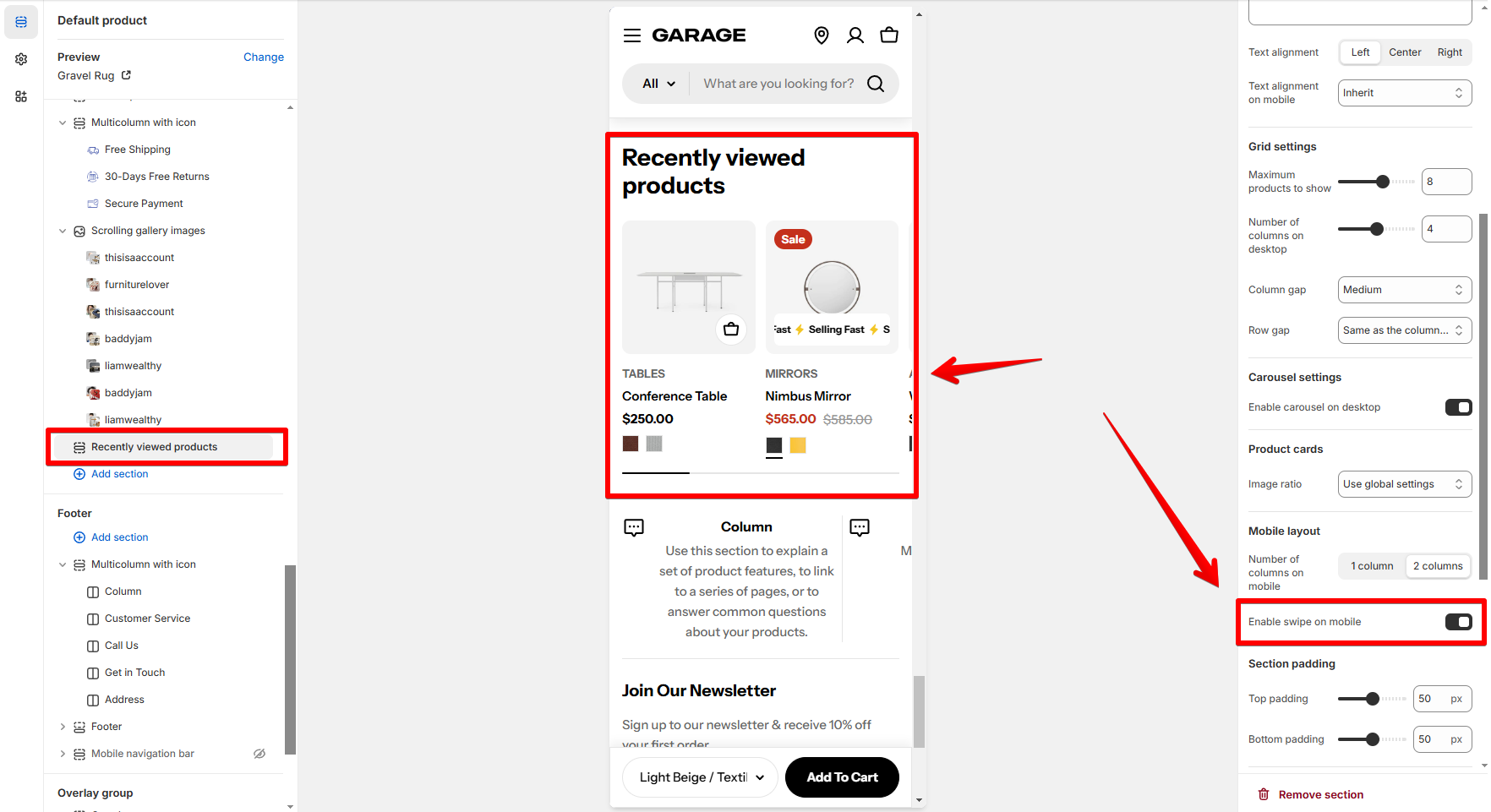
Mobile layout
- Number of columns on mobile: Set the number of product grid columns for mobile view (1 column/ 2 columns).
- Enable swipe on mobile: Check the option to make the product list swipeable instead of showing in a grid layout.
Last updated