
Theme Sections
Before/after image slider
3 min read
_qaBwvXhX.jpg)
How to add a Before/ After image slider to your Shopify store
- In the theme editor (Customize), click Add section.
- Locate Before/after image slider section
- Make necessary changes.
- Save.
How to edit a Before/ After image slider
Section settings
Section header
Before/ after image settings
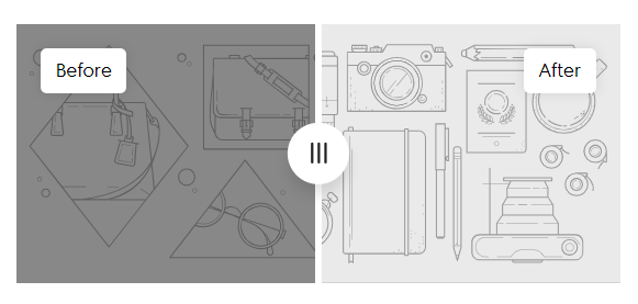
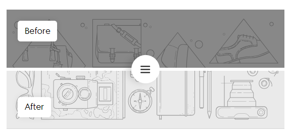
- Direction: Choose the orientation of the slider:
- Horizontal: The images are displayed side by side, with the slider moving left or right.
- Vertical: The images are stacked on top of each other, with the slider moving up or down.
- Image height: Select how the image height is determined: Adapt to image/ Small/ Medium/ High.
- Image heading style: Customize how the heading appears above the images.
- Product: Link the slider to a specific product from your store.
Block settings
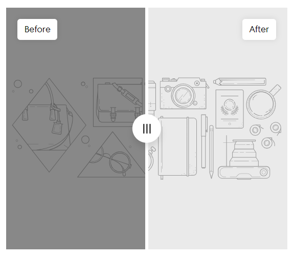
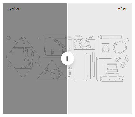
- Before
- After
- Text
| Setting | Description |
|---|---|
| Image | Upload the desired comparison image. |
| Mobile image | Optional: upload a version optimized for mobile. |
| Image heading | Add a short label (e.g., Before, After 2 months). |
| Color scheme | Match the background to your site style. |
| Setting | Description |
|---|---|
| Heading | Add a title |
| Heading color | Customize the heading text color. |
| Heading size | Choose heading scale: Extra small to Large. |
| Text | Use this space for a description or supporting statement. |
| Text size | Adjust body text size. |
Last updated