
Theme Sections
Collection cards
4 min read
_Fo6vrNct.jpg)
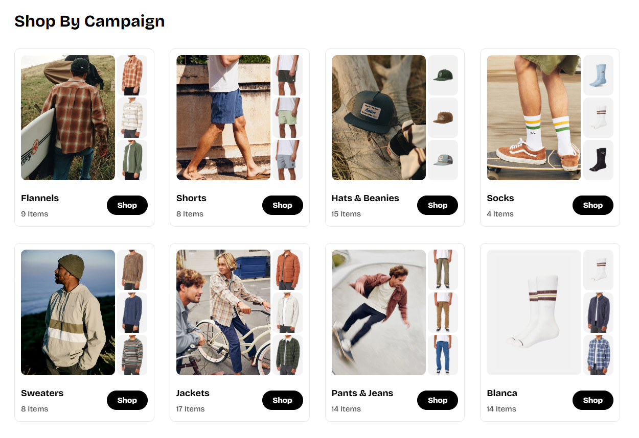
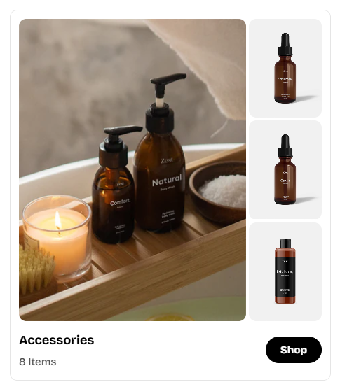
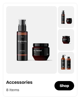
- Collection thumbnail image
- First 3 collection products
- Collection title
- Item count
- Shop button
How to add a Collection cards section to your Shopify store
- In the theme editor (Customize), click Add section.
- Locate Collection cards section.
- Make necessary changes.
- Save.
How to edit a Collection cards section
Section settings
General
- Color scheme: Choose a theme color preset. Learn more →
Section header
Layout setting
- Number of column on desktop: Set how many collection cards display per row on desktop.
- Column gap and Row gap: Control spacing between cards and rows separately.
Carousel setting
- Enable carousel on desktop: Allow horizontal swiping through collections when the number of collections exceeds the number of column on desktop.
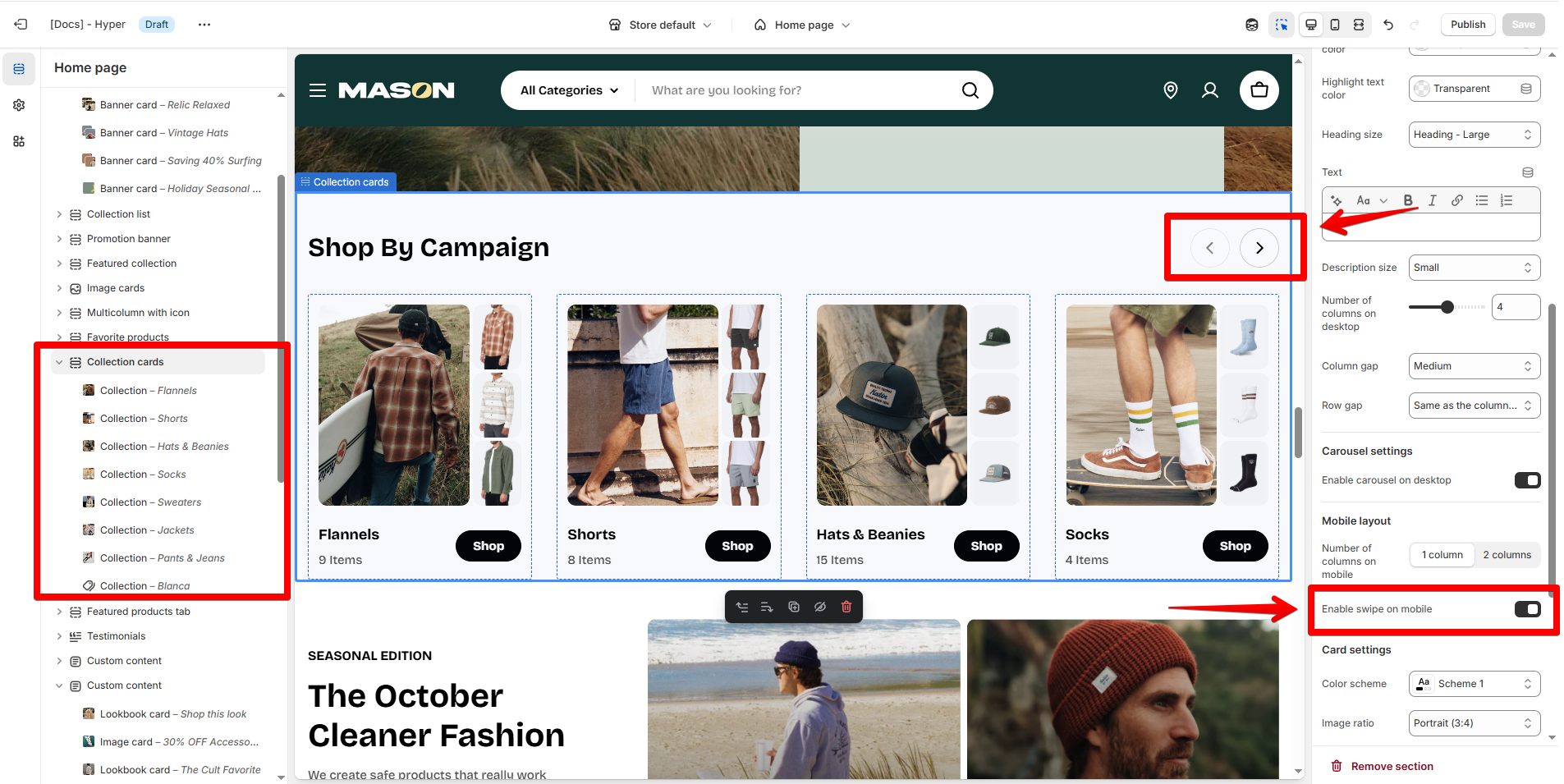
Mobile layout
- Set the number of columns on mobile as 1 column/ 2 columns.
- Enable swipe on mobile to swipe through the collections on mobile.
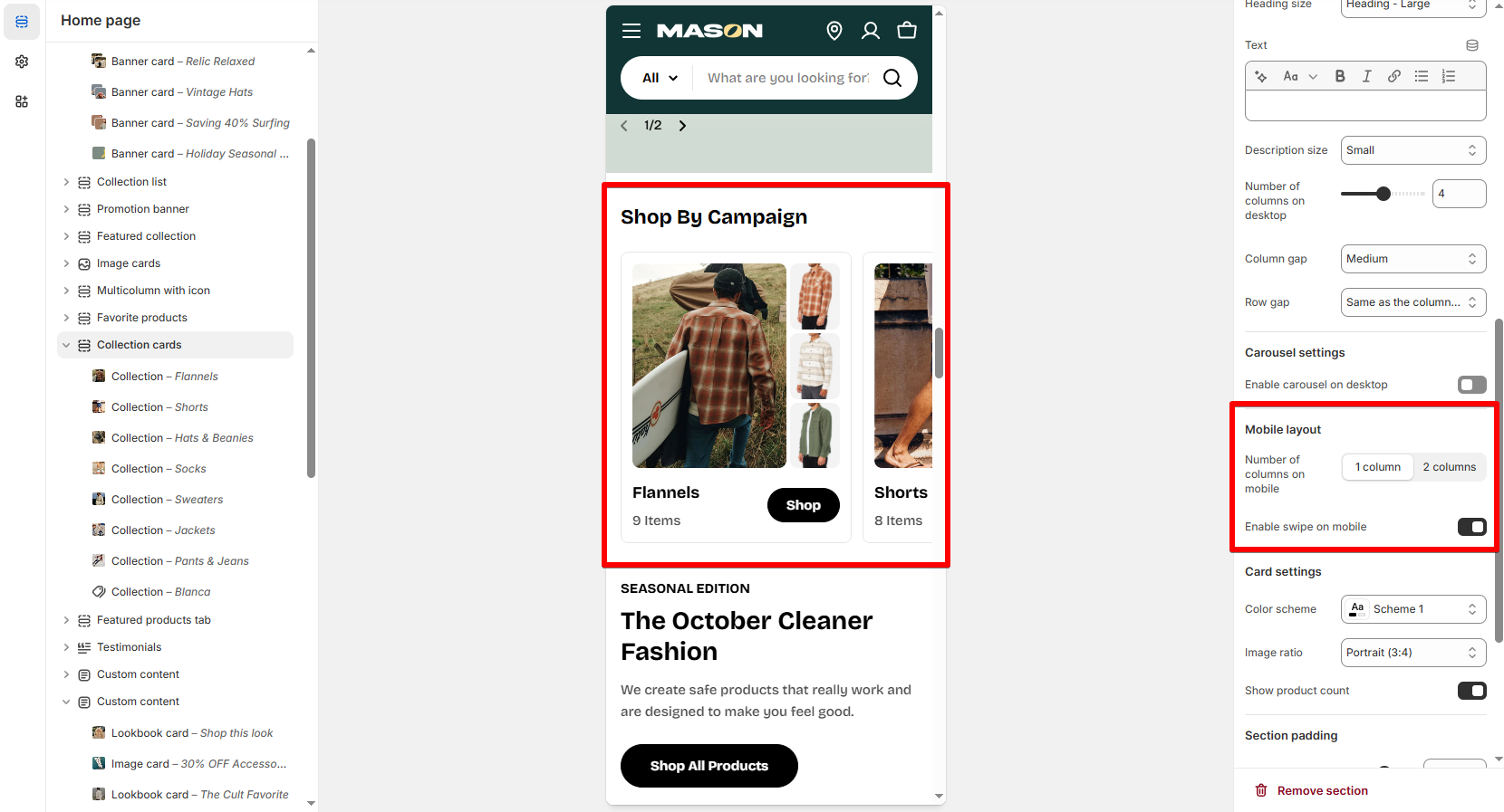
Card settings
- Color scheme: Select a pre-defined set of colors used for the collection cards of the section.
- Image ratio: Set the aspect ratio for collection images (both the collection's featured images and product images).
- Show product count: Toggle on to display the number of items in each collection under the collection title.
Block settings - Collection setup
- Option to select a collection you want to feature.
- Upload a custom featured image for the collection.
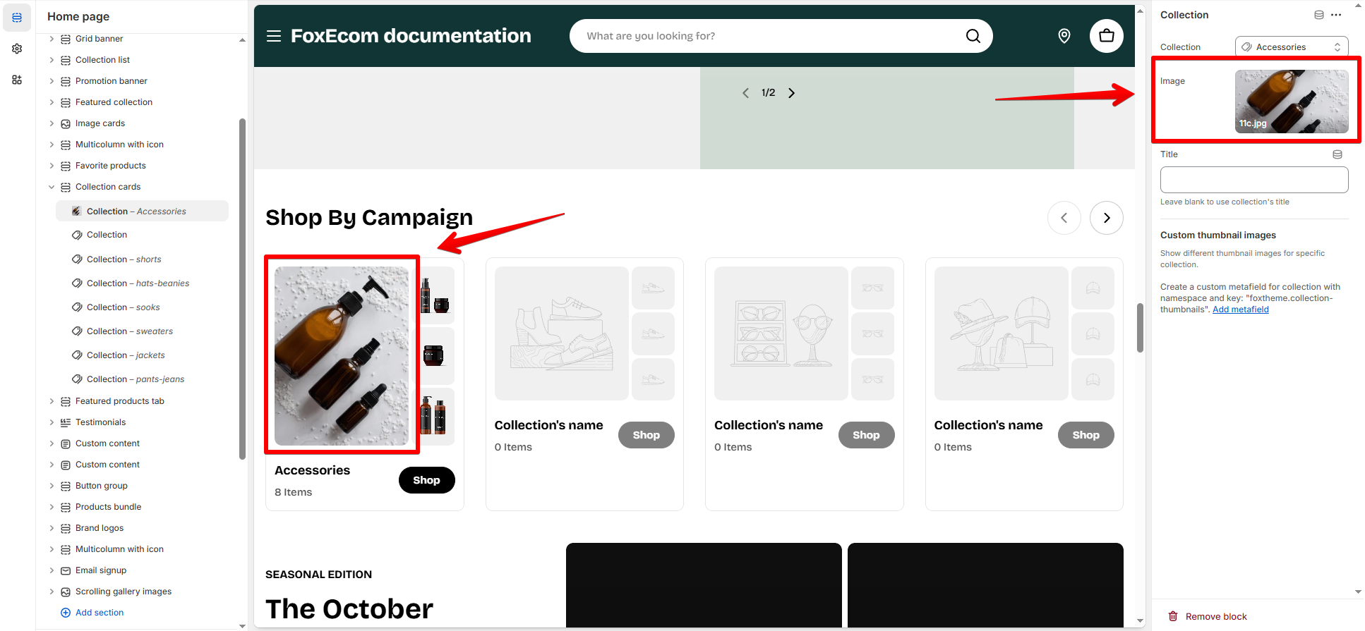
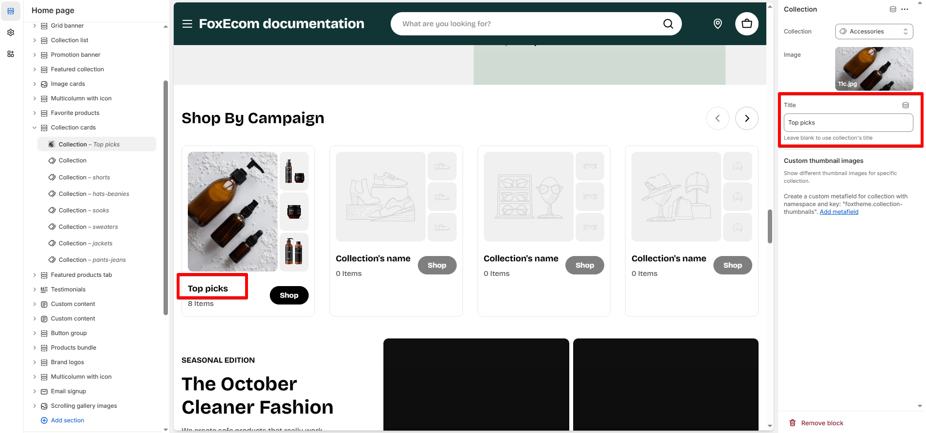
Custom thumbnail images 🔥
- Your first 3 products don’t reflect the collection well.
- You want to highlight bestsellers or curated visuals.
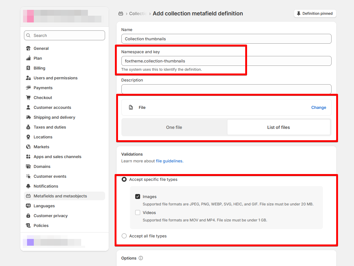
Create a metafield definition
-
- Name: Collection thumbnails (or any name you like)
- Namespace and key:
foxtheme.collection-thumbnails - Content type: File → Accepts: List of images
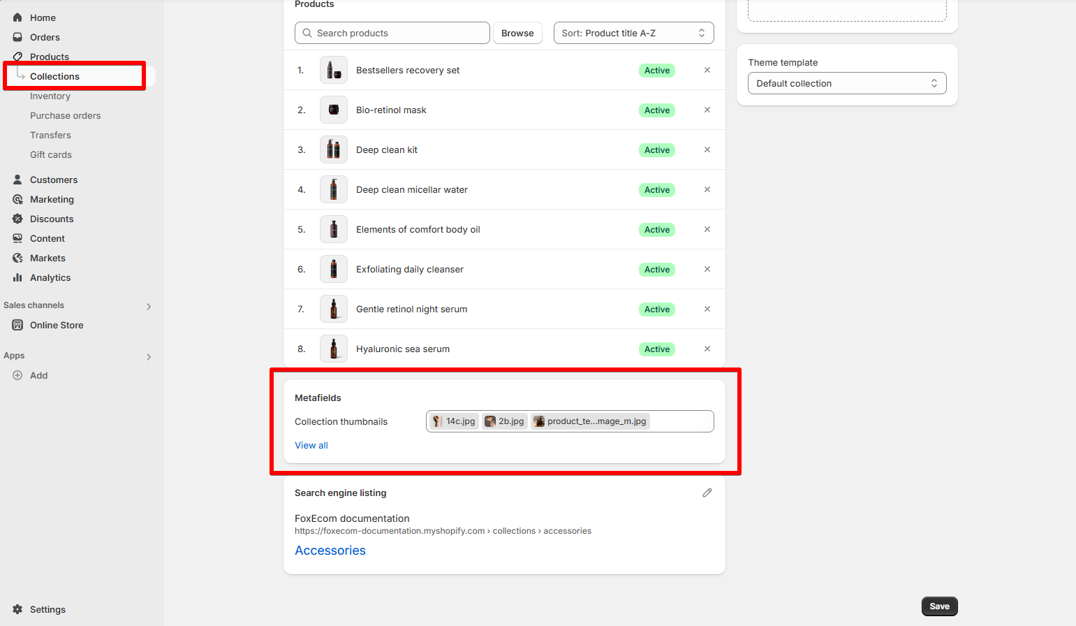
Add images to collection
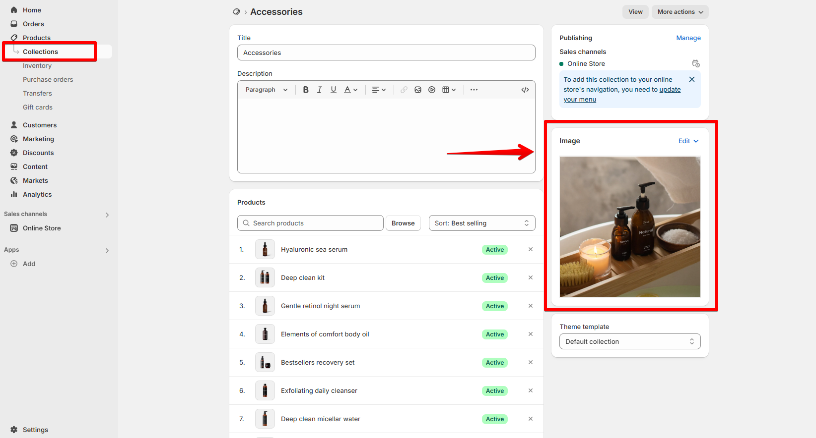
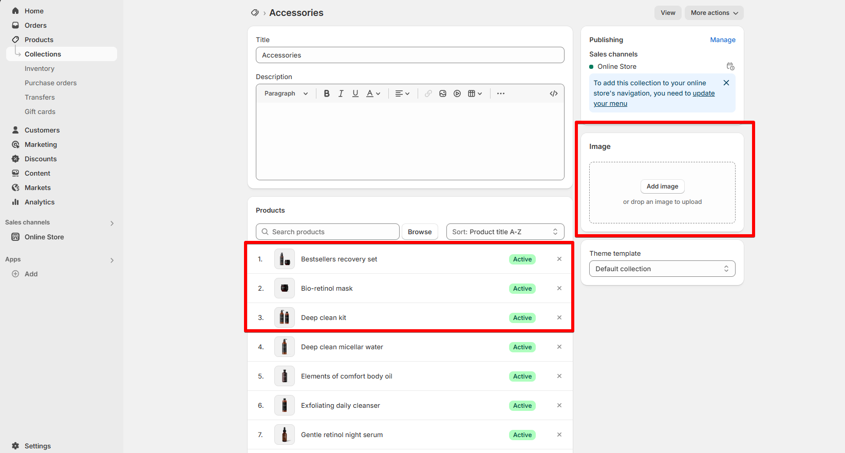
- Go to Products > Collections.
- Click on the collection you want to edit.
- Scroll down to the Metafields section.
- Upload 1–3 images to the metafield you just created.
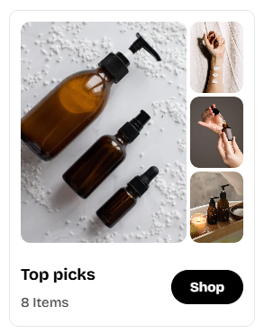
View on the theme editor
- Open your theme editor (Online Store > Themes > Customize).
- Navigate to the Collection cards section.
- You’ll see the new thumbnail images appear on the right side of the collection card.
Last updated