
Theme Sections
Button group
2 min read
_X35GRyND.jpg)
How to add a Button group section to your Shopify store
- In the theme editor (Customize), click Add section
- Locate Button group section
- Make necessary changes
- Save.
How to edit a Button group section
Section settings
Section header
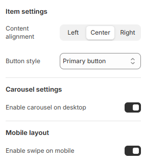
Item settings
- Content alignment: Align the content within the buttons (left, center, or right).
- Button style: Choose between styles for your buttons.
Carousel settings
Mobile Layout
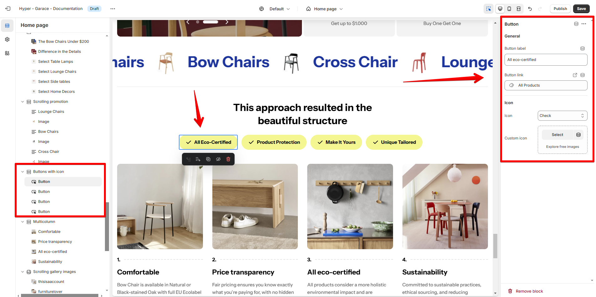
Block settings
Last updated