
Theme Sections
Banner with categories 🔥
3 min read
How to add a Banner with categories section to your Shopify store
- In the theme editor (Customize), click Add section.
- Locate Banner with categories section.
- Make necessary changes.
- Save.
How to customize a Banner with categories section
Section settings
| Setting | Function |
|---|---|
| Container width | Full width or fixed width layout. |
| Color scheme | Choose background and font styling. Learn more: Colors |
| Number of columns | Adjust how many columns: - of banners on desktop - of category bar on mobile. |
| Column gap | Set spacing between category cards. |
| Enable swipe on mobile | By default, the banners are stacked. Toggle ON to make the category row horizontally scrollable on mobile.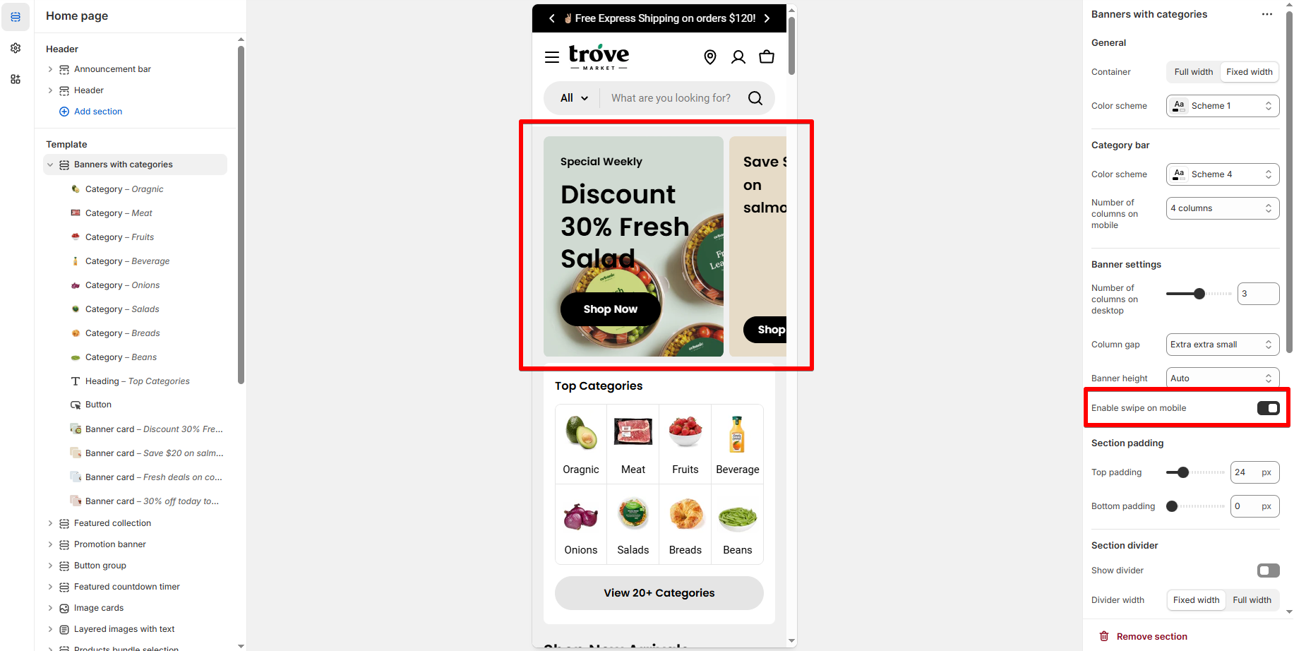 |
| Top/Bottom padding | Adjust spacing above and below this section. |
Block settings
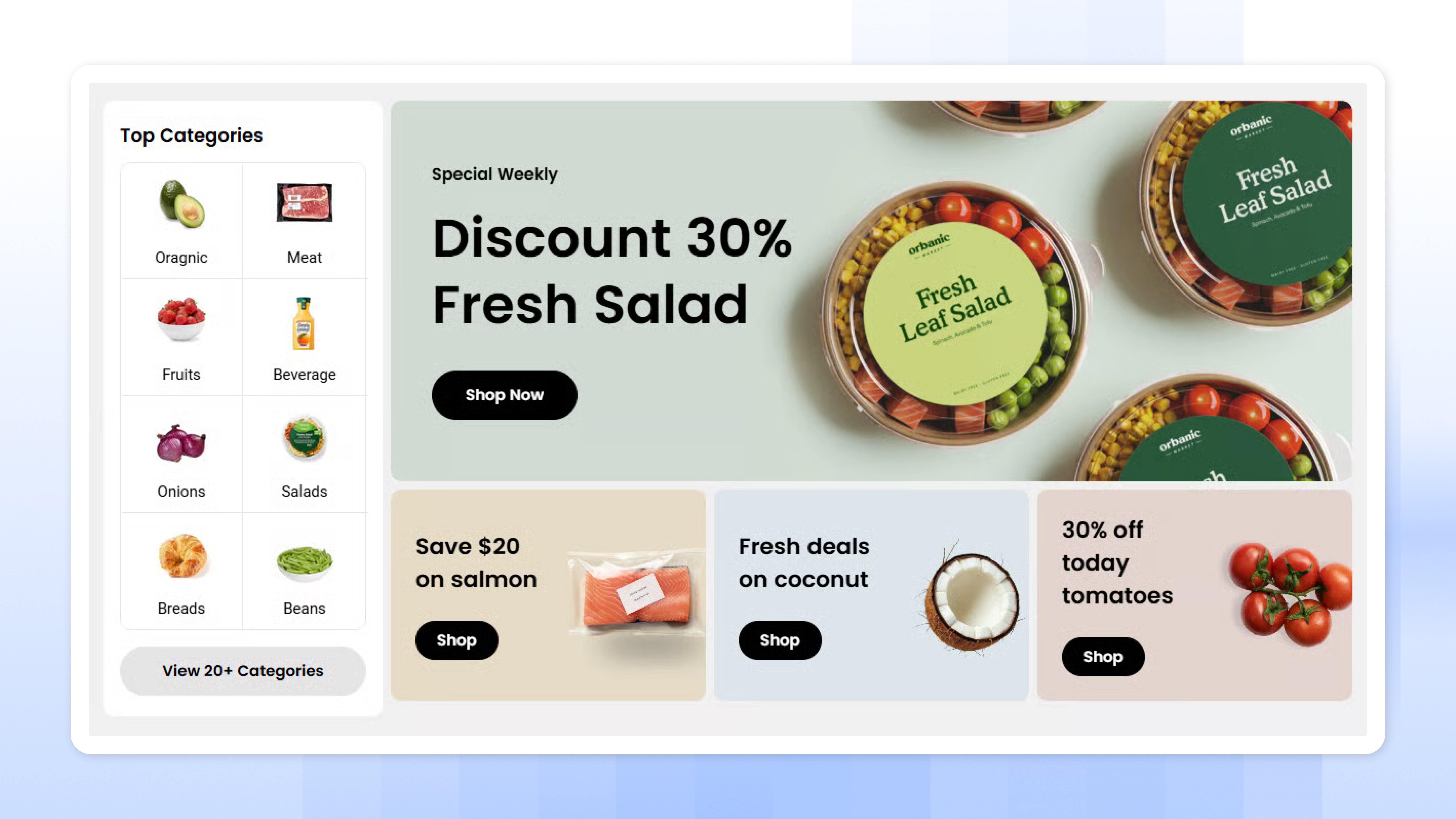
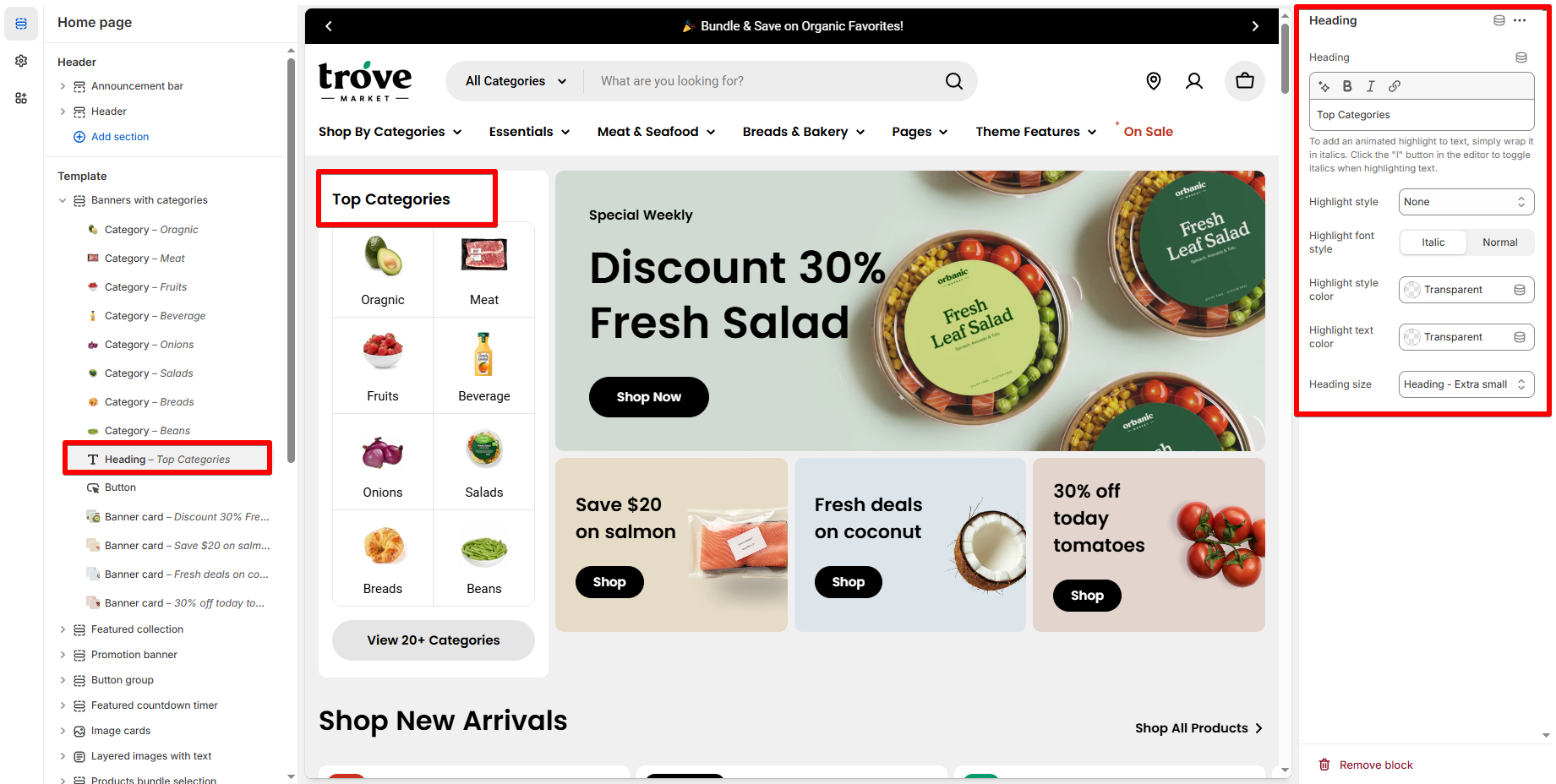
Heading block 🔝
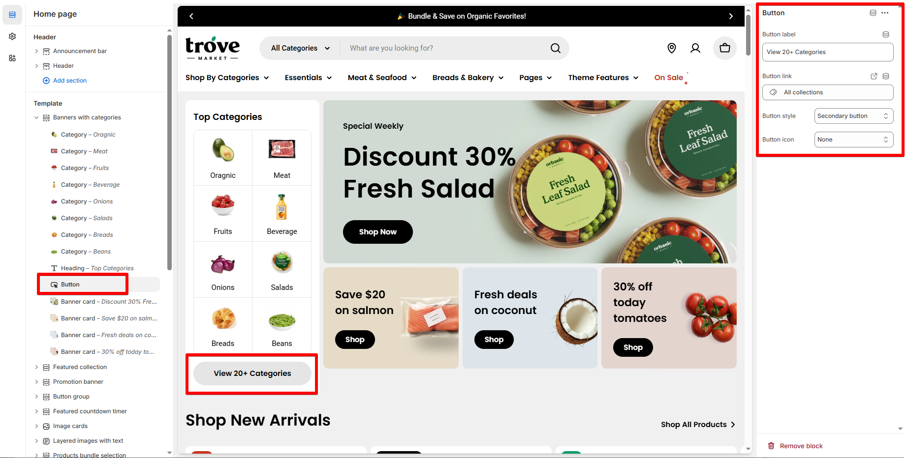
Button block 🔘
Category block 🗂️
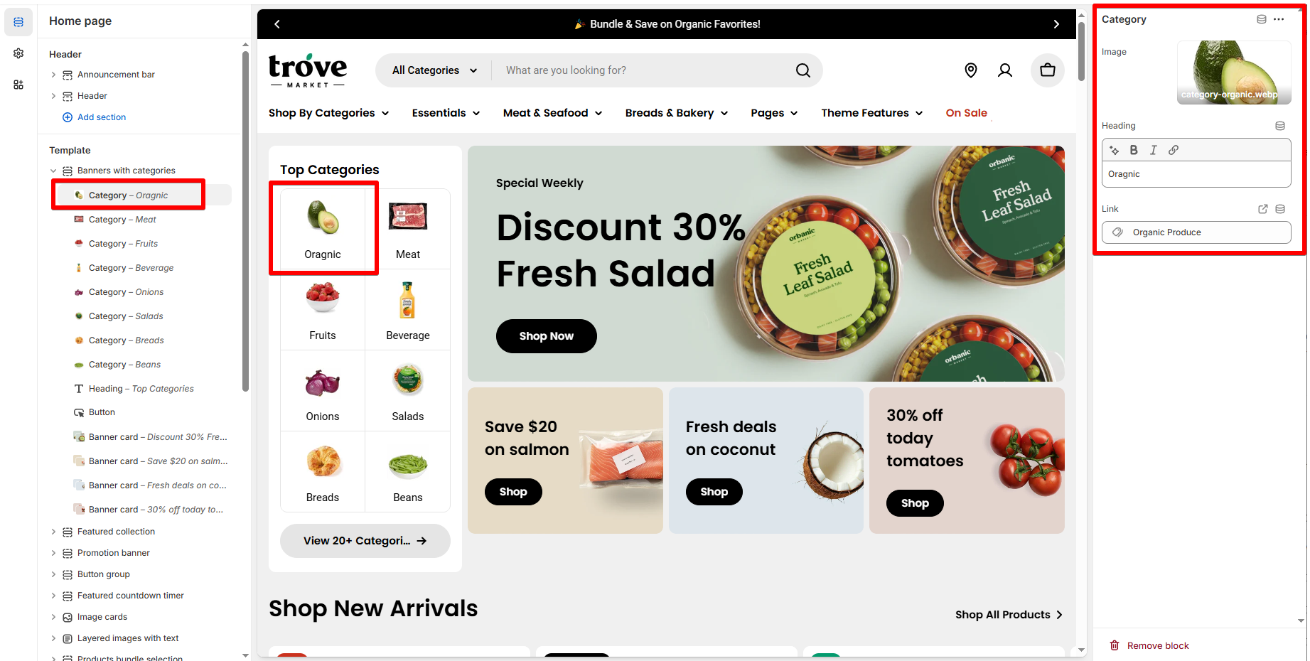
| Setting | Description |
|---|---|
| Image | Upload an icon or small banner |
| Heading | Short label (e.g., “Meat”, “Fruit”) |
| Link | Directs to a page or collection |
Banner card block 🖼️
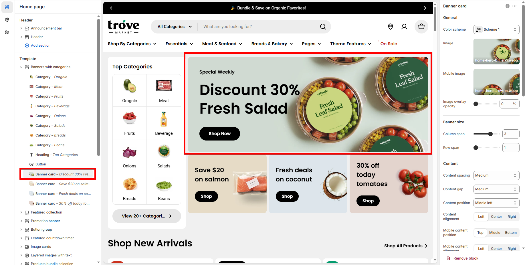
| Setting | Description |
|---|---|
| Image (desktop) | Main banner image for desktop |
| Image (mobile) | Optional mobile-optimized image |
| Column span | Decide how wide the banner appears across the grid (between 1-6). |
| Row span | Choose vertical space coverage (between 1-3). |
| Content | Promo text |
| Button label/link | Add a CTA like “Shop Now” with a destination URL |
| Overlay opacity | Adjust dark/light overlay on the banner image |
| Content alignment & position | Control how the control is display over the banner |
📝 Best practices
- Keep category names short (1–2 words) to avoid layout issues.
- Use consistent image styles for a clean and unified look.
- For banner text, keep it brief and contrast it against the image with an overlay if needed.
Last updated