
Theme Sections
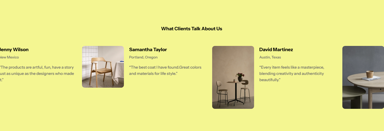
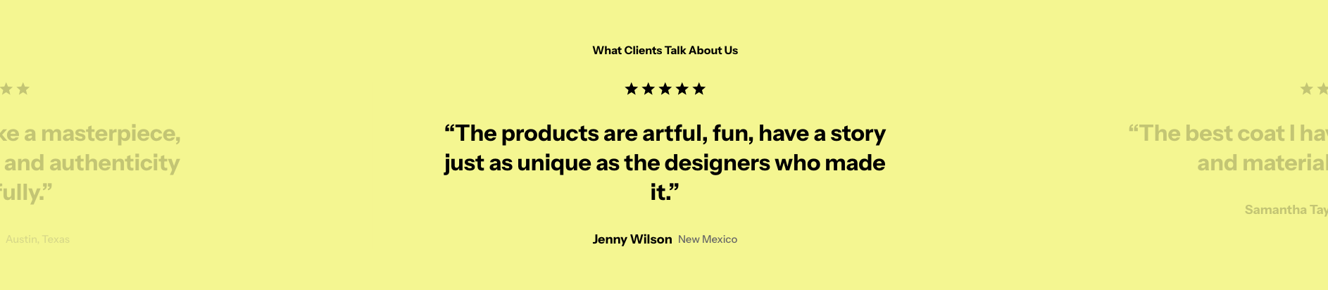
Testimonials
3 min read
_HvNb5BSx.jpg)
How to add a Testimonials section to your Shopify store
- In the theme editor (Customize), click Add section.
- Locate Testimonials.
- Make necessary changes.
- Save.
How to edit a Testimonials section
Section settings
Section header
Card settings
- Color scheme: Select a color scheme for your cards (testimonials).
- Layout: Set how the testimonials' images and content are displayed.

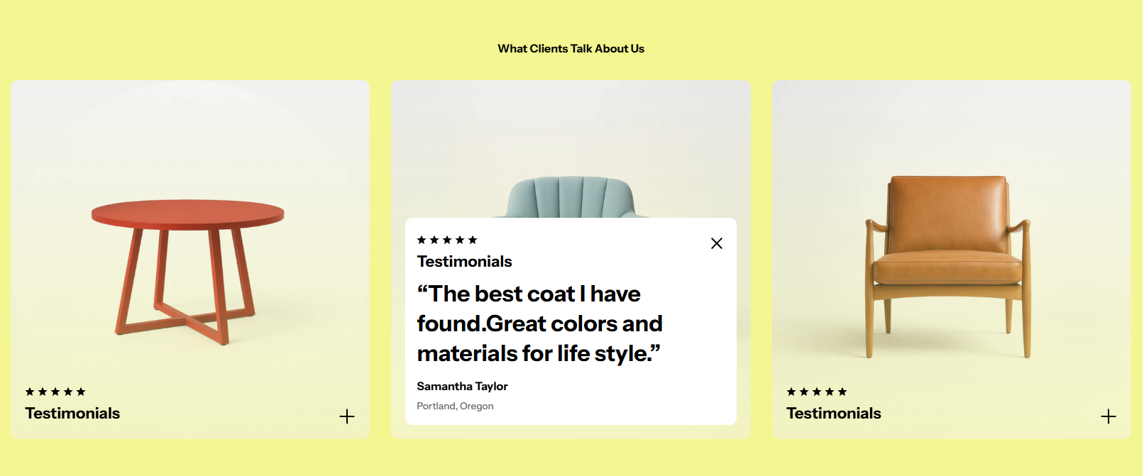
- Image ratio: Set the image ratio of the testimonial cards.
- Text size: Adjust the text size of the testimonial.
- Author info layout: Choose Vertical/Horizontal layout.

- Show image: Display image in testimonial cards.
- Show author image: Display author's avatar/photo next to their testimonial.
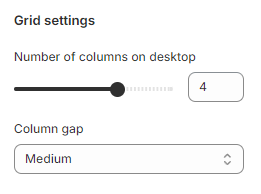
Grid settings
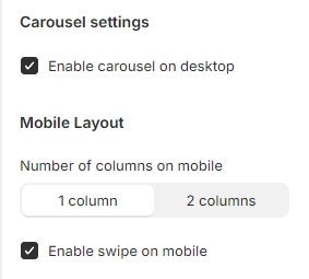
Carousel settings & mobile layout
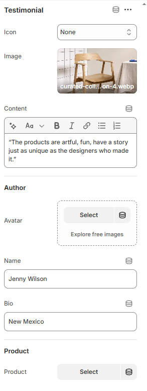
Block settings
Last updated