HYPER theme
Try Hyper freeResourcesOther solutions
  • What is Hyper theme
  • Changelog
  • Refund policy
  • Support policy
  • Getting started
    • Install Hyper theme
    • Set up my store as Hyper demo
    • Update Hyper theme
    • Theme license & Transfer
  • Page's global sections
    • Announcement bar
    • Top bar
    • Header
      • Mega menu
      • Use Country/ Region selector
      • Use Language selector
    • Footer
    • Cart drawer
    • Popup
    • Product compare
    • Quick view
    • Spotlight picks
  • Theme sections
    • Banner with hotspots
    • Before/after image slider
    • Brand logos πŸ”₯
    • Button group
    • Collapsible tabs
    • Collection list
    • Collection list slider
    • Collection tabs
    • Contact form
    • Countdown timer
    • Custom content
    • Custom liquid
    • Email signup
    • Favorite products πŸ”₯
    • Featured blogs
    • Featured collection
    • Featured countdown timer πŸ”₯
    • Featured product
    • Horizontal products list πŸ”₯
    • Image with text
    • Image with text overlay
    • Image with text slider πŸ”₯
    • Lookbook slider
    • Multicolumn
    • Multicolumn with icon
    • Press πŸ”₯
    • Products bundle πŸ”₯
    • Promotion banner
    • Recently viewed products
    • Rich text
    • Shop the feed πŸ”₯
    • Scrolling banner
    • Scrolling gallery images
    • Scrolling promotion
    • Slideshow
    • Tabs content
    • Testimonials
    • Testimonials masonry πŸ”₯
    • Video
    • Video hero
  • Theme settings
    • General
    • Animations
    • Blog cards
    • Buttons
    • Cart
    • Color swatches
    • Colors
    • Currency format
    • Custom CSS
    • Layout
    • Logo
    • Product badges
    • Product cards
    • Product compare
    • Quick view
    • Search behavior
    • Social media
    • Typography
  • Collections & Products
    • Product page
      • Product template
      • Breadcrumbs
      • Product information
      • Quick comparision table
      • Quick order list
      • Related products
    • Collection page
      • Collection template
      • Collection banner
      • Product grid
    • Collections list page
  • Other pages
    • Blogs
    • Blog posts
    • Cart
    • Password
    • Search page
  • FAQs
    • Add Highlighted text to your Headings
    • Add gift wrap option to my cart
    • Combined listings app
    • Set up Local Pickup option
    • Set up quantity rules and volume pricing in B2B
    • Show Payment icons
Powered by GitBook
On this page
  • How to add a Horizontal products list section to your Shopify store
  • How to edit a Horizontal products list section
  • General
  • Section header
  • Layout setting
  • Grid settings
  • Mobile layout
  • Best practices
  • FAQs
  • Can I link the button to a specific product or custom page?
  • Why aren’t all products from the collection showing?
  • Why is the "Show More" button not appearing?
  1. Theme sections

Horizontal products list πŸ”₯

Display your top-selling or featured items in a clean, scroll-friendly product list

PreviousFeatured productNextImage with text

Last updated 21 days ago

The Horizontal products list section showcases a product collection in a clean, horizontal layout. Great for promotions like "Trending This Week" or "Staff Picks", this section allows customers to browse featured items from a selected collection without leaving the page.

How to add a Horizontal products list section to your Shopify store

Steps:

  1. In the theme editor (Customize), click Add section

  2. Locate Horizontal products list

  3. Make necessary changes

  4. Save

How to edit a Horizontal products list section

General

  • Color scheme: Pick a predefined scheme to match your site.

    • Customize your Color schemes: Colors

  • Collection: Choose a collection you want to display.

Section header

  • Text alignment: Align the section header on desktop and mobile views separately.

  • Heading & Subheading: Add an optional subheading and title for the section.

  • Text: Add description to the section header

  • Text size: Small/ Base size/ Large/ Inherit

  • Go to Theme settings > Typography to change the store's Base size.

  • Select Inherit to apply your rich text editor setting for the text.
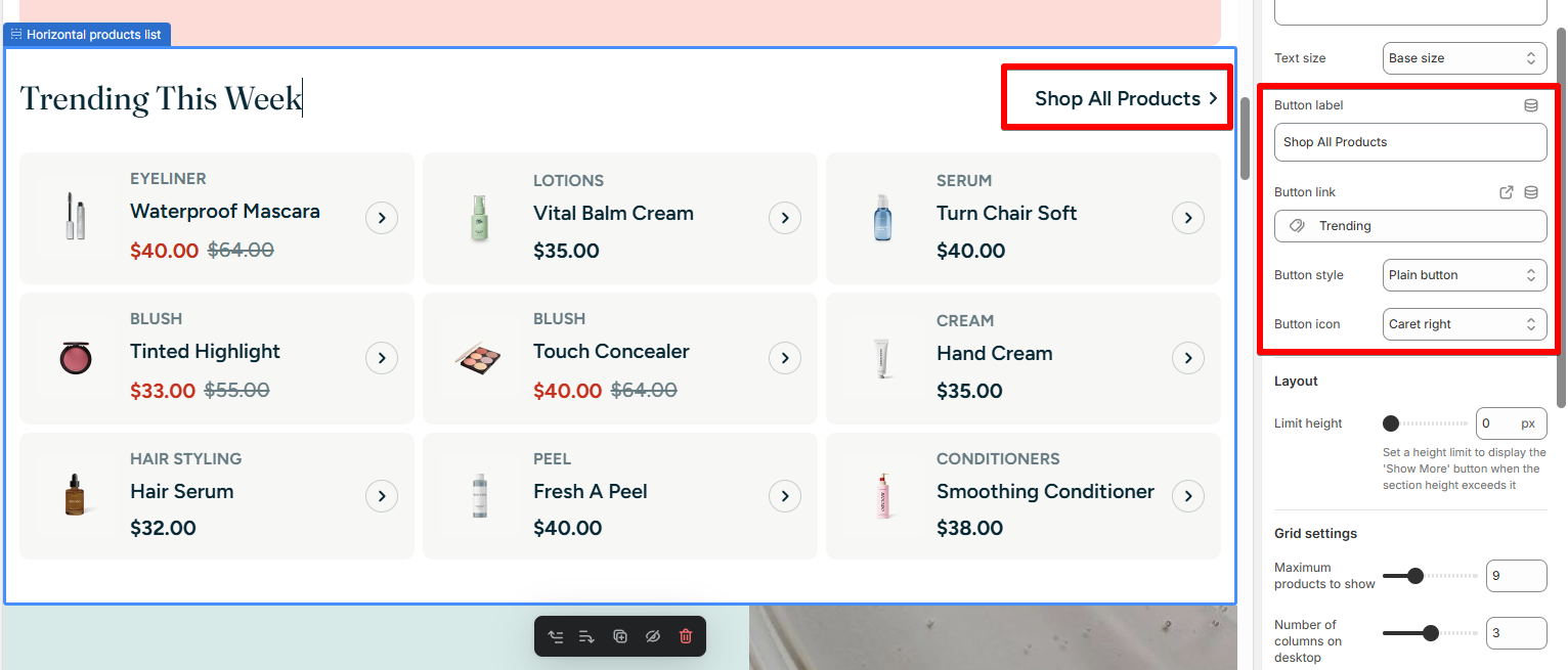
  • Button settings:

    • Button label: Text shown on the call-to-action button.

    • Button link: Choose where the button leads (usually a collection or product page).

    • Button style: Choose between Plain or Solid styles.

    • Button icon: Choose an icon shown after the button label.
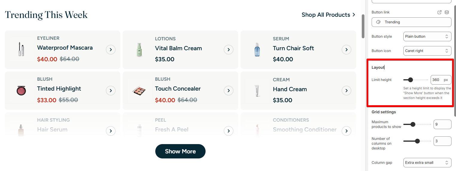
Layout setting

  • Limit height: Set a pixel height limit before the section collapses behind a "Show More" button for desktop view.

Grid settings

  • Maximum products to show: Control how many products are displayed.

  • Number of columns in desktop: Choose how many product cards appear per row.

  • Column & Row gap: Adjust spacing between products.
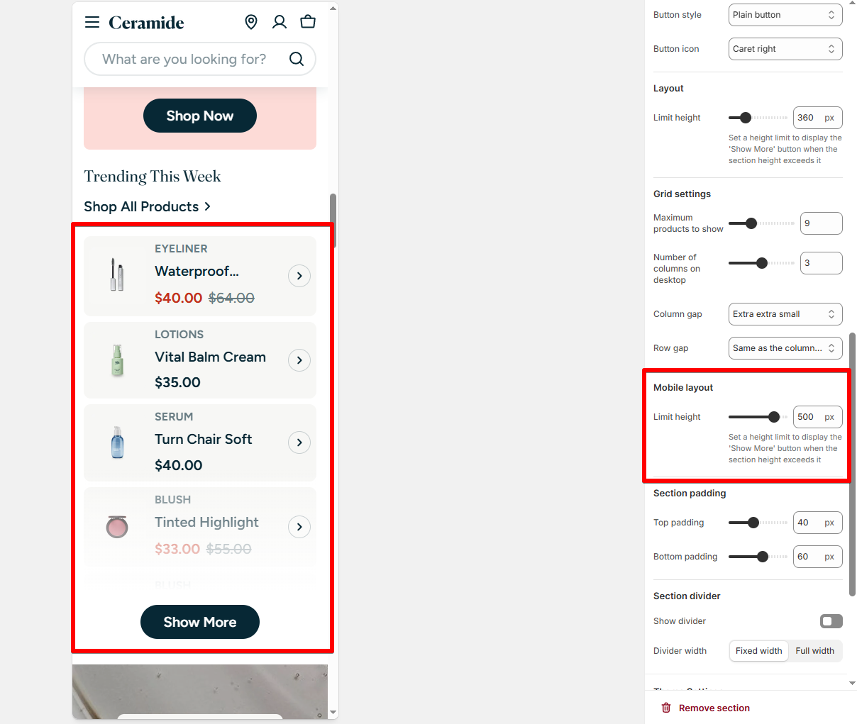
Mobile layout

  • Limit height: Set a pixel height limit before the section collapses behind a 'Show more' button for mobile view.

Best practices

βœ… Keep button CTA clear: "Shop All", "View More", etc.

βœ… Limit product count for a smoother scroll experience.

FAQs

Can I link the button to a specific product or custom page?

πŸ‘‰ Yes, you can link to any URL or Shopify page using the Button link field.

Why aren’t all products from the collection showing?

πŸ‘‰ Check the "Maximum products to show" setting. It may be limiting your display.

Why is the "Show More" button not appearing?

πŸ‘‰ It only appears if the content height exceeds the set Limit height for desktop or mobile.

You might be interested: Add Highlighted text to your Headings

πŸ‘€