
Pages Global SectionsHeader
Mega menu
6 min read
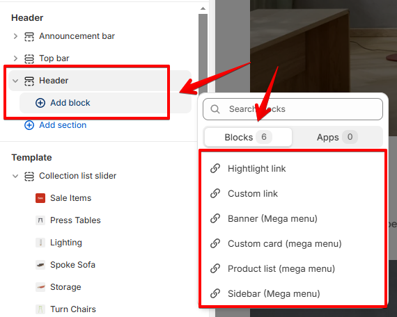
- In the theme editor (Customize), locate the Header section.
- Click Add block, then select the add-on type you want for your menu.
- Make necessary changes.
- Click Save.
Highlight link
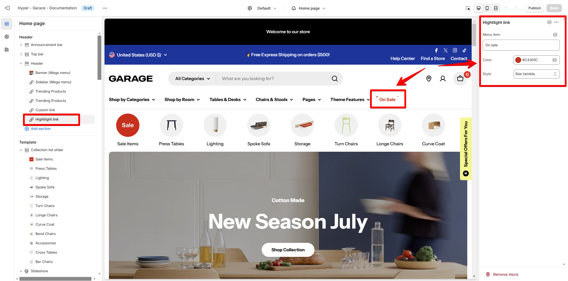
- Menu item: Type the name of the menu item exactly as it appears in your store’s navigation.
- Color: Select a custom color for the highlight. This makes the link visually distinct from others in the menu.
- Style: Choose a visual effect to enhance the link’s appeal. Available options include:
- Text color for having the menu item in a different color.
- Star twinkle for a subtle animated effect.
- Button to convert the link into a button.
Custom link
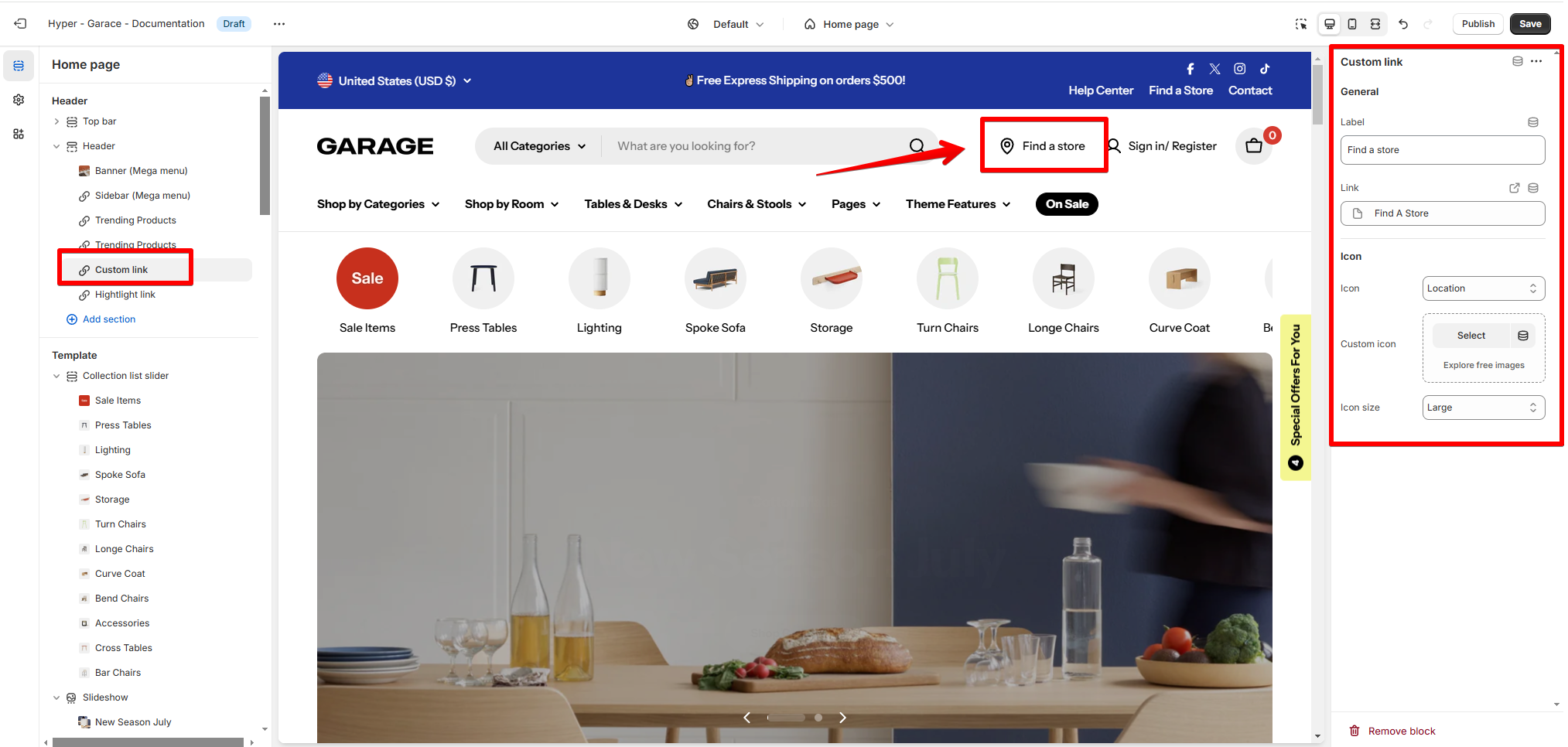
- Label: Type the name you want for the custom link.
- Link: Use the Link field to connect the label to a specific page. You can:
- Select an existing page from the dropdown.
- Paste a URL for external pages or links.
- Icon: Choose a built-in icon that matches the purpose of the link. For instance, select the Location icon for a store locator.
- Icon size: Adjust the size of the icon to fit your design preferences.
Banner (Mega menu)
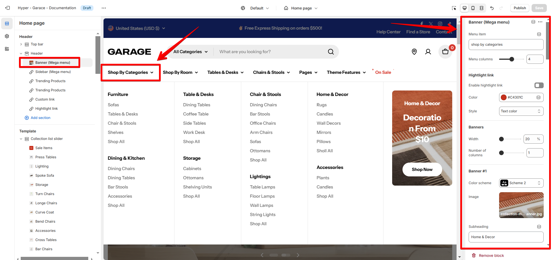
- Menu item: Type the name of the menu item exactly as it appears in your store’s navigation.
- Menu columns: Set the number of columns for your nested menu items.
- Highlight link: Enable this feature to draw attention to that main menu item.
- Color: Select a color to highlight it from others.
- Style: Adjust the text style to text color, star twinkle, or button for better visibility.
- Banner settings:
- Width: Adjust the width of the banner.
- Number of columns: Specify how many columns the banners take up.
- Add up to 5 banners in each main menu item.
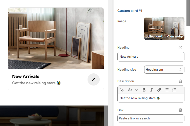
Custom card
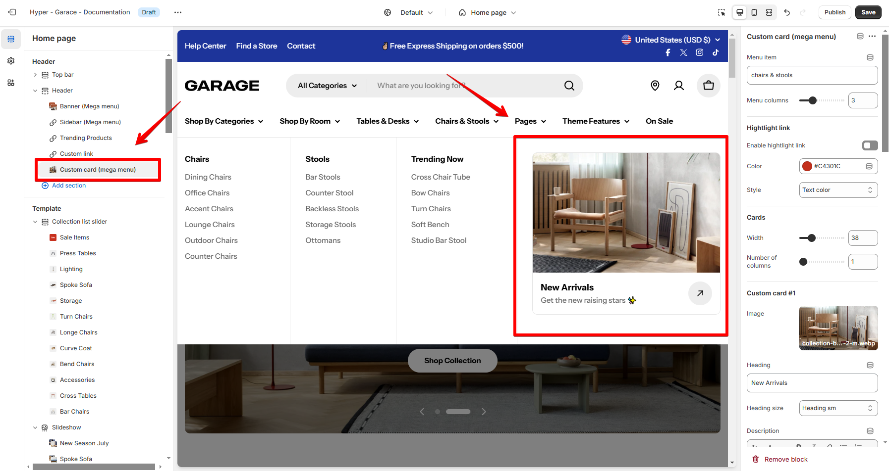
- Menu item: Type the name of the menu item exactly as it appears in your store’s navigation.
- Menu columns: Set the number of columns for your nested menu items.
- Highlight link: Enable this feature to draw attention to that main menu item.
- Color: Select a color to highlight it from others.
- Style: Adjust the text style to text color, star twinkle, or button for better visibility.
- Card settings:
- Width: Adjust the width of the banner.
- Number of columns: Specify how many columns the custom cards take up.
- Add up to 5 custom cards in each main menu item.
Product list
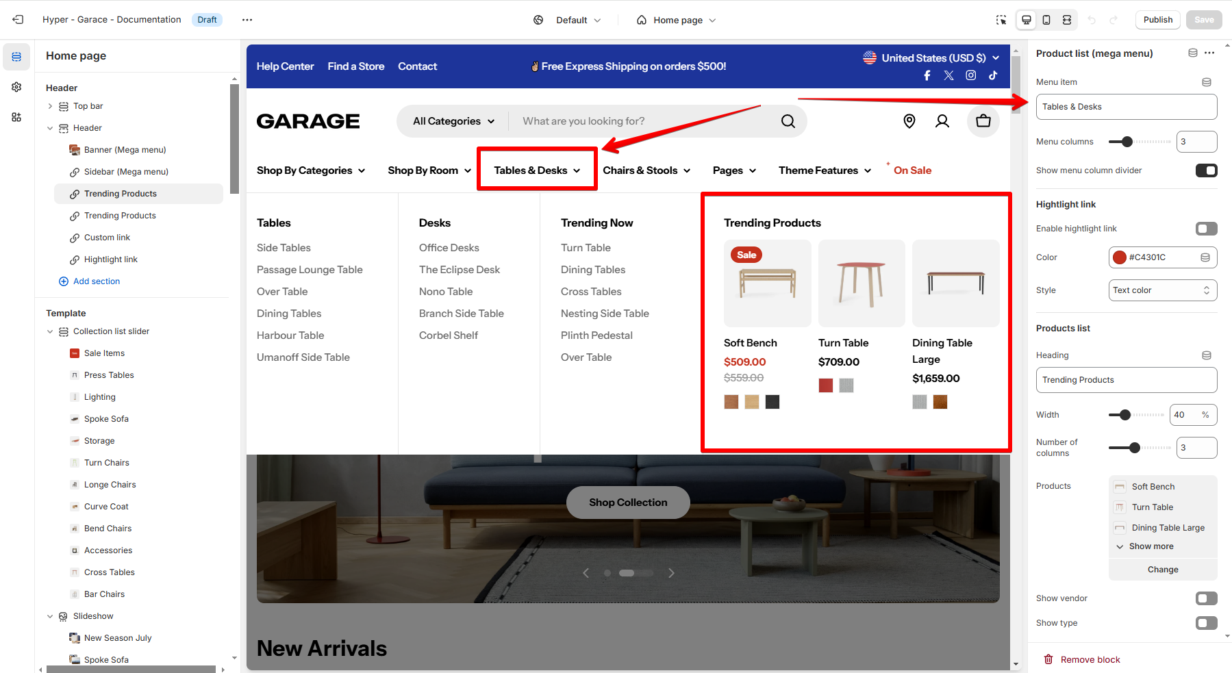
- Menu item: Type the name of the menu item exactly as it appears in your store’s navigation.
- Menu columns: Set the number of columns for your nested menu items.
- Show menu column divider: Toggle this on/off to display a divider between menu columns for better structure.
- Highlight link: Enable this feature to draw attention to that main menu item.
- Color: Select a color to highlight it from others.
- Style: Adjust the text style to text color, star twinkle, or button for better visibility.
- Products list:
- Heading: Give the product list a heading.
- Width: Adjust how much space the product list takes up in the menu dropdown.
- Number of columns: Choose how many product columns to display.
- Products: Select the products you want to display in your mega menu.
- Show vendor: Enable this setting to display the vendor/brand name for the products.
- Show type: Toggle this on to display the product type.
Sidebar
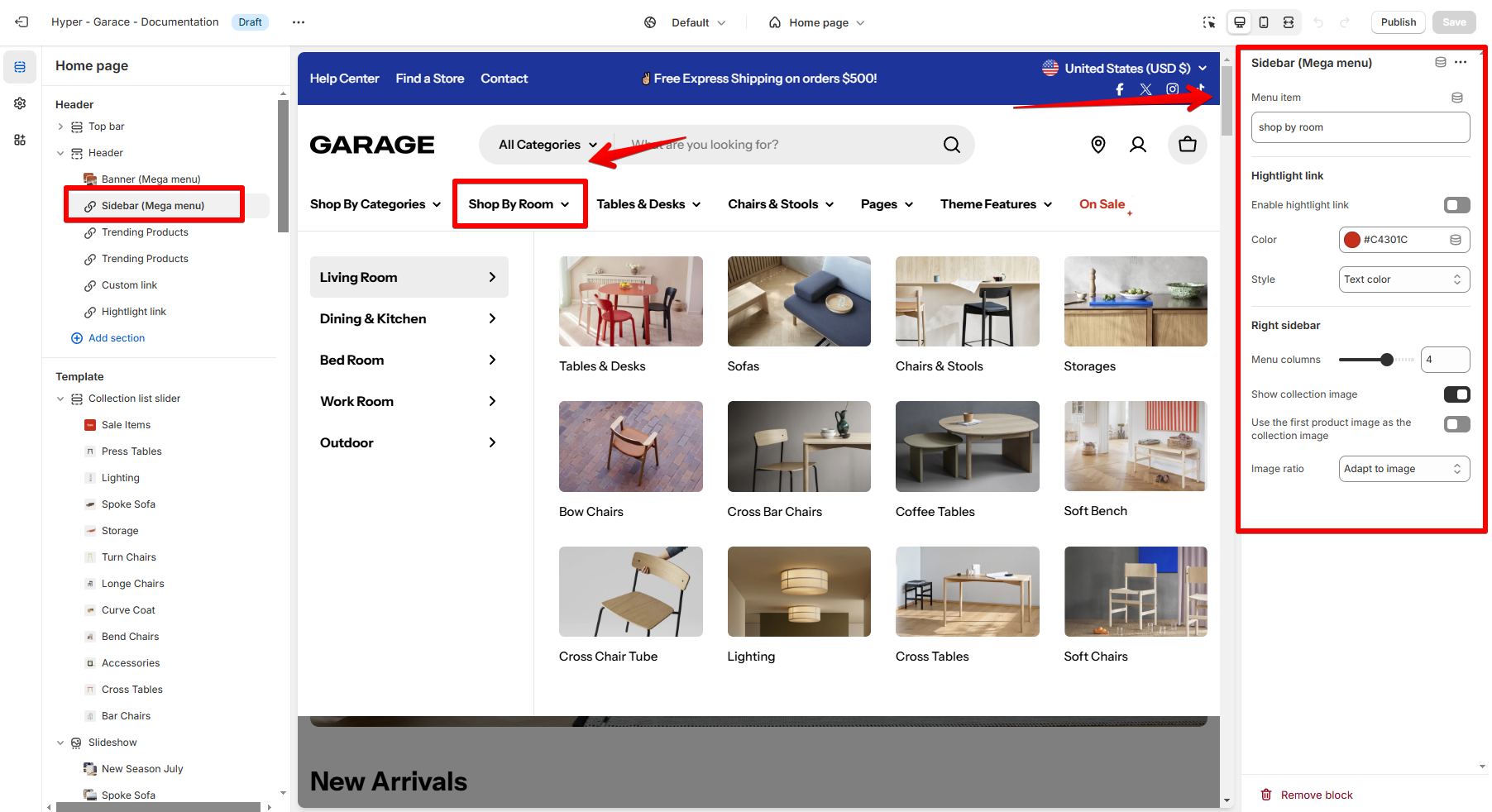
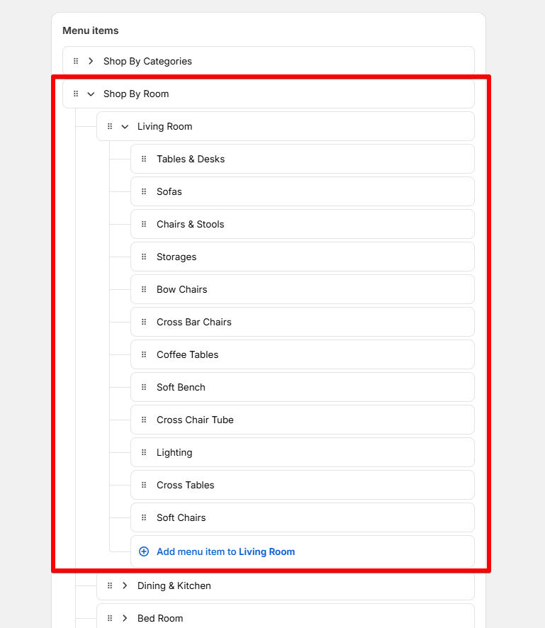
See Editing menus.
- Menu item: Type the name of the menu item exactly as it appears in your store’s navigation.
- Highlight link: Enable this feature to draw attention to that main menu item.
- Color: Select a color to highlight it from others.
- Style: Adjust the text style to text color, star twinkle, or button for better visibility.
- Right sidebar:
- Menu columns: Adjust the number of columns of 3rd-level items to organize content.
- Show collection image: Display a featured image for each collection in the sidebar.
- Use the first product image as the collection image: Automatically use the first product’s image from the collection instead of a custom collection image.
- Image ratio: Define how the collection images are displayed.
Last updated