
Theme Sections
Grid banner 🔥
4 min read
_zYYeAlgJ.jpg)
How to add a Grid banner section to your Shopify store
- In the theme editor (Customize), click Add section.
- Locate Grid banner section.
- Make necessary changes.
- Save.
How to edit a Grid banner
Section settings
Section header
Grid settings
- Set the number of columns on desktop (between 4-6 columns).
- Define the Banner height and gap between columns/rows.
Mobile layout
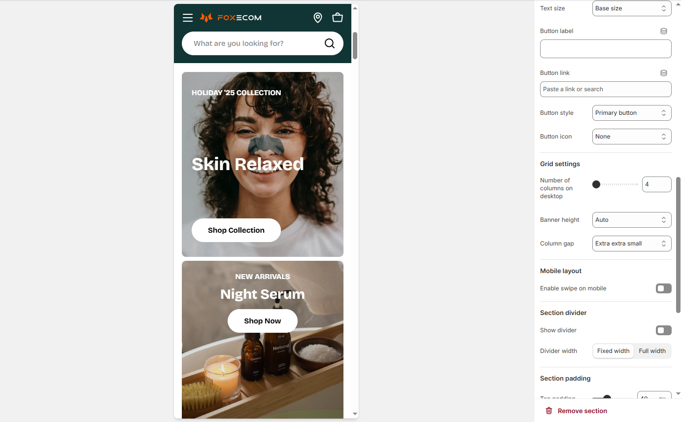
- Enable swipe on mobile if you want a horizontal scroll instead of stacked cards.
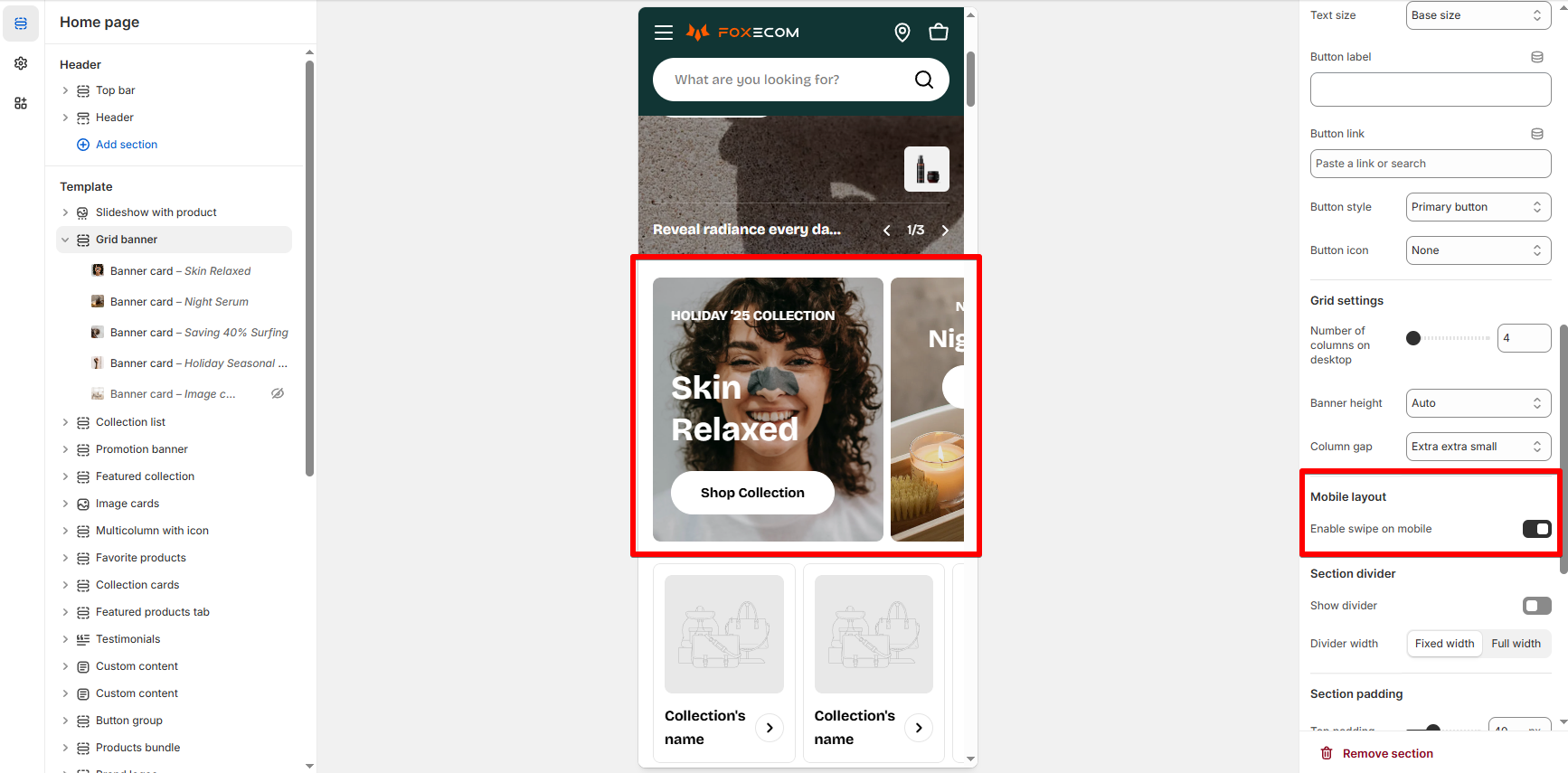
Block settings
✅ Best practices
- Balance large and small cards: Avoid setting all cards to span 2x2. Mix sizes (e.g., 2x2 with 1x1) to create a dynamic and well-spaced layout.
- Plan layout flow: Think of the grid like a puzzle—larger cards go first, then smaller ones fill the gaps.
- Avoid overflow: If too many cards are set to span 3 or 4 columns, they may overflow or break alignment. Keep your layout within a 4-column limit per row.
Last updated