
Collections And ProductsCollection page
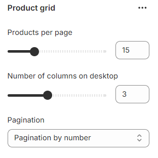
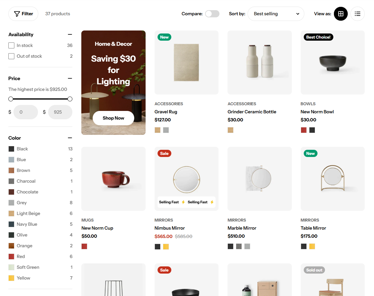
Product grid
3 min read
_o1Q9FfG9.jpg)
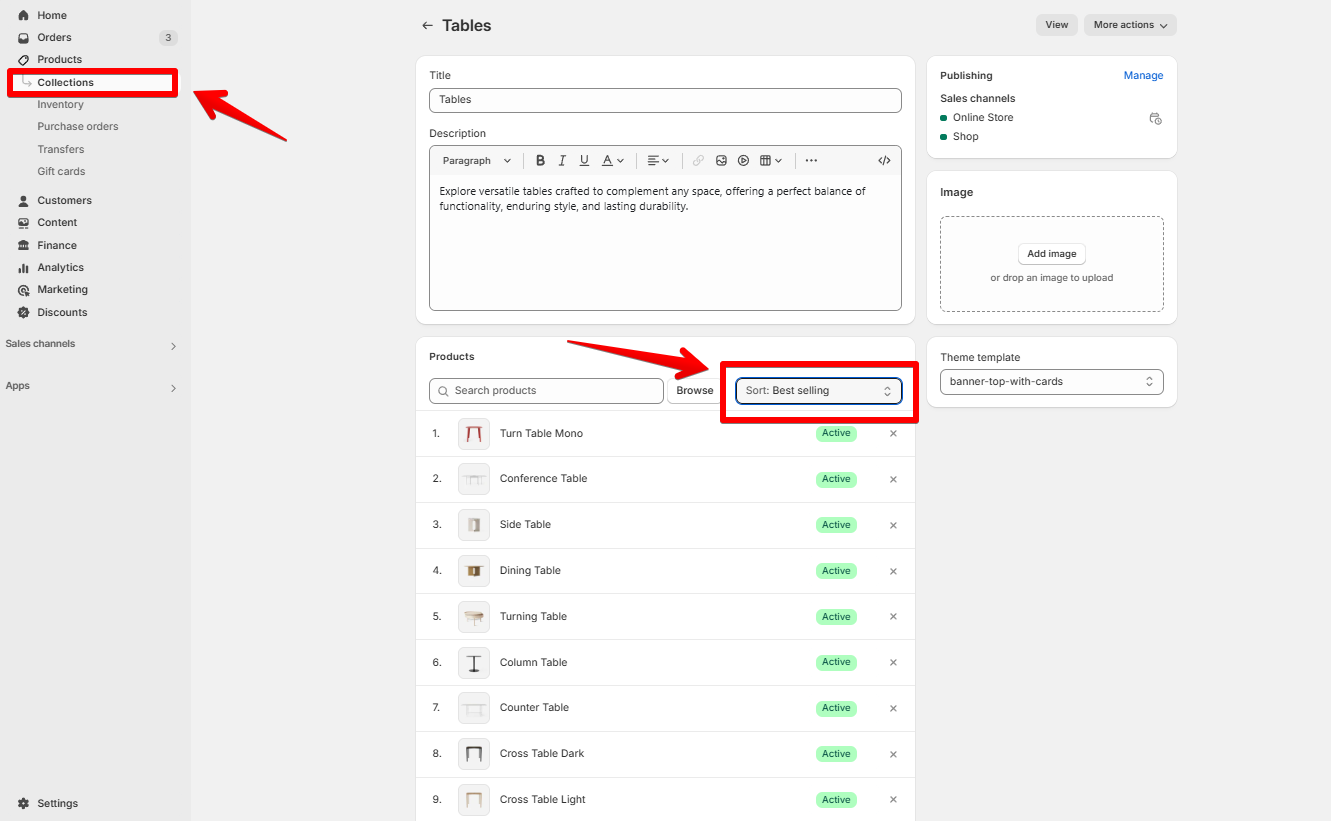
- In the theme editor (Customize), open the template selector.
- Select Collections, then Default collection.
- On the left-sidebar, locate Product grid
- Make necessary changes > Save.
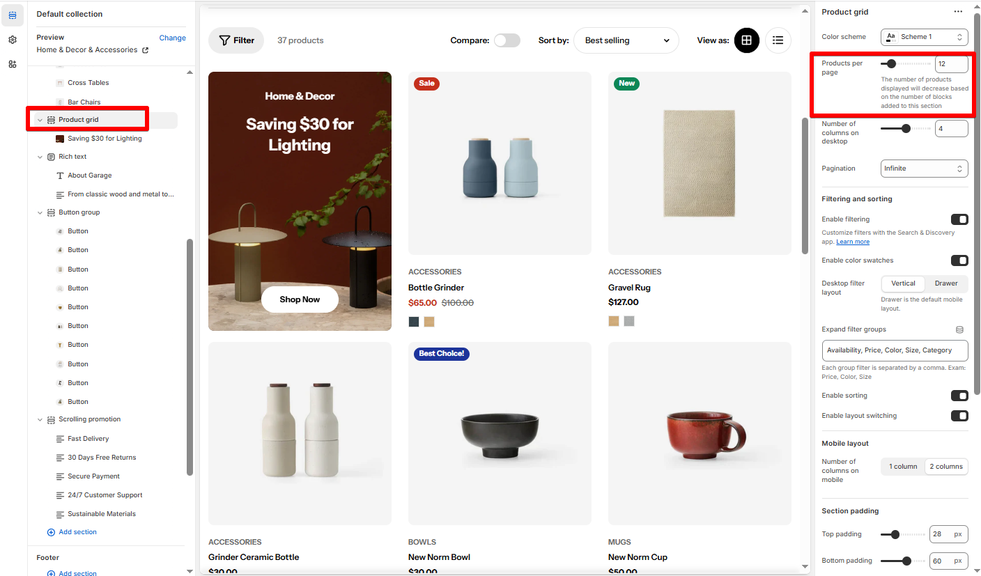
General and layout
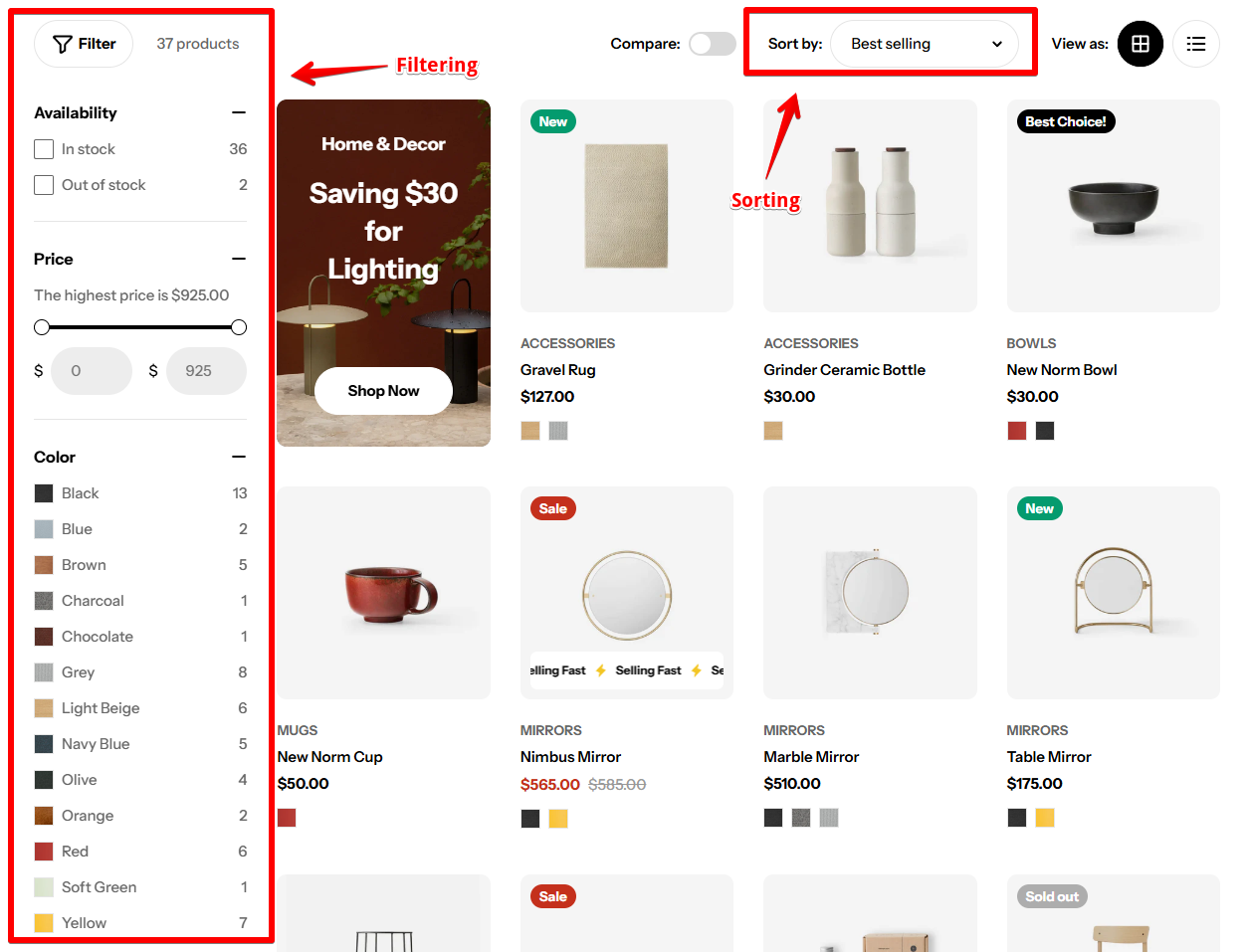
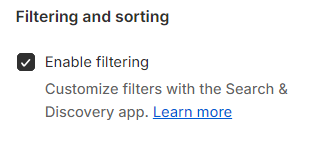
Filtering and Sorting
- Featured
- Best selling
- Alphabetically, A-Z
- Alphabetically, Z-A
- Price, low to high
- Price, high to low
- Date, old to new
- Date, new to old
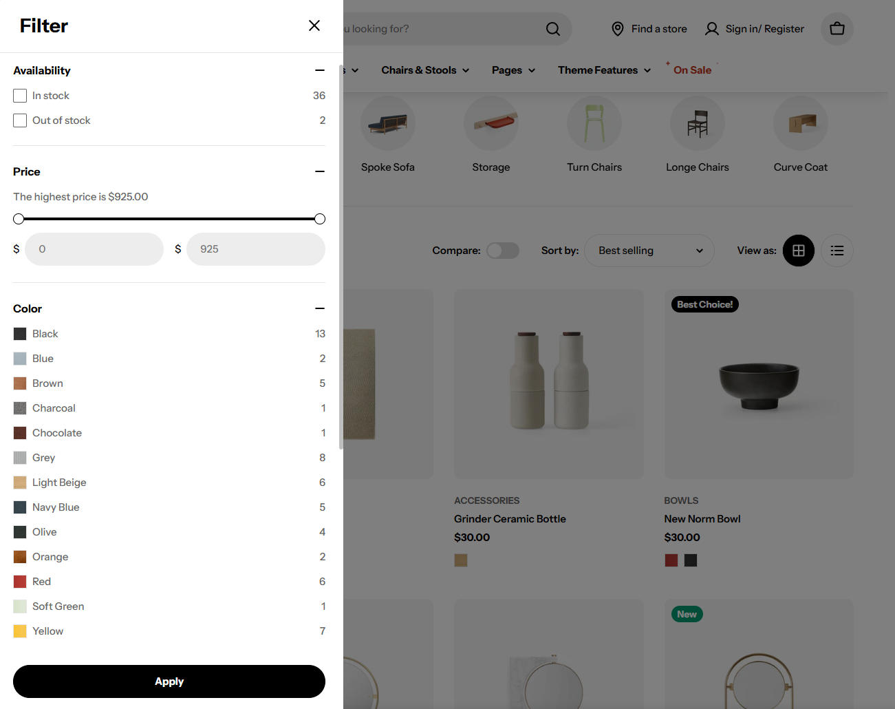
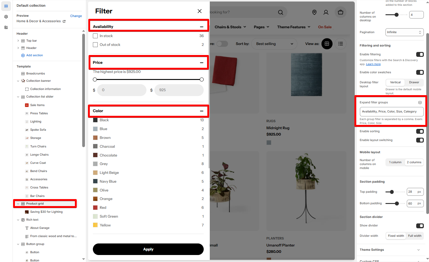
How to customize filters
Customizing the filters in your store requires the Shopify Search & Discovery app.
Learn how to customize filters with the app.
Learn about Filters considerations.
- Go to Apps > Search & Discovery.
Make sure you install the Shopify Search & Discovery app for your store
- Select Filters.
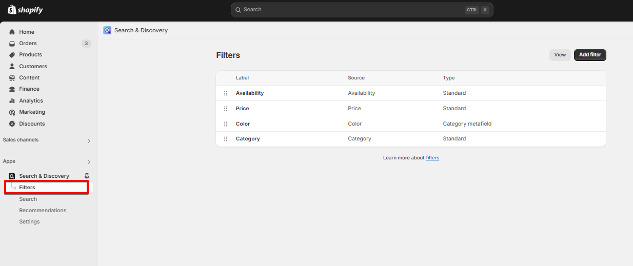
- Add or remove filters to show/hide from the storefront filters > Save the settings.
- In the theme editor (Customize), open the template selector > Select Collections > Default collection.
- On the left-sidebar, locate Product listing > Select Enable filtering checkbox
- Save
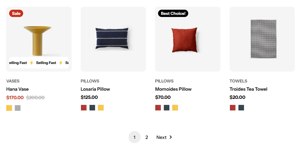
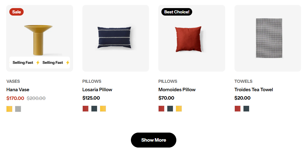
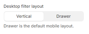
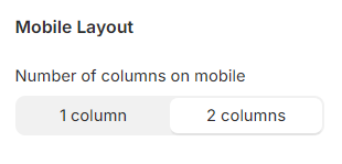
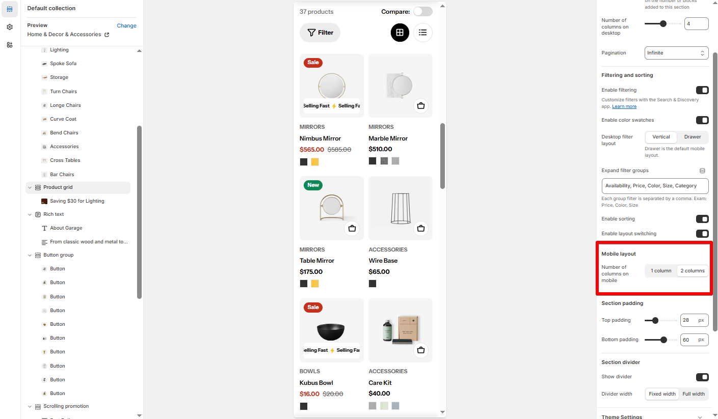
Mobile Layout
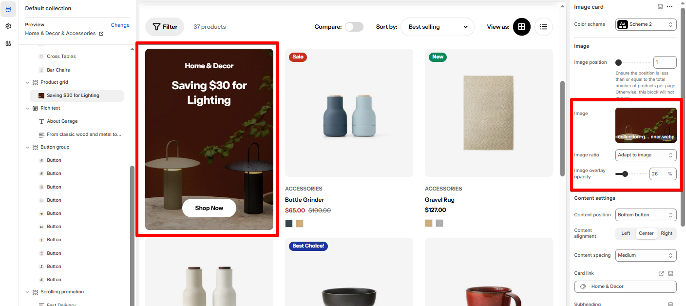
Add an Image card to your Product grid
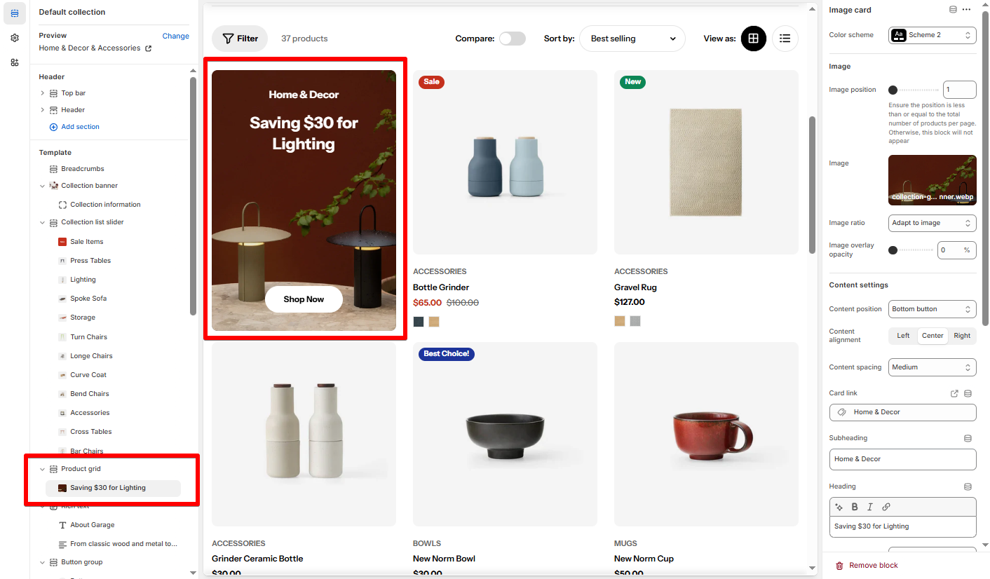
Image settings
- Image position: Defines which spot the image card appears in (e.g.
1shows it before the first product).
- Image: Add your promotional banner or styled image.
- Image ratio: Choose how your image scales (e.g. Adapt to image or Fixed aspect ratio).
- Image overlay opacity: Add a dark overlay (0–100%) for better text readability.
Content settings
- Content position: Choose where the text/button appears.
- Content alignment: Align content left, center, or right.
- Content spacing: Adjust internal padding around content.
- Card link: Where users are taken when they click the image.
- Subheading: Optional small text above the heading.
- Heading: Main attention-grabbing text.
- Text: Add a short description.
- Button label: Custom CTA (e.g. “Shop Now”).
- Button link: Where the CTA button redirects.
Last updated