# Multicolumn
_BzRPri3H.jpg)
You can utilize a multicolumn section to showcase your store's services and other details.
## How to add a Multicolumn section to your Shopify store
Steps
1. In the theme editor (**Customize**), click **Add section.**
2. Locate **Multicolumn** section
3. Make necessary changes
4. **Save.**
## How to edit a Multicolumn section
### Section settings
#### Section header
Customize the text and alignment to ensure the section effectively communicates your message and encourages engagement.
* **Subheading**: Add a short, secondary heading to complement the main heading. This can provide additional context or detail.
* **Heading**: Enter the primary title for your banner.
* **Heading size:** Adjust the size to fit your design preference and ensure readability. Choose from available heading sizes.
* **Description:** Add a detailed explanation or summary for the banner. Use rich text formatting like **bold**, *italic*, links, and lists for better visual emphasis.
* **Description size:** Select the size of the description text.
* **Button label:** Input the text for the call-to-action button.
* **Button link:** Add a link to the button to direct users to a specific page, product, or collection.
* **Button style:** Choose a style for the button.
* **Text alignment:**
* Align the text in the section to the **Left**, **Center**, or **Right**.
* Adjust alignment based on your banner’s design and layout.
* **Text alignment on Mobile:** Override desktop alignment settings specifically for mobile devices if needed.
#### Card settings
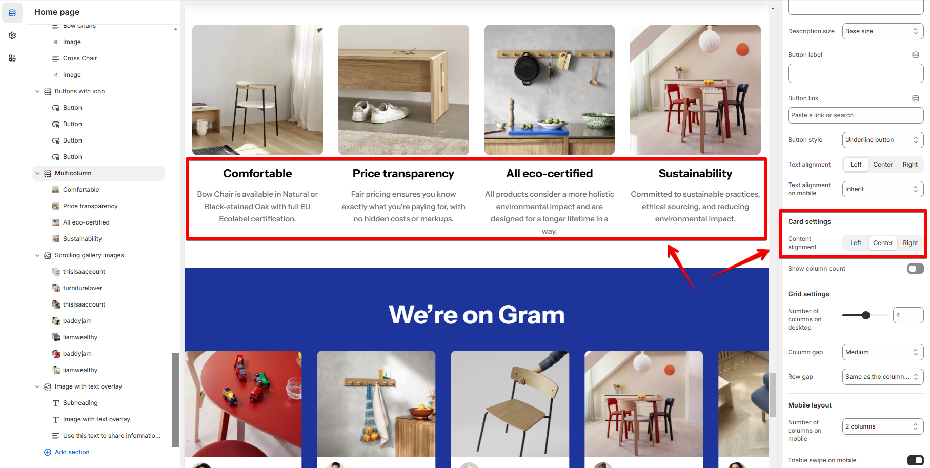
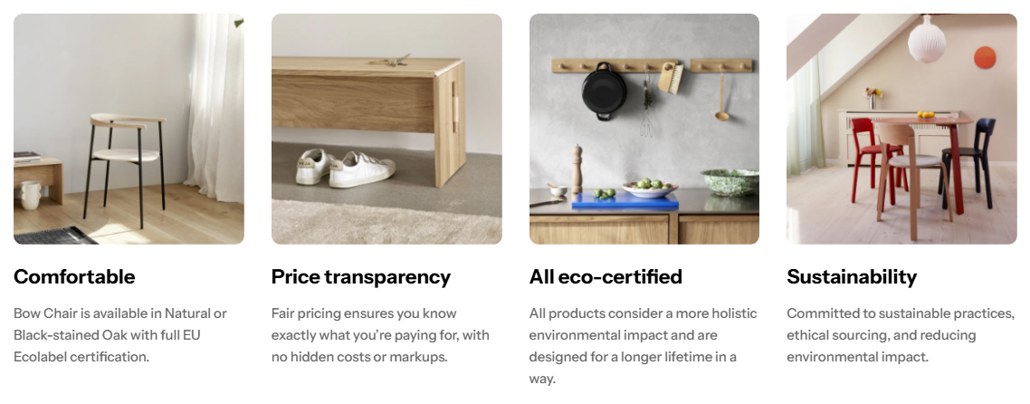
You can adjust the card's **content alignment** and enable **column count**.
* **Content alignment**: Left/Center/Right
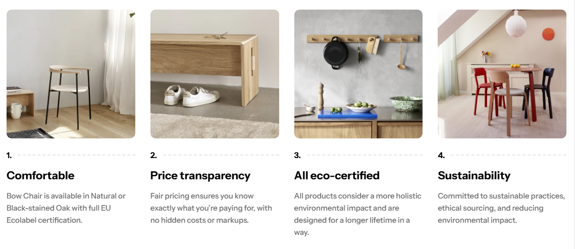
* **Show column count**
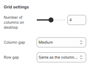
#### Grid settings
Set the **number of columns on desktop** (between 2-6 columns) and the gap between them.
#### Mobile layout
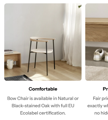
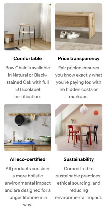
Enable swipe on mobile or display as grid.
### Block settings
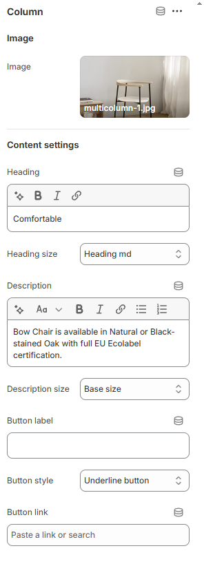
To each column, you can add an image and the content below it.
Leave any field blank to hide the element.