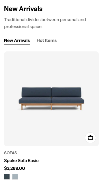
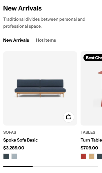
Featured collection
Featuring collections can help merchants promote sales and new collections.
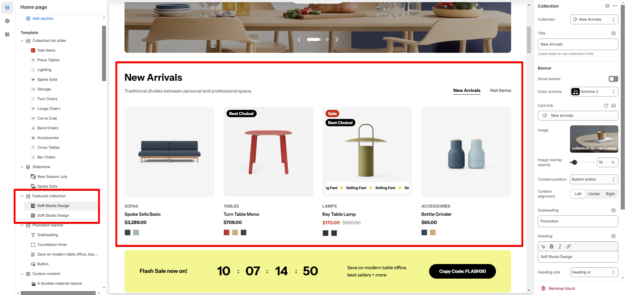
# How to add a Featured collection section to your Shopify storeSteps:
In the theme editor (Customize) , click Add section.
Locate Featured collection.
Make necessary changes.
Save. # How to customize a Featured collection section# Section settingsCustomize the text and alignment to ensure the sectioneffectively communicates your message and encourages engagement.
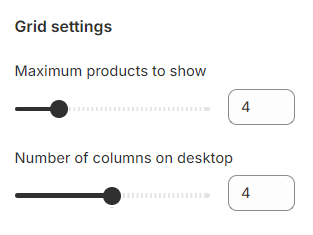
# Grid settings
Maximum products to show: Set the total number of products visible in the section (between 2 and 12). Number of columns on desktop (between 2 and 6): Adjust the number of products displayed per row for desktop users.
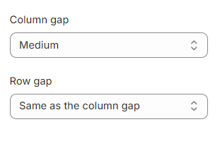
You can also control the suitable spacing between the product cards by selecting Column gap and Row gap options.
# Carousel settings
Enable carousel on desktop: Toggle this option to display the products as a scrolling carousel.
Carousel shows only when the number of products is larger than the number of columns.
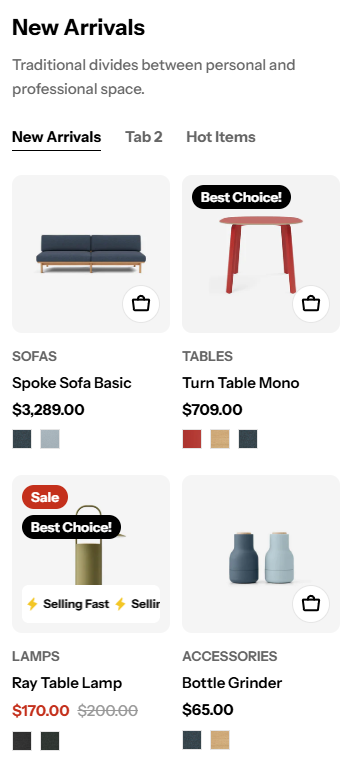
# Product cards
Image ratio : Select the aspect ratio for product images.
Use global settings
Adapt to image
Square (1:1)
Portrait (3:4)
Landscape (4:3)
⭐ To set up other addons such as badges, buttons, etc. to the product cards, check out this article:
# Mobile layout You can adjust the Number of columns on mobile to 1 column or 2 columns.
If you are not into the grid layout, you can use the carousel layout by selecting the Enable swipe on mobile .
Use the swipe option for larger collections to save space while showcasing more products.
# Block settings# CollectionSelect a Collection you want to display in the section.
Add a title for the block (e.g., “New Arrivals” or “Bestsellers”). Leave blank if you want to use the default collection title.
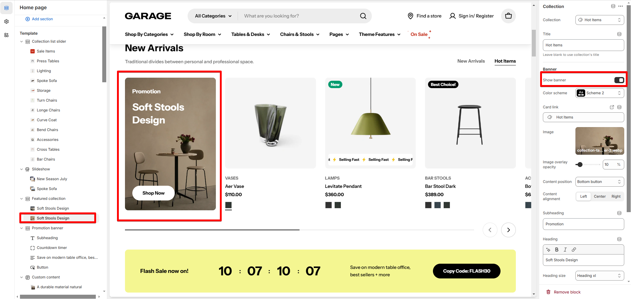
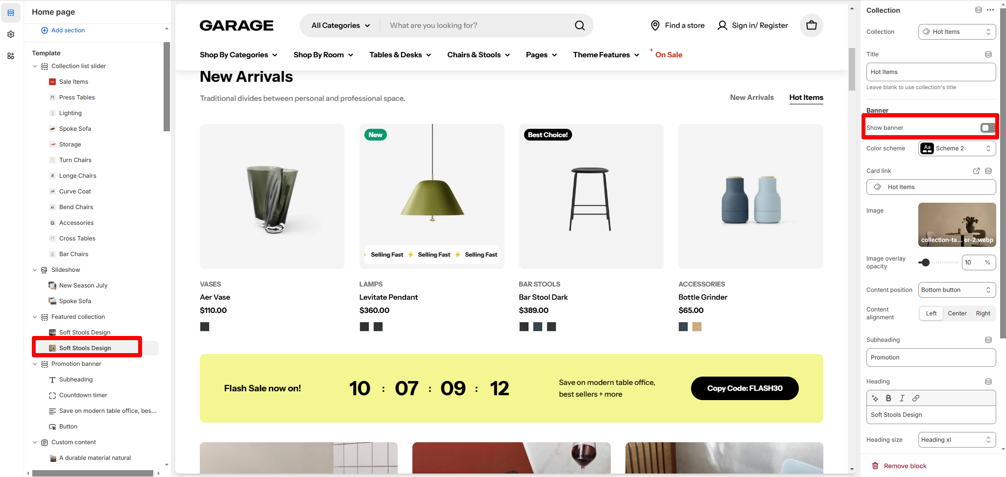
# BannerEnable the option Show banner i f you want to show a featured image at the beginning of the product list. Once enabled, upload an image and customize how it shows in the section.
Show banner enabled Show banner disabled
Best practice: Ensure images and text are not overcrowded. Keep your blocks clean and minimalistic for better readability.
Last updated about 2 months ago

_bcn0jB1k.jpg)